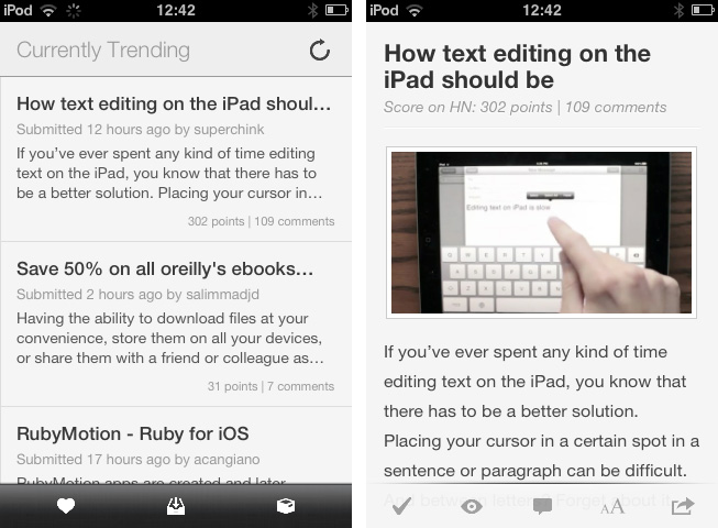
Hacker News from YCombinator is a reliable and very active source of information for all things geeky. Users collect noteworthy technology news articles from all over the web, comment and discuss on them, and vote to create a top list sorted by popularity. Following the trends of the community by joining the network or just regularly visiting the site and clicking through new articles is interesting for anyone who wants to know a bit more about the latest web technologies and how to help enhancing them, from entrepreneurs to developers. In my opinion though, the HN website is cluttered, and the typography is a mess. Maximilian Mackh solved many of these issues by recently publishing his iPhone client for Hacker News. Read more
Create Multiple Mail Signatures On Your iPhone with Signatures
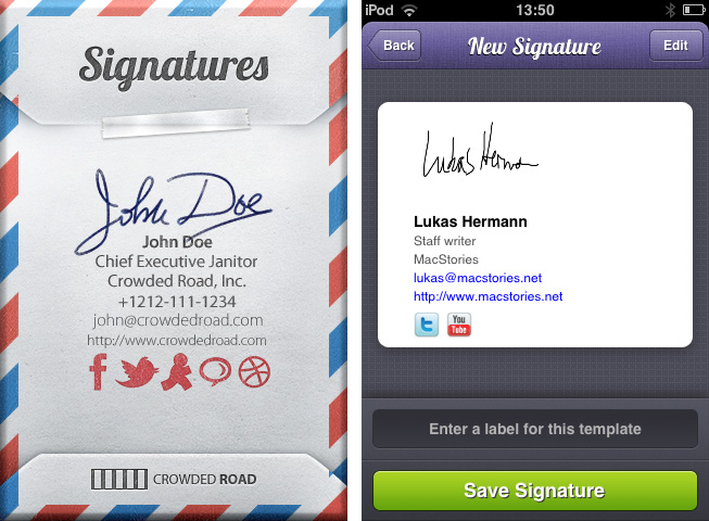
When it comes to mail conversations, it’s often difficult to find the right signature for the mail you’re about to send. You obviously cannot send a mail to your grandma ending up with “Kindest Regards, Lukas Hermann – Staff writer for MacStories.net”. I mean, of course you can, but she may misconceive that a bit. To avoid uncomfortable answers or telephone calls from her, mail apps for the Mac most of the time offer the ability to create several signatures and add them to a mail with a single click. On the iPhone, you can only create one signature, it completely lacks of this ability although it’s Mac companion has this feature. Signatures from Crowded Road fills this gap of functionality with a great UI and many useful features. Read more
Metanota Brings Simplenote Organization To OS X
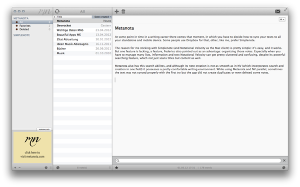
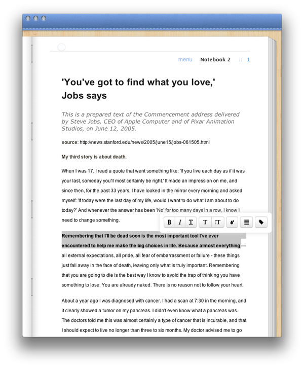
At some point during a writing career there comes that moment, in which you have to decide how to sync your text to all your devices. Some people use Dropbox; others, like me, prefer Simplenote. Metanota is a “new & noteworthy” OS X client for Simplenote which enhances the service’s feature set with different organizing possibilities on the desktop.
My reason for sticking with Simplenote (and Notational Velocity as a Mac client) instead of Dropbox is pretty simple: it’s easy, and it works. There’s a feature, however, that’s lacking in Simplenote – a feature that Federico also pointed out as an advantage of Dropbox: organizing your notes. Especially when you have to manage many lists, information, and text, Simplenote through Notational Velocity can get pretty cluttered and confusing, despite its powerful searching feature, which doesn’t just titles but content as well. Often, I get overrun by my own notes.
Metanota has decent search abilities, and although its note creation is not as smooth as in NV (which incorporates the search and creation features in one single interaction), it possesses a comfortable writing environment. While using Metanota and NV in parallel, text was not always synced properly with the first try, but the app did not create duplicates or deleted notes. Its design isn’t really pleasing, but it’s functional and serves the basic needs of a good note-taking app. Metanota can sync automatically every 20 seconds, 60 seconds, 5 minutes, and 60 minutes; with automatic sync in the background, notes were quickly synced to the Simplenote web app running in my desktop browser. Notes deleted on Simplenote’s website were deleted automatically on Metanota, and, similarly, updates made to a note from the Mac app were saved as “versions” on Simplenote’s website.
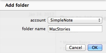
I want to focus on the most advantageous feature the app has to offer: sorting notes in folders. Simplenote itself features note tagging — these tags are also shown in the sidebar and on top of any tagged note in Metanota as folders. I believe tagging is not incorporated well in NV, where you just can sort notes after their tag, but not list only those notes with a specific tag with one click. Metanota imports Simplenote tags and allows you to create your own “folders” in the sidebar: these will be synced to Simplenote as tags, but Metanota doesn’t (surprisingly) lets you drag & drop notes between “folders”.
Overall, Metanota is a visually well-arranged Simplenote client with the biggest feature in its two sidebars. It more or less seamlessly syncs with the Simplenote service, it offers some nice features to cope with a large amount of notes and with the task of organizing them, but it doesn’t come with more advanced features such as Markdown support or keyboard shortcuts.
You can try Metanota for free on the Mac App Store (the built-in, unobtrusive ads can optionally be removed through a $9.99 in-app purchase).
DevRocket Is A Photoshop Plugin To Boost Your iOS Design Workflow
Just a few hours ago I wrote a bit about Screeshot Journal, an app to easily manage and investigate your iPhone and iPad screenshots in order to ease your design workflow. But to take pictures of an app which deserves to be viewed in such large resolutions, such app must have a solid UI design. To speed up and simplify the process of creating iOS UIs, developers at UI Parade — one of the greatest resources for UI inspiration by the way — just released their own Photoshop plugin called DevRocket.
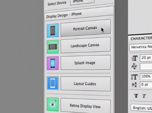
DevRocket is a sweeping blow of all design presets and saving possibilities iOS UI designers could need for their process of designing new apps. It supports designing for all devices (iPhone and iPad) and Retina resolution presets as well. With DevRocket, you can:
- generate portrait, landscape and splash display canvases, which include the native iOS status and navigation bars
- design the same interface for Retina and non-Retina devices at the same time
- save those designs with one click cut down the complete UI to individual “UI snips” for Xcode
- create icons out of preset canvases (with adjustable corner radius and correct naming for Xcode)
Besides all these features, DevRocket looks nice and easy to use. It is definitely worth a try for all iOS designers who use Photoshop to design their app UIs, and who are constantly after a nitro boost for their productivity and workflow. There’s also a little demo video on Vimeo (and embedded after the break) showing the plugin in action. You can get DevRocket for $10 (payment via PayPal).
Read more
Organize And Investigate Your Mobile Screenshots with Screenshot Journal
The first thing I have to mention about Screenshot Journal is that the developers at UIForge who are responsible for this handy and beautiful iPhone and iPad app do a really fast and good support work. Otherwise, I would not have been able to write this review at all, because to my surprise, the app didn’t work at all when I installed it for the first time. Fortunately, I just had to re-activate the location option for my Camera Roll to allow Screenshot Journal to journal my screenshots and myself to finally test it.
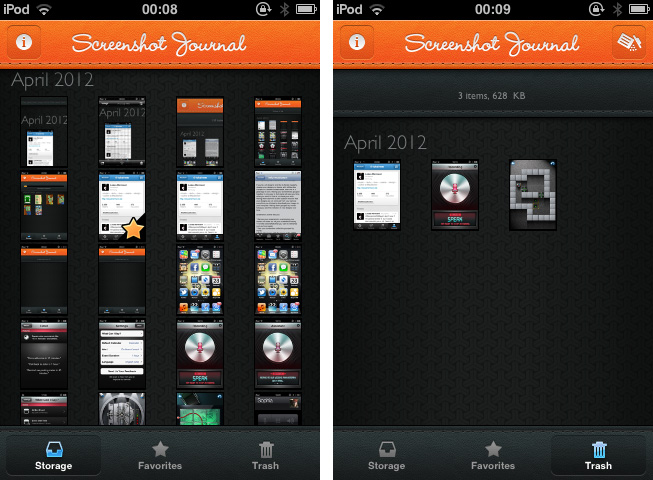
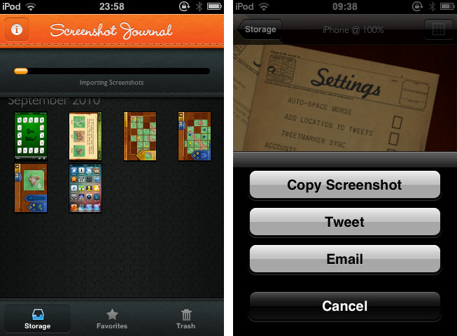
Screenshot Journal is a tool for UI designers, artists, and other pixel addicts who care a bit more about their iPhone (or iPad) screenshots than the integrated Camera Roll archive does. The app archives all your screenshots and organizes them chronologically or by marking favorites. After the first launch, Screenshot Journal imports all your existing screenshots within a few minutes, and new ones will immediately get imported after you took them and the app is running in the background. This way, it can handle an immense amount of images — the exact amount and overall data size is also displayed at the top — and you’ll never need to have a look into your Camera Roll again.
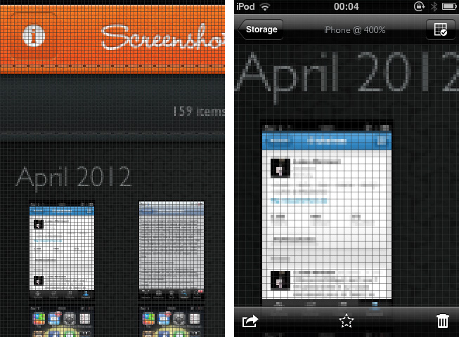
When selecting a screenshot, you’ll find the same interaction options as in the system Camera Roll, but all are slightly (one, in fact, immensely) improved. You can copy images, additionally send them via mail or Twitter to the world, and delete them, either individually or via a bulk delete in the trash window. But the real deal of Screenshot Journal is its zooming feature. You can zoom in an image until you can see (and optionally grid) single pixels, which equates an optical enlargement of up to 400 percent. Every detail of your screenshot becomes visible and analyzable; this feature is the reason why Screenshot Journal is a very handy companion utility for designers on the go: you can check any detail, flaws and bugs of beta designs, websites or other releases – wherever you are, almost instantly.
This powerful feature set is packed into a very beautiful UI, just as if Screenshot Journal itself wants to give an example of how such pixels should look like. For the first time, an app I test is that simple, I don’t consider the absence of preferences a drawback. Screenshot Journal doesn’t need preferences: its features are intuitive and arranged well within the app. Unfortunately, Screenshot Journal did not perform quite well on my 3rd-gen iPod running iOS 5. Changing from the main window to an image (and back) always took its 5 to 10 seconds and got pretty annoying after some time.
But nevertheless Screenshot Journal is a very good take on serving UI designers’ needs on the go. This app marks an important step forward in the area of mobile app and UI design, and I recommend it to anyone who needs to take and check a lot of screenshots on his iPhone or iPad.
Screenshot Journal is available as a universal app for $1.99 on the App Store.
Typeli Is A Questionable OS X Note-Taking App
I really thought a long time about the question whether I should review Typeli by Lukasz Dmowski or not. When I looked at the app website for the first time, I was quite impressed by its design and feature set, but after trying it out for some time, most of the magic the website conveys is gone. What remains is just another note taking app with innovative, but very uncomfortable and unfinished styling and organizing features. Read more
Assistant: Older iPhone Generations Just Got Their Own Siri
During the last years, dictation software has become more and more popular with the development of touchscreen devices. Many writers prefer to use mechanical keyboards for typing, because touchscreen keyboards are not suited for longer texts: they can get very uncomfortable for someone who is not used to them. So especially when you’re outside, dictating text or data can be a very comfortable and healthy alternative to touchscreen keyboards. Even Apple has shown a reaction to that development by introducing Siri, the mobile all-in-one voice assistant on the iPhone 4S. Although it works fine and has lots of features, there are still many independent competitors in this area of app development.. Assistant, developed by Appmosphere and designed by talented designer Michael Flarup, is one of the newer, yet slightly more interesting, efforts.
Assistant serves just one feature: setting calendar events and timers via voice recognition. I know, Siri does that as well, plus much more (and might be funnier too). So why mention a more or less obviously inferior competitor, for which you even have to invest extra money when you get Siri for free with your iPhone 4S? Well, first of all, because not everyone owns an iPhone 4S and Assistant works on 3G(s) and 4 models. And to a certain extent, because of Flarup and his UI work.
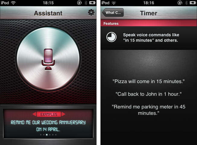
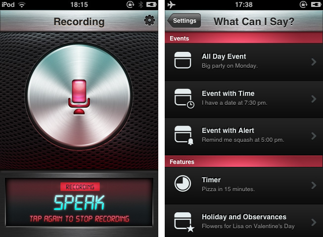
After firing up the app you’re greeted with that immensely huge and gloomy stainless steel recording button and some examples on how to use the features of Assistant. Tap it and the voice recording via the integrated or attached microphone starts; tap it again to stop it. The app processes your vocal input (using the well-founded technology of Nuance Communications) and shows up a date dialogue afterwards, titled with the dictated appointment content and enhanced by eventually mentioned reminders. That’s it: all these main windows are clean, simple and immediately understandable, and the voice processing is pretty accurate and efficient.
Besides its well-done demo video on the app’s website, Assistant also has many setting possibilities which make the app very flexible and useful. You can select the default calendar in which Assistant will deposit your appointments, and default alter time and event duration. The app currently supports only English language input: you can choose from Britain, American, and Australian English. In addition to that, the settings include examples as to which kind of formulations the voice recognition is able to process. It’s quite variable: for example to set an appointment to a special time you can use direct time spelling (12.00 AM) or prevalent paraphrases like noon.
So now let’s get into the UI. Although I like Michael Flarup’s style of digital design very much and, as I already pointed out, the main window and the dialogue panel look nice and polished, there are two things that made me feel a bit uncomfortable with the overall design of Assistant: the buttons and the (also stainless-steel-like) titlebar used within the settings. The latter might fit pretty well to the main window and the “What can I say?”-example list, since the recording button, the monospace screen at the bottom, and the gloomy red list elements correspond to it. But if you move into the settings and the standard iPhone listing UI used for selecting several options, it becomes a disturbing visual overkill. Secondly the buttons set on it do not have anything in common with the plastic and rather machinery look of the titlebar: in my opinion, they are too smooth and colored too dark to fit to the bright but still cold and “hard” atmosphere the title bar creates.
So, I have to say that giving an exact final statement or even a recommendation for buying Assistant is rather difficult. It definitely has some advantages and provides iPhone 3G(S) and 4 users the possibility of stripped-down voice dictation to quickly create calendar appointments. But its look is a bit uneven and therefore I think not good enough to be considered as a must-have — there are some hot spots in it, but to me it is not completely coherent and attractive to reasonably use because of the design. Still if you’re searching for a stable and quite enjoyable app to solve the problem of not having a Siri-like working robot on your phone, get Assistant for $1.99 to dictate calendar events on your older devices.
The Heist 1.1: Highly Addictive Puzzle Fun
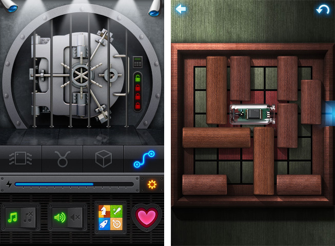
I’m a huge fan of puzzle games. Throughout the years I installed almost every interesting game from this genre on my iPod touch: Cross Fingers and Smart Sokoban are some of my all-time favorites. I have to confess, I didn’t notice MacHeist coming up with their first iPhone game about a year ago. But today, their very sophisticated iPhone game The Heist got updated to version 1.1 and I had the great pleasure to beta test its new features and gameplay. Finally, I also recognized what a great game concept and visual effects The Heist has to offer.
Let’s start out with the actual game features. The Heist has got a small “story” around it:
Some puzzle-obsessed nut has rigged up this vault with state of the art defenses! You’ll have to crack a variety of puzzles to short circuit the lasers, security cameras and electrified bars. Are you up for the challenge?
Because of that, you frequently get calls by your spying colleague Sophia who gives you more instructions and (not really existing) time limits. Every time she calls you, new levels and difficulties are unlocked until you finally reach the vault.
In version 1.1 this story and the whole app has been enhanced by various features and fixes (taken from its App Store description):
- iPod play through with remote control support
- Game Center enabled on older devices (iPad 1 and iPod Touch 2nd generation)
- Awards earned achievements if any were missed
- Support for unlocking secret Clear theme
- Vault exit button
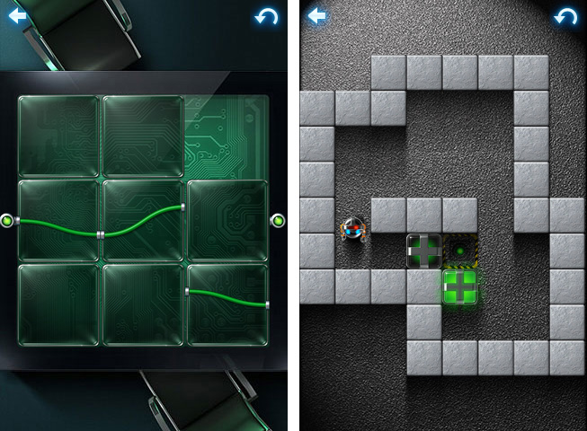
As the app is developed by the curators of MacHeist, there are some real loots deposited in this vault: with the new 1.1 version you can get steam codes for various games; you can even unlock a secret theme for Clear 1.1. To get there you have to solve four different puzzle games with 15 levels and four difficulty stages. These games actually include Smart Sokoban-style box puzzles, two sliding puzzles with bars and rectangle pieces. The most difficult — and unique — puzzle game in my opinion was the fourth one: a game where you have to sort differently colored stones marked with symbols on the field without having the same symbol two times in a horizontal or vertical row.
These games are not just addictive: they are surrounded by stunning visual effects and endowed with easy gameplay as well. The Heist is a very good example of how extensive and detailed design and the goal of keeping the gameplay smooth and simple should be mixed. Its use of LED effects, light reflections, and other more or less decorative elements is never disturbing the game’s content, and The Heist is easy and intuitive to play and understand.
With its Game Center integration (which now also works on iPad 1 and the 2nd generation iPod touch) and new achievements, The Heist is a quite substantial and addictive collection of tricky puzzles, and it definitely has the capability of captivating you for some time. If you like small time killers for short train or bus rides, go and get The Heist 1.1 right now for $0.99 (introductory sale price) .
BangTidy2: A Beautifully Animated Growl Notification Theme
Growl has no plans of going away as we covered back in February, and it’s nice to see people still creating excellent notification styles.
Last Sunday, Daryl Ginn (@darylbro) published an update to his Growl notification theme called BangTidy. The new version 2.0 features a stunning 3D splash effect, while remaining simple, clear, and minimalist. Your notifications are going to pop out as smooth as ever. I haven’t used Growl (the universal notification service for the OS X) for a while now, but with this new notification style, I will definitely consider using it again.
BangTidy2 is available for free on Daryl’s Dribbble stream, where he also attached a short demo video.


