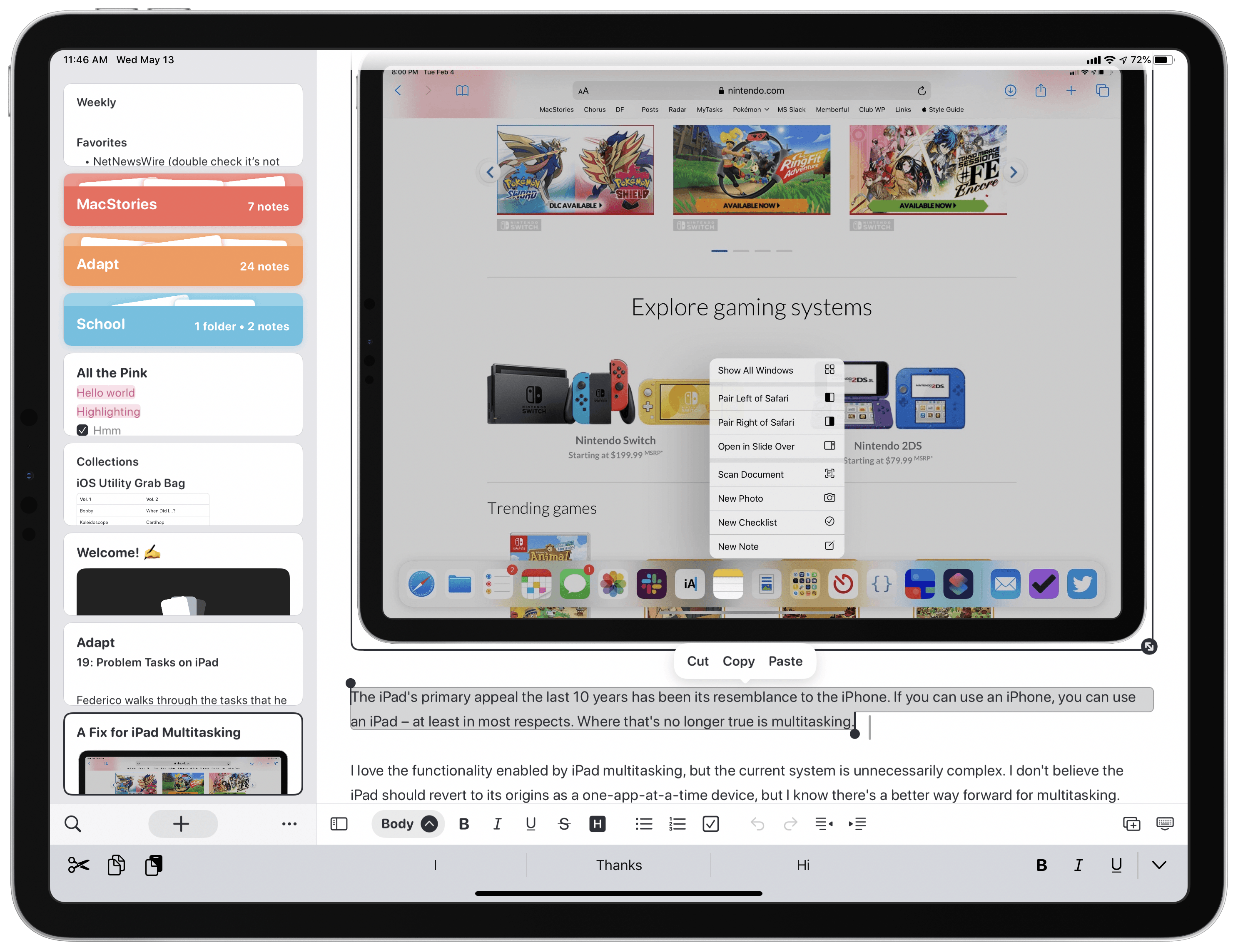
Noto, the modern notes app for iPhone, iPad, and Mac that I reviewed back in February, recently launched a 2.0 update that introduces brand new features and key fixes and enhancements. On the iPad, mouse and trackpad are now natively supported, and you can use drag and drop to easily import notes from another app into Noto. Additionally, the app’s syncing engine has switched from iCloud Drive to CloudKit, making it faster and more reliable than before. Finally, several of the issues I noted in my initial review have been resolved in this latest update.
Book Track Adds Reading Status, Statistics, Quote Entries, and More
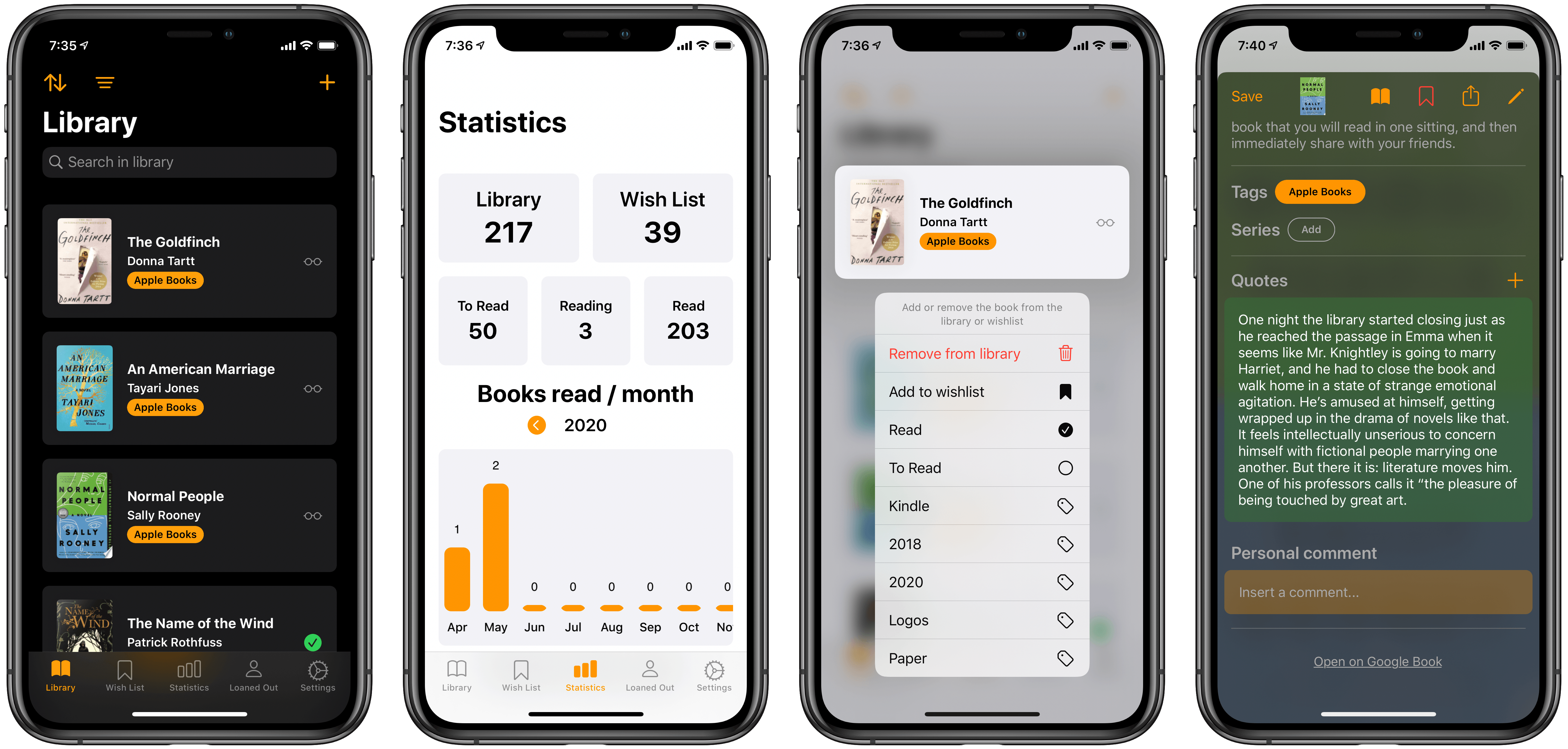
Earlier this year I reviewed Book Track, a new book library manager that debuted across iPhone/iPad and Mac. I noted that the app offered a strong foundation to build upon, but its young age showed in the absence of several valuable features. One such feature, library importing, has been added since then, and today’s 1.2 update introduces a handful of excellent additions as well: reading status, statistics, quote entries, and loan status. This promising app is evolving faster than I had even hoped.
My 11-inch iPad Pro Experiment
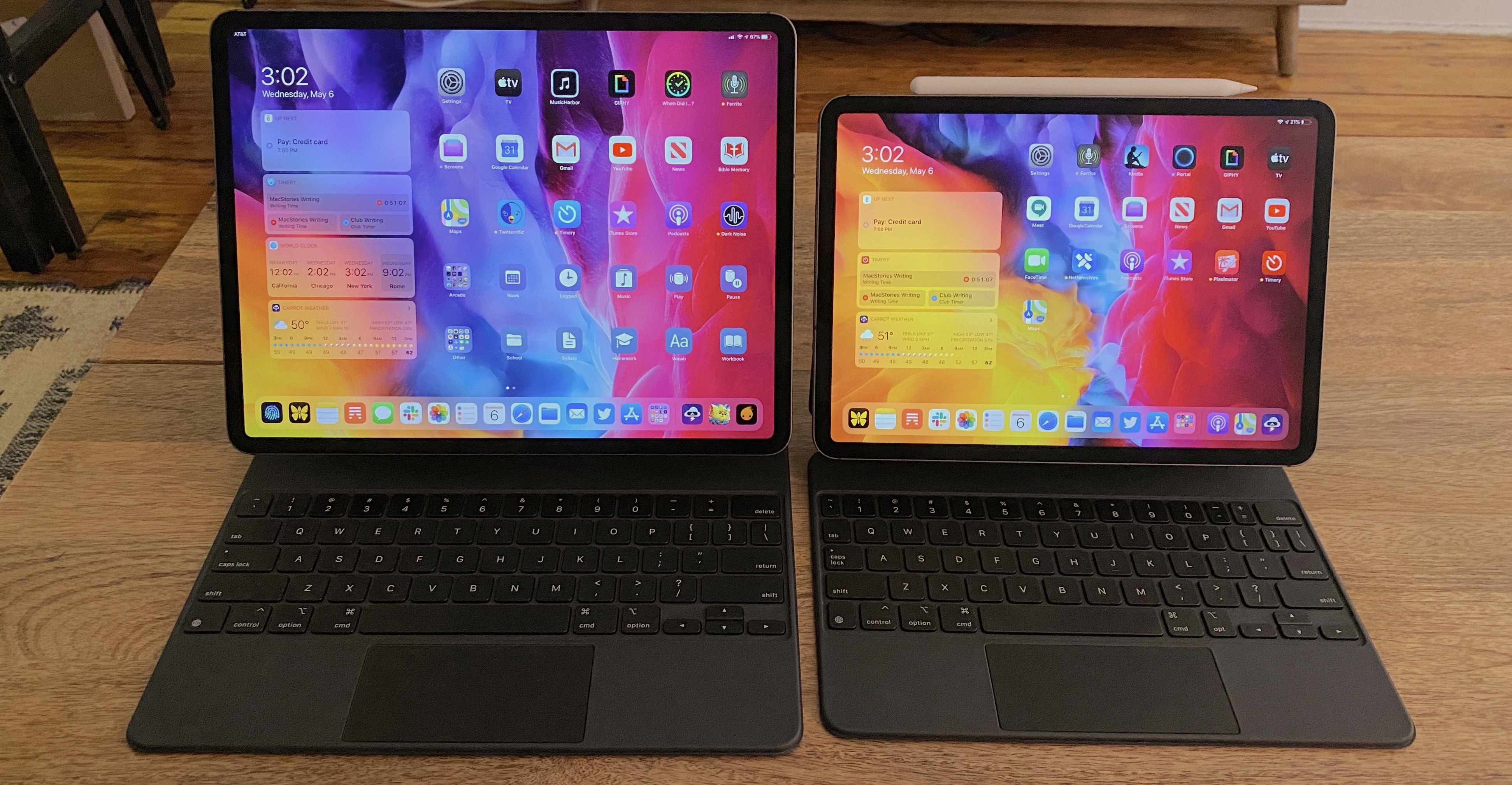
If you’re in the market for an iPad Pro, choosing the ideal model size is not easy. It used to be simpler, back when the big option was made bigger by its bezels, and the small option had a significantly smaller display. I’ve used a 12.9-inch iPad Pro as my primary computer for five years, and have been very happy with it, but as the smaller iPad Pro’s display has grown, I’ve become more intrigued by it.
2017’s 10.5-inch iPad Pro was the first smaller model that tempted me. 2016’s 9.7-inch simply wasn’t enough; as an iPad user since 2010, I knew what a 9.7-inch display was like, and it wasn’t suited for my needs as a primary computer. But the screen bump in 2017 was intriguing, so I gave it a test run for a couple weeks. My takeaways: it was a fine device, but Split View was a bit too cramped, and since I mainly used my iPad at home rather than lugging it around regularly, sticking with the larger model made more sense for my needs.
Recently, however, I embarked on another test of the smaller iPad Pro. On the latest episode of Adapt, the iPad-focused podcast I do with Federico, I challenged us both to try doing our work on the 11-inch iPad Pro rather than our usual 12.9-inch setups. In my mind, it was the perfect time to try the smaller size again because a lot has changed since my 2017 experiment.
First, the smaller iPad Pro’s display has gotten larger yet again. The gap between 11 and 12.9 inches is relatively narrow. Also, while the current pandemic has forced me to work from home more than ever, prior to this global crisis I was taking my iPad on the go more regularly. In 2017 I lived in the suburbs of Dallas, whereas now I call Manhattan home, so it’s much easier to just walk out my front door and visit a local coffee shop, park, or some other public space to get work done.
Finally, the concept of the iPad as a modular computer has been another motivator to try the 11-inch model. I normally use my 12.9-inch iPad Pro exclusively in “laptop mode” with a hardware keyboard attached. But lately I’ve been wondering if that approach is too limited, causing me to miss out on the full potential of the device’s versatility. Using my iPad Pro not just as a laptop, but also as a tablet or in a desktop configuration sounds intriguing, and for several reasons I’ll detail later, I think the 11-inch model is better suited to these alternate setups.
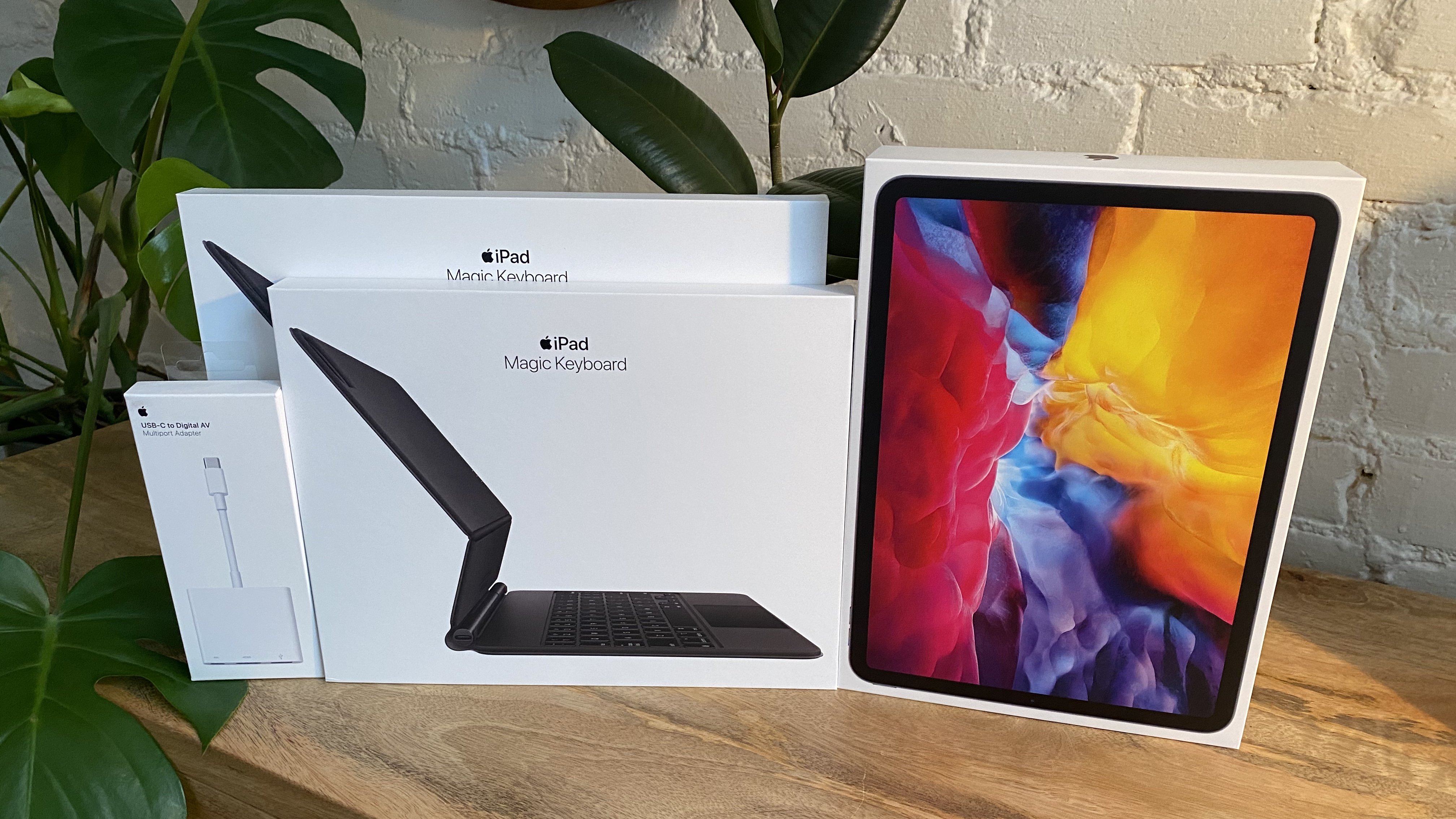
So a few weeks ago I ordered an 11-inch iPad Pro alongside the Magic Keyboards for both the 11- and 12.9-inch models; I also bought a USB-C Digital AV Multiport Adapter so I could connect my iPads to an external display. All of these purchases made possible a comprehensive comparison of the two iPad Pro sizes, spanning tablet, laptop, and desktop configurations, for the purpose of determining which iPad was best for me. As I mentioned, I was already pretty happy with my 12.9-inch model, so my focus was especially on trying the 11-inch and evaluating its unique strengths.
Here is what I learned from my experiment, and my decision on the iPad I’ll be using moving forward.
Todoist Introduces New Upcoming View Across All Platforms
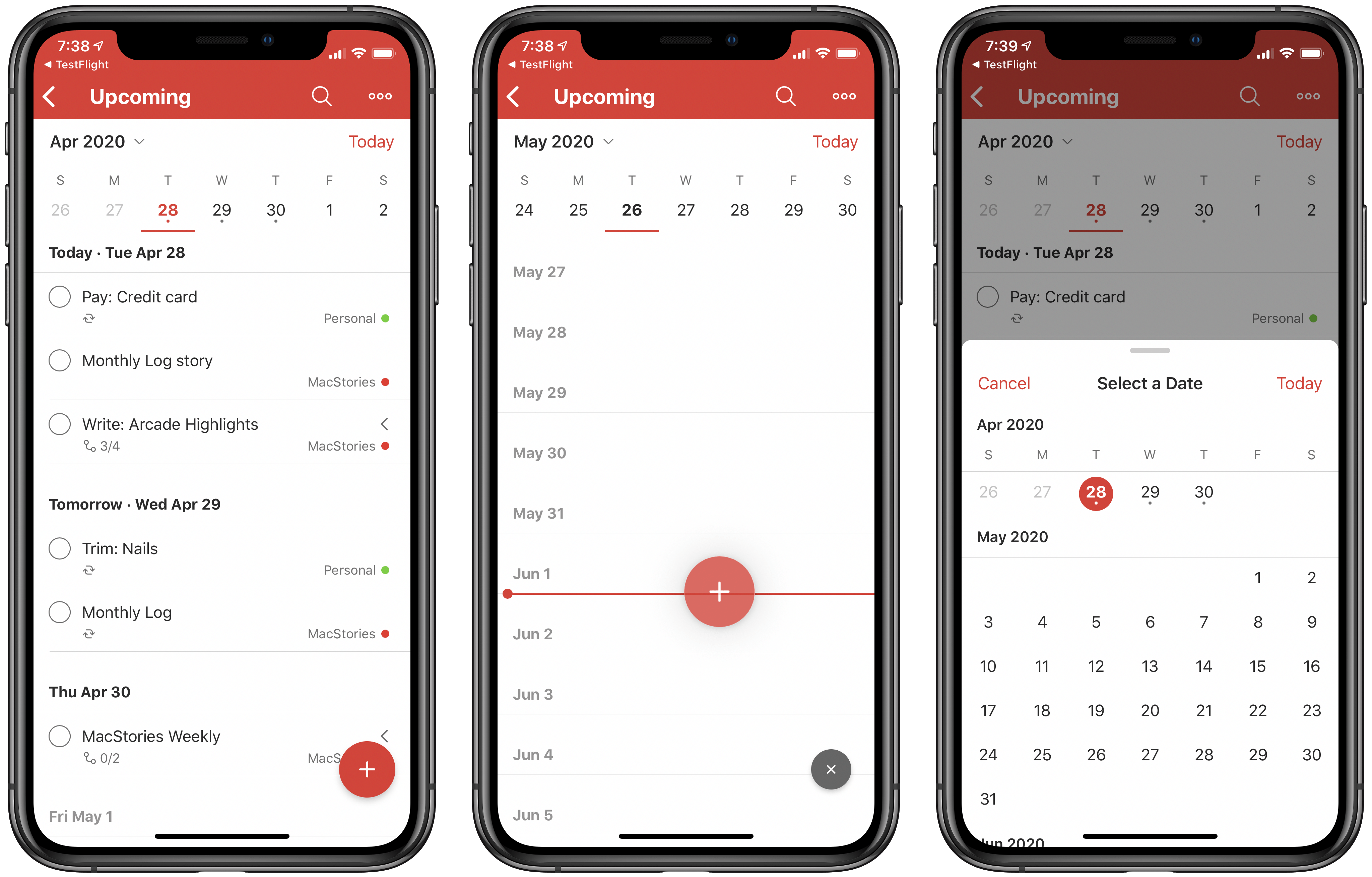
Popular cross-platform task manager Todoist is introducing a new Upcoming view today that serves as a replacement for the previous Next 7 Days view and adds greater functionality to it with a new calendar element and by offering access to all future tasks.
If you’ve used Next 7 Days in the past, or even the Scheduled view in Apple’s Reminders app or Upcoming in Things, you’ll feel right at home in Todoist’s Upcoming view. It’s essentially an endless list of all tasks with due dates, divided by day. One detail I appreciate is that even days containing no assigned tasks remain visible in the view, whereas in Reminders, for example, Scheduled only shows days with assignments. I could see this bothering some users, but for my needs it’s great because it allows easily rescheduling tasks by dragging and dropping them on to any day I’d like; if only the days with existing tasks were visible, that wouldn’t be possible. It’s just as well-suited for creating new tasks, since you can drag the add task button on to any day you’d like.
Besides providing access to all scheduled tasks, rather than just the next week’s worth, the main change with Todoist’s Upcoming view is the new calendar element. Similar to the Forecast view found in OmniFocus, this takes the form of a row lining the top of the screen that displays the next week’s worth of dates. A small dot indicates whether a day has assigned tasks or not, and you can swipe left to page through future sets of days. You can also tap the month/year button in the top-left corner of the calendar row to bring up a scrolling month view for the sake of quickly navigating further into the future.
The Upcoming view isn’t exactly world-changing, but it is markedly better than what it replaces, and if Todoist were my primary task manager it would absolutely be the view I spent all of my time in. I love the ease of seeing all my tasks in one place, rescheduling them via drag and drop, and the added utility of the new calendar row. Everyone’s task management needs and preferences are different, but if it were up to me, every task manager would have a view that works like this.
Todoist is available on the App Store.
Ulysses 19 Brings iPad Cursor Support, External Folders, Material Sheets, and More
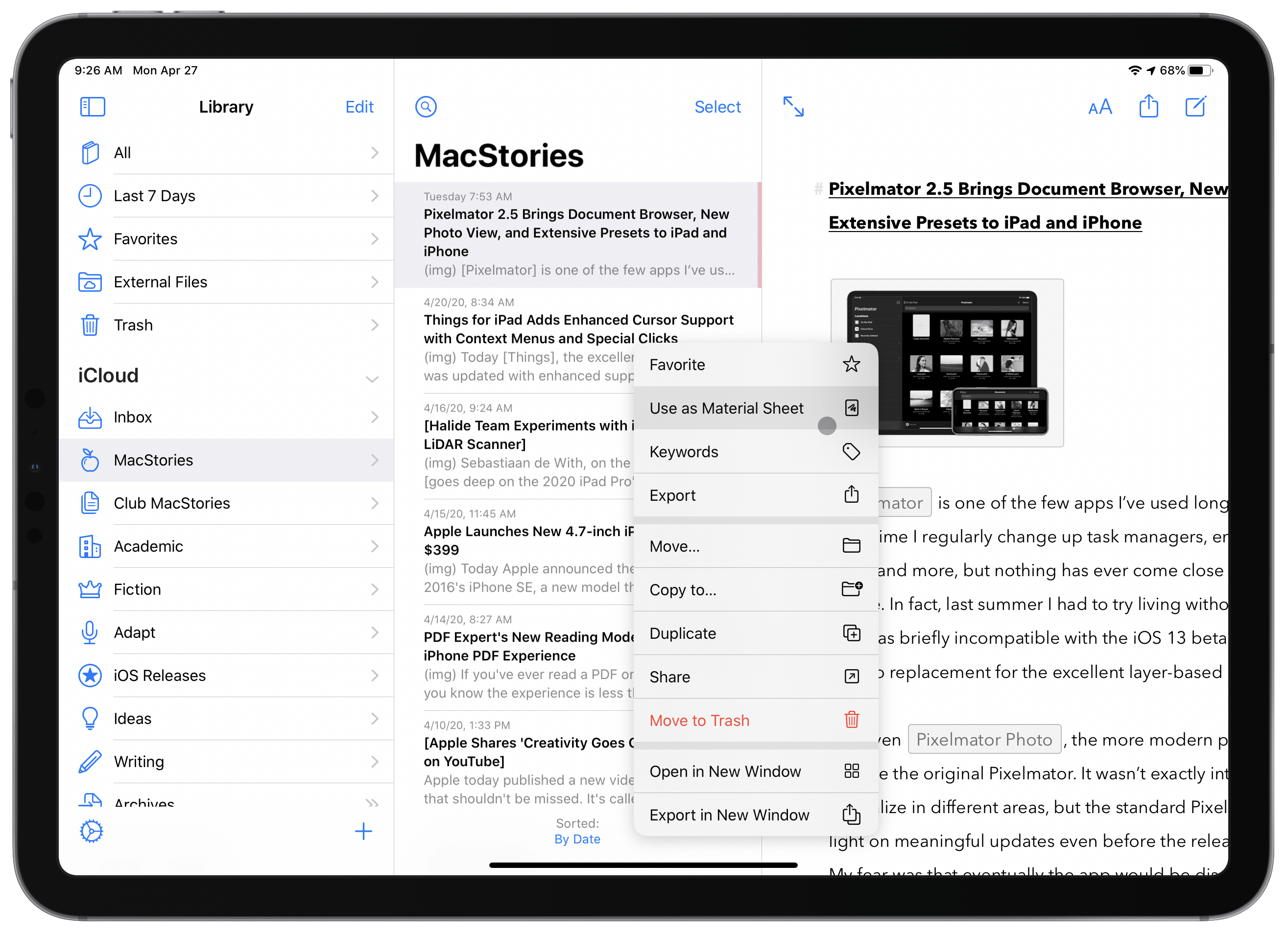
The latest version of Ulysses, the excellent Markdown editor, is available now. Ulysses 19 offers enhancements in several different areas, from fully optimizing for the new iPadOS cursor, to supporting external folders for the first time, introducing a new ‘material’ designation for sheets, and adding keyword improvements, exportable backups, and even a new font. It’s a strong update, and one that continues to prove Ulysses the best app for my writing needs.
Pixelmator 2.5 Brings Document Browser, New Photo View, and Extensive Presets to iPad and iPhone
Pixelmator is one of the few apps I’ve used longer than anything else. Over time I regularly change up task managers, email clients, note-taking apps, and more, but nothing has ever come close to replacing Pixelmator for me. In fact, last summer I had to try living without it for a time while the app was briefly incompatible with the iOS 13 beta. Try as I might, I could find no replacement for the excellent layer-based image editor.
Not even Pixelmator Photo, the more modern photo editing tool, could replace the original Pixelmator. It wasn’t exactly intended to, since the apps specialize in different areas, but the standard Pixelmator nonetheless felt light on meaningful updates even before the release of Pixelmator Photo. My fear was that eventually the app would be discontinued.
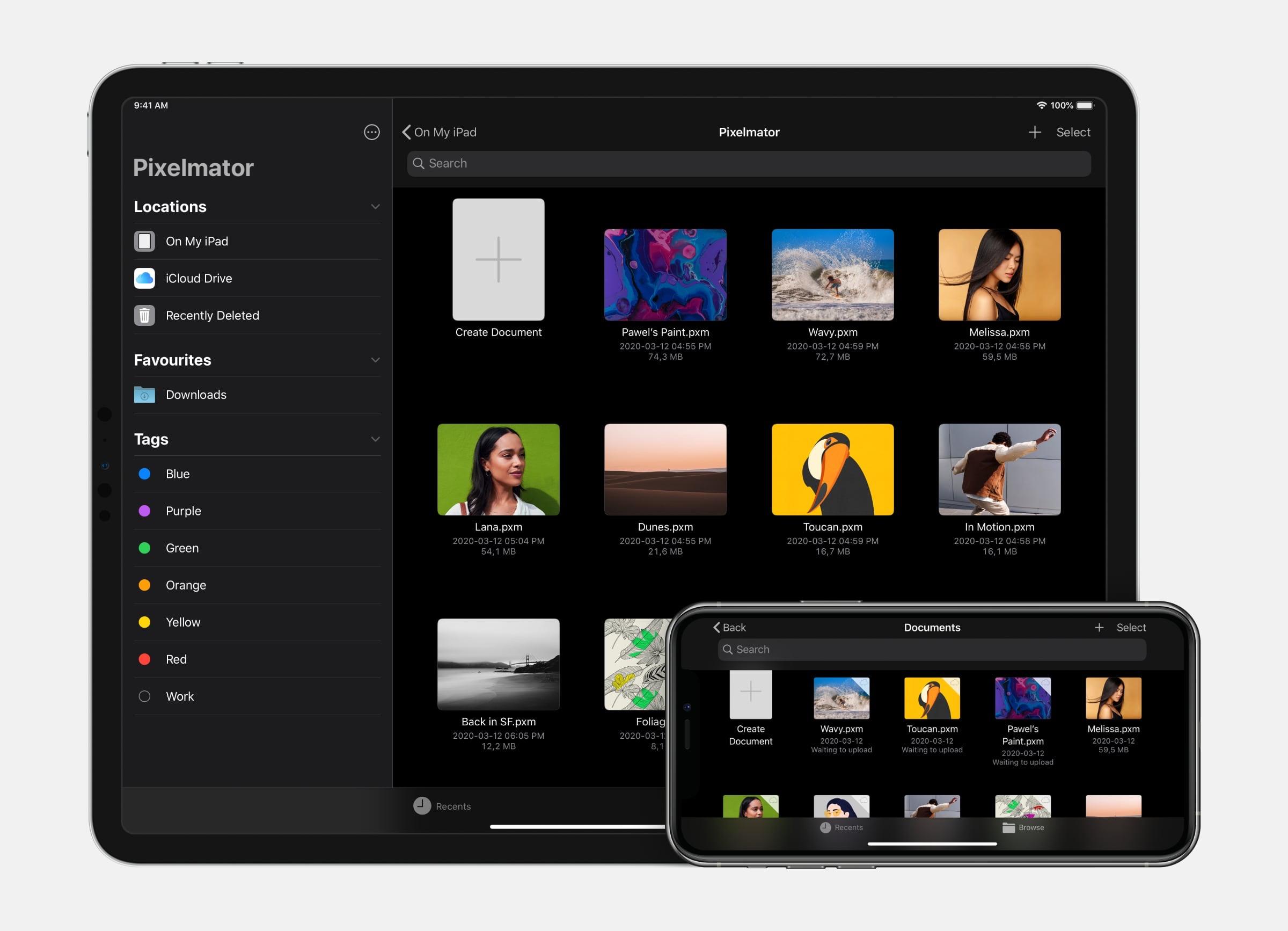
Pixelmator 2.5, launching today, is strong evidence that that’s not going to happen. By transitioning the app to the Files document browser, designing an all-new photo browser, and adding a rich collection of new image size presets, Pixelmator’s team has crafted the app’s biggest leap forward in years and set it up for a strong future.
Things for iPad Adds Enhanced Cursor Support with Context Menus and Special Clicks
Today Things, the excellent task manager, was updated with enhanced support for the iPad’s new cursor just in time for the Magic Keyboard’s arrival. While you could use the iPadOS cursor in the app before, now all of the interface elements respond appropriately to it and key additions like context menus and special clicks make the experience complete.
Halide Team Experiments with iPad Pro’s LiDAR Scanner→
Sebastiaan de With, on the Halide blog, goes deep on the 2020 iPad Pro’s camera module. His examination reveals that the device’s wide camera is virtually identical to that of the 2018 model. And the ultra-wide camera, unfortunately, isn’t quite up to the quality level of what’s found in the iPhone 11 and 11 Pro.
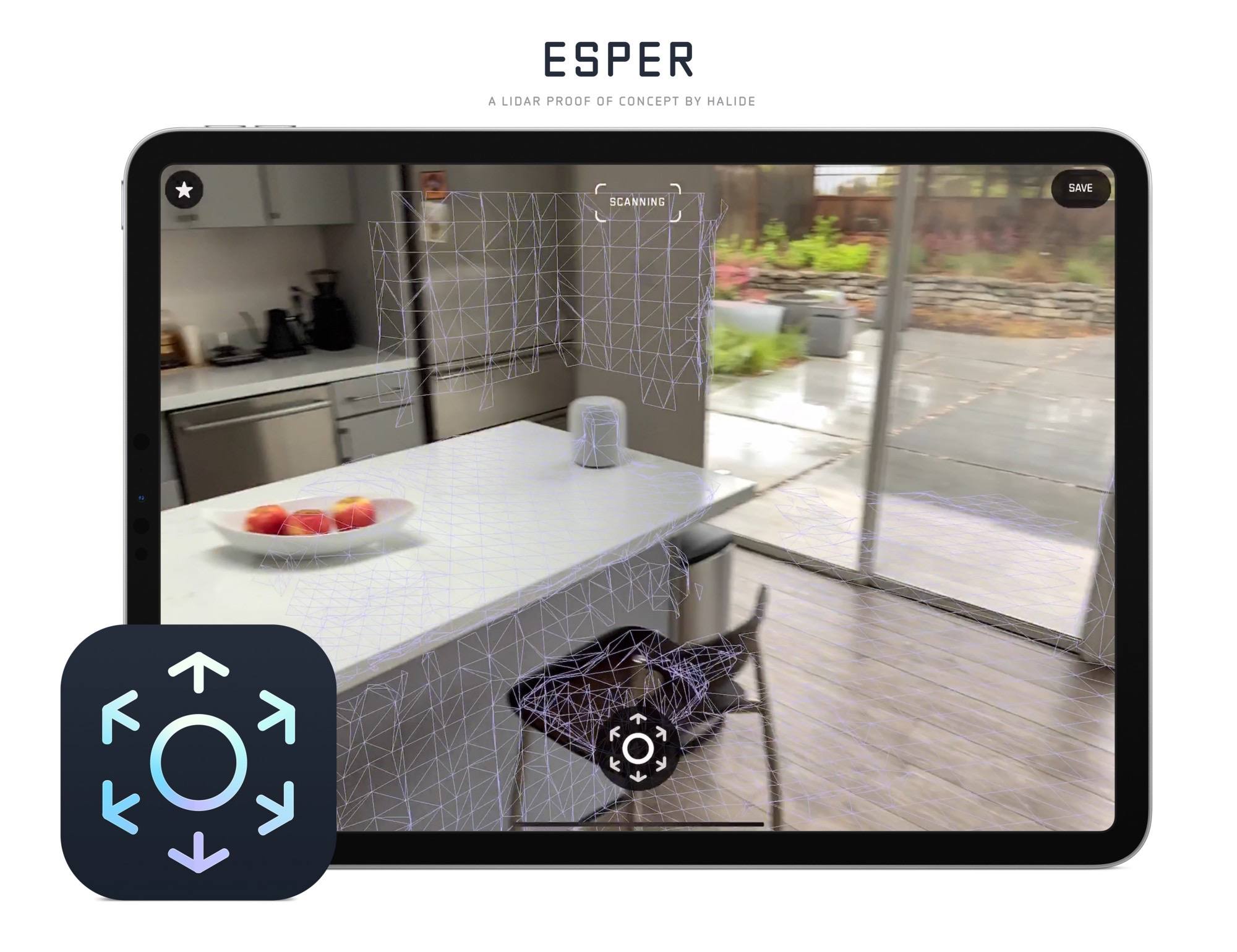
The most exciting and impressive aspect of the camera system is the LiDAR Scanner. The Halide team actually went to the trouble of building an entire proof of concept app that utilizes the LiDAR Scanner to capture your surroundings.
With Halide, we’d love to use the depth data in interesting ways, even if it’s low resolution. There was only one problem: there are no APIs for us as developers to use to get access to the underlying depth data. They only expose the processed 3D surface.
What if we re-thought photographic capture, though? We built a proof-of-concept we’re calling Esper.
Esper experiments with realtime 3D capture using the cameras and LIDAR sensor at room scale. It’s a fun and useful way to capture a space.
I always love reading de With’s in-depth explanations and comparisons of new iPhone or iPad cameras, and this was an especially fun one.
Apple Launches New 4.7-inch iPhone SE at $399
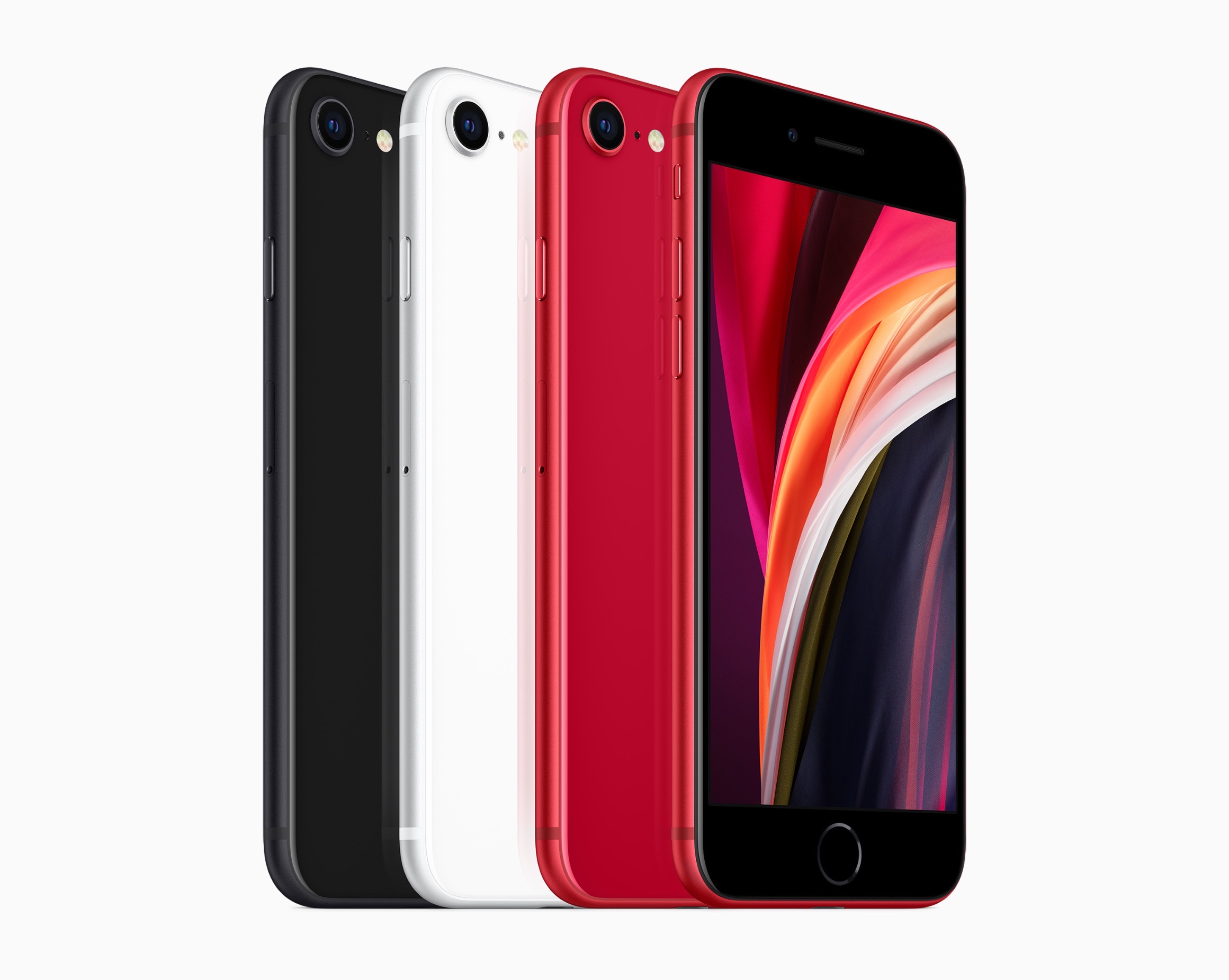
Today Apple announced the successor to 2016’s iPhone SE, a new model that retains the same name and goal of being the budget option for customers. The new iPhone SE will be available for pre-order this Friday, April 17, it ships one week later on April 24, and starts at $399, the same price the original SE had when it launched. Unlike that original model, though, the new SE carries an altogether different form factor. While the original SE was based on the iPhone 5’s 4-inch design, the new SE resembles the iPhone 6/7/8’s 4.7-inch design. This makes it notably larger than the previous iPhone SE, but still smaller than any of the flagship iPhone 11 line.
The 2020 iPhone SE, like its predecessor, contains modern specs but in a classic iPhone body. It has the same A13 Bionic processor found in the more costly iPhone 11 and 11 Pro models, but cuts costs in other ways such as by offering Touch ID rather than Face ID authentication, and a single 12MP rear-facing camera rather than the dual- or triple-lens arrays on Apple’s flagship models. The presence of Touch ID in particular makes the device an attractive option not only for users on a tighter budget, but also those who really don’t want to lose the Home button the next time they upgrade devices.


