Ryan Christoffel

684 posts on MacStories since November 2016

Ryan is an editor for MacStories and co-hosts the Adapt podcast on Relay FM. He most commonly works and plays on his iPad Pro and bears no regrets about moving on from the Mac. He and his wife live in New York City.

This Week's Sponsor:

1Blocker

A Cleaner, Faster, and More Private Web Experience


Spotify Debuts on Apple Watch, Promising Advanced Features Still to Come

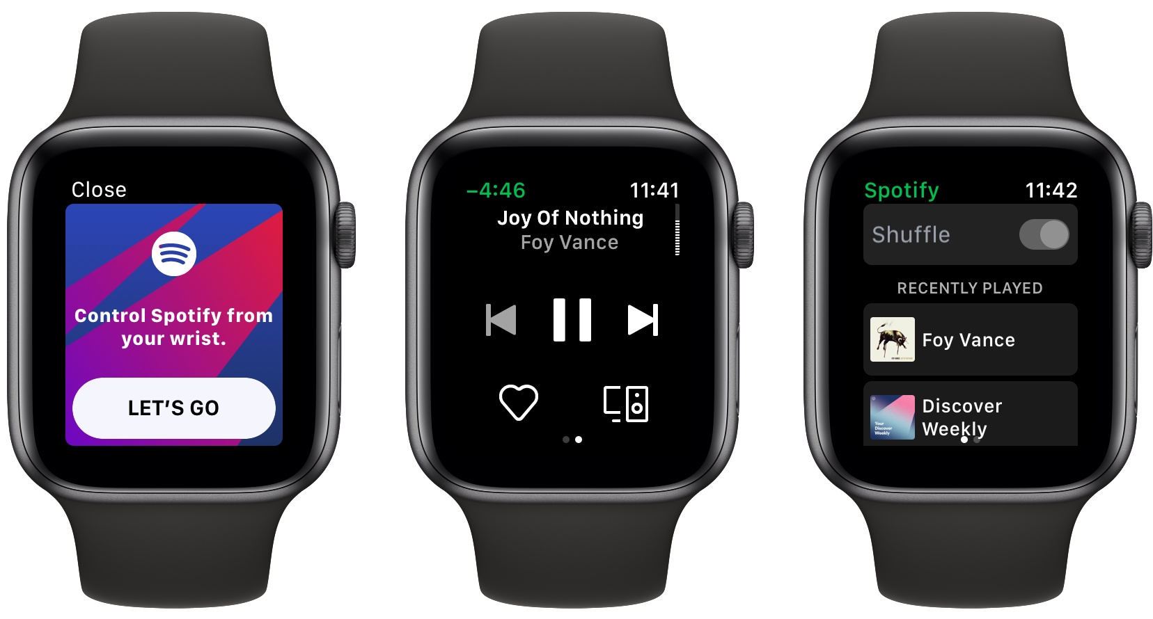
The latest version of Spotify for iOS has been released, and it includes the music player’s first Apple Watch app. The App Store release notes stress this is merely a “first version” of the Watch app, which is reassuring considering how limited the app is now.

Spotify’s Watch app currently serves as a way to start playback of recently played music, and control that playback via play/pause, skip, and volume controls. You can also choose a connected device to send music to, and like a song to add it to your collection. And that’s it.

As a 1.0, Spotify’s Watch app covers the basics well. I’m especially pleased that volume control via the Digital Crown is enabled here. Spotify has designed its own custom volume indicator, visualized as a vertical dotted line in the upper right corner of the screen, and it’s especially satisfying to see each area of the line fill in sync with the haptic clicks of the Series 4 Watch’s Digital Crown.

One strikingly disappointing oversight is that Spotify isn’t optimized for the new 40 and 44mm Series 4 displays, as you’ll notice in the framed images above. Launching two months after new devices debut, but without support for those devices, is not a good look. I’m hopeful we won’t have to wait long for that issue to be remedied, though. In its announcement post for the Watch app, Spotify candidly acknowledged that there’s plenty more work to be done to create the best Watch experience – “we have many exciting things coming up —including the ability to listen to your music and podcasts offline.” Surely support for modern Watch displays is one of those ‘exciting things.’


Reminder and GoodTask: Third-Party Upgrades to Apple’s Reminders

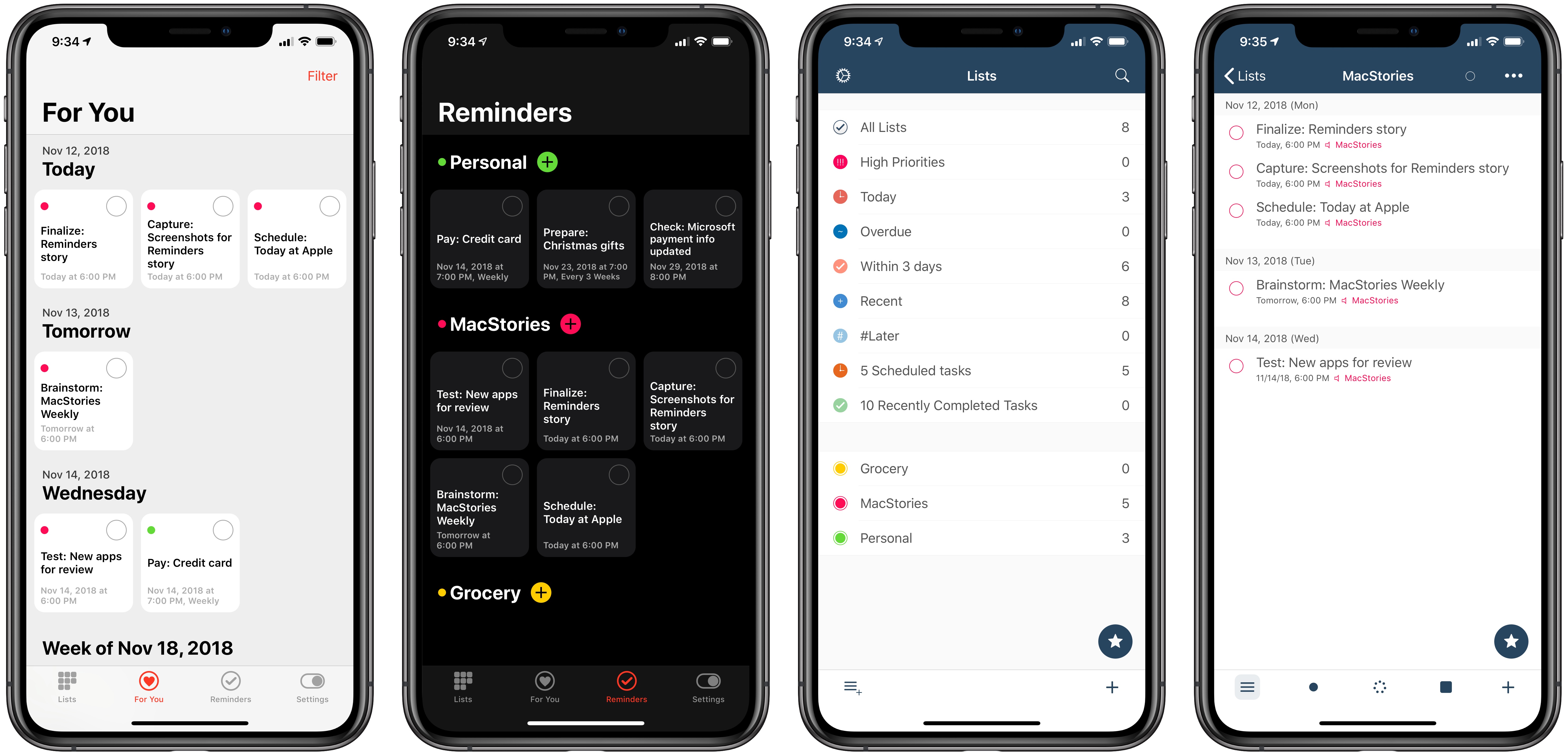
Reminder (left) and GoodTask (right)

Reminder (left) and GoodTask (right)

Apple has long prided itself on being a company that carefully weaves hardware, software, and services together to offer a holistic user experience. Because of this, every purchaser of Apple products benefits from the built-in apps and services that accompany those products. And on the two most popular sellers, the iPhone and iPad, one of those bundled apps is Reminders.

At its core, Reminders is a simple list and to-do app that can be surprisingly powerful thanks to features like repeating tasks, location-based reminders, collaborative lists, and note support. Many times over the years Reminders has been my primary task manager and served me fairly well. It may not be as capable as alternatives like Things, but the app remains an appealing tool for those whose needs are light, and who value the ease afforded by Apple’s built-in ecosystem.

Unlike most of Apple’s other iOS apps, Reminders is built on a framework that’s accessible to third-party developers. Though developers can’t build apps that hook in directly with your Messages or Notes databases, Reminders is a different story. The underlying system powering Reminders is calendar-based, meaning it’s not tied to a single first-party app. Just as Fantastical and Timepage offer access to your existing iCloud calendars, developers can similarly build entire replacements for the Reminders app utilizing your existing collection of lists and to-dos. Two such apps, Reminder and GoodTask, serve as perhaps the best third-party Reminders clients on the App Store.

Each app takes a different approach to enhancing Reminders, with one focusing on modern design while the other offers power user features and flexibility; both, however, retain some of the benefits of staying in the Apple ecosystem while improving upon the first-party Reminders app.

Read more


Apple’s Clips Introduces New Selfie Scenes, Filters, and More

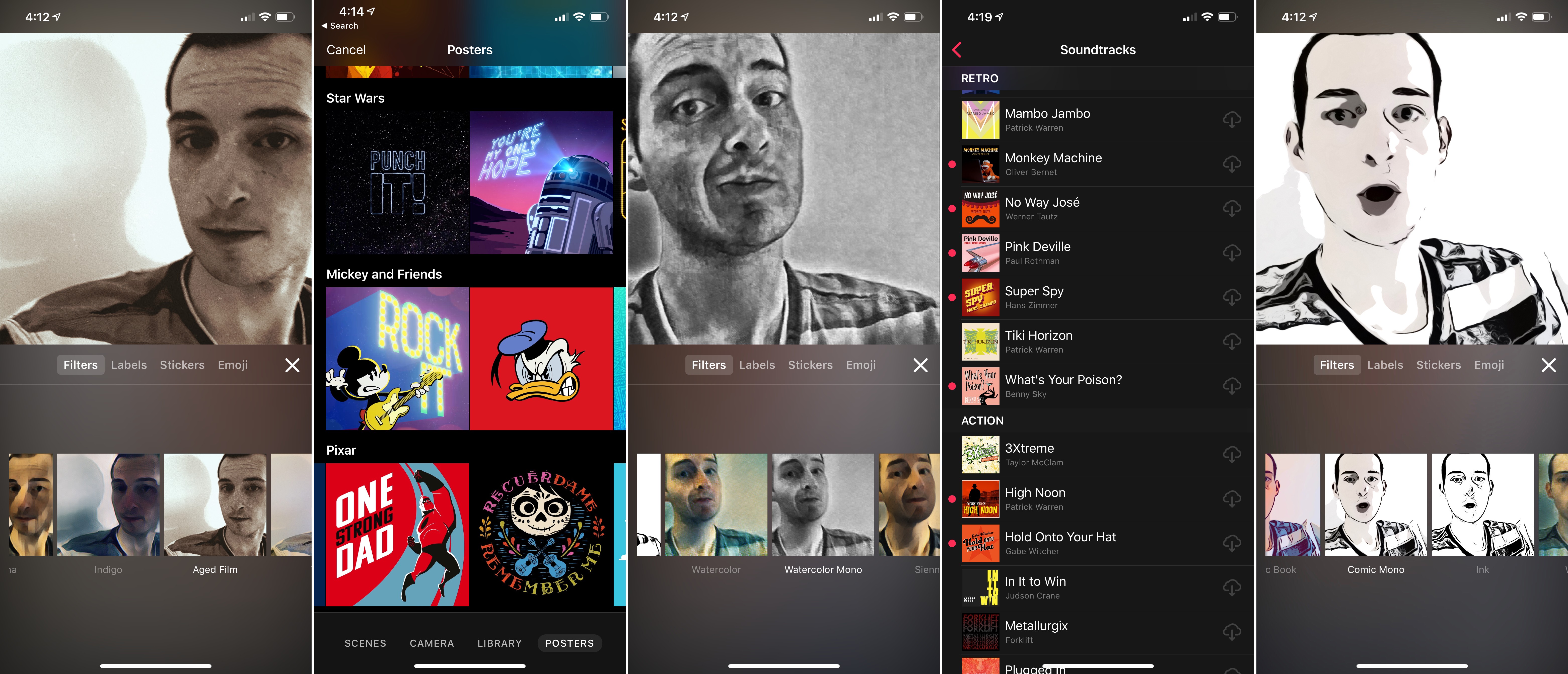
On launch day for the new iPad Pros, which feature the iPhone’s TrueDepth camera system for the first time, Apple has upgraded its Clips video app with new features that take advantage of TrueDepth’s power. Today’s update also brings new camera filters, posters, stickers, and soundtrack options.

If you have an iPhone X, XS, or XR, or one of the new iPad Pros, the highlight of this release is a batch of six new Selfie Scenes. Last year when the iPhone X launched, Clips debuted Selfie Scenes as a fun and impressive way to utilize the new device’s TrueDepth camera system. Selfie Scenes isolate you from your environment and replace your surroundings with interesting digital backgrounds, such as the Millennium Falcon from Star Wars, or an animated world. The new scenes added in today’s update are called Clouds, High Noon, Big Backyard, Monster Lab, Animal Forest, and Municiberg Mayhem, a scene from The Incredibles 2. They’re all a lot of fun, providing different moods through sound effects and music. Apple says that Selfie Scenes perform better than ever on recent devices thanks to the A12 Bionic’s Neural Engine, and in my tests I did notice that the scenes were smoother and more responsive than before.

Filters and soundtracks are Clips’ next most substantial upgrades. There are three new filters: Comic Mono, Watercolor Mono, and Aged Film. Of these, the latter is easily my favorite, as the first two are only monochrome versions of existing filters. On the soundtrack side, there are a whopping 17 new tunes to choose from for your videos.

Every major Clips update adds a host of new posters, stickers, and text labels, and today’s is no exception. Continuing Apple’s partnership with Disney, there are poster options from Coco and The Incredibles 2, as well as designs related to sports, science, and more.

Though the app’s development cycle has slowed, Apple continues to plug away making Clips a great tool for short video creation. My biggest wish for the app – non-square video – has still gone unfulfilled, but hopefully one day we’ll get that change. Until then, the Selfie Scenes are a fun demo of the newest iPhones and iPad Pros, and Clips continues to be the most enjoyable video creation tool I’ve ever used. I think Apple’s on to something here, but the square video restriction continues to hold Clips back.


Choosing Your Markdown Editor: A Comparison of Ulysses and Drafts

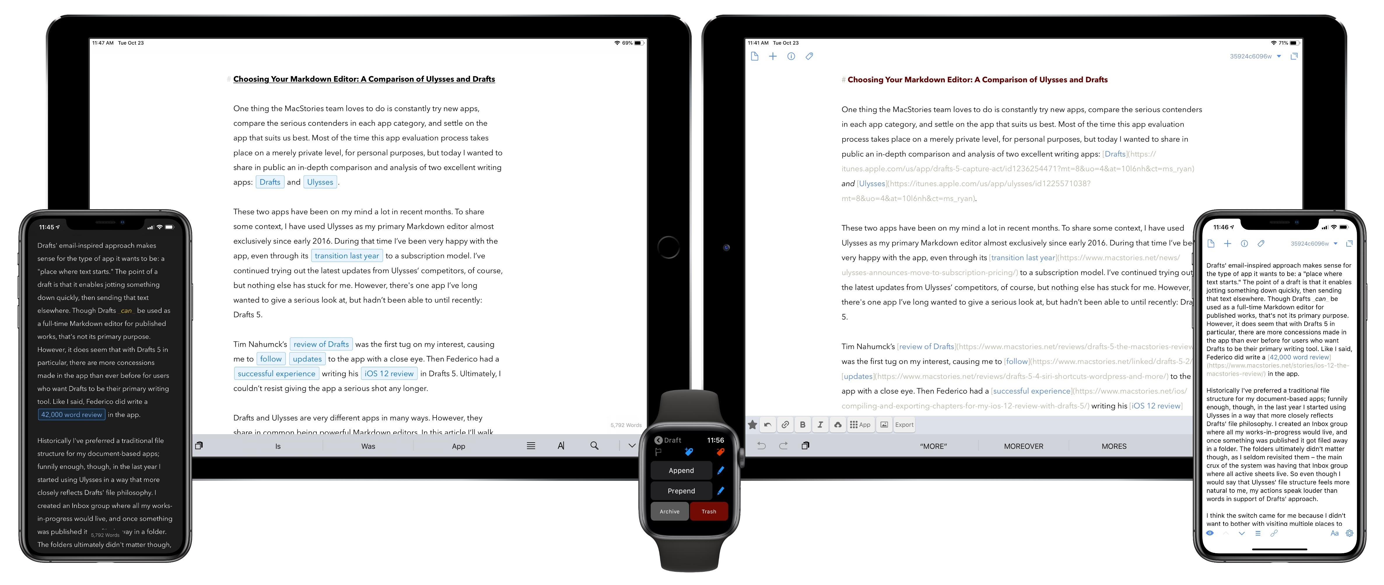
One thing the MacStories team loves to do is constantly try new apps, compare the serious contenders in each app category, and settle on the app that suits us best. Most of the time this app evaluation process takes place on a merely private level, for personal purposes, but today I wanted to share in public an in-depth comparison and analysis of two excellent writing apps: Drafts and Ulysses.

These two apps have been on my mind a lot in recent months. To share some context, I have used Ulysses as my primary Markdown editor almost exclusively since early 2016. During that time I’ve been very happy with the app, even through its transition last year to a subscription model. I’ve continued trying out the latest updates from Ulysses’ competitors, of course, but nothing else has stuck for me. However, there’s one app I’ve long wanted to give a serious look at, but hadn’t been able to until recently: Drafts 5.

Tim Nahumck’s review of Drafts was the first tug on my interest, causing me to follow updates to the app with a close eye. Then Federico had a successful experience writing his iOS 12 review in Drafts 5. Ultimately, I couldn’t resist giving the app a serious shot any longer.

Drafts and Ulysses are very different apps in many ways. However, they share in common being powerful Markdown editors. In this article I’ll walk through their similarities, divergences, and ultimately share which app I’ve decided to write in going forward. The goal is not to say which app is better, as the answer to that question is entirely subjective. Instead, I want to help you decide which app is likely best for you.

Read more


Captivating the Creative Community with ‘Today at Apple’

Michael Steeber of 9to5Mac writes about the increasing importance of ‘Today at Apple’ as a unique competitive strength for the company:

Would you go to a Photo Walk at a Microsoft store? Do you trust a Google retail employee to teach you how to draw? Is there a group of passionate musicians dedicated to Samsung platforms?

Apple has captivated the creative community for over 40 years, and many people across the world have done their life’s work with Apple products. This year’s “Behind the Mac” ad campaign perfectly encapsulates why people are excited about Today at Apple.

In-store sessions aren’t totally new. Apple stores have held workshops in one form or another since their introduction in 2001. But until Today at Apple, sessions were more focused on technical training and lacked the same creative spark.

Steeber’s point about other big tech companies is a great one. I wouldn’t look to any other tech giant for creative lessons in areas of music, photography, or drawing, and I don’t think any other average customer would either. But with Apple, the story’s different. The company has always held a special level of credibility among creators, and that remains true today.

I’ve never attended a Today at Apple session, but over time I’ve grown more and more intrigued by Apple’s major retail initiative. Unlike the intense scrutiny given to everything else Apple does, Today at Apple seems to receive very little attention from the world of tech journalism. Yet Apple clearly believes it’s on to something with Today at Apple, and it shows every time Angela Ahrendts or Tim Cook spend time at an event lauding the program.

It’s hard to care too much about Today at Apple when your closest Apple Store is far enough away to be an inconvenience, which is perhaps why I never seriously considered attending a session while living in the suburbs of Dallas. Now that I’m in the urban environment of New York City, however, with Apple Stores all around and in walking distance, the idea of popping in for a session to help sharpen my creative senses is really appealing. It doesn’t hurt that Apple’s latest retail store work is so visually stunning, making a great environment for learning.

Moving forward, I’m definitely eager to keep a close eye on Today at Apple.

Permalink

The New 12.9- and 11-inch iPad Pros: The MacStories Overview

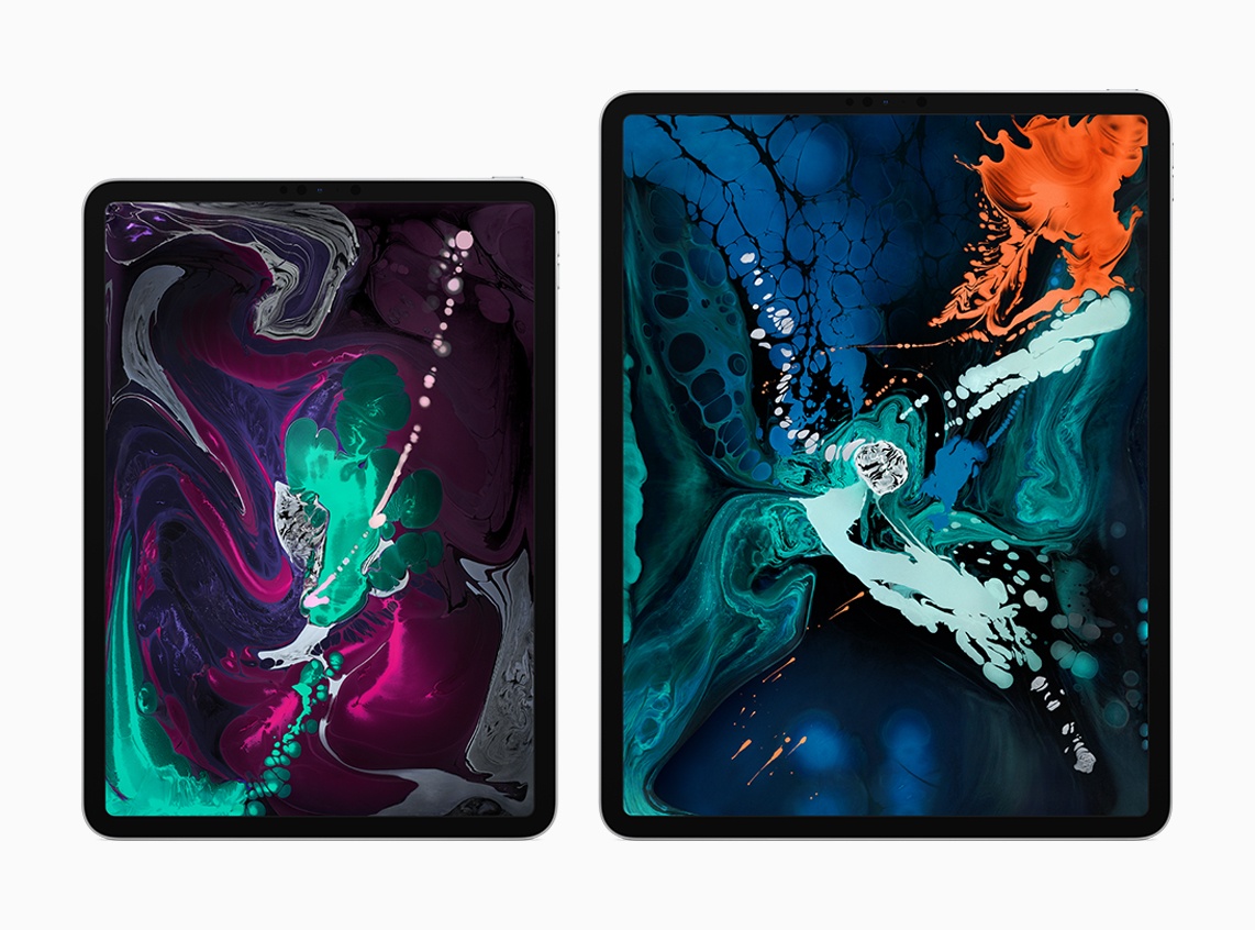
Today during its keynote event in Brooklyn, Apple took the wraps off the most radical change to iPad hardware since the first iPad Pro launched in late 2015. The new 12.9-inch and 11-inch iPad Pro models represent the iPad’s ‘iPhone X moment,’ bringing drastic changes to Apple’s tablet platform aimed at making the iPad an even more valuable tool for creation and productivity. While many of these iPad Pro changes are directly inspired by Apple’s iPhone efforts over the last 12 months, some represent new innovations entirely.

“The new iPad Pro is a huge step forward for powerful, creative, mobile computing; it has an all-new thinner design, speeds through projects with the super-fast A12X Bionic chip and unlocks with a glance using Face ID in any orientation — while you’re sitting or standing, with iPad Pro on your desk or lap, with the new Smart Keyboard Folio and new Apple Pencil,” said Philip Schiller, Apple’s senior vice president of Worldwide Marketing. “There has never been a mobile device anything like the new iPad Pro; it has a gorgeous edge-to-edge Liquid Retina display that curves into the corners, breakthrough performance that outperforms most laptops, Face ID, support for the new Smart Keyboard Folio and new Apple Pencil, advanced new cameras and sensors for the best AR experiences ever in any device, a high-speed USB-C connector, louder speakers, faster wireless and more, all packed into a thinner device that has all-day battery life and is 25 percent smaller in volume.”

Read more


The Journalists and Processes That Drive Apple News

Today Jack Nicas of The New York Times published a first-of-its-kind in-depth look behind the curtain of how the Apple News journalistic team operates. The piece highlights Apple’s distinct handling of the news, where human curation is a larger driving factor than at other major tech companies. Nicas writes:

Apple has waded into the messy world of news with a service that is read regularly by roughly 90 million people. But while Google, Facebook and Twitter have come under intense scrutiny for their disproportionate — and sometimes harmful — influence over the spread of information, Apple has so far avoided controversy. One big reason is that while its Silicon Valley peers rely on machines and algorithms to pick headlines, Apple uses humans like Ms. Kern.

The former journalist has quietly become one of the most powerful figures in English-language media. The stories she and her deputies select for Apple News regularly receive more than a million visits each.

Lauren Kern, the editor in chief of Apple News, heads a staff of journalists that span the globe. One of their chief responsibilities is selecting each day’s top stories for the app.

Ms. Kern leads roughly 30 former journalists in Sydney, London, New York and Silicon Valley. They spend their days consuming news across the internet, fielding 100 to 200 pitches a day from publishers, and debating which stories get the top spots.

Ultimately, they select five stories to lead the app, with the top two also displayed in a prominent window to the left of the iPhone home screen. They also curate a magazine-style section of feature stories. The lineup typically shifts five or more times a day, depending on the news.

Read more


Twitter Testing Reply Buttons, Presence Indicators, Ice Breakers, and More

In an interesting move that highlights Twitter’s recent efforts to develop its product more openly, soliciting feedback from its user base, the company invited The Verge’s Casey Newton to a meeting where it shared details on a handful of new features it’s working on.

A new design that more clearly indicates how to reply to tweets was one project in the works. Current prototypes resemble the sort of UI found on Facebook and Instagram, with a reply button indented underneath tweets. Related to that change, and in another modeling of other popular social networks, the UI for threads is being worked on to better resemble a conversation rather than a string of individual tweets.

One of my favorite ideas from those shared with The Verge was something Twitter calls “ice breakers.” Newton writes:

Another feature Twitter is considering is a twist on the pinned tweet designed to promote conversations. The company showed me a design that would let you pin an “ice breaker” to the top of your profile to let people know you wanted to talk about something specific. The company’s design director, Mike Kruzeniski, told me it could help Twitter users channel their followers’ enthusiasm into discussions they wanted to have — whether it be about a new project, a current event, or some other item of interest.

The current implementation of pinned tweets is fine, but I love the idea of conversation starter tweets that can be changed up over time as users’ interests and desires for connection change.

Finally, presence indicators and status indicators are two similar features that would, respectively, let the world know when you’re online and ready for conversation, and share a status within your status such as “at WWDC19.” While I’m generally not a fan of presence indicators, according to Newton Twitter’s will be entirely optional, which I appreciate. If the feature were used sparingly enough, it could be a replacement for the standard AMA (“ask me anything”) tweets that are common when a user is free and open for conversation. Most likely though, Twitter will activate presence indicators by default for all users, making that specific use case doubtful.

None of these changes are set in stone, so be sure to make your voice heard if you feel strongly about any of them. As Twitter’s Sara Haider told Newton:

“Coming up with a product in a silo and dumping it on people is not going to work,” she said. “Some people are going to love it. Some people are going to hate it. We want to understand what people’s feedback is, and then tweak and iterate on the product.”

Permalink