Ryan Christoffel

684 posts on MacStories since November 2016

Ryan is an editor for MacStories and co-hosts the Adapt podcast on Relay FM. He most commonly works and plays on his iPad Pro and bears no regrets about moving on from the Mac. He and his wife live in New York City.


Apollo 1.2 Is Packed With Redditors’ Feature Requests

Today a big update launched for Apollo, the Reddit client for iOS that I once said “may just be the best designed social feed app I’ve ever used.” Version 1.2 isn’t focused so much on major new features, but instead a huge wealth of small improvements based on feedback from the Reddit community that make for an even more delightful user experience.

Apollo’s new Jump Button is a quick way to jump between top-level comments and save yourself some scrolling. Progress bars for GIFs and video runtimes on thumbnails provide a better sense of context when browsing. There are new settings options to change which browser links open in, to view videos directly in the YouTube app, and more. And lots of under-the-hood tweaks simply make the app faster and more responsive than ever before.

For a visual peek at these changes and more, developer Christian Selig put together a great video, linked below. The full 1.2 release notes are available on the App Store, and in Selig’s launch post on Reddit.

Permalink

Google Introduces News App for iOS to Replace Newsstand

Yesterday at the keynote for Google’s I/O developer conference, the company introduced a News app launching soon for iOS and Android, which will replace the existing Google Play Newsstand app. The app is rolling out some time in the next week, but here are the highlights for what it’ll contain.

Like Apple News, the landing page for Google News is called For You, which is where Google aggregates stories based on your interests. The second tab, Headlines, is strictly about the biggest stories in the world each day. These stories will be the same for everyone within a given geographic region, with no personalized curation at all. Finally, Favorites and Newsstand give you quick access to the publishers you follow, including the ability to subscribe to publications from directly within the app.

For the most part, Google News is a close imitation of Apple News – it has a similar layout, and a similar design with white backgrounds and a heavy focus on photography. The way it best differentiates itself is a feature that I think is the highlight of the app: Full Coverage. When you’re reading a story and want to gain more insights and perspectives on the same topic, tapping the ‘Full Coverage’ option opens a view that aggregates a wide array of sources covering a variety of angles on that story. It’s one way Google is aiming to promote solid journalism while gently combating filter bubbles. Based on the examples that have been shown so far, Full Coverage will list stories on an event timeline, offer answers to frequently asked questions about an event, highlight tweets and opinion pieces, fact checks, videos, and more. It’s meant to be a comprehensive overview of a given story, and I think it looks fantastic.

It’s unclear how widely available Full Coverage will be throughout the app, but we can assume that the most significant news events at least will include a Full Coverage component to them. Google demoed one Full Coverage story focusing on the Puerto Rico power outage situation.

Despite being different in execution, Full Coverage is similar in spirit to the Spotlight tab in Apple News: both aim to provide substantive overviews on a given topic by aggregating a variety of sources. While Spotlight is updated daily to cover a new topic, I appreciate Google’s approach with Full Coverage because it will make those aggregated pages more accessible and relevant to readers. I love Spotlight and check it regularly, but it’s frustrating that Spotlight stories can only be accessed the day they’re published. Apple should take a note from Google News’ playbook and start offering links to previous Spotlight features at the bottom of related stories.


Streets 4 Adds Drag and Drop, Live Panorama Mode, and iPhone X Support

Last week my wife and I ventured to New York City for a vacation, and in the time leading up to that we planned out our agenda with the help of Google Street View. Unfortunately, our planning took place just a couple weeks too early to benefit from the newly released Streets 4 by FutureTap.

Streets is an iOS and watchOS app John reviewed upon version 3’s release. It provides an immersive, touch-friendly way to navigate Google’s Street View data. And in version 4, that experience has been upgraded with drag and drop support on iPad, a new Live Panorama mode, and optimization for the iPhone X’s display.

Drag and drop enables you to drop in a location from Apple Maps, a contact that includes an address, or any other linked address to load up nearby panoramas in Streets. My favorite feature enables dropping in any geotagged photo, which Streets will identify the location of so it can show you existing 360º images of the same or a nearby area – an easy way to discover great captures from other photographers.

Live Panorama mode can be toggled on by tapping the rotating circle icon in the top-right corner. Once activated, it offers a new interaction method for exploring street views. Rather than swiping around on the screen, simply move your device in the space around you and the visible street view area will change with your motion.

Whether you’re planning some time away, or simply want to explore the world from the comfort of your couch, Streets is the best way to do so on iOS.

Streets 4 is available on the App Store.


Pretext: Files-Rooted Simple Markdown for iOS

Last month I was delighted to discover a new plain text editor for iOS, Textor, that focused simply on the basics of text editing. Though I valued Textor’s minimalism, one feature I did miss was support for Markdown styling. This hasn’t been added to the app since then, but fortunately, I no longer have to wait for it; a new app just launched that’s essentially Textor with Markdown, and its name is Pretext.

Pretext integrates directly with iOS 11’s Files app, making it easy to create or edit Markdown and plain text files stored across any of your file providers. Open the app and you’ll see a document browser for choosing a file to edit; alternately, you can create a new file by hitting the plus button in the top-right. If you’re creating a new file, Pretext asks you to set a file name, with the option of automatically prepending the date to it, and you can choose to make it either a .md or .txt file.

While the simplicity of Pretext’s “just you and the text” environment is its greatest strength, the app does offer a few specific features that are of benefit to Markdown writers especially. First is the great keyboard shortcut support: all the basics of Markdown syntax can be done with a quick shortcut, including tasks like link insertion; because of this, Pretext offers one of the most efficient means of adding links to an article. The remaining few features of the app are found by hitting the share icon during editing, which offers access to the share sheet, the app’s settings screen, and previewing your Markdown file as HTML – the latter is especially useful for anyone who publishes their work online. Options in settings include tweaking the text size, switching themes from light to dark, and a couple alternate app icons.

I’ve been using Pretext in beta for the last few weeks to edit Markdown files shared by other MacStories collaborators in Working Copy, and the app has been exactly what I need. I can open Pretext, make my edits aided by visual Markdown styling and keyboard shortcuts, and preview the finished product as HTML. All changes are then saved directly in the file’s source.

Pretext is a simple utility, and isn’t going to replace Ulysses for me as a daily driver, but for some people it legitimately could. Too often writing apps are overly complicated, and Pretext focuses on offering just what a writer needs: space, and a few key tools to aid the writing process.

Pretext is available as a free download, with a $0.99 In-App Purchase unlocking the app’s dark theme and alternate icons.


Google Launches New ‘Tasks’ App for iPhone

Google Tasks is a service many Google users may be unfamiliar with. Historically it’s been a somewhat hidden feature of Gmail and Google Calendar, but today alongside a redesign of Gmail, Google is helping Tasks break out and receive slightly better treatment with the launch of a new iPhone app.

I have to say up front: if this app wasn’t a Google property, tied to an existing Google service, it likely wouldn’t merit much attention. Essentially it’s a barebones home for task lists, with a couple small task manager-like functions. Each task you create can include additional details in a note area, be assigned a due date, and can include embedded subtasks. And that’s basically it. You can create multiple lists to store your tasks, but there’s not even a smart list that consolidates all your tasks containing due dates.

Ultimately, this is an extremely lightweight task manager that makes Apple’s Reminders, its closest analog, seem like a heavy duty task powerhouse by comparison. Rita El Khoury of Android Police sums it up well in her take on the Android app:

I struggle to see who Tasks is for with this first version, and hope it’s quickly iterated upon. If you’re deeply invested in the Google ecosystem, and have very minimal task needs, but want something integrated with Google’s other products, I guess Tasks could be for you. But only on the iPhone; there’s no iPad version at this time.

Google Tasks is available as a free download on the App Store.


Spotify Announces Improvements to Mobile App for Both Free and Paid Tiers

Today Spotify held an event in New York City where it announced several changes to its mobile app that impact users of both free and paid tiers of the service. Jordan Crook reports for TechCrunch:

Spotify’s…free tier has always limited users to shuffle. With the new version, users can listen on-demand to whatever song they want, as many times as they want, as long as those songs appear on one of the 15 personalized discovery playlists like Daily Mix, Discover Weekly, Release Radar or Today’s Top Hits.

Considering the breadth of Spotify’s discovery playlists, the ability to choose songs from those playlists on-demand is a significant change. Crook also mentions how machine learning is being used not just to impact the quality of those discovery playlists, but also, now, to help users make better playlists themselves. This new feature, called “assisted playlisting,” aids in playlist creation by recommending songs below the search field that are similar to the songs you searched for.

Another noteworthy change is that Spotify introduced a new “data saver” mode for its app that reportedly cuts data use by up to 75% when streaming music. This feature is available to all users, but it’s particularly beneficial to free tier users who don’t have the option of downloading songs for offline playback.

Each of these updates are currently being rolled out to all users of the Spotify app; it’s unclear if an App Store update will be necessary, or if the changes will all be server-side.

Unlike Apple Music, which only exists as a paid service, Spotify has the challenge of balancing the features of its paid and free tiers in a way that satisfies free users, while simultaneously encouraging them to upgrade. Today’s improvements seem to do a great job of that by leveraging one of Spotify’s strengths over Apple Music – machine learning-powered personalized playlists. The deeper invested you are in teaching the service your likes and dislikes, the more likely you are to eventually become a paid Spotify user rather than jumping ship to Apple Music.

Permalink

Dropbox iOS App Receives Drag and Drop Support, Fullscreen iPad Navigation

The latest version of Dropbox for iOS includes some nice improvements, the most noteworthy of which is drag and drop support.

Now if you need to add files to your Dropbox from another app, you can just pick them up and drop them right into the Dropbox app in exactly the folder you want. Equally exciting to me personally is that you can also use drag and drop for file management inside the app – just tap and hold on a file or folder and it will lift from its place, letting you drag it around and move it to other locations inside the app. I’ve always felt Dropbox’s method of moving files required too many taps, so drag and drop is a perfect solution for that. Also, I’m happy to report that file moving via drag and drop works on both iPad and iPhone.

Drag and drop capabilities have technically been available already for Dropbox users via managing your documents in Apple’s Files app, but if you need or simply prefer to use Dropbox’s own app, these are great features to have.

Another change in today’s update is that on the iPad, you can now close the file previewing pane to get a fullscreen browsing experience with your files – just hit the X in the upper left portion of the preview pane to get fullscreen navigation. I find that this feature is especially helpful when you’re using the grid view for files, but it could also be of benefit in list view if you have a lot of long file names that will no longer be truncated.

The app’s release notes also state that there is improved previewing and new text editing abilities for more than 120 file extensions, but the specifics of those extensions are unknown. I was hoping one of them would be Markdown (.md) files, but unfortunately those still can’t be edited in-app.

Despite the fact that Dropbox users can now do most document management inside the Files app, Dropbox continues to improve its app and make it a solid option for those who prefer not to use Files.


Burst: A Reddit Client to Pop Your Filter Bubble

Burst is a new Reddit client for iPhone with a unique goal: bursting the filter bubbles we can all find ourselves in.

Recent political events around the globe highlight how harmful it can be to society when people are only exposed to news from one perspective. The same piece of news can be spun into two polar opposite stories by differing political parties, leading each opposing side to remain, at best, misunderstood, and at worst, demonized. To lesser degrees these divisions extend to other areas of life too, such as technology debates between iOS and Android users, or even, to get a little more relevant to our audience, iPad and Mac users. In all these cases, Burst makes it easier to see the thoughts of people outside your normal online circles in an effort to broaden the array of perspectives you’re exposed to.

Read more


Microsoft Office and the Files App Finally Play Nice Together

Today Microsoft updated its Office suite for iOS, with Word, Excel, and PowerPoint all reaching version 2.12. Office updates rarely receive detailed release notes, and today was no exception, but user Teddy Svoronos discovered that the updates brought ‘Open In’ capabilities to the share sheet, which previously only enabled making a copy of an Office document. The ‘Copy to’ option has now been removed, replaced by the more convenient ‘Open in.’

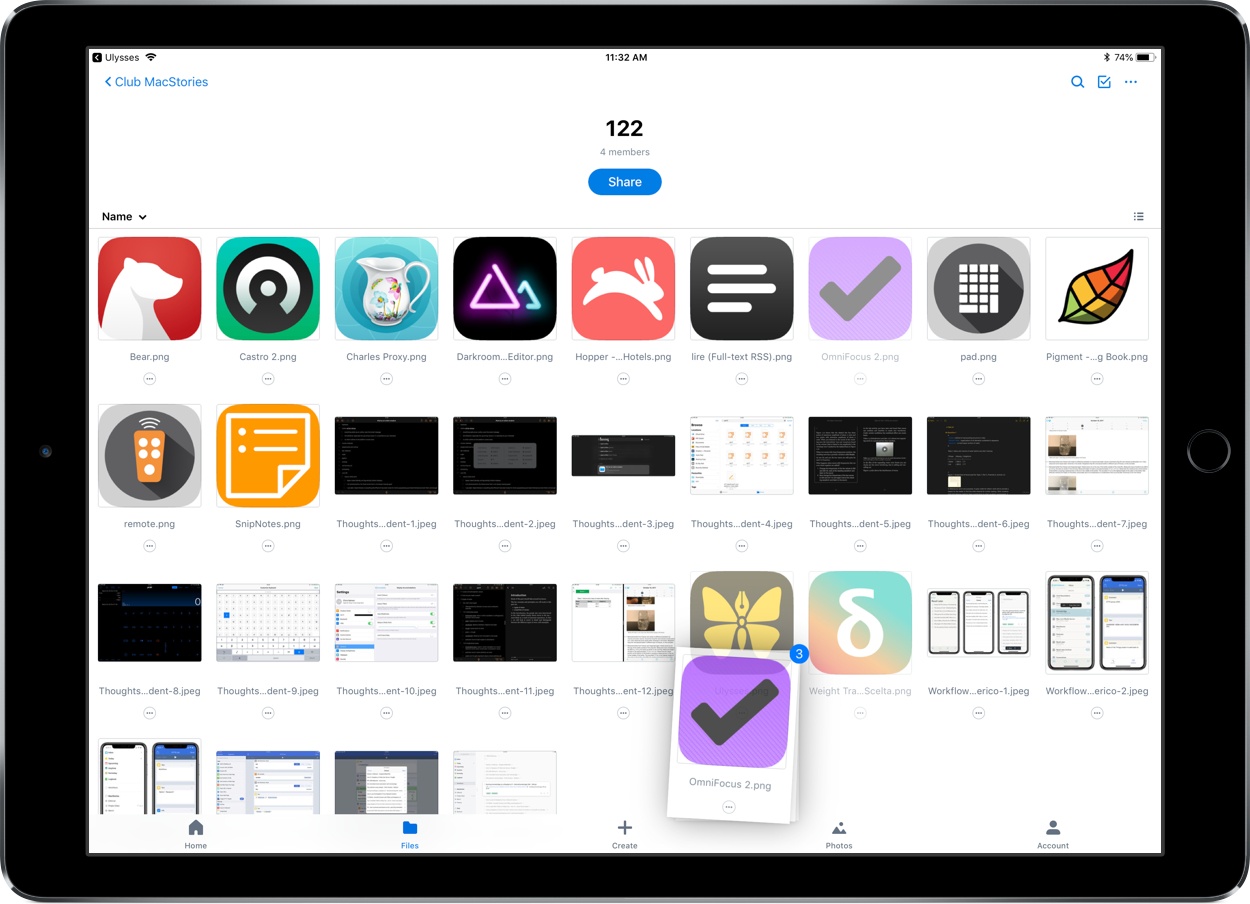
After seeing Teddy’s tweet, I did a little playing around in the Files app and discovered that, while Excel and PowerPoint documents accessed in Files will load Quick Look previews and require tapping ‘Open in’ from the share sheet, the experience is even better with .docx files. Those Word-associated documents open directly in the Word app with just a single tap from the Files interface – no need to open the share sheet first.

It’s possible this disparity in behaviors between file types only exists because I view Word documents far more regularly than Excel or PowerPoint files. Perhaps heavy Excel or PowerPoint users will see a different behavior because the Files app has enough data to know which app you want to open certain file types in. It’s also possible, though, that the behavior I’ve seen is true for everyone, and Microsoft simply made a somewhat perplexing design decision.

In any case though, whether a Files document opens in its correct app with a single tap, or you use the share sheet and ‘Open in’ first, this is still a huge improvement for Office users. Previously any documents stored in Files would need to be accessed by going to either Word, Excel, or PowerPoint, tapping the ‘More’ button in the ‘Open’ menu, then locating the file from there. Now, iOS users can go straight to the Files app, locate the appropriate document, and open it directly with only a tap or two.

Update: One of the developers working on Office has confirmed my suspicions: the reason Word files open for me with a single tap while Excel and PowerPoint files do not is that I haven’t opened those files enough for iOS to know that I would prefer to bypass the share sheet.

In theory, a system where iOS knows what you want every time could be great, but in reality, I sure would like having the option to set default apps per document type.