This Week's Sponsor:

Washing Machine X9

Spring Clean Your Mac Effortlessly


Posts in iOS

Spotify Brings Back the Tab Bar on iOS

As I mentioned on Connected earlier today, I’ve been using both Spotify and Apple Music for the past few months. I prefer how discovery is more skewed towards indie artists and songs I don’t know in Spotify, but I keep Apple Music around because of its exclusives, colorful interface, and system integrations. I’ll write about this eventually.

One of the design decisions I couldn’t stand in the Spotify app for iPhone was its hamburger button and hidden menu that required far too many swipes and taps to navigate in the app. Interacting with the menu was slow, getting search to open quickly never worked, and it epitomized many of the reasons why several companies (including Apple) have been advising against using a hamburger menu with navigation hidden by default.

The good news today is that the classic tab bar is back in style at Spotify. Starting today, the company is rolling out a redesigned navigation experience on the iPhone (pictured above) with five tabs across the bottom – Home, Browse, Radio, Library, and Search in the middle.

There’s nothing exceptionally inventive about this design – it’s the good old tab bar you’ve known since the iPhone debuted nine years ago, with a docked mini player that’s highly reminiscent of Apple Music.

Hello tab bar, my old friend.

Hello tab bar, my old friend.

Everything old is new again, and, I have to say, I was looking forward to Spotify rolling out this design since I saw screenshots of an A/B test they ran a few weeks ago. While it was fun to experiment with various spins on the hamburger button for the past few years, I’ve seen several apps go back to a traditional tab bar design with navigation elements always shown. As it turns out, the tab bar is faster, it’s more intuitive, and it’s just more comfortable to reach on large displays.

The same applies for Spotify: navigating across sections is faster, and resetting a view to its initial state takes only a couple of taps (tap the tab bar icon to change view, and tap it again to go back to the initial screen). There are some instances in which a hamburger button with side menu makes sense, but I’m glad Spotify has gone back to a tab bar.

You can get the latest version of Spotify from the App Store. If you don’t see the tab bar yet and you’re based in one of the supported countries (I have an American Spotify account), try force-quitting and re-opening Spotify. That did the trick for me.


Reddit App Takedowns Expose Serious App Review Flaws

[Editor’s Note: The following is adapted from Ongoing Development, a column by John Voorhees published 2-3 times a month in MacStories Weekly, the email newsletter sent to Club MacStories members. This installment first appeared in MacStories Weekly #28 and is being published here at the request of Club members.

Ongoing Development focuses on issues facing app developers and others in creative fields that rely on the web to reach an audience. Previous installments have covered topics like app marketing strategies and making the time to tackle new projects.

You can access past issues of MacStories Weekly, including Ongoing Development, and enjoy other perks by becoming a Club MacStories member.]


Something has been bothering me since last week that I can’t shake - the Reddit debacle that unfolded last Monday night. That evening, Apple pulled several third party Reddit clients for violating App Review rule 18.2 which says that:

Apps that contain user generated content that is frequently pornographic (e.g. “Chat Roulette” Apps) will be rejected.

Sounds awful right? It turns out that what Apple didn’t like was that these apps had a NSFW switch in their settings that allowed you to block (or show) NSFW content. Narwhal’s developer who spoke to Gizmodo said:

Today, we received notice that our new update with a lot of great new features was rejected under the App Store rule 18.2: “Your app contains a mechanism to enable or disable Not Safe For Work (NSFW) content, including pornographic content. Apps with sexually explicit content are not appropriate for the App Store.” About 15 minutes afterwards, we received notice that the current version of our app has been removed from the app store.

You can argue with the policy choice Apple made and rightly point out that every browser violates Rule 18.2 if Reddit clients do, but it’s that last bit of the quote above that’s been bothering me. The part where Apple decided that a feature that was in some of these apps for over a year violated rule 18.2 and then immediately pulled them off the App Store. These weren’t new apps pushing boundaries, these were existing approved apps. The only thing that changed was Apple’s interpretation of its own rule.

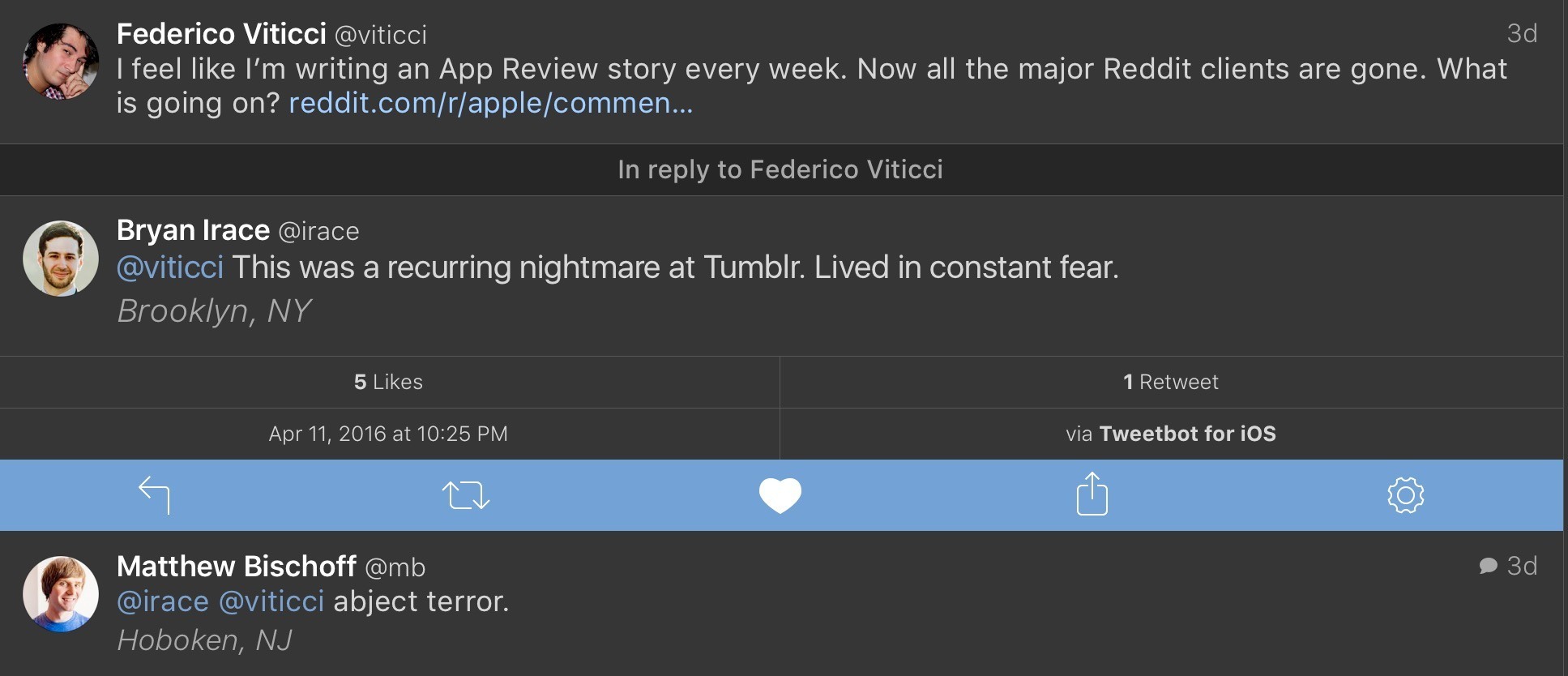
Federico wasn’t joking when he tweeted that he feels like he’s writing an App Review story every week. This particular story came and went quickly, in part because the developers affected scrambled to update their apps and Apple expedited review. But the implications of the shoot first, ask questions later approach to App Review bear further examination because they has lasting negative effects on the developer community and, ultimately, Apple and its customers.

This sort of out-of-the-blue, unilateral action legitimately strikes fear into the hearts of developers. Consider these responses to Federico’s tweet from Bryan Irace and Matt Bischoff, both formerly of Tumblr:

This is no exaggeration. I don’t know a developer who hasn’t had a run-in with App Review and wondered, ‘Maybe this is it. This is where my my app dies.’ That may sound a little dramatic, but read the results of Graham Spencer’s poll of developers - the feeling is real.

I can imagine that some at Apple may roll their eyes at this as an overreaction, or be a little offended at the implied lack of trust, but step into developers’ shoes. In the absence of meaningful communication by Apple of its intentions, it’s stories like the Reddit client take-downs that shape developers’ behavior. And as Federico noted, it’s not like this is an isolated story, it’s one of a long string of similar stories that make developers jumpy.

What bothers me the most about this incident is how Apple implemented its policy change. There was no imminent threat or emergency that made Reddit clients any more a threat than they were twelve months prior, but nonetheless Apple summarily pulled them and offered to reconsider the apps if the developers resubmitted. The developers worked through the night, resubmitted their apps and many were back on the App Store by the next morning. As a result, the story barely got traction and, while Apple may have avoided an onslaught of bad press, the damage was done. Developers took note.

So what to do? Probably the other reason this episode bothers me as much as it does is that it seems like the solution is obvious. I will grant that it’s easy for me to say that sitting here blissfully ignorant of many of the issues Apple faces, but just because it may be a hard problem to solve isn’t an excuse not to try. Apple needs to define when apps can and should be pulled from the App Store without advance warning and make that clear to developers. Those circumstances no doubt exist, such as where there is an immediate threat to customers or their data, but in circumstances like this, where a feature has been in apps for over a year, developers should be given advance notice of any policy change and a fair period of time to make adjustments before an app is pulled from the Store.

I also think that it’s time for Apple to appoint an internal advocacy group for third party developers. A group that takes developers’ calls, attends conferences, and is a voice for developers when policy choices like this are made.

The distrust caused by events like this is the sort of thing that is not easily fixed and will erode developer support for iOS in the long term if it’s not addressed. That’s not good for Apple or its customers. It’s hard enough to build a sustainable business on the App Store. Making app take-down stories a thing of the past would go a long way toward eliminating some of the negative sentiment we saw in the MacStories developer poll.


Testing Apple’s 29W USB-C Power Adapter and iPad Pro Fast Charging

When Apple refreshed its online store with a new USB-C to Lightning cable with support for fast charging through a 29W power adapter on the 12.9-inch iPad Pro last week, the addition immediately caught my interest.

You can also use the cable with an Apple 29W USB-C Power Adapter to take advantage of the fast charging feature on the 12.9-inch iPad Pro. – Apple

Just as everyone was focusing on the smaller iPad Pro and its True Tone display and superior camera, Apple’s semi-hidden note on fast charging seemed to promise a fix for what is, in my opinion, the most annoying aspect of the big iPad Pro – it takes too long to charge.

As I noticed when I was reviewing the iPad Pro last year (and as reported by other publications), the 12W power adapter included in the iPad Pro box takes about four and a half hours to fully charge the device. While the 12W adapter is recommended for fast charging on the iPhone, it barely manages charge a 12.9-inch iPad Pro in under five hours if it’s not being used.

I use the iPad Pro as my only computer every day, and I often need to quickly charge it before going out so I know it won’t run out of juice when I’m using it for a few hours on 4G with music playing through the speakers. Fast charging on the iPad Pro is a big deal to me, though I understand why people who primarily use it at home and charge it overnight won’t see the appeal of it. As soon as we wrapped up our coverage of the March 21 event, I went ahead and splurged 98 Euros on a 29W adapter and a 2-meter USB-C to Lightning cable.

Read more


Slack 2.8 Brings 3D Touch Support, Better Search Assist

Slack has released version 2.8 of their iOS app today with some great changes to save time on the iPhone and iPad.

On the iPhone 6s, you can now use 3D Touch on the app icon to switch teams, open channels and DMs, and search for messages and files. While I would have liked to see the ability to pin specific channels and DMs to the quick action menu, the feature is welcome regardless as it cuts down the time I spend swiping to open the sidebar just to switch between teams (I think anyone who’s on multiple Slack teams can relate to this).

Read more


Overcast 2.5 Adds Dark Theme, File Uploads

Overcast's new dark theme.

Overcast’s new dark theme.

When it launched in October with support for streaming and chapters, Overcast 2’s patronage model was positioned as a way to directly support the app without the promise of anything exclusive in return. With Overcast 2.5, launching today on the App Store, Marco Arment is introducing the first features available only to Overcast patrons: a dark theme, and the ability to upload audio files to Overcast’s cloud.

Read more


Workflow 1.4.4 Brings More Image Automation, HTML to Markdown Conversion

As much as I like to use Workflow for every task I don’t want to perform manually, until last week there were still some things I couldn’t automate with the app. Those tasks were utterly specific: converting HTML and rich text back to Markdown (with my beloved html2text in Python), or assembling iOS screenshots with pretty device frames (with LongScreen). With the release of Workflow 1.4.4 today, I can finally integrate these two key tasks into Workflow’s automation, and I’m in love with the results.

Read more


iOS Tip: Export PDFs from Print Preview with 3D Touch

Printing to PDF with 3D Touch.

Printing to PDF with 3D Touch.

Note: this tip was first shared with Club MacStories members over a month ago in issue 16 of MacStories Weekly. We are sharing it today as a one-off sample. Subscribe now and don’t miss out on more iOS tips and workflows.


A hidden option of iOS’ Print feature I’ve recently discovered is a way to export a PDF file from the Print preview screen using 3D Touch. I haven’t been able to replicate it without 3D Touch on the iPad, which makes the option available exclusively on the latest iPhones.

When viewing a page you want to save as PDF – say, a webpage in Safari or a note in the Notes app – open the share sheet, find the Print extension at the bottom, and tap it. This will open a Printer Options screen with a page preview in the lower half. You can swipe on pages to scroll through them, but what I didn’t know is that you can also press lightly on a page and then pop it open to get a Quick Look preview of the PDF file that’s going to be printed. Because it’s a PDF file, you can share it with other apps and action extensions, saving it elsewhere.

You can also generate PDFs from the Notes app.

You can also generate PDFs from the Notes app.

Thanks to this hidden feature, you’ll be able to share PDF files generated natively by iOS with other apps, including Dropbox and Workflow, without having to save the PDF to iBooks. I wish this could also be done on an iPad.


Slack Adds Support for iOS Document Providers, New Emoji Picker

Slack's new file uploads.

Slack’s new file uploads.

I’ve been using Slack every day for a couple of years, and especially after we upgraded to a paid team account last August, we’ve completely cut email from our internal communications (in addition to other features). One missing functionality that always annoyed me was the inability to natively attach files to conversations on iOS – Slack could either upload photos and videos from your library or preview links to files, but it couldn’t upload documents from other iOS apps.

Read more