This Week's Sponsor:

Winterfest 2024

The Festival of Artisanal Software


Posts in links

Empty States

Empty States

Craig Dennis on area of app design that gets often overlooked:

Empty states are places in apps that have no content or data. They are empty. A blank page. Traditionally empty states are overlooked as most designers focus on how best to display lots of content or data. It’s common for empty states to be dealt with by developers as they are often caused by exceptions (such as no internet connection). They often write the copy and as a result it can be a little difficult to understand or it is left with the basic styles. Not the best combination. It should be logged as something that needs designing but that doesn’t always happen.

It gets even worse with apps that deal with errors through text that isn’t localized. In fact, I’d argue that proper localization is another aspect of the app economy that shouldn’t be underestimated anymore (as if it ever could be): with apps available in more than 150 countries, designing for the US market alone is a foolish assumption (unless, of course, an app’s only market is in the US – which is the case with many online services these days).

Empty states can be useful and provide context. Whether it’s a way to instruct users on how to get articles into a read-later app or a cute illustration with a link to How-To pages, empty states should find a balance between their lack of content and presenting on-screen guides.

Permalink

Launch Chrome Bookmarklets With Keyboard Shortcuts

A few weeks ago I switched back from Safari to Google Chrome. I wanted to give Safari a fair chance, especially after the introduction of iCloud Tabs, but, alas, the browser never “clicked” for me the way Chrome did. Worse, using Safari on a daily basis for work-related tasks became an unsafe bet, as it was crashing too often, taking several minutes to sync my iCloud Tabs, or generally hanging for no apparent reason. I’m still figuring out the ins and outs of Chrome – particularly how to handle the lack of a “default browser” option on iOS – but, so far, Chrome is working better for me.

One thing I miss from Safari is the ability to launch bookmarks in the Bookmarks Bar with a simple CMD+1…9 keyboard shortcut. I use a lot of bookmarklets (which, by the way, Chrome syncs faster than Safari across devices), and I’m too used to hitting CMD+2 for OmniFocus and CMD+4 for Pinboard to give up the convenience of quick bookmarklet activation. Unfortunately, Chrome uses Safari’s CMD-based shortcuts for switching between open tabs.

The solution was laying in my dock the whole time. As cleverly shown by Patrick Welker, you can use a Keyboard Maestro macro to assign a keyboard shortcut to what is, essentially, Keyboard Maestro’s own GUI scripting, only done with a visual workflow. Make sure to read Patrick’s post to see how you can create a simple macro to “click” a bookmark in Google Chrome.

For the non-Keyboard Maestro users, a solution is to actually use AppleScript GUI scripting to simulate clicking a bookmark’s name. Using something like the script below, you can use any launcher that supports assigning a keyboard shortcut to an AppleScript to quickly launch a Google Chrome bookmark.

tell application "System Events"
	tell process "Google Chrome"
		click menu item "pin" of menu "Bookmarks" of menu bar 1
	end tell
end tell

The script could use an error-checking system to see if Chrome is the frontmost application, but I avoided adding it because I know I won’t use the shortcut anywhere else.

As for Chrome on iOS: because the browser forces you to type out bookmarklet names to launch them, my suggestion is to use a standard prefix so you’ll be able to launch them easily from the iOS keyboard. For instance, I prepend “xx” to my most used bookmarklets, so Chrome for iOS will filter the names right away.


Favs for iPad

Favs for iPad

After months of silence, Dirk Holtwick is back with a Favs update (version 1.2) that brings iPhone 5 support and a native iPad version. For those unaware of Favs, it’s a Mac/iOS app that collects your Internet favorites (“starred” or “liked” items) from sources like Twitter, Google Reader, Instagram, and more. From my review of the iPhone app:

Released yesterday, Favs for iPhone is a $2.99 mobile companion that serves the same purpose of Favs for Mac — it offers a unified interface to browse favorite items from multiple sources. The main screen features three general tabs for All items, Inbox, and Archive. However, I never use Favs’ own read/unread indicators, because I don’t want to “feel the guilt” of having too many favorites in my accounts. For this reason, I am glad Favs for iPhone lets me hide unread counts from the Settings, which also reveal iCloud sync will be coming soon to keep account information synced across Mac and iOS devices. I very much prefer to browse favorites by their original source.

The iPad app is an addition to the existing app, which is now Universal. It’s not revolutionary in that it takes the iPhone app and puts a list of accounts and favorite items in a sidebar on the left, with a larger panel on the right to view content. There are options to turn on Readability, and an action button to email, tweet, or copy a URL, or open a webpage in Safari. iCloud sync worked on first launch for me – it pulled some of the accounts I had configured on the iPhone – but I would like to see more options added in a future version (hopefully not in six months) such as Google Chrome support or a URL scheme to launch specific accounts directly.

Favs is available at $2.99 on the App Store.

Permalink

Quick Unit Conversions With Measures and Launch Center Pro

Quick Unit Conversions With Measures and Launch Center Pro

Measures by Michael Neuwert is one of the iPhone apps I’ve been following here on MacStories since I started the site in 2009. I’ve later reviewed (and became a fan) of the iPad version of the app, Measures HD. The latest update to Measures for iPhone, version 2.3, adds more units, iPhone 5 support, and a URL scheme. As you know, automation and URL schemes for iOS apps is something I’ve been focusing on lately, so I was curious to try out the Measures implementation.

A basic Measures URL looks like this: x-measures://convert?from=USD&to=EUR&value=100 – but it’s also possible to simply launch a specific category without starting a conversion by using something like: x-measures://convert?category=Mass. The convert action may also contain a category parameter to avoid ambiguities, and it’s possible to search as well using: x-measures://search?q=Watt.

Being based in Italy but working (remotely) in a US environment, I do a lot of conversions on a daily basis. Primarily currency (EUR to USD and vice versa) and temperature conversions to understand what my colleagues are talking about when they say “it’s cold over here”.

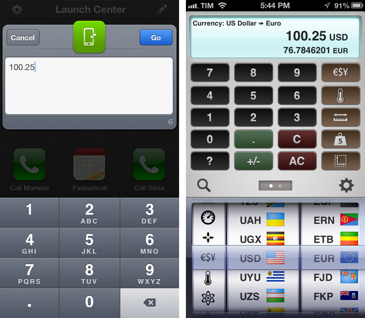
It was very easy to set up a Launch Center Pro action (Measures isn’t listed in the officially supported apps in App Cubby’s launcher yet) to start a Dollar to Euro conversion in Measures using input from Launch Center Pro. Using the first example URL I showed above, replace the numeric value parameter with [prompt-num] in Launch Center Pro. This will ensure that a URL-encoded numeric string will be sent from Launch Center Pro’s number pad to Measures, directly displaying the conversion. In this way, I can keep Measures inside a folder, and create shortcuts for my most-used unit conversions that I’ll launch with a single tap from Launch Center Pro. Thanks to URL schemes, the conversion process will take two seconds and I’ll be shown the final result without having to tap or select anything else.

Currently, there’s no official documentation for Measures’ URL scheme and I’m not sure Michael is using the x-callback-url protocol (though it certainly looks like it). If you’re looking for a quick unit converter you can launch from Launch Center Pro (I was looking for a way to send a browser selection as well, but alas), check out Measures 2.3.

Permalink

Retina Favicons with Icon Slate

Retina Favicons with Icon Slate

This post by John Gruber prompted me to fix a longstanding annoyance of MacStories that, for some reason, we had forgotten about: making the favicon Retina-ready.

Old (non-retina) favicons are 16 × 16 px; a retina favicon is thus 32 × 32 px. The lazy way to support retina is to replace your old 16 px favicon.ico file with a 32 px file, and allow non-retina browsers to scale the image. The proper solution, however, is create a single favicon.ico file containing two icon resources: one 16 × 16, the other 32 × 32. ICO files support other resolutions as well, but I see no practical utility in doing so.

Gruber goes on to detail how he used Icon Slate to produce a single .ico file containing both resolutions of the icon file. I have been using Icon Slate for quite some time now, and I highly recommend the app. It is, essentially, a more powerful, modern Icon Composer that makes it easy to package icons containing files at multiple resolutions (I’ve been using iconutil to package .icns file, and I’ve also tried this automated method by Jono Hunt). If you’re a designer (or developer dealing with icon files), I don’t know why you wouldn’t want to try Icon Slate.

Thanks to Gruber’s reminder (and the good work of @aylys), our site’s favicon – the little red bookmark icon in the address bar – is now updated for Retina displays. If you, like me, use Google Chrome on iOS, you can see the updated favicon on a Retina device by switching to tab view in the browser.

Permalink

SketchParty TV

SketchParty TV

I don’t usually write about games here at MacStories, but SketchParty TV is a real gem that I’ve enjoyed playing with my friends a few days ago.

To properly celebrate the end of 2012 and the arrival of a new year, we organized a dinner with a few good friends at my place on December 31st. As we waited for midnight with the company of good Italian food and wine, we took a couple of photos, shot some videos for future memory, and eventually got past midnight, unable to go out because of the aforementioned overwhelming quantity of food that forced us to sit down and rethink our New Year’s Eve strategy. Out of curiosity, I took my iPad mini and decided to try SketchParty TV, a Pictionary-like drawing game that uses AirPlay Mirroring to split the gameplay between the device (where words you have to draw appear) and the big screen (where drawings are shown alongside scores and team information).

We ended up playing SketchParty TV until 6 AM. At one point, I was laughing so hard at my friend’s attempt to guess a platypus (I’m terrible at drawing) that I dropped wine all over my elegant New Year’s Eve outfit (I’m also terrible at laughing without causing things to fall off desks and/or tables).

Because I don’t have an Apple TV connected to my living room’s old CRT television, I used Reflector for AirPlay Mirroring on my MacBook Air. With Reflector and my local WiFi network, SketchParty streaming quality was great, but we had to restart Reflector a couple of times. The app is extremely simple and, for that reason, insanely fun: you just need to set up two teams and start drawing. The app has a built-in timer for turns, and it correctly hides the word your teammates have to guess on the mirroring screen (so only you can see it). There are colors to choose from, three brush sizes, and Undo buttons; there’s also a Clear Page button to erase an entire page when your attempt to draw a woman’s stylized figure are backfiring. The app automatically keeps track of scores and saves an archive of games that you can re-watch at any time from the main screen.

SketchParty is a good example of how modern devices and software can make our lives even slightly better. It’s a simple and fun game, but I didn’t have to waste any paper to play it with my friends; furthermore, we now have an archive of our platypus drawings to go through for a serious amount of quality mocking. SketchParty TV is Universal and available at $4.99 on the App Store.

Permalink

NextDraft by Dave Pell

NextDraft by Dave Pell

Speaking of how I discover great non-fiction on the web, I have been a subscriber of Dave Pell’s NextDraft for months now, and it’s become a daily appointment that I’m always looking forward to.

At first, I didn’t “get” NextDraft at all and I couldn’t understand why people were making such a big deal about it. After all, NextDraft is a daily newsletter, and the last thing I wanted was another email requiring my attention in my inbox.

A few weeks in, I was hooked. Dave Pell, who also writes Tweetage Wasteland, sits down every day and collects “the day’s most fascinating news” in the form of (usually) 1o “blurbs” containing links. That’s it. There are no photos or videos or slideshows infesting what is, essentially, a human-curated list of links I wouldn’t have time to collect personally. NextDraft arrives in my inbox on a daily basis with a collection of insightful articles, news items, and subtle humor that offers an enjoyable combination of Pell’s distinct humor and Internet research skills. In fact, aside from the occasional jokes and witty remarks, I always get the feeling that Pell cares about providing a collection of links – not necessarily “breaking news” – that offer context and perspective to the reader. Case in point: yesterday, Dave collected four links on the fiscal cliff to explain what it is, what it means, what are its consequences, and why politics has become the new reality TV.

Or, to better get Dave’s style, here’s the typical Apple rumor you’d find in the “Bottom of the News” section:

It’s another year so here’s another useless Apple rumor: The company is reportedly testing the iPhone 6 and iOS 7. Seriously, what the hell else would they be doing, re-examining the Mac SE?

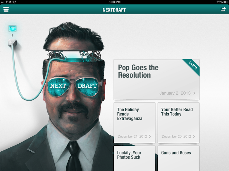
NextDraft is also available as a Universal iOS app with push notifications and an archive of the most recent newsletters. I use the app on my iPad, and I like how it breaks the blurbs in pages you can swipe through to reach The Bottom of the News. The app lets you use your Instapaper, Pocket, and Readability accounts to “read later”, and it uses native Twitter and Facebook integration on iOS to let you share blurbs; if you want to “read before you share”, there’s an in-app browser (with a text mode) to preview articles without leaving NextDraft.

I didn’t believe I could look forward to receiving a newsletter every day, but it happened with NextDraft. Dave Pell does an exceptional job in bringing quality news to me with a style that’s informative and friendly. More importantly, NextDraft is uniquely human, with no robots involved in link aggregation. Subscribe here.

Permalink

Longform for iPad

Longform for iPad

I’ve recently tweeted about how I re-discovered Longform and their iPad app, and I thought the app deserved a mention here as well. Like the name implies, Longform is a service that curates “new and classic non-fiction from around the web” in the form of direct links to articles you can read in your browser. While there are many services like it, I prefer the clean look of Longform’s website and the human aspect of their curation: for instance, the summaries Longform provides feel like they’re written by humans rather than automated scrapers. The format of the website, Twitter account, and “Best Of” lists feel like they’re managed by people who actually read the links they curate. Even their About page is simple and elegant.

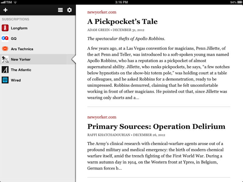
The iPad app (soon to be joined by an iPhone version) has become my go-to app for discovering articles I want to read. Even better: while I discover a lot of articles about tech via Twitter and RSS, Longform allows me to read great pieces of non-fiction out of my “geek comfort zone”, such as this story about Apollo Robbins or this terrific story by Eric Puchner. The iPad app comes with the standard stream of Longform-curated links, but it also lets you add “subscriptions” to specific sites, so you can, for example, view only articles from The New Yorker or GQ.

Longform doesn’t care about read-later drama and nerd gossip: it’s service-agnostic in the way it supports Instapaper, Pocket, and Readability – so you’ll be able to easily send articles to your app of choice. A subtle touch that I really appreciate is that, while the app comes with its own text-only “Read mode”, it defaults to a standard Web view when opening links, so I’m sure the website owner gets a page view from me before I send the article to Instapaper. If you do want to read within Longform, there are settings to adjust fonts and sharing options, but, overall, I prefer the presentation and feature set of Instapaper for these tasks.

More than an anonymous web service, Longform is a group of human editors whom I trust to bring me content I wouldn’t discover otherwise. The iPad app is only $0.99 on the App Store.

Permalink

Facebook Introduces Poke for Mobile

Facebook Introduces Poke for Mobile


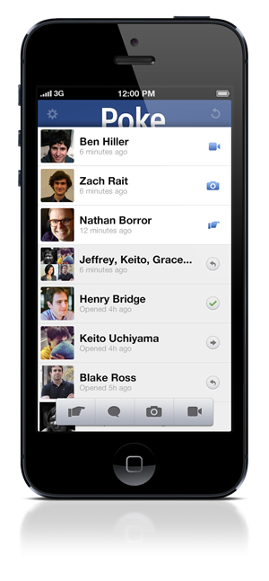
On Friday, December 21st, Facebook announced Poke for Mobile, a brand new application that makes it easy to say hello to friends. Where Facebook’s Messenger interfaces with the web giant’s chat app, and Facebook Camera makes it easy to upload groups of photos, Poke for Mobile offers an alternative, quick way to see who’s online and send quick greetings with pokes, messages, pictures, or video. The virtual pokes, perhaps cutely, can be set to last from one second to ten seconds. The app also lets you share where you are when you send a poke and you can see when your friends take screenshots. Poke for Mobile can be downloaded for free from the App Store.

Permalink