This Week's Sponsor:

Winterfest 2024

The Festival of Artisanal Software


Posts in links

The Omni Group’s 2013: OmniFocus 2, OmniOutliner 4, New “OmniPresence” Sync

The Omni Group’s 2013: OmniFocus 2, OmniOutliner 4, New “OmniPresence” Sync

In a post published on the company’s blog, The Omni Group CEO Ken Case has detailed their plans for the first quarter of 2013. In the upcoming months, The Omni Group will unveil OmniFocus 2, OmniOutliner 4, and a new sync engine based on open web standards called OmniPresence.

OmniFocus 2 will officially be announced on January 31, during the week of Macworld/iWorld. As expected, it will bring a redesign inspired by the iPad app, dedicated review and forecast modes, a clearer navigation, and “a fresh look and feel”. An OmniFocus 2 private beta will be given to attendees of the private event. Another major update will be OmniOutliner 4: as explained by Case, the original OmniOutliner 3 was released in 2005, before Apple’s transition to Intel processors for Macs. With version 4.0, The Omni Group has “completely rebuilt” the outlining engine to support zooming text, showing and hiding columns, and a better handling of attachments. As an OmniOutliner user myself (I used the app to build a massive outline for my Mountain Lion review earlier this year), I have to say I’m looking forward to OmniOutliner’s update in particular as the app feels outdated at this point.

The biggest news in my opinion is OmniPresence, Omni’s new automatic document syncing. Based on open web protocols, OmniPresence will run on The Omni Group’s Omni Sync Server as well as other cloud servers users can set up on their own. It will support Omni’s apps and, on OS X, even syncing of documents from other apps configured with the service.

OmniPresence is not limited to syncing with a single cloud, either: you can choose which folders to sync with which clouds. This means that teams can set up separate folders in separate clouds, and you can access files from any of them on each of your devices.

Because it’s open and you can host your own cloud, OmniPresence is designed to sync any documents you want: it’s not limited to syncing documents created by our apps. In fact, on the desktop OmniPresence is completely independent of our other apps: if you wish, you can use it to sync TextEdit documents! (But when using OmniPresence with non-Omni apps, we’ll ask that you limit the amount of space you use on our Omni Sync Server since we can’t provide infinite storage to everyone for free. On your own cloud server, though, do whatever you want!)

I have been running my own OmniFocus syncing server for months, but lately I went back to using the Omni Sync Server – initially out of curiosity to see whether it had improved over the past months. Not only is it faster, The Omni Group has also started testing features exclusive to their service, such as Mail Drop. That’s the reason I’m excited about OmniPresence: it’s an open standard and it’ll work with other apps and your own server, but I have no doubt The Omni Group will enhance their hosted solution with better integration with their apps.

Read the details of The Omni Group’s future updates here.

Permalink

Personal Search Results In Google with CloudMagic and Evernote

Personal Search Results In Google with CloudMagic and Evernote

Following my decision to switch back to Google Chrome as my default desktop browser, I have installed two extensions that are making Google search results more useful for me.

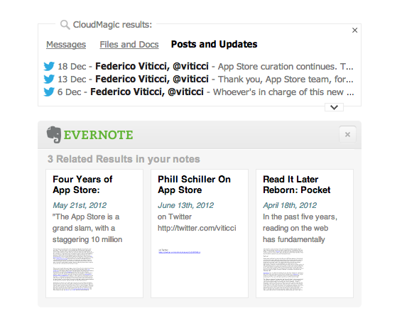
Last week, I installed the Evernote web clipper for Chrome, which was capable of displaying my own Evernote notes alongside Google’s search results. This means I can look for, say, “AppleScript iTunes” and likely find something that I had already clipped in Evernote in the past. It is a powerful addition when combined with Evernote’s new Related Notes feature; it also allows me (in the extension’s options) to make the thumbnail results open directly with the Evernote Mac app when clicked. Evernote announced yesterday the possibility to have the same kind of inline results with Safari.

The second addition is CloudMagic’s new extension, which I discovered today thanks to TechCrunch. MacStories readers know why I like CloudMagic:

CloudMagic is fast: it can search across thousands of indexed items in seconds, with results updating in real time. It is astonishingly accurate, even when it has to match a couple of words with, say, hundreds of tweets from last year or an Evernote PDF inside a nested notebook. I use CloudMagic on a daily basis to retrieve old tweets (as reference material), email messages, or notes; in fact, I would say the app has better search than Evernote’s iOS app. Which, by the way, is supported with an URL scheme – so you’ll be able to search notes and open them directly in the Evernote app.

The new CloudMagic extension is exactly what you think it is. Once installed, it’ll find results for your Google query by looking inside the accounts you’ve already configured with CloudMagic. By using both Evernote and CloudMagic, I can get Google results in an instant (the main Google search results load first), then get relevant results from my email inbox, Twitter accounts, Dropbox and Evernote notes, and more Evernote related notes thanks to Evernote’s different algorithm. I would say that 50% of my searches are for items that I have already saved in the past but that I have also likely forgotten about. CloudMagic and Evernote results in the browser allow me to keep using Google but also have my own results show up alongside the normal search I’m used to.

The updated CloudMagic extension is available here.

Permalink

Interesting For iPhone: Simple News

Interesting For iPhone: Simple News

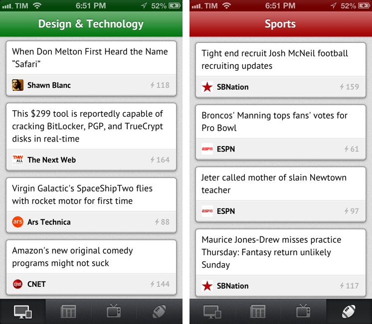
Nice new app by Mike Rundle: Interesting is a super-simple $0.99 aggregator of news for iPhone organized in four sections. Interesting collects new articles from a variety of sources and displays a list of entries in reverse chronological order. Tapping on an item opens an embedded web view, which has a toolbar for navigation, refresh, and sharing options. Sharing includes Pocket and Twitter integration, Copy Link, Open in Safari, and Mail Link. Interesting has four sections: Design & Technology; News & Politics; Entertainment & TV; and Sports. The built-in list of sources includes websites like The Next Web, Wired, SBNation, CNN, SPIN, and various sub-reddits.

Interesting has some great details. For instance, Mike has used the iOS 6 status bar tint in a way that’s not too bad, but that actually contributes to better identify sections visually: each section has a different title bar color, which consequently changes the color of the iOS status bar. I like the color choices. Further, tab bar icons have a nice animation when you tap on them, and I don’t mind the custom font and pull-to-refresh animation.

As Marco Arment learned with The Magazine, completely avoiding settings is a tricky decision. Interesting is very easy to use, but you can’t pick a different read later choice (only Pocket has native integration in the sharing menu and with tap & hold) and you can’t, say, set a different browser for opening links. I appreciate the simplicity; on the other hand, I wish the app had at least some options in the iOS Settings app.

As you know, I already use MacHash as an Apple news aggregator on my iOS devices. Interesting is a cool option for other kinds of news – TV is especially useful to me – and it’s only $0.99 on the App Store.

Permalink

IMDb 3.0 for iPad

IMDb 3.0 for iPad

I’m a fan of the major update to the IMDb app for iOS released today. Hitting version 3.0, IMDb (which, for those who don’t know, is owned by Amazon) sports a completely refreshed user interface for the iPad, taking advantage of the larger screen to provide better access to a variety of sections, charts, and options for your account.

The “Home screen” of the app is now accessible  by swiping to the right (or tapping the IMDb logo) to bring up a panel on the left; this panel contains your lists and recommendations (if you’re signed in) as well as links to Featured movies and TV shows, “Coming Soon” (either to theaters or DVD/Blu-Ray), Latest (news, birthdays, etc) and Popular. There’s a lot to browse through thanks to these links collected under your account’s information. The main view itself is interesting too: at the top, there’s a Coverflow-like carousel of featured entries that, however, are actually composed of two distinct items. As you swipe, a movie will be presented with a poster (to go to the IDMb page for the item) and a trailer thumbnail, which you can tap on to start playing a trailer right away. The entire app is full of mini widgets/sections that you can swipe through to access other pages or view more content. The interface has been polished to offer a simple dark background that makes movie posters really “pop”.

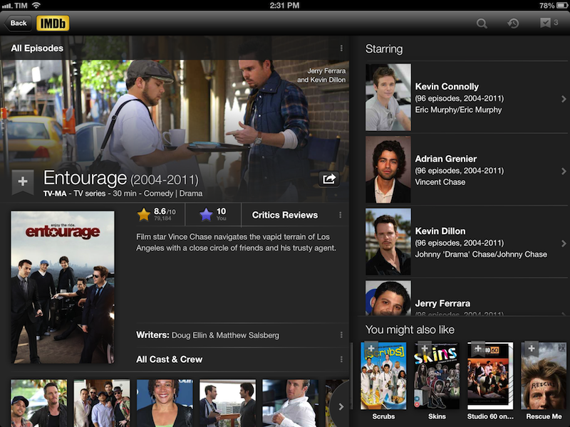
For me, the best feature is improved support for Watchlist and the reorganized movie pages. Every item now has a “+” button to quickly add it to your Watchlist, which can be opened in a “top shelf” by tapping on the same button in the upper toolbar; the shelf also features an arrow button on the side to go straight to the dedicated Watchlist page (this button is used elsewhere in the app). History (every item you’ve recently viewed through the app) is available in the same section at the top. The new item pages are essentially composed of three main areas: movie information (poster, reviews, trailer, photos, and more) on the left, Cast on the right, and “You might also like” recommendations at the bottom right.

Both the iPhone and iPad app now use native iOS 6 Facebook sharing and include TV episode details in Filmographies. IMDb 3.0 is available on the App Store.

Permalink

Letterpress 1.2 Brings HTML5 Replay Feature

Letterpress 1.2 Brings HTML5 Replay Feature

Loren Brichter’s Letterpress is my favorite iOS game. It’s no surprise that the game has been adopted so quickly and listed by Apple as a runner-up for Game of the Year on the “Best of App Store” list for 2012. Letterpress is fun, clever, and incredibly addictive. As I detailed in my original review (and as Loren himself explained in our interview), Letterpress has also a strong strategic component that, again unsurprisingly, has already been largely discussed.

Today’s Letterpress update brings a new feature that may appear as “minor” at first sight. While Letterpress got a quick “rematch” functionality in version 1.1, the 1.2 update released today brings “replay” – a way to literally replay a match word-by-word in an HTML5-powered webpage you can share with friends.

I asked Brichter about the technical details of Replay, because – try it for yourself here from a Mac or iOS device – I had to know how he managed to archive a match’s list of words and play it back with an interactive slider. In version 1.2, the app creates a JSON version of the history of the game, which is then “replayed” via JavaScript and HTML in the browser. The Replay webpages support touch controls (you can move the slider with a mouse on a computer) and the letter tiles “wiggle” just like they do in the app if you touch a word in the list. You can also simply tap the board (click on a computer) to advance one step at a time. It’s a simple feature that’s been executed extremely well.

There are two aspects to consider about Replay. From a strategic standpoint, it can be useful to analyze an opponent’s previously shared links for possible patterns and/or past mistakes. But I also wanted to ask Brichter about the technological component of Replay; he told me that, with this technology in place, he could now consider other neat visualizations for Letterpress games: for instance, he mentioned charts for scores and word lengths as possible implementations of the Replay webpage, which simply requires server-side updates. Brichter is also thinking about documenting the data format to allow other developers to build analysis tools for Letterpress. It may be “just a game”, but Brichter has several ideas to turn Letterpress into more than just a Game Center-enabled game.

Letterpress 1.2 is available on the App Store. It also brings an updated dictionary and funny release notes.

Permalink

YouTube Capture for iPhone by Google

YouTube Capture for iPhone by Google

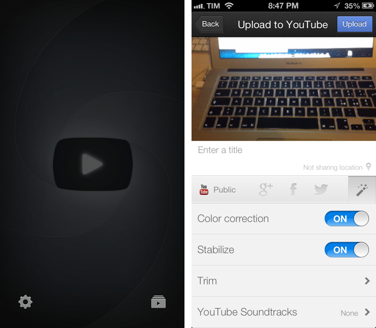
Google released YouTube Capture for iPhone Monday afternoon, a brand new app that lets anyone record and upload up to 720p landscape videos to YouTube from an iPhone or iPod touch. YouTube Capture allows people to touch up videos with color correction, add stabilization, trim videos to shorter lengths, and add music tracks. Plus, recorders can share their videos automatically to their Google+, Twitter, and Facebook accounts when uploading video. YouTube Capture can additionally upload videos from the Camera Roll. Download it for free from the App Store.

Permalink

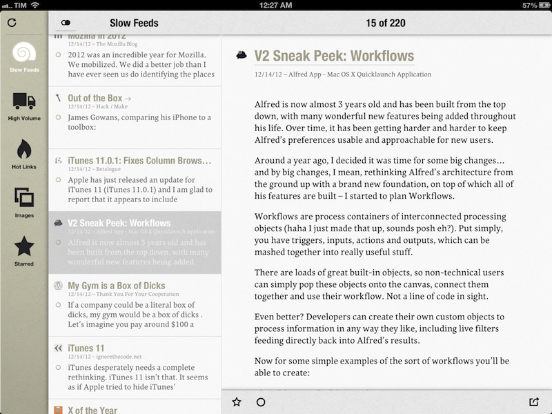
Slow Feeds 2.0 Does “Fever for Google Reader”

Slow Feeds 2.0 Does “Fever for Google Reader”

I have been testing Slow Feeds 2.0, a major update to Slow Feeds released today that adds new features and an iPad version. For those who don’t know Slow Feeds, it’s a neat concept: the app analyzes your Google Reader account, and puts “slow feeds” – articles from blogs that don’t post 20 articles per day – in a separate section. From my old review:

Slow Feeds won’t replace your daily RSS app (it doesn’t want to), yet at the same time, I believe it really has a chance of becoming an app many will use alongside their RSS client on a daily basis. Slow Feeds’ core concept is so clever, and so naturally implemented, I am now wondering why, in retrospective, others didn’t come up with it first.

Slow Feeds 2.0 is a solid update. The developer is extremely clear about his main source of inspiration for the new Hot Links section: Shaun Inman’s Fever. Hot Links doesn’t look at “slow” or “high volume” blogs, it simply collects links that are the most discussed and “linked-to” in your account. Just like Fever, only for Google Reader (and with less features: there are no “kindlings” or “sparks”). It is a natural evolution of what Slow Feeds already did; now the app comes with four different browsing options: Slow Feeds, High Volume, Hot Links, and Starred. With just one app, I can catch up on the different kind of RSS feeds I want to receive every day. I only have two minor complaints right now: there’s no way to hide the sidebar/middle panel in landscape mode, so the web view for a Hot Link is too small for most websites (the app uses panels in portrait mode); second, the sites that are linking to a Hot Link should be listed in the app (Sunstroke gets this right for Fever).

Slow Feeds 2.0 also has an Images view that extracts every image from the articles in your feeds, and displays them as a large “photo wall” on screen. Unfortunately, the feature doesn’t have much utility for mea right now, as I don’t want to browse a beautiful wall of app screenshots (a common topic among the blogs I subscribe to). Ideally, Slow Feeds could let me pick a “Photography” folder from my Google Reader – and in that case the Images view would come in handy.

Make sure to read more about Slow Feeds’ original concept in my review of version 1.o. Slow Feeds 2.0 is a great update the makes the app more useful for my reading workflow, and I’m looking forward to future improvements.

Permalink

“This Won’t Happen On iOS”

“This Won’t Happen On iOS”

I found myself nodding in agreement with Jason Snell’s latest piece for Macworld:

That’s why I’m optimistic that the dismissal of Forstall to tend his garden might be just the shake-up that iOS needs. In the operating system’s nearly six years of existence, Apple hasn’t really rethought any of iOS’s major features. We’ve seen the continual addition of new features, but very little has disappeared to be replaced by something utterly new. iOS is pretty good, but that stasis is odd, and perhaps even a little self-delusional on Apple’s part: Nothing is inviolably perfect, especially on the first try.

For me, there are two sides to this argument. I have been advocating iOS, and especially the iPad, as a platform capable of doing tasks previously exclusive to “real computers”. At the same time, I’ve also been trying to focus on how “regular people” could benefit from using apps that we thought were only “for geeks”. Maybe not Pythonista or another scripting app, but definitely – just to name two examples – apps like 1Password or Launch Center Pro.

And yet, the single reply I get the most every day is that “this won’t happen on iOS”. Some people seem to think that just because Apple was successful in reinventing the mobile OS five years ago, then they’ll have to stick to that model forever. That they’ll have to keep the Mail app as it is, that they’ll avoid considering more “power user features”, and that trying to make technology work for everyone – from grandparents to nerds – is wrong.

I disagree with the notion that the philosophy of iOS is set in stone. If there’s anything great about software, is that it can be changed. Sometimes it’s a huge undertaking, but it can happen.

I’m not saying change is always good – because I don’t know. But like Jason says, being static and complacent isn’t good either: the market is changing, people change their habits and needs. Eventually, change is not only good, but necessary.

And if Apple didn’t believe this too, we’d all be using a stylus today.

Permalink

iTunes 11 Navigation

iTunes 11 Navigation

Disclaimer: I am not a “heavy” iTunes user, but since version 11 came out – out of curiosity – I have tried to use it more.

I think Lukas Mathis is spot-on with his comments on iTunes 11’s new navigation. Mainly, the different ways to change “views” and “sections”:

To reiterate: if I’m in the store section, I don’t click on «Music» to go to my music, I click on «Library». But if I’m in my music section, I click on «Music» (which is on the opposite side of the screen from the previously-clicked «Library» button) to go to my movies.

I may not use iTunes as my default media manager for music and movies, but I do use it every day to check for app updates and buy new apps. Therefore, I am constantly switching between the “Apps” view of the Library and the “My App Updates” section of the iTunes Store (which, by the way, still hasn’t been updated to a new look). In the Library, the dropdown menu to switch views (Music, Movies, etc) is on the left; when I check for updates and I’m given the updates page, to go back I have to work with a different dropdown on the right. Maybe I’m too old for this stuff, but this breaks my muscle memory. Even worse, if I am in Apps, I check for updates, and click Library in the My App Updates page, I am not brought back to Apps – the Music view opens instead. This is incredibly confusing, and it still happens in iTunes 10.0.1.

I recommend reading Lukas’ post for a reasonable take on iTunes 11’s complicated navigation scheme and menu layout. Personally, I have gone back to showing the sidebar because it just makes more sense to me.

Permalink