This Week's Sponsor:

Winterfest 2024

The Festival of Artisanal Software


Posts in links

The (Un)Obviousness of iCloud

The (Un)Obviousness of iCloud

Chris Bowler writes (via Shawn Blanc) about his slow yet inexorable migration to iCloud:

And so it has gone with iCloud overall. I never really set out to use it to its fullness, but it has become integral to my computing experience. It should have been an obvious transition, but instead it was subtle. This past year came with migrations to two new laptops. The ease of setting up each blew me away both times. The combination of Dropbox (my data), Rdio (my music) and iCloud (preferences, OS X integrations, applications and everything else) is a powerful one and a testament to the time we live in.

I have previously written about how, for the end user, iCloud may as well look like “the operating system”.

When I think about it, I’m thankful for the kind of integration that iCloud provides. I use Calendar, Safari Tabs, and Find My iPhone on a regular basis and I enjoy their functionality. On the other hand, I’m less excited about iCloud Mail and its continuous downtimes, and I understand third-party developers who lament the poor state of iCloud sync and APIs for their apps.

Major shifts like iCloud take time. When you consider that Apple hasn’t traditionally been great at web services, what they have managed to make work reliably is quite a remarkable achievement. Yet, like Maps, average users don’t care about this: they just want their devices to work. And if Apple gave them iCloud, then Apple needs to make sure users can trust it.

As an aside, I’d point out that several friends of mine constantly ask me about iCloud – the things it does and what it is. Maybe my friends are lazy, but I’d go all the way out to guess perhaps Apple needs to tweak the initial guided setup to make iCloud even more understandable. I’ve always thought the short trackpad videos Apple embeds in OS X are nice and effective because they show features in context. Rather than using an animated cloud, short videos and actual screenshots would be a nice addition to iOS’ first setup guide.

Permalink

Spaced 3.0

Spaced 3.0

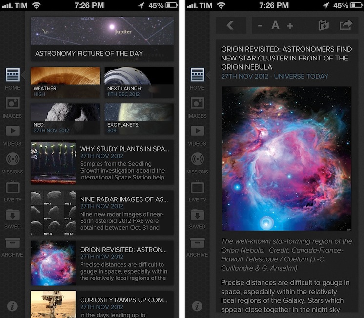
I’m no expert of astronomy or space missions, but I enjoy reading about the subject because I’m completely fascinated by it. I don’t subscribe to dedicated blogs about space news, because I don’t really follow the scene actively – I’m casually interested in reading what’s new when I have the time. For the past two years I’ve been using Spaced to keep up with the most important space news and discoveries; the team behind the app released today a major 3.0 update that adds a completely redesigned UI, iCloud support, and more sections.

Spaced aggregates news from well-established publications and sources and it is perfectly suited for people like me: folks who are curious to know about space but who don’t have the time to read every news item from blogs and magazines they are not even following. The new Spaced comes with a gorgeous black UI that gives even more depth and contrast to the beautiful imagery of NASA including Astronomy Photo of the Day and Image of the Day. In a sidebar on the left, you can now access a Home page featuring a collection of news, missions, NEO data, and photos, or you can browse individual sections to see more photos, videos, and live TV from NASA (including a programming schedule). You can tap on the Missions tab to learn more about single missions like the Webb Telescope and Mars Science Laboratory, or you can just head over Videos, tap Play and watch.

The big new feature of this 3.0 version is iCloud sync: in the Saved view, you access photos, articles, and videos you’ve saved from your iPad or iPhone. iCloud integration has been working reliably for me both on WiFi and 3G. You can also activate push notifications in the Settings for articles and other items, but I decided to keep them off as I prefer opening the app when I have time to read.

I recommend Spaced 3.0 to anyone who’s interested in space news but doesn’t have the time or patience to keep up with blogs, NASA webpages, and magazines. The app is only $0.99 on the App Store.

Permalink

Nasturtium Player Beta

Nasturtium Player Beta

Interesting idea for a new Mac OS X audio player, currently in open beta. Nasturtium (which, by the way, is a plant that produces great-looking flowers) is based on playlists that you can save and re-open at any time; playlists can be made of music from iTunes or videos from YouTube.

Listen to your own music library alongside YouTube videos for the optimal mix of old favorites and new tunes. Both sources play directly in Nasturtium Player, with no extra helpers required. But if you like, you can also queue up tracks with drag and drop from iTunes and the YouTube website, and import and export your playlists.

The concept of combining local music with YouTube videos resonates with my music workflow. While I tend to listen to music on Rdio, there are some older albums and songs that I need to keep locally either in iTunes or, most recently, Plex with PlexSync; similarly, there are YouTube videos of older demoes or live concerts of my favorite bands that I want to access every once in a while. I like how Nasturtium unifies search of local media and YouTube videos in a single interface.

Nasturtium is in beta, so I’ll save longer considerations for a proper review of the final version. Right now, I can say that I appreciate the existing selection of keyboard shortcuts and the iTunes 11-like look of the mini player. The inline YouTube video player could probably use resizing options, and it’d be nice to have a system-wide keyboard shortcut to pause playback. I like the unified search panel, but I believe filters for YouTube-only content and inline thumbnail previews could come in handy.

I’ll keep an eye on Nasturtium as, like I said, it is a powerful concept that fits my music listening habits. You can download the free open beta here.

Permalink

Quickly Create Pythonista Shortcuts with Custom Icons

Quickly Create Pythonista Shortcuts with Custom Icons

Interesting set of scripts posted on the Pythonista Community Forums (which, by the way, are becoming a daily appointment for me as Pythonista users are coming up with all sorts of tricks). Using Pythonista as a web server and Safari, you can create local (and unsigned) .mobileconfig files to automate the installation of Pythonista webclip icons. As I explained in my review, Pythonista can launch specific scripts using webclips created from a special webpage:

Upon tapping, a Pythonista Home screen bookmark will briefly open a blank page and then immediately redirect to the script you’ve configured in the Pythonista app. I’m fairly certain there’s no way to avoid showing a blank page for a second before redirecting to Pythonista; fortunately, it’s really just the fraction of a second, as the redirecting process is instantaneous both on my iPad 3 and iPhone 5.

Using the scripts linked in the forums, I easily managed to create a custom icon for my Markdown-Poster workflow that uses Poster’s icon instead of the default Pythonista one. To extract and convert iOS icons for personal use, I recommend Crunch, which I’ve also previously reviewed. I was intrigued by how forum user pudquick figured out the installation of provisioning profiles from Pythonista:

When you run the code, it starts a web server in Pythonista - and copies the URL for the generated .mobileconfig file to the clipboard. When you switch to Safari and attempt to load the URL, the socket connects - but it’s waiting for communication from the web server in Pythonista (which is paused, since it’s in the background).

As soon as you switch back to Pythonista, this un-pauses the web server fast enough to cause Safari to finish loading the .mobileconfig file while it’s swapping to the background, which then triggers the installation screen!

Combining the script with this other one to easily generate base64 images, I suggest replacing Image.BILINEAR on line 20 with Image.ANTIALIAS for slower but better results in the overall crispness of the icon (I also changed the size to 114x114 for my Retina iPad).

Looking forward to improvements for Pythonista shortcuts (as mentioned by developer Ole Zorn in the thread), this is a nice stopgap solution to use scripts with custom shortcut icons in the Home screen.

Permalink

FTP Support, Short URLs, And Other Features Coming Back To Skitch

FTP Support, Short URLs, And Other Features Coming Back To Skitch

In a post published on the Evernote blog, Skitch co-founder Keith Lang has shared a bit of backstory regarding Evernote’s acquisition of the product and confirmed many old features of Skitch will be coming back “soon”.

I am really excited about the newest release of Skitch for Mac, but troubled by some of the negative reaction from some of our oldest and most loyal users. After thinking about this for the past few weeks, I’ve come to the realization that we’ve underestimated how deeply ingrained Skitch had become in many people’s daily workflows and how disruptive changes to the product could be. I’d like you to know that we’re going to fix it.

Skitch, an image annotation tool, was released as version 2.0 with deep Evernote integration earlier this year. The new version included an updated UI, new sync, and many simplified and/or removed options that weren’t met with excitement by the app’s existing userbase. Namely, users weren’t thrilled with Evernote’s decision to build every single Skitch sharing feature into Evernote, thus removing functionalities to upload images via FTP, directly link to them, and share them in multiple ways. The new Skitch also didn’t come with proper keyboard and menubar support, and, generally, it left much to be desired for those that were used to the old feature set and who had become dependent on the app for their workflows.

Evernote quickly went back to the drawing board and re-added a menubar icon and background options. In the blog post published today, Evernote confirms support for FTP/sFTP, image deep linking, and short URLs for shared images will come back to Skitch soon. Options for multiple fonts and custom colors, streamlined cropping and resizing, and automatic type tool selection will also be added to Skitch in future updates.

Of course we’ll be doing a lot more than just putting improved 1.x features back into the new Skitch. We’re working on some really amazing stuff that should appeal to our most loyal users as well as bring in many millions of new fans. Imagine being able to Skitch on top of different document types, communicate complex ideas via email without typing a single line of text, and going on a manned mission to Mars.

Read the Evernote blog post for all the details.

Permalink

ScriptKit - Drag and Drop Programming for iPad

ScriptKit - Drag and Drop Programming for iPad

Mark Wilson profiles Scriptkit by Kyle Buza, a new “touchable programming” app for iPad.

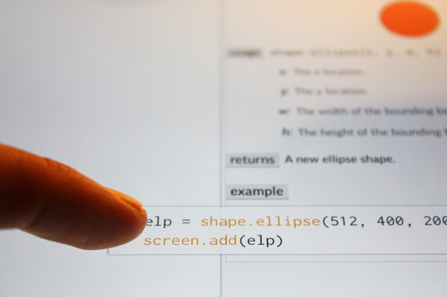
The app I’m using is Scriptkit, by Kyle Buza, and it allows you to drag and drop snippets of code from a library of well-annotated APIs. The goal? Rapidly prototype your app ideas on the very device you’re looking to run them on. Sure, you’ll still get your hands dirty on the iPad keyboard from time to time, tweaking the X/Y values determining size and shape of a button, for instance, but building a functional app really isn’t much harder than a few taps and a few drags–especially if you already know what you’re doing (which I don’t).

Only last week, I wrote:

I believe that, going forward, Pythonista and other similar apps will show a new kind of “scripting” and task automation built around the core strenghts of iOS.

I had no idea ScriptKit existed, but this is exactly what I was referring to in my Pythonista article. Yes, ScriptKit is limited, it’s confined in its own sandbox, and its initial set of APIs could use some additions. But look at what ScriptKit already enables: a touchable programming interface for building prototypes that use real data (Facebook photos, Dropbox files, etc) with real iOS core elements such as Camera and Location Services. Developers can use ScriptKit to build quick working prototypes; users with an interest in scripting like me can learn a basic syntax to build scripts and app demoes that may lead to bigger interests in other areas of iOS and languages. All within a touch-based interface, with real APIs, on an iPad.

Codea, Pythonista, ScriptKit – the future of iOS couldn’t be more exciting to me.

Permalink

Andreas Zeitler’s Keyboard Maestro Macros Repo

Andreas Zeitler’s Keyboard Maestro Macros Repo

A new collection of Keyboard Maestro macros by Andreas Zeitler:

Macros are meant to be imported “folder by folder”, rather than all at once. I’ve tried to make it more convenient for the user by putting all macros in a group labelled “Keyboard Maestro Macros Repo” before exporting. This way they are imported in a group of the same name, so that you can easier find them.

Note however: Some macros have very “commonly” used triggers like F1, ↑, or ↓. In these instances it is best to put the macros in a new group that is only available in one certain application, or a group that can be turned on and off by a separate shortcut. The window manipulation macros are an example of that. The triggers for moving a window by 1px in either direction is simply ↑, ↓, ←, and →. If not put in a new group you won’t be able to use these keys anymore.

Andreas is the creator of the Keyboard Maestro Markdown Library, which I use on a daily basis. In fact, I don’t think I could ever come back to using a Mac – or writing on my computer in general – without the Keyboard Maestro Markdown Library, which is now part of the repo available on GitHub.

I’m already a big fan of several macros Andreas included in this new collection. I particularly appreciate the ones related to Mail: there’s one to easily copy a message’s unique URL, and another one to print a message as PDF with a single keystroke.

Get them here.

Permalink

Siri Vs. Google Voice Search

Clark Goble has posted an excellent review of Siri and Google Voice Search, taking into account the improvements Apple and Google made to their services in the past few weeks. His experience largely reflects mine: Siri is more useful to do stuff, Google is faster at transcribing dictated input and displaying search results.

That said Siri still has places it needs to improve. It really should speak far more results. For certain classes of queries Siri should display a large simple result and speak it rather than the stylized Wolfram result it now provides. Given that Siri already has started speaking more results, I suspect we’ll see that added over the next month. Siri also has a problem of not letting you speak over it. I’d like it to be able to let me answer before I have to listen to every part of the question she’s asking. Finally I think there are several types of queries Siri needs to be optimized for. Temperature conversions, forthcoming movie releases, television schedules, and time series sporting event statistics really are all things Siri needs to do better.

In October, I wrote:

Google Search for iOS doesn’t want to be Siri: after all, it can’t. It has some similar features (“Do I need a raincoat today?”), but it’s not an assistant. It couldn’t be per Apple’s restrictions, and Google isn’t even trying to posit it as a Siri replacement. It’s Voice Search.

I also agree with Clark in regards to the tests many people conduct to compare Siri to Google. I’m not interested in the funny and witty responses – for as much as they’re an entertaining demo – because, after all, I want to know how voice works in real life. I’m always around a computer or iOS device, and the only times when I can’t directly manipulate a UI with my hands is when I’m driving or cooking. I want to know how Siri compares to Google in letting me complete tasks such as converting pounds to grams and texting my girlfriend, not showing me pictures of the Eiffel Tower.

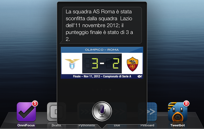
As an Italian user, I have to say Siri has still a long way to go with a language that’s full of variables such as conjugations and pronouns. Some Italian responses are poorly worded (see screenshot above), and sentences containing a “that” are still plainly transcribed. Sports results for Serie A lack player pictures and coach information, and results for the last match are displayed instead of rankings. Siri asks me if I mean “November 19th” or “November 20th” when I ask for “tomorrow” minutes after the midnight of November 19th, but simply replying “the 19th” doesn’t work.

Italian Siri has also been getting better, though. It presents more results for businesses open at night in my area if I ask after 11 PM, and it appears to accept a more variegate vocabulary for Reminders and Calendar integration. I can also attest reliability has improved recently, but it’s still far from perfect.

If you want a balanced and detailed take on the differences between Siri and Google, read Clark’s review here.

Permalink

Tweetbot 2.6.1 Tweaks UI

Tweetbot 2.6.1 Tweaks UI

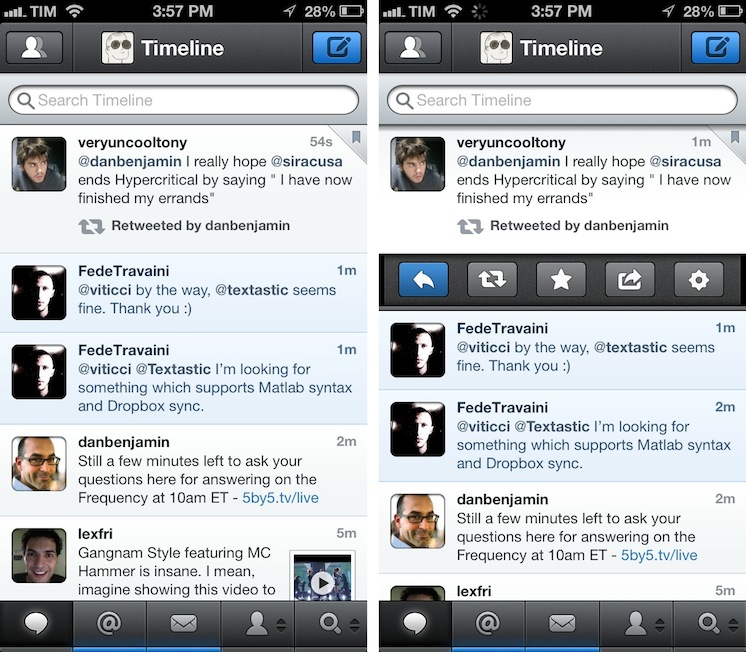
A minor update to Tweetbot has been released today by Tapbots: among bug fixes, version 2.6.1 introduces a slightly tweaked user interface with a different design for buttons and icons seen throughout the app. Unchanged since the first version, the new icons are similar to the old ones, yet somewhat more rounded and, in my opinion, peculiar.

Like I said, it is a very minor change. However, if you, like me, stare at Tweetbot for several hours a day, it is something you’ll quickly notice upon updating to 2.6.1. It certainly contributes to subtly differentiating Tweetbot from Netbot, which I appreciate.

Tweetbot 2.6.1 is available on the App Store.

Permalink