This Week's Sponsor:

Winterfest 2024

The Festival of Artisanal Software


Posts in links

iCloud and Document Sharing

iCloud and Document Sharing

Over at Macworld, Dan Moren writes about the poor state of iCloud document sharing between apps and users:

For example, if you’d like to take a text file created in TextEdit and stored in iCloud, and then edit it in some other program, there’s no easy way to do so. No other program can see that data, either on the Mac or the iPad. In fact, no iOS program at all can see the files stored in TextEdit, because there’s no equivalent Apple text editor on that platform.

And about collaboration:

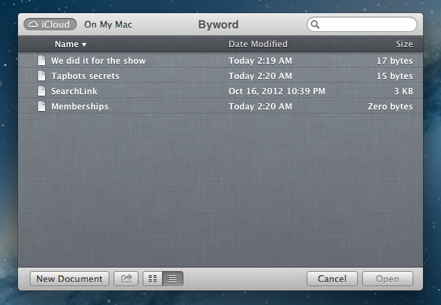
Imagine being able to see other documents that friends or co-workers share with you, right in that same iCloud Open dialog box. You open a file and work on it, all of your changes are automatically saved and versioned so that when your collaborators edit it later, they’re sure to be working on the most up-to-date version.

Realistically, I imagine “simple collaboration” with other people (“send John a document”) would be the easiest for Apple to integrate in iCloud. Just like you can “find friends”, Apple could leverage the same infrastructure to “work with friends” – obviously making the necessary adjustments to switch from a location app to tools like Pages or Keynote.

It gets more complicated with stuff like real-time editing, sync, and tracking changes or differences. I believe there is plenty of room in the iCloud Document Library for a “Your Collaborators” tab that would show people working on a project with you or editing a document you are “subscribed” to. Imagine being able to receive “updates” for a document via iCloud email, or to assign to-dos of a document to a Reminders list. Imagine asking Siri “has John updated the presentation yet”? Once you start thinking about pulling all the iCloud strings together, the possibilities are endless.

Question remains as to whether it’s in Apple’s plans to tackle these requests in the short term. Which brings me to the issue with sharing files across iCloud-enabled apps. In my Mountain Lion review, I had a whole section dedicated to this subject. I concluded with:

I’d like an app’s visual Document Library — not just the Mobile Documents folder — to display files from other apps that can be opened and edited. It would enable me to use an elegant interface without giving up on the filesystem-oriented nature of the Mac, which, as much as it may be hidden by default in some areas, is still there and still part of my daily workflow.

On the flip side, I recognize how the majority of users don’t see this option as a must-have. The average user doesn’t fiddle with dozens of text editors, nor do they try 10 different PDF apps to see which one has the best support for annotations (I am guilty of this too). Still, I think there could be some edge cases in which those users would miss “shared iCloud documents” — for example, they could be using TextEdit on the desktop, but another text editor on iOS — so once again, I restate my hope that Apple will someday consider the possibility of making iCloud documents app-independent…as an option if nothing else.

After three months, I keep hoping that Apple is considering the possibility of real iCloud documents, not just app documents. Like Dan and I suggested, they could be the same files with an extra “shared” privilege; or – mine is a more futuristic alternative – iCloud could simply have its own “Documents” area that contains files any app can open and send updates to.

These things take time. As I said, though, I hope Apple isn’t simply dismissing the idea as a “power user request”. After talking to people who have upgraded to 10.8 for the past three months, I’m convinced file portability and inter-app access is something a lot of folks understand, not just nerds.

Read Dan’s full story here.

Permalink

RSS.app

RSS.app

RSS.app is a very simple Mac app developed by Joost Schuttelaar following the removal of RSS feeds from Mail and Safari in Mountain Lion. RSS.app sits in the menubar, and checks for updates to your feeds every few minutes or hours. It then displays new article alerts using Notification Center.

The app is almost invisible: It is embedded in the status menu and uses Mountain Lion’s Notification Center to alert you of new posts. You can use RSS.app to import your existing list of RSS feeds from Apple Mail — even after you’ve updated to Mountain Lion.

The list of feeds to check can be configured in the app’s preferences, and you can import feeds from Mail even if you’ve already upgraded to Mountain Lion. The app is extremely simple: it’s got no keyboard shortcuts, menus, or distracting interface elements – it’s just a menubar checker for RSS feeds. Clicking on a notification will take you to the article using your default browser, and that’s it.

As Michael Tsai noted, the app has been rejected by Apple because of rule 2.8, which says “Apps that are not very useful or do not provide any lasting entertainment value may be rejected”.

If you think RSS.app can be useful to you, download it here.

Permalink

Average App Size Increased By 16% Since March

Average App Size Increased By 16% Since March

MacRumors points to new data by ABI Research, showing that, since March 2012, the average app size has increased by 16%:

The iPad 3’s Retina display and Apple’s more liberal submission policy have caused the file sizes of leading iOS apps to grow substantially, especially in games. The latest data from ABI Research shows that the global average app size across all categories was 23 megabytes in September, 16% more than in March.

On March 1, I wrote:

I see two solutions. Either Apple gets the carriers to agree to larger download sizes, establishing a new “average” that should work for most apps (let’s say 60 MB as Panzarino suggests), or they rebuild the download mechanism completely by allowing devices to “ignore” resources they don’t need. The second solution would be a “cleaner” approach, in that it would address the root of this likely scenario — that is, devices downloading apps containing all kinds of images and resources for Retina and non-Retina displays.

As we know, Apple decided to increase the maximum download size over cellular to 50 MB. This, combined with LTE networking, has allowed developers to be more relaxed in regards to their app sizes, and users to have reasonable download times on 4G (or DC-HSDPA). The solution I proposed earlier this year – a way to identify which assets to download for an app on a specific device – would still require a major rework of iOS.

Due to international pricing, this year I had to get a 16 GB iPhone 5. But I regret my decision. Something we’ve learned in the past two years (since the Retina display was introduced in 2010) is that that app sizes are only going up, and you’re never going to wish you got a device with less capacity. You’ll either be fine, or want more. With the iPhone 5 and Retina + Universal games, I find myself having to keep an eye on my available space, which is something I despise doing.

For the future, I hope 32 GB will become the new 16 GB, and I’m looking forward to 128 GB iPhones and iPads.

Permalink

Watermark Releases iPhone App

Watermark Releases iPhone App

Twitter and App.net archiving and search tool Watermark.io gained a first official mobile companion today, a native app for iPhone. Dubbed “Watermark Mobile”, the free app is very simple, as it’s solely focused on letting you search and copy links to tweets or posts.

Watermark is a searchable archive of tweets and App.net posts. It downloads tweets from everyone you are following, so you can go back and find older tweets later. And it provides a backup of all your own tweets and favorites forever.

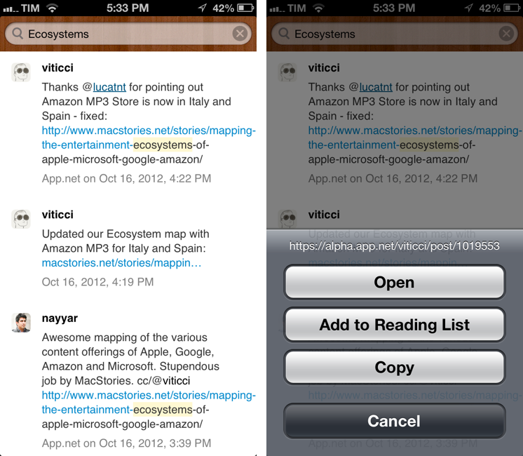
Watermark Mobile is, for now, an interface to your archive. There are no options or sidebars – just a search bar to retrieve posts from your Watermark archive. Right now, you can search and tap & hold on a post to copy its link; you can tap on usernames to open their profiles on Twitter or App.net. For a future version of the app, I hope developer Manton Reece will add native integration with Watermark filters and saved searches.

You can download Watermark Mobile for free on the App Store. You can catch up on our previous coverage of Watermark here.

Permalink

Scapple Beta

Scapple Beta

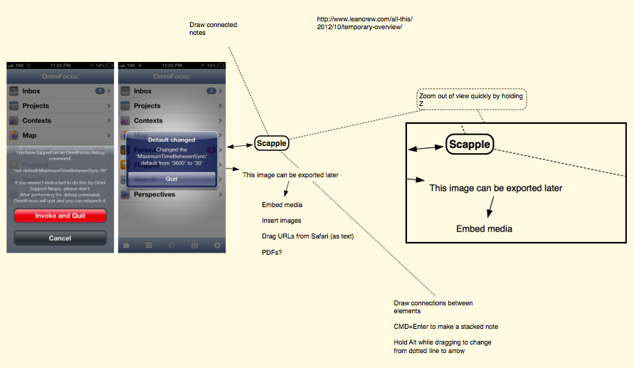
Developed by Literature and Latte – the creators of Scrivener – Scapple is a new “mind-mapping” app for OS X that has been released as public beta on the developers’ forums. Featuring a clean canvas to write notes and draw connections, Scapple’s focus is on not forcing users to maintain a hierarchical structure of the document.

There is a veritable panoply of mind-mapping software out there, but what’s different about Scapple is that it doesn’t force you to make connections. It doesn’t expect you to start out with one central idea and branch everything else off that. Instead, you are free to write anywhere on the virtual paper. Individual notes can be as short or as long as you like. Scapple allows you to get all of your ideas down, move them around, and find and make the connections as you go along. And it’s designed to make the whole process just as quick and fluid as it is on paper.

The app is clearly in beta and not finished, but I’m seeing some interesting ideas already. The app is easily navigable with either the cursor or the keyboard; you can create a new note with a double-click anywhere on the canvas, and you can select notes as you would with multiple files in the Finder. Notes can be “stacked”; to connect a note with another one, simply drop the source onto the destination. You can change the style of borders, lines, arrows, and every single note with an Inspector. I found Scapple very easy to pick up.

Dr. Drang notes an interesting feature about zooming: you can get a “quick” overview of a document by simply holding the Z key temporarily.

As someone who’s often working zoomed-in on a small section of a document, I love the idea of getting a temporary overview of the entire document by holding down a key. And the added ability to move when you unzoom just makes it that much better. If this is available in other graphics apps, I’d like to know about it; and if it isn’t, other developers should steal it.

Personally, my curiosity was piqued when I saw the already-available exporting options: maps can be exported (aside from the app’s own .scap format) to PDF, PNG, plain text, rich text, rich text with attachments, OPML, plain text list, or a folder of images. In fact, one of Scapple’s feature is the ability to present both text and images inline with the document.

I’m looking forward to the final version of Scapple. I hope it’ll support AppleScript to make it easier to script the export/import process and allow the app to be integrated with iThoughts on iOS. In the meantime, you can download the public beta of Scapple here.

Permalink

Change Default Sync Times of OmniFocus For Mac and iOS

Change Default Sync Times of OmniFocus For Mac and iOS

In my post about OmniFocus and flagged Mail.app messages, I wrote that there’s no way to tell the app to sync every few minutes. I was wrong. As reader Bill Pallmer told me, there are two settings to change the default sync behavior of OmniFocus for Mac. In Terminal, you can use these commands to change how often OmniFocus will start a new sync and sync after an edit, respectively:

defaults write com.omnigroup.OmniFocus MaximumTimeBetweenSync -float 30
defaults write com.omnigroup.OmniFocus TimeFromFirstEditToSync -float 2

The numeric value after the -float flag indicates time in seconds. As explained by Ken Case on The Omni Group forums, you’ll have to quit and restart the app after using these in Terminal; you also can’t go lower than 2 seconds for TimeFromFirstEditToSync and 15 seconds for MaximumTimeBetweenSync.

There are two hidden preferences which control the timing of automatic synchronization, MaximumTimeBetweenSync and TimeFromFirstEditToSync. Both are specified in seconds. MaximumTimeBetweenSync is how often OmniFocus looks for changes on the server when no changes have been made locally; it defaults to 3600 seconds (one hour). TimeFromFirstEditToSync is how soon OmniFocus will sync after you’ve made an edit, and it defaults to 60 seconds (one minute).

If you have the Mac App Store version of OmniFocus, change the first part of the command to com.omnigroup.OmniFocus.MacAppStore.

The great thing about these commands is that they also work on iOS in debug mode. They share the same name and settings, but a different URL:

x-omnifocus-debug:set-default:TimeFromFirstEditToSync:2

x-omnifocus-debug:set-default:MaximumTimeBetweenSync:30

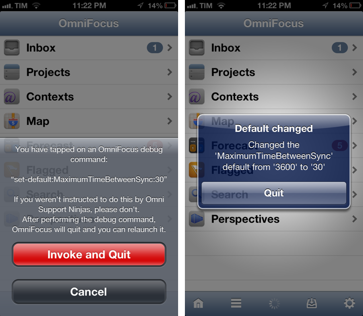
To activate the iOS settings, choose the value you want, and paste the URL into Safari: OmniFocus will open and tell you that you’re enabling a debug option, as pictured above. The app will quit; restart, and it’ll now sync more often according to how you changed the default setting. Obviously, remember that you’ll be consuming 3G data for sync, so don’t set it to refresh too often, unless you don’t have a problem with that.

To revert to factory settings on iOS, use:

x-omnifocus-debug:reset-default:MaximumTimeBetweenSync

This is a great tweak, because I run my own OmniFocus sync server for a variety of reasons, and I always want to make sure I have the latest version of my database. Thanks Bill.

Permalink

iOS 6 GUI PSD for iPhone 5 Now Available

iOS 6 GUI PSD for iPhone 5 Now Available

With every new major version of iOS or new device from Apple, design studio Teehan+Lax releases a free iOS GUI PSD. The PSDs, downloaded millions of times in the past few years, have helped designers and developers mock up their apps and iOS designs using Photoshop, while relying on graphic assets that look just like interface elements and controls of iPhones and iPads.

Today, Teehan+Lax released its new iOS 6 GUI PSD for iPhone 5:

This version, iOS 6 for iPhone 5, is a bit different than previous version. Those of you who have downloaded and used these files have probably noticed they’ve become quite bloated. As fast as our computers are today, they still get pretty sluggish when working in a document that contains tens of millions of pixels with hundreds of shape layers. This time around we focussed on making the file a bit more usable. It’s smaller in file size and has a reduced canvas making it quite a bit more manageable. We did this by removing some of the more obtuse elements.

Weighing at 13 MB, you can download the iOS 6 GUI PSD here.

Permalink

Send Flagged Mail Messages To OmniFocus Automatically

Send Flagged Mail Messages To OmniFocus Automatically

Sven Fechner pointed today to an AppleScript published in late 2011 by Hunter Hillegas to send flagged Mail.app messages to OmniFocus’ inbox on the Mac.

In iOS 5, Apple added the ability to flag a message, just as you’ve been able to do on the desktop forever. I created an AppleScript that looks for flagged messages. When it finds them, it adds them to OmniFocus and links them back to Mail.app, just like the Services action does. It then also unflags the message, resetting the state back to normal. This script runs every five minutes.

In iOS 6’s Mail.app, it’s now even easier to mark a message as flagged. I have tried the script, and it works as advertised. I would modify it to include only the latest message of a thread in the task note, but I see the appeal of having an entire conversation saved in OmniFocus for reference.

Obviously, the script is best enjoyed if executed on a Mac that’s running all the time. In this way, you can set a message as flagged on iOS, wait a few seconds, and find it in OmniFocus right away.

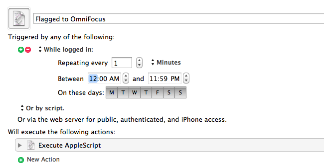
Personally, I run my own OmniFocus sync (every minute) so that I always have up-to-date sync that I can control. To implement this script in my workflow, I just had to create a new Keyboard Maestro macro (pictured above) that runs the AppleScript every minute if I’m logged in. In the way the script is designed, flagged messages are processed, then set back to “unflagged” so they won’t be added again in the future (unless you flag them manually).

You can find the AppleScript here.

Permalink

iOS 6 Concepts: Multitasking and App Store

iOS 6 Concepts: Multitasking and App Store

The past couple of days has seen a fresh round of new iOS 6 concepts surface online. Specifically, Rene Ritchie at iMore posted a series of mockups showing possible improvements for the current (poor) state of App Store search on the iPhone, while The Verge featured a forum post by member Sentry about multitasking on iOS.

For the App Store, I’ve already largely discussed why I think the new interface represents a step backwards in several areas. Especially on the iPhone, discovery is hampered by a new card-based layout for search results that’s slow and makes terrible use of information desnsity on our device’s screens. Rene offers some interesting solutions:

Taking it one step further, Apple could implement the portrait interface they use for app categories and present a few horizontal list views. The first could present search results filtered by keyword relevance, the second by rating, the third by how many “friends” have the app, the fourth by recency of release, etc. So, for example, a search for “Twitter” could result in the official Twitter for iPhone app showing up first for relevancy, Tweetbot first for friends who have the app, and Flurry for most recent.

Filters are interesting. With iOS 6, not only does Apple have data from Genius and Game Center, they also have direct integration with Facebook and Twitter. I’m not sure this is a path Apple could go down with for such a core feature of the system, but it’d be curious to see, say, how a Facebook-enabled App Store could recommend apps that my friends are liking and using. I’m not sure about the privacy implications, but the appeal of such a functionality could be big for the average user who just wants good app recommendations.

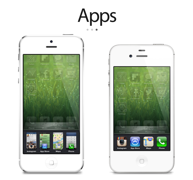
On The Verge, forum member Sentry has an elegant and very Apple-like take on how the multitasking tray could be improved. Practically unchanged since iOS 4, Sentry argues that iOS 6 should make better use of the extra screen space of the iPhone 5 for multitasking. Instead of proposing the usual Mission Control-like UI we’ve seen in dozens of mockups, he says that users are very entrenched into the simplicity of the multitasking tray: it shouldn’t change too much.

In an attempt to offer more functionality and features, they lose the core simplicity of the switcher which made it particularly usable to begin with. Some concepts use the entire screen space to display a grid of app previews, others only double the switcher height to include an extra row of icons. While both offer additional functionality, they actually hinder the flow and ease of app-switching. Whether it’s a full screen grid solution or displaying two rows in the switcher instead of one, both require more from your thumb than Apple’s original solute while tending to be overly brash in appearance as well.

I agree about the app switcher: it’s very easy to use, and, while geeks like us would like to have more options for “real” multitasking, typical iPhone users don’t have any problems with switching apps. I’m still not completely sold on the concept of live app previews for the switcher, but I know (at least I very much hope so) that Apple won’t change this part of the experience unless they come up with something better. An improvement that’s useful, not just different for change’s sake.

Check out the concepts by clicking on the source links above. Also recently: a great concept on how to enhance Spotlight by giving it Siri-like features based on text input.

Permalink