This Week's Sponsor:

Winterfest 2024

The Festival of Artisanal Software


Posts in links

Ecoute for iOS

Ecoute for iOS

A while ago our Lukas Hermann published an in-depth review of Ecoute for iOS:

From now on, Ecoute for iOS is my new default music player for iOS. Its UI features every design decision I ever wanted to have on my iPod touch. Plus, it eases up changing and pausing tracks while browsing through your music library, something I often do while I’m on the go. I can’t wait to see this thing on the iPad as well. If you’re a music and design enthusiast like me, or just dislike the system music player on your iPhone or iPod touch, you have to try it out.

Last week, I saw Ecoute had been updated for the iPhone 5, and I decided to give it a try. I’m glad I did, because the app works perfectly for the way I think of browsing my music collection.

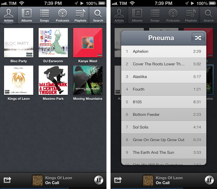
The thing I like about Ecoute is that it displays Artists using album thumbnails. The Music app does this only for the Albums view, and then again they’re small thumbnails arranged in a list view. Ecoute is more similar to iTunes’ grid view, which I use on my Mac. When you tap on an album, instead of going deeper into the level views, Ecoute brings up a modal popup that you can dismiss with a swipe – this is not too dissimilar from how the upcoming iTunes 11 will expand albums inline. If you tap on an artist that has multiple albums, a nice animation will “drill down” to show the album thumbnails. Last, when you tap on a song, it starts playing in a bottom bar without opening a new view in the foreground – and that’s exectly all I want from a music app.

Ecoute looks gorgeous on the iPhone 5. If you’re looking for a complete overview of all its features, check out Lukas’ review. For me, Ecoute works better than Apple’s Music app because it reflects the way I tend to browse my music collection.

Ecoute is available at $2.99 on the App Store.

Permalink

Apple’s Tribute To Steve Jobs, Yo-Yo Ma, And The Prelude From Bach

Apple’s Tribute To Steve Jobs, Yo-Yo Ma, And The Prelude From Bach

Camillo Miller of Italian website TheAppleLounge noticed an interesting tidbit about the brief tribute to Steve Jobs Apple published on its website today. The song that plays in the video, the prelude from Bach’s Cello Suite No. 1, sounds like F# major. The prelude, however, was composed in G major.

Why tuning down the prelude? It comes down to an important detail related to Steve’s tastes in classical music. The version that Apple is using on the website is played by American cellist Yo-Yo Ma. As Walter Isaacson writes in Steve’s biography, Yo-Yo Ma and Steve were close friends:

There was one classic musician Jobs revered both as a person and a performer: Yo-Yo Ma, the versatile virtuoso who is as sweet and profound as the tones he creates on his cello. They had met in 1981, when Jobs was at the Aspen Design Conference and Ma was at the Aspen Music Festival. Jobs tended to be deeply moved by artists who displayed purity, and he became a fan. He invited Ma to play at his wedding, but he was out of the country on tour. He came by the Jobs house a few years later, sat in the living room, pulled out his 1733 Stradivarius cello, and played Bach. “This is what I would have played for your wedding,” he told them. Jobs teared up and told him, “You playing is the best argument I’ve ever heard for the existence of God, because I don’t really believe a human alone can do this.” On a subsequent visit Ma allowed Jobs’s daughter Erin to hold the cello while they sat around the kitchen. By that time Jobs had been struck by cancer, and he made Ma promise to play at his funeral.

As it turns out, Ma plays the first four Bach suites tuning down his cello a full semitone, and there is a specific reason for doing so. In baroque times, instruments like cellos sounded a little different: the musical note A (A440) didn’t have a frequency of 440 Hz, but was more around 415 Hz – something known as the baroque pitch.

Among several modern ensembles, there is a consensus to play baroque music a semitone lower than A440. By tuning down the A to the baroque pitch,  the prelude from Bach sounds like F# major, while still playing it in the original G major; this helps achieve a more vibrant, “full” sound that is closer to the original and resonates beautifully.

The Cello Suites by Yo-Yo Ma are available on iTunes.

In many ways, Apple is still sweating the details.

Permalink

Steve Jobs And The iPad 27 Years Before The iPad

Steve Jobs And The iPad 27 Years Before The iPad

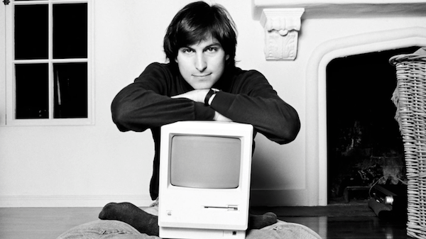
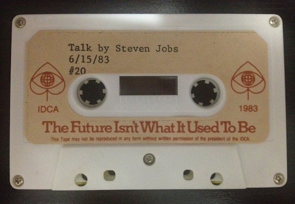
Matthew Panzarino has published a summary of a “lost” Steve Jobs speech from 1983 uncovered in its entirety by Marcel Brown. Brown was given a cassette tape with the full recording of a speech Steve gave at the International Design Conference in Aspen (IDCA) in 1983 (photo). During the speech, Steve shared some forward-looking ideas for the future of computing including what would become the App Store and, 27 years later, the iPad.

He says Apple’s strategy is to “put an incredibly great computer in a book that you can carry around with you that you can learn how to use in 20 minutes”. Does that sound like anything we are familiar with today? And they wanted to do it with a “radio link” so that people wouldn’t need to hook it up to anything to communicate with “larger databases” and other computers.

And about the App Store:

He thought that the software industry needed something like a radio station so that people could sample software before they buy it. He believed that software distribution through traditional brick-and-mortar was archaic since software is digital and can be transferred electronically through phone lines. He foresees paying for software in an automated fashion over the phone lines with credit cards.

When these tapes and old video recordings surface, it’s easy to dismiss them as “inevitable”. It was “inevitable” for Apple to come out with a tablet that looked like an iPad, and it was “inevitable” for software to be distributed digitally in an App Store-like marketplace.

Of course, progress itself is inevitable. But I don’t think it’s that easy – I don’t think we can dismiss innovations as “inevitable” or “obvious”. What supporters of the “inevitable” theory are missing is the work and vision and effort of dozens of people that it took to get there. In hindsight, it’s easy to look at any product and think it had to be in that way.

The speech uncovered by Marcel Brown is the perfect example of how some people, in this case Steve Jobs, have a vision that is only constrained by technology. A vision that, after years of research and design iterations, will become real and, at that point, “inevitable”.

Permalink

Good App Store Screenshots

Good App Store Screenshots

Speaking of good App Store practices for developers, Jen Gordon published (via Jeremy Olson) a nice overview detailing how users browse the App Store looking for screenshots and icons.

An app with a fantastic interface design will definitely increase sales. However, if all you publish are plain screenshots sans description of features and benefits – you’re missing a HUGE selling opportunity.

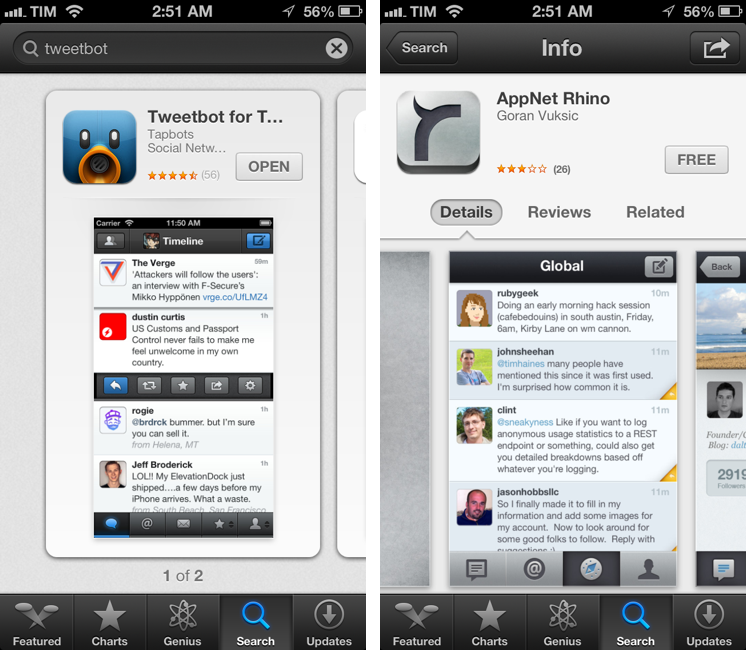
In the new iOS 6 App Store, icons and screenshots are more relevant than ever. Particularly with the new “cards” interface for search and genius, the application icon and first screenshot are what users immediately tend to look at, as titles get cut off after 12-15 characters and ratings have a smaller font than iOS 5.

On the other hand, because (on the iPhone) cards are displayed one after the other, developers have more chances to catch a user’s attention with good icons and screenshots. While swiping through search results, beautiful icons get immediately noticed, but the first screenshot has to instantly communicate the main purpose of the app, while showing some elements of its interface. It’s undoubtedly hard to find the right balance between communication and appearances (the coolest part of the UI might not be the most informative), but developers need to keep in mind that just like cards can get an app more visibility, it’s easy to swipe away to the next result.

Permalink

Dissecting The iOS 6 App Store

Dissecting The iOS 6 App Store

Justine Pratt has published (via TUAW) a very thorough overview of the new App Store in iOS 6.

The new AppStore, especially the cards, was really designed for the iPad and the faster processor of the iPhone5. Finally the stores on both devices are common, which should help increase the familiarity when browsing both stores. On older devices, the icons and graphics are slow to load and the cards are slow to scroll on the iPhone. This situation is only temporary, as new devices are released and adopted.

In my iOS 6 review, I took an extensive look at the App Store, its new features, and its most apparent shortcomings; Justine does a much better job at carefully analyzing every single section and change in App Store layout and category organization. I also learned a few tidbits from her overview, such as the new positioning of the “App Support” button next to reviews.

Interestingly, we both came to the conclusion that the new App Store seems to really be optimized for the iPad in terms of layout. In the past few weeks, following the release of iOS 6, I’ve heard quite a few people saying that the opposite was true – that the cards layout was meant for the iPhone first, and eventually brought to the iPad with a larger UI design.

Overall, the App Store still has several visible and deeply annoying bugs that hinder the performance of search, Genius, and Purchased History. Apple still hasn’t fixed many of these, and the improved speed of the iPhone 5 only partially contributes to making the browsing experience slightly better.

As I wrote in my review, there are still some noteworthy additions and changes for developers in the new App Store, so make sure to check out Justine’s article for a detailed analysis.

Permalink

iPhone 5 Display Vs. Spectroradiometer

iPhone 5 Display Vs. Spectroradiometer

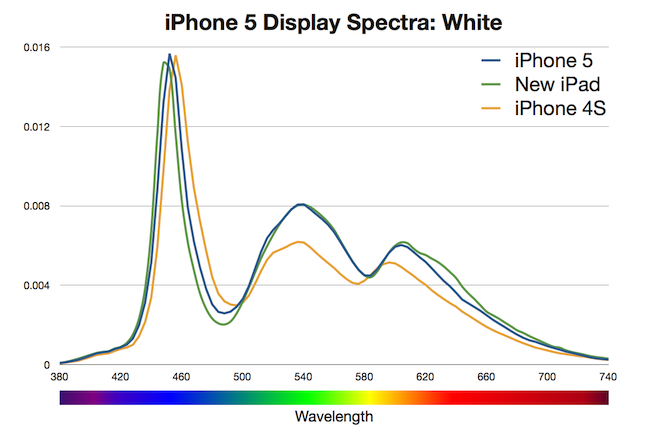
According to Apple, the iPhone 5 offers 44% more color saturation than the iPhone 4S. Jeff Yurek of dot color decided to put the claim under direct scientific inspection, and found out (through a spectroradiometer) that, indeed, the display is remarkably improved.

The 44% more color claim for the iPhone 5 is the same claim Apple made for the new iPad. As with the iPad, increasing the color performance of the iPhone 4S by 44% of NTSC 1953 gamut, measured using the CIE 1931 color space, would result in color saturation matching the sRGB color standard. Using these standards as the goal posts, we measured the iPhone 5 at 70% of NTSC 1953 in CIE 1931, a 39% increase from the iPhone 4S, which measured at 50%. That’s 5% less of an improvement than Apple’s 44% claim and just 99% of sRGB (measured against the sRGB primaries). While 5% less might seem like a big deal, getting to 99% of sRGB is a major feat and will result in tremendously noticeable color improvement in the phone. Additionally, color filters are notoriously difficult to manufacture.

I am no display expert, but from personal experience I can say I see a definite improvement of blues and greens on the iPhone 5. Just by looking at the App Store, Phone, and Messages icons on an iPhone 5 and iPhone 4S, you can see that the colors are more vivid and “real” on the new device. Yurek’s scientific measurements put this into better context with factual evidence.

Also worth linking is the photo set of retinal neuroscientist and photographer Bryan Jones. He took macro shots of the iPhone 5 and iPhone 4 to compare color quality, then put them both under a microscope to take a look at the pixels. Check out his results here.

Permalink

OmniOutliner, Plain Text, and Nebulous Notes

OmniOutliner, Plain Text, and Nebulous Notes

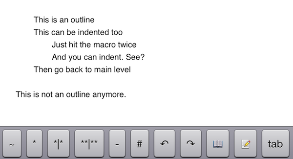
A few months ago, I asked if there was a way to produce plain text-based outlines and import them into OmniOutliner for iPad while preserving indentation. Today, Jeff Hunsberger has posted a nice overview of his setup, which doesn’t include OmniOutliner but relies upon the same “trick” I use – speeding up plain text outlining using Nebulous Notes’ macro functionality.

Just by setting up those few macros, I have create a fully-realized meeting outline tool in markdown using Nebulous Notes. The outline in the same format I’ve been using for years and is searchable, extensible and ubiquitous thanks to Dropbox. The beauty of this is, after the meeting is over, the notes I’ve just taken are ready back at my desk – they can be inserted into an email to the team with a simple copy/paste.

My workflow is only slightly different. Firstly, I usually outline in CarbonFin Outliner on the iPad (Tree on the Mac), but sometimes good ideas strike when I’m already in my text editor, thus requiring me to write them down as quickly as possible. What I end up with is a rough structure of my thoughts that I want to further refine in OmniOutliner. From there, I’ll then export as OPML to CarbonFin Outliner. It sounds convoluted – maybe it is – but this setup works for me. This is how I built the outlines for my Mountain Lion and iOS 6 reviews, and I’m always looking for improvements.

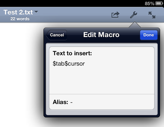
As I discovered, OmniOutliner for iPad wants to receive tab-delimited plain text. So, unlike Jeff’s, my macro doesn’t have hyphens, just a tab that I can hit as many times as I need to indent text into lines and children. Unfortunately, it doesn’t seem like tab-delimited plain text can handle notes, but that’s something I do in OmniOutliner or CarbonFin Outliner anyway.

I would love to see proper documentation for plain text import in OmniOutliner; for instance, while OmniOutliner can export to plain text, if you try to re-import what you exported (I know, I like to reverse-engineer plain text), OmniOutliner will lose indentation. Similarly, I’d like to see import/export options in CarbonFin Outliner, which is still lacking from this standpoint. As for Nebulous Notes, the latest 6.0 version lets you chain macros, which makes the app even better.

Check out Jeff’s plain text workflow for outlines here.

Permalink

iOS 6 and Developers

iOS 6 and Developers

Over at TidBITS, Matt Neuburg has posted a clear and concise overview of what iOS 6 means for third-party developers. Among the mentioned technical changes, he talks about UICollectionView:

The major new widget that will have the biggest impact on app interfaces is the collection view. A collection view is like a table view on steroids. A table view is the scrolling column of cells commonly seen in any master–detail app where a list must be displayed; Settings, Mail, and Music are familiar examples. A collection view breaks the bonds of the single vertically scrolling column, so you can expect, in short order, to see horizontally scrollable rows of data, multicolumn tables, and grids of information.

While web-based, some of the conventions of the new App Store in iOS 6 (horizontal-scrolling lists, grids) could be replicated with UICollectionView. I’d argue that many of the changes brought to the App Store are actually making some parts of search and discovery worse, but that’s not the point.

What matters is that, with each new version of iOS, developers are given more powerful tools to build new apps and refine existing ones. As I wrote in my piece about iOS 6, Apple understands “the importance of a healthy developer ecosystem that sets iOS apart from the competition”.

To get a good overview of the changes for developers in iOS 6, I recommend reading Matt’s article.

Permalink

Where Great Animations Make All the Difference

Where Great Animations Make All the Difference

Ben Johnson of Raizlabs writes,

Animations can make a world of difference in the user experience of a mobile app. Most of the time, we don’t even notice these animations in the same way that we rarely notice the environmental sound effects (by foley artists) that are added to most motion pictures. It is important when building mobile apps to remember that animations can be a powerful tool and can often do more for a user’s experience than the interfaces they inhabit. They Inform, Enable, Welcome, and Delight us. Below are a few examples (from iOS) of great animations that fit into these four categories.

It seems obvious right? The classic instance of where animations can make all the difference could be something as simple as loading a specific splash screen before the content loads so that apps, to the user, appear as if they’re loading quickly (less of a problem nowadays). Today, with gesture driven interfaces being the norm on mobile devices, animations can guide the user through the interface or help them find their way back home. In cases like Mail, animations verify that an action took place (yes — your email was deleted). Ben goes through several examples from lots of popular apps that get it right. It’s also good for pointing out some of the more recent design trends (such as how navigation is revealed in Facebook).

Permalink