This Week's Sponsor:

Winterfest 2024

The Festival of Artisanal Software


Posts in links

iPad + Linode, 1 Year Later

iPad + Linode, 1 Year Later

Last year, programmer Mark O’Connor decided to swap his MacBook for an iPad and Linode. Foregoing any discussion as to whether the iPad could be considered a PC, Mark simply started doing real work with it. Using Vim as a work environment, O’Connor relied on a combination of Mobile Safari, VNC apps, email, and SSH console to work from anywhere. The article in which he described his experience and workflow took off.

One year later, O’Connor says the experiment is over. But not because he stopped using his iPad as his main device – in fact, he’s using it even more. In a follow-up to last year’s post, O’Connor says that the iPad stopped being an experiment a long time ago – having become a natural part of his setup that has allowed him to work “on river islands, half-way up trees and on exclusive rooftop terraces”.

The 10-hour battery life, 3G connection and small form-factor of the iPad + wireless keyboard combination frees me from so much; today I can work wherever I can sit.

As he says, however, not everything’s perfect. In noting the deficiencies of Mobile Safari in terms of performances as a full desktop browser replacement (though JavaScript is much improved in iOS 6), O’Connor admits he’d be interested in checking out the Surface, Microsoft’s upcoming tablet effort.

Last but not least, the Metro vibe feels fresh and new and I’m intrigued by Microsoft’s choice to make Javascript + HTML5 a first-class way to develop for the system. I’m already looking forward to hacking my own tiles together to smooth my workflow and simplify my day.

I am no web developer or programmer. From my personal experience, however, I can say that, in the past year, I’ve seen several apps coming out for the iPad that filled some of the most glaring omissions in my workflow. Poster and Posts, two great apps to write for WordPress; OneEdit, for batch processing of images; iStorage, a decent file manager; Diet Coda, to access FTP servers and upload images; Nebulous Notes, to write plain text even faster with macros. And these are just a few examples.

The iPad is still no full Mac replacement for me. But as Apple keeps giving more great tools to developers, I am looking forward to the apps they’ll come up with to enjoy an increasingly more mature platform.

Permalink

A Reasonable Take On Apple’s Maps Problem

A Reasonable Take On Apple’s Maps Problem

Mike Dobson of TeleMapics has published a balanced, reasonable, and informative article on the various technical issues that Apple is facing with the new Maps on iOS 6.

The issue plaguing Apple Maps is not mathematics or algorithms, it is data quality and there can be little doubt about the types of errors that are plaguing the system. What is happening to Apple is that their users are measuring data quality. Users look for familiar places they know on maps and use these as methods of orienting themselves, as well as for testing the goodness of maps. They compare maps with reality to determine their location. They query local businesses to provide local services. When these actions fail, the map has failed and this is the source of Apple’s most significant problems. Apple’s maps are incomplete, illogical, positionally erroneous, out of date, and suffer from thematic inaccuracies.

Alongside his sarcasm-free explanation of many aspects of building a mapping solution, Mike offers some suggestions that are worth considering as well.

It’s a recommended read, which I suggest checking out here.

Permalink

Apple: “The More People Use Maps, The Better It Will Get”

Apple: “The More People Use Maps, The Better It Will Get”

In a statement sent to AllThingsD, Apple said they are working hard to improve the customer experience with the new Maps of iOS 6. In particular, the company notes that “it’ll get better” with time and usage.

We launched this new map service knowing it is a major initiative and that we are just getting started with it. Maps is a cloud-based solution and the more people use it, the better it will get. We appreciate all of the customer feedback and are working hard to make the customer experience even better.

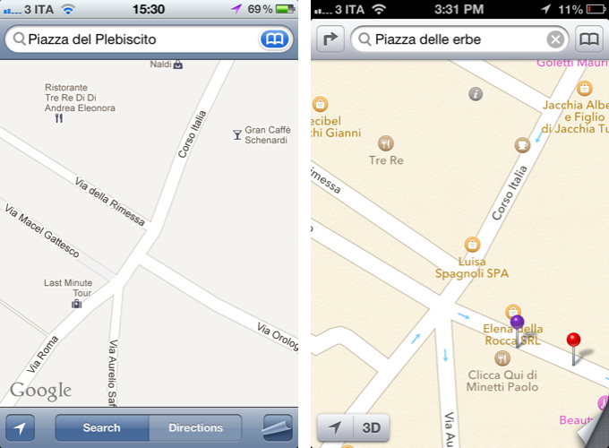
In my review of iOS 6 yesterday, I dedicated a section to Maps, comparing its features to those of iOS 5’s Google Maps product in Italy. Following yesterday’s launch, people have increasingly noticed that Maps, unlike Google Maps, is lacking in several areas like business listings, satellite views, Flyover accuracy, and more. Screenshots of Maps discrepancies with reality and plain-wrong data are all over the web.

In our Reading List in the sidebar (on the right), we’ve collected some of the best Maps-related articles from around the web.

There’s no denying that Maps will get better with time and usage. But unlike Siri, which Apple also said will get better with time, people have become dependent upon accurate maps for their livelihood. If I really had to nitpick, though, I, too, am curious to know how actually Apple plans to improve Maps without allowing customers to actively suggest other options.

Personally, I wonder how users who had (and will have) real-life issues like this would react to Apple’s statement.

Permalink

Use Term.ly As A Dictionary Pop-Up on OS X

Use Term.ly As A Dictionary Pop-Up on OS X

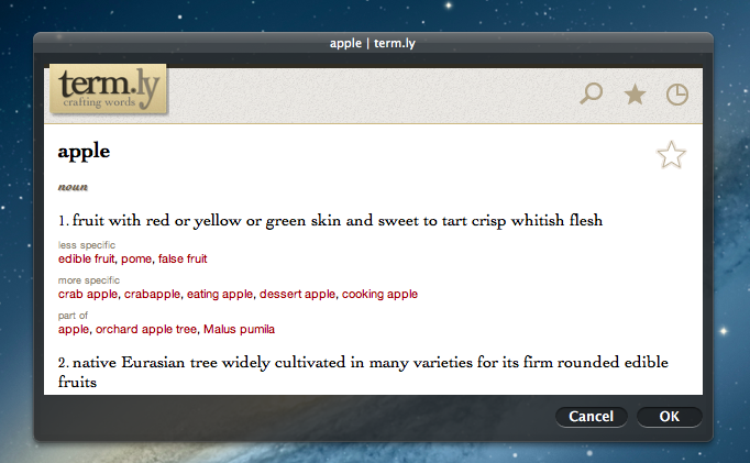
Earlier this week, Gabe of Macdrifter shared a great tip to use Term.ly, the dictionary service, as a pop-up to get definitions on OS X without opening the Term.ly website in the browser. His method requires building an Automator service that uses the “Website popup” action to display web contents inside a floating window, optionally using an iPhone resolution to get the mobile website.

I created an Automator service that allows me to select some text and then pop open the Term.ly definition as a small pop-over panel. I can then select a word in Term.ly and it will replace the selected word in my document and add the new term to my clipboard.

I like Term.ly because it’s easy to use, yet the content is focused and in-depth. For instance, the service will offer you “more specific” or “less specific” alternative words to choose from, and if it “understands” the word you’re passing along, say “tree”, it’ll also display options for “made of” (wood) and “member of” (forest). It’s really clever.

Gabe mentions it’s also possible to call the service using Launchbar. If you, like me, use Alfred instead, you can set up an extension that looks up words using Gabe’s workflow, as you can see in the screenshot above.

Term.ly is run by Agile Tortoise, which also happens to make two of my favorite iOS apps – Drafts and Terminology.

Permalink

On The Benefit Of iOS 6 Maps

On The Benefit Of iOS 6 Maps

Anil Dash, writing about his experiences with Apple’s Maps on iOS 6:

Here in Manhattan, where I live, basic search by building names is profoundly degraded in Apple’s maps search. “Bloomberg” doesn’t find the Bloomberg Tower; on Google Maps it’s the first result. Searching for its address “731 Lexington Avenue” yields that address on Lexington Avenue in Brooklyn. It’s fine to think that perhaps I wanted the address in Bed-Stuy, but even appending “NY, NY” or “Manhattan, NY” still yields the Brooklyn address. Google maps has none of these comprehension issues. I understand this is due to Apple partnering with Tom Tom, whose maps are considered to be lower in quality than other players like Nokia, but I’m not informed enough to say with certainty whether that’s the case.

In response to our iOS 6 coverage (my thoughts on iOS 6 here, Cody’s overview of Maps here) TomTom sent us the following statement:

TomTom supplies maps and related content to the majority of handheld players, including RIM, HTC, Samsung, AOL (MapQuest Mobile), Apple and, yes, Google (for the areas where they don’t make their own maps).

Our maps are used by businesses around the world, which have standards for coverage, detail, quality and safety.

When people use a map, their experience is determined by two things. Firstly, the underlying content, notably the maps. This is what TomTom is currently supplying the mobile industry with and it is what gives their maps the best foundation. Secondly, user experience is determined by adding additional features to the map application, such as visual imagery. This is typically defined and created by the handset manufacturers and third party software providers on the basis of their own vision and needs.

If I understand this correctly, TomTom is essentially implying that, because user experience is defined by “additional features” (such as Apple’s custom map tiles, I assume), then issues with the user experience are also related to the choices made by “the handset manufacturer”.

I do believe, however, that the problems mentioned by Dash (poor recognition of POIs, questionable detection of local addresses) – the same ones I mentioned in my piece – aren’t related to Apple’s “vision” and “visual imagery”. Here’s Business Insider yesterday, reporting about an interview with Waze CEO Noam Bardin (Waze is also listed in Maps’ copyright notices):

But Bardin says that Apple has taken a huge bet by partnering with TomTom, a maker of traditional GPS hardware that’s morphing into a mapping-data provider. Both TomTom and Waze are listed in Apple’s copyright notice as providers of map data. But Bardin’s observations suggest that Apple is relying predominantly on TomTom.

“Apple went out and partnered with the weakest player,” Bardin says. “They’re now coming out with the lowest, weakest data set and they’re competing against Google, which has the highest data set.

Ultimately, it simply comes down to having a good experience – no matter who puts in the data. But it’ll be interesting to see how fast Apple will manage to iterate on its new Maps.

Update: After asking whether issues with the visualization of maps were related to Apple’s imagery, TomTom provided us with an additional statement:

Yes, we did not develop the map application. Rather, we only provide the data to build a car-centric map foundation. Everything thing on top of that - routing, visualization, etc. - is determined by the supplier.

Permalink

iPhone 5 Camera Tests and iPhone 4S Comparison

iPhone 5 Camera Tests and iPhone 4S Comparison

As usual with new iPhone releases, Apple has created a webpage showing “actual photos taken with the iPhone 5”. It is available here, and it features a gallery of six photos with an option to view them in full-size (the iPhone 5’s camera shoots photos at at 3264×2248 pixels).

Curiously enough, Dpreview’s Scott Everett recently took a photo of Big Sur in California (the location pictured above) with an angle very similar to Apple’s one for the iPhone 5 (also embedded above). Because of this, Dpreview was able to closely compare the picture quality of the devices with the same subject. While the camera may appear to be the same, there are some notable differences.

Looking at the EXIF data of the images confirms Apple’s assertion that this is a new sensor, despite the pixel count remaining the same. Close examination shows the iPhone 5 is using a 4.1mm lens to give a 33mm equivalent field of view, rather than the 4S’s 4.3mm lens, which gave a 35mm equivalent view. This means the new sensor is a tiny fraction larger. The iPhone 5 has also selected ISO 50, 1/3EV below the 4S’s minimum sensitivity of ISO 64.

Last year, a Sony camera was found in the iPhone 4S’ teardown. Check out the 4S/5 comparison shots at Dpreview, and more iPhone 5 photos over at Apple’s website.

Permalink

Developers, Apps, And The iPhone’s Taller Screen

Developers, Apps, And The iPhone’s Taller Screen

Matthew Panzarino of The Next Web reached out to some iOS developers asking about the technical changes involved with a taller screen on the iPhone. As it turns out, adopting existing applications to the iPhone 5 will depend on how a developer chose to put his software together.

Some apps, ones that use a ‘table view’ element, will likely be able to simply “stretch the middle”, letting the table spread out to the top and bottom of the screen. But even those types of apps will need some tweaking before they’re completely fit to ship on the new iPhone. Apps that use custom graphics all around, like those with bespoke interfaces or many 2D games, will need a full revamp.

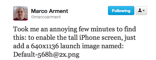
Apps that use “tables” – e.g. lists coded in the way Apple recommends – will be fairly easy to update. As several developers are already pointing out on Twitter, most apps will simply need a new “default image” that specifically targets the new iPhone’s 4-inch screen. However, other apps that present more custom elements such as 2D and 3D graphics will require more effort, as their entire interfaces will need to be redrawn for the extra pixels of the iPhone 5. It is likely that, for at least a few weeks, these apps will run in the “letterboxed” mode Apple announced today.

It’ll also be interesting to observe whether developers will slowly move away from placing UI elements at the top of the screen. First reports are suggesting the iPhone 5 is perfectly fine for one-handed use, but this could still become an issue for users with smaller hands who won’t be able to reach the area at the top.

Considering how this screen size will likely stay around for many years to come, developers surely have time to figure this out.

Update: Below, a simulation of an app updated for the new iPhone’s screen. The app is Filterstorm, and the screenshots were posted by its developer on Twitter.

Permalink

“iPhone 5”, “New iPod Touch and Nano” Appear On Apple’s Website

As noted by 9to5Mac, search queries for “iPhone 5” on Apple’s website are returning links to press releases and product pages that haven’t been released yet. With a media event scheduled for later today in San Francisco, it only makes sense that Apple is getting ready to update its website with information on the new iPhone, rumored to be a major upgrade to the iPhone 4S.

There’s been some speculation as to whether Apple would call it “iPhone 5” being the device the sixth iteration, but, at this point, there seems to be little doubt in regards to the monicker chosen by Apple. It could be a well-played “fake leak” orchestrated by the company, but it seems unlikely.

Other search queries for iPod Nano and iPod Touch reveal similar results, with links press releases and webpages not available yet.

This isn’t the first time Apple let product names and details slip a few hours ahead of media events. Last October, the “iPhone 4S” name, image, and release date briefly appeared on Apple’s Japanese website before they were pulled.

As noted by MacRumors, different search queries are also returning results for a press release called “Apple Unveils New iTunes”, dated September 12, 2012.


Favstar Redesigns

Favstar Redesigns

Favstar is one of my favorite web services. Alongside Evernote, Simplenote, Cue, and Dropbox, it has become an essential part of my daily workflow. Today, Favstar has launched a major redesign that will surely come in handy in monitoring tweets from tomorrow’s Apple event.

Favstar works with Twitter. By default, it monitors the “faves” and retweets your tweets receive, by which users, and when. It then provides a clean interface to access these statistics, and, aside from “ego-boosting” purposes, it can actually be a great tool to see the kind of tweets and content your followers like and engage with the most. However, if you decide to unlock the Pro functionalities for $30 every six months, you’ll gain the option to give the “tweet of the day award”, see older tweets in your timeline, see retweet details, tweak your profile, get custom notifications, and a lot more. For me, it’s 30 bucks well spent on a service that has enabled to understand Twitter besides wasting time making fun of Samsung.

Matthew Panzarino has a good overview at The Next Web about today’s redesign:

The tweet view now lets you see the profile pics of those who have retweeted/fav’d you, which is standard, or provides you with a detailed analysis of the first 1k retweets of a tweet, with the account, its followers, a profile pic and text profile for reference. This can be cool as it shows which accounts are ‘first responders’ in retweeting you, allowing you to perhaps reciprocate with a follow of your own.

The old Favstar was feeling a little long in the tooth, and the new version looks great both in terms of design and features. The new Favstar offers more data and simpler navigation; the mobile website has been updated to a new design as well, sporting a panel-based layout that’s a terrific improvement over the old Favstar. I use Favstar’s mobile site every day through Tweetbot (double-tap on the Profile tab), and this is a welcome improvement that doesn’t sacrifice any functionality of the desktop site.

You can sign up for Favstar here.

Permalink