This Week's Sponsor:

PowerPhotos

The Ultimate Toolbox for Photos on the Mac


Posts in links

A Web Developer’s look at Diet Coda

A Web Developer’s look at Diet Coda

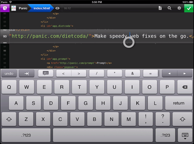
Diet Coda is great. Seriously. This app might not be your first choice to do serious work on (yet). However, if the only reason you’re taking your huge, heavy laptop with you on that otherwise relaxing vacation is just in case you get the 5-alarm-fire call from your boss because of a major bug that needs to get fixed RIGHT NOW (don’t they all?), Diet Coda and an iPad with an LTE/3G connection could be all you need.

Joesph Schmitt gives an honest perspective of the good, the bad, and what he’d like to see come down the pipeline for Diet Coda in the future. Diet Coda isn’t and shouldn’t be your replacement for a desktop app like Coda 2 or Espresso, but it is a fantastic companion touchscreen editor that it makes it relatively easy to dart around your projects and apply changes as needed. I’m trying not to take for granted having an always on-hand iPad app that lets me seamlessly implement changes as they come to mind — I think people forget that even having a tool like Diet Coda on the iPad is something special (especially when it has that quality Panic user interface behind it). If you’re looking for a reasonable review that weighs the pros and cons of Diet Coda, I’d say Schmitt does a good job of summarizing the praises and complaints — you’ll be well prepared as to what to expect concerning a mobile editor. As of now, Diet Coda is still $9.99 on the App Store, half-off during its initial launch period.

Permalink

Facebook Releases Standalone Camera App

Facebook Releases Standalone Camera App

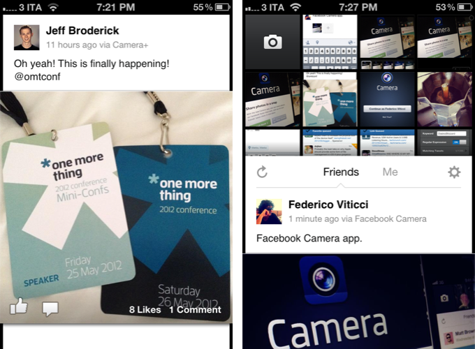
Facebook’s acquisition of Instagram raised eyebrows and foreshadowed the launch of a Facebook branded camera app, separate from the official Facebook application just as Facebook Messenger and Facebook Pages Manager are. Combined with the dream team of developers from Sofa, Facebook’s previous talent pull seems to have paid off with Facebook Camera, a central app dedicated to taking pictures, lightly editing photos, and uploading pictures to your Facebook profile. With cropping and straightening tools, the ability apply stylish filters, batch upload multiple photographs at a time, and view your friend’s photos in fluid streams a la the camera roll, we’re left astonishingly impressed with Facebook’s latest mobile application.

Facebook’s app makes it easy to take photographs, batch upload your images (up to 2048 x 2048 pixels), tag them, and apply up to fifteen different filters not dissimilar from Instagram. A vertical feed of large photos, expansive album views, and an engaging progression of composing photos to uploading your favorite shots makes Facebook Camera feel like a solid camera application. Many unexpected elements can be pulled and pushed onscreen to reveal or hide information, and the app is simple enough to be intuitive without feeling crowded like you would expect a management app to be. Facebook has a well balanced, thoughtful, and overall enjoyable app on their hands. Facebook users should love it.

From Ellis Hamburger at The Verge:

Facebook Camera just became instantly the best way to upload photos to the social network, just ahead of Batch and other competitors. It’s simple to take photos, tag them, and upload them en masse, which is something we’ve been asking for for a long time.

Animations throughout Facebook Camera are fluid, the app is fast, and there’s a lot of clever interaction to take advantage of throughout the interface — clearly Facebook’s acquired talents have been hard at work in making the app to not just feel like a boring extension of Facebook, but rather a necessary addition that belongs, no, deserves to be on a Facebook user’s smartphone. Facebook has made an incredibly bold statement with Facebook Camera — they’ve stepped up to the plate to deliver a solid application that doesn’t feel tacked on or only done for the sake of their platform. It’s a serious release. Just look at their landing page.

All Things D and The New York Times both have introductory pieces on Facebook’s latest app release alongside Facebook’s official announcement on their blog. We recommend trying the app for yourself by downloading Facebook Camera from the App Store. A lot of care went into this app, and we’ll have more coverage after we spend some time using what’s already given us a great impression.

Permalink

CheatSheet Quickly Lists an App’s Keyboard Shortcuts

CheatSheet Quickly Lists an App’s Keyboard Shortcuts

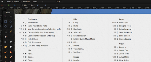
With Coda 2 from @Panic hitting the Mac App Store this evening along with Diet Coda, we’d be hard pressed not to share this simple utility from @MediaAtelier. CheatSheet is a free Mac app that displays an app’s keyboard shortcuts in an opaque pop-up in the vein of a Quick Look preview. Holding down the command key for a couple seconds brings up the entire list of shortcuts for the active application. While holding down the command key, you can click on commands with your mouse cursor to activate that command. If you want to learn all of the useful keyboard shortcuts to get the most out of your new applications, CheatSheet will be an excellent companion — it runs in the background without taking up menubar or dock space on OS X.

You can also check out KeyCue from Ergonis and Dashkards if you prefer additional options like custom global shortcuts, themes, or if you want your keyboard shortcuts to be listed in the Dashboard. For me, CheatSheet provides everything I need in an easy-to-read interface and easy-to-use keyboard shortcut suited for OS X.

Permalink

Drafts 1.2 Saves Quick Notes To Evernote, Facebook

Drafts 1.2 Saves Quick Notes To Evernote, Facebook

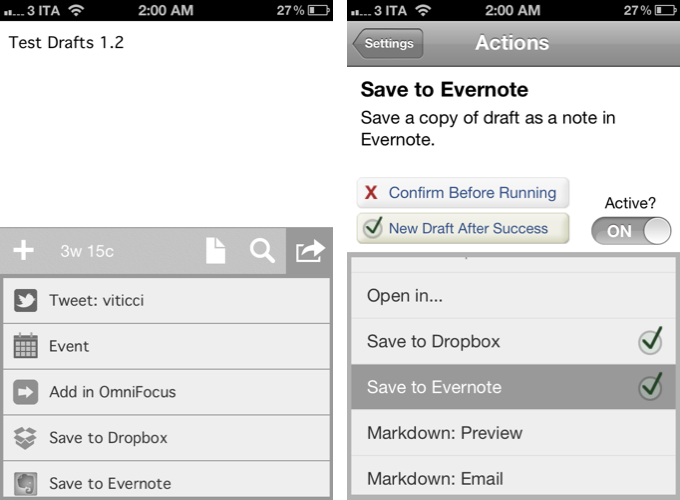
Agile Tortoise released version 1.2 of its “quick note-taking” app Drafts today, adding support for Facebook and Evernote. As an Evernote user, the addition is more than welcome, as I now have the possibility of quickly saving a time-stamped note into my account in seconds. Previously, I used FastEver for this functionality. I don’t post to Facebook much, but the integration sounds handy as well:

Like Drafts’ existing twitter features, this update adds the option to post drafts to Facebook. The first time you post you will have to go through an authorization process, allowing Drafts access to your wall – from then on out it’s a simple tap. Those of you that use the Facebook app know, launching it and waiting for it to load to post an update is cumbersome – now you have a quick alternative.

Other improvements in Drafts 1.2 include a new “new draft after success” setting, support for calendar event creation, and integration with OmniFocus notes and Due. These add to the new icon, fixes, and Dropbox support that came in Drafts 1.1.

Drafts is available at $0.99 on the App Store.

Permalink

Keyboard Maestro 5.3

Keyboard Maestro 5.3

I love Keyboard Maestro. It is one of my most used OS X utilities – I use it every day, I rely on it to automate processes and tasks that would take repetitive and tedious clicks and selections otherwise, and my work is ultimately faster and more efficient because of it. I have covered Keyboard Maestro in the past on MacStories, and after using the app for over a year now, it still feels like I’m just getting started with it. Keyboard Maestro offers an infinite amount of possibilities, because it is capable of automating almost every aspect of OS X.

With today’s 5.3 update, Keyboard Maestro gets even more powerful, and adds support for one specific area that is going to dramatically speed-up my workflow once again: image manipulation. From the press release:

Version 5.3 adds a bunch of new Image manipulation actions, allowing you to create new images, flip, rotate, resize, and crop images, composite images, styled text and shapes onto images, display images, get the size of images, and even find the image on the screen. You can also capture the screen or a window to an image, or highlight a location on the screen.

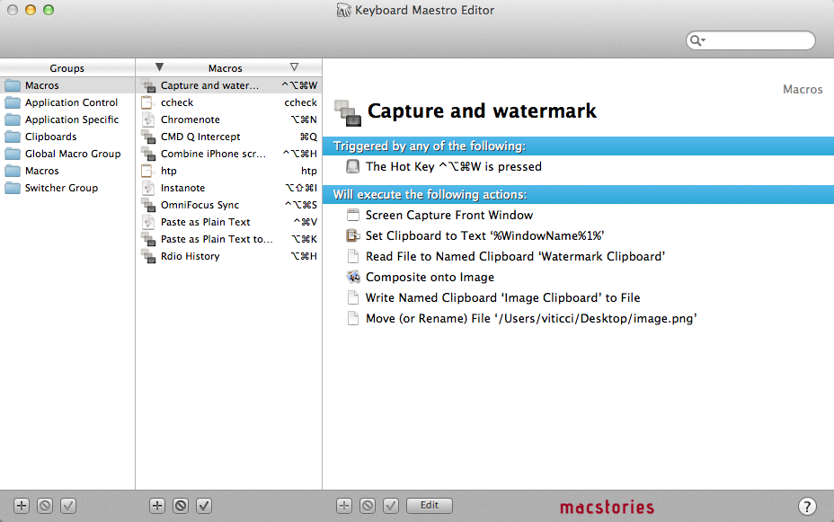
Let alone the other improvements of version 5.3 (here’s the full changelog), let me quickly focus on the image capabilities of the app, as I have set up two new macros that are going to substantially enhance my screenshot-taking duties for the site. Firstly, the image above: taken with Keyboard Maestro, set it to a specific clipboard, modified with the addition of a pre-defined watermark, saved as .png and renamed with (previously copied to clipboard) front window’s file name. Execution time: 1 second.

Then, iPhone screenshots. For iPhone apps, I like to take two screenshots, place them side by side, and generate a single image. Until today, I had to manually drag the image out of Photo Stream (or use Scotty), resize them with Preview, create a new image in Acorn, drop the images in there, adjust their position, and save. I came to the point where the process took less than a minute, but still it required a manual and boring effort on my side. Enter Keyboard Maestro 5.3: I rename the images I need to use “1” and “2”, respectively (“1” goes on the left side); I tell Keyboard Maestro to run an Automator workflow to scale them; Keyboard Maestro creates a blank image in its clipboard, composites files 1 and 2 onto the image at a specific pixel position, and creates a new .png file on my desktop. Like this one. I don’t need to manually switch between apps anymore as everything’s automated, and takes 2 seconds, literally.

Keyboard Maestro has a lot to offer, but that’s up to you. Check out the app’s tour, full documentation, then buy it from Stairways Software for $36.

Update 9/30/2012: Here’s an updated version of the “Combine iPhone screenshots” macro for the new iPhone 5 resolution. (thanks, @PiratXMac)

Update 10/7/2012: A better version of the macro is now available here.

Permalink

MacRumors Posts Leaked Photos Of Alleged Taller iPod touch Panel

MacRumors Posts Leaked Photos Of Alleged Taller iPod touch Panel

Eric Slivka, reporting for MacRumors:

In line with today’s claims of taller iPhone prototypes with 3.95-inch displays, one of our sources has provided us with images of what are claimed to be new next-generation iOS device parts being carried by a supplier. The most significant of these parts is a claimed front panel from the next-generation iPod touch, with the supplier claiming that the display would be taller than the current model and measure in at 4.1 inches diagonally.

Rumors of Apple gearing up to release a new iPhone with a bigger screen have been extremely persistent, albeit discordant in the past few weeks. Last week, The Wall Street Journal claimed Apple was ordering new screens for an iPhone measuring “at least 4 inches diagonally”; Reuters, on the other hand, said the new iPhone will measure “4 inches from corner to corner”. This morning, 9to5mac published a report claiming that Apple is internally testing an iPhone (codename N41AP) with a bigger, 640 x 1136 screen “very close to a 16:9 screen ratio”.

Of course, rumors of the iPhone getting a screen overhaul are nothing new. Here’s an allegedly leaked part from February 2011; a design document from March 2011; and here’s a report that, back in April 2011, suggested Apple’s “iPhone 5” (that turned out to be the iPhone 4S), would carry a bigger, 3.7-inch screen with a thinner design.

Since last year, we at MacStories have decided to refrain from posting the majority of “reports” and rumors that come out on a weekly basis depicting allegedly leaked parts, codenames, design documents, and theories from people familiar with the matter. Today’s photos from MacRumors, however, provide an interesting point of discussion as they effectively show a “leaked” component, and suggest Apple may be willing to increase the size of all iOS devices, not just the iPhone.

Check out the photos here.

For further discussion on the matter of iOS and bigger screens, check out Dan Provost’s mockups of a 16:9 iPhone, Rene Ritchie’s excellent roundup of possible ramifications for a 4-inch iPhone, and these other mockups from The Verge Forums.

Permalink

Alien Blue 2.1

Alien Blue 2.1

My favorite Reddit client for iPad, Alien Blue by Jason Morrisey, was recently updated to version 2.1, adding a number of functionalities (including iCloud sync, which will work alongside an upcoming update to the iPhone version) aimed at increasing the app’s Reddit-based discoverability features.

From Alien Blue’s subreddit:

Inside Alien Blue, you’ll now find a well curated and up-to-date list of active subreddits ranging across a wide variety of topics. This list is maintained and updated nightly. If you see something missing, you can make a recommendation in any of the categories and they’ll be live soon after.

To better leverage Reddit’s wide-ranging amount of information available every day, Alien Blue now lets you easily organize similar subreddits (sections of the site) into groups that are synced to iCloud, and will automatically carry over to the iPhone once the new version comes out. At first I didn’t get the usefulness of groups – I was used to accessing my most-visited subreddits through Alien Blue’s sidebar, which, by the way, in version 2.1 seems to be more reliable at switching between “compact navigation” and extended panels depending on whether you’re holding the iPad in landscape or portrait mode.

Subreddit grouping, however, has changed the way I use Alien Blue. Aside from the convenience of neatly categorizing similar subreddits in the app’s sidebar, each group can be turned into a “front page” collecting all the most upvoted links of each subreddit. This means that, for instance, I was able to create a “Learn” group within Alien Blue, throw TodayILearned, HistoryPorn, Wikipedia, and ExplainLikeImFive in there, so that when I’m in the mood of learning new things and cool facts, I can enjoy my own “Learn” Reddit front page made of the subreddits I grouped. It’s incredibly smart.

Check out all the improvements in Alien Blue 2.1 in the official announcement post, and download the app at $3.99 on the App Store.

Permalink

Chrome 19 Syncs Open Tabs Across Computers and Smartphones

Chrome 19 Syncs Open Tabs Across Computers and Smartphones

Google Chrome 19: Tab Sync

Google Chrome 19: Tab Sync

From the Google Chrome blog:

With today’s Stable release of Chrome, you can. When you’re signed in to Chrome, your open tabs are synced across all your devices, so you can quickly access them from the “Other devices” menu on the New Tab page. If you’ve got Chrome for Android Beta, you can open the same recipe tab right on your phone when you run out to the store for more ingredients. The back and forward buttons will even work, so you can pick up browsing right where you left off.

Signing into Google Chrome synced items such as your bookmarks in the past, but this release brings us closer to the continuity many of wish for with our web browsers: tab syncing between our devices. Google Chrome should automatically update in the background, but you can visit About Google Chrome in the wrench menu to manually update to the latest stable version. Chrome 19 is available today, while the tab sync feature itself is rolling out over the coming weeks.

Also updated in the latest version of Google Chrome is the apps Settings. The new Settings view makes seeing history and clearing out browsing data a cinch by moving them to the first menu. The Extensions sub-menu has pretty much stayed the same, but the Settings sub-menu now contains an expansive list of options you can use to set how Chrome tracks privacy data and how Google Chrome will connect to the Internet (this is where you’ll make Chrome your default browser as well). The options themselves aren’t new, but rather the presentation has been updated to show you general preferences first, while making advanced options a simple extension of the more commonly used browser settings.

In other Chrome related news, Google could be gearing up to release their web browser on iOS according to a tidbit found by Macgasm. If gushing over this mockup was any indication, we’ve been wishing for Chrome to land on iOS devices for a long time now. While Google hasn’t officially announced Chrome for iOS (we’re talking mere speculation), iOS devices may soon be able to take advantage of the tab syncing that was introduced in today’s update.

Permalink

Perian to Retire After a Final Update

Perian to Retire After a Final Update

From the Perian homepage:

We began the Perian project over 6 years ago. We wanted to simplify viewing your content. Our team has attained that goal and with that in mind, Perian will be retired soon. Our stewardship has been a blast but it’s time for all of us to move on.

When I first purchased my Mac, Perian was one of the must-have applications that should’ve been installed as part of your initial setup alongside Quicksilver, MacFUSE, and Growl. Perian, the can-play-anything System Preferences drop-in, was considered essential for anyone with folders of DivX files (even though it could play so much more). While Perian’s developers are dropping support for the over six year old product, the OS X community will have the chance to maintain the product once Perian’s source code is shared after development ends.

Starting 90 days after the final Perian release, we will no longer provide support. We’ll wrap up our loose ends, pack up our bags, and move on to new and exciting projects.

Perian’s developers are asking that the community step forward to handle support requests, and they are directing new users to download Niceplayer as an alternative. Perian should continue to work on Lion as time permits, but its compatibility with Mountain Lion is undetermined. The source code will be posted to Google Code or GitHub soon for developers to learn from. If developers are interested in maintaining Perian, the #perian IRC room on irc.freenode.net will provide a hub where developers can communicate, ask questions, and get in contact with the founders. As it stands right now, Perian’s development will end within the next few months.


Permalink