This Week's Sponsor:

PowerPhotos

The Ultimate Toolbox for Photos on the Mac


Posts in links


Dom Leca On UI Conventions and Sparrow 2.0

Dom Leca on UI Conventions and Sparrow 2.0

Sparrow’s Dom Leca on The Verge:

What’s the give and take between adhering to popular OS X UI conventions and going in your own direction?

I think there is a huge variety of design on OS X but the 2 main choices that a developer / designer really has are the orthodox way, sticking with the Apple HIG in a strict manner, or the Loren Brichter’s way.

I am not saying that there is no in-between. A lot of our inspiration in Sparrow comes from other developers who are not strictly following the HIG or Loren’s UI style. But like on the iPhone with the pull to refresh or the cell swipe, Loren created a new standard with its Tweetie core animation sidebar.

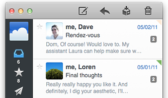
Jared Erondu has another interview with Leca today over at Macgasm today; in the article, Leca mentions some of the future plans for Sparrow 2.0, including a people-centric view for the desktop application:

The main idea we have for version two is that the concept of messages will be thrown in the background and people will take a central place. It will be a people centric app. You won’t look for the last message you received, but for the last people who talked with you. In terms of navigation, and the way you will treat your mail, the functioning of labels, folders and stuff like that – it changes the way it works a lot.

Sparrow may have borrowed a lot from Brichter’s Tweetie design, but in the past year the app has been constantly updated, adding innovative functionalities that you can’t find anywhere else (CloudApp and Dropbox integration for attachments is a personal favorite). Whilst Sparrow recognized Brichter’s UI approach as functional to what they were trying to achieve (switching accounts) and iterated on the concept blending that specific UI convention with new Lion elements, standard HIG stuff and their own vision, others have – unfortunately – blindly re-implemented Tweetie’s design adding little or no innovation to the mix.

This is what the first Sparrow beta looked like. With Sparrow for iPhone announced in August and now nearing the beta stage, I have big expectations for Sparrow in 2012.

Permalink

Slippery slopes

Slippery slopes

Good response by Marco Arment to my counterargument to his post about auto-renewal subscriptions and iOS technologies Apple doesn’t open up to developers (or at least the majority of them). I particularly like his proposed solution for Newsstand Kit’s push notification applied to other apps:

Newsstand Kit’s background-wakeup push notification can only fire once a day, and background NKAssetDownloads only work if the device is on Wi-Fi and has a healthy battery charge. So give all apps the ability to receive that background-wakeup push notification once a day, as long as the user has granted them permission to use push notifications. Then let them update or download whatever they can do in the 10 minutes that they’re allowed to run in the background. And if the system decides to terminate them during those 10 minutes for any reason, that’s fine, too.

Even without NKAssetDownloads, and even if Wi-Fi was required, this would be a huge benefit. Unlimited-time NKAssetDownloads are only required by magazines because so many of them are ridiculously bloated at hundreds of megabytes per issue, but a huge class of apps could download everything they need in a few hundred kilobytes over a few minutes, at most.

I still think auto-renewable subscriptions should be limited to a specific set of apps (and Apple must be clear about that – enough with the unwritten rules), but I have to say I’m intrigued by the idea of smaller lightweight downloads now.

Permalink

The OmniFocus for Mac 2.0 Wish List

The OmniFocus for Mac 2.0 Wish List

Sven Fechner of Simplicity is Bliss:

I hardly use the project or task notes as the UX choice made is too clunky for me. It is clearly a concept coming from OmniOutliner, which, using the Kinkless GTD Scripts, was the original source of inspiration for OmniFocus. However, it doesn’t really work for longer notes, any font size you chose for the note section is either too small or too big, if you insert attachments things start looking awkward, … In my eyes there are quite some challenges with the way notes are handled in the current OmniFocus UI.

I’d like to cut and paste Fetcher’s entire list of ideas for OmniFocus 2.0 here, but his complaints about notes (in both OmniFocus and OmniOutliner) hit the nail on the head and sum up the issues about giving ideas or tasks additional details.

The one challenge that OmniFocus and other apps face is mitigating how you manage an “everything box.” OmniFocus ultimately becomes and should become a sort of outbox where you follow up on email, gather your errands for the afternoon, and follow decisive actions to complete a project. Where the lines begin to blur is with contexts and details. Contexts are the sort of tags that specify either the person, thing, or place you need to be in to complete a task, and details are the additional reference materials or notes associated with a task.

If your task is concise and straightforward (you should never have to think about the action), you shouldn’t need any supporting details. This changes however if you need a reminder for an article (Paste attached note as a quote in “Apple Q1 2012 Results”) or if you need to attach a picture, lines from an email, or need to type out what someone gave to you in paper form. OmniFocus could really use a boost in how documents are attached. An icon inline with text or a full blown image that can get cut off due to column-width aren’t good ways to display supporting details for tasks and projects.

There are other good opinions in the article too. I personally don’t need or want themes in OmniFocus, but I would love to see better email handling and the ability create projects based off templates of pre-written tasks (you can sort of do that now, but it’s messy).

Permalink

The Logitech Cube

The Logitech Cube

Ricardo Bilton at ZDNet:

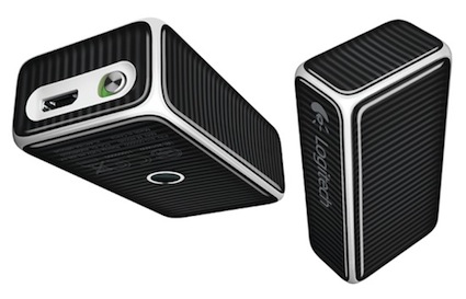
The first thing you’ll have to understand about Logitech’s interesting take on the mouse is that its not actually a cube, despite its name.

The second thing to know is that the Cube is meant to offer more than just a strange shape; it’s meant to be a presenter’s best friend.

Scrolling, for example, works via a swipe of the finger, a movement that’s meant to mimic touch screen navigation. Lifting up the device  puts it in presentation mode, allowing presenters to advance slides with the click of its top.

According to Logitech’s specification sheet it works with OS X 10.5 and up. The mouse isn’t a bluetooth device — instead it connects to a small USB nano-receiver (over the 2.4 GHz spectrum) that’ll work with a desktop you’re connecting to at a podium, or to a laptop that’s absent of Bluetooth. It’s more or less a mouse-mote in that it probably wouldn’t be comfortable to use as your primary mouse, but it’s convenient and pocketable enough to browse the desktop, open your PowerPoint or Keynote document, then pick up and use for the presentation.

It’s not clear what the battery life is on the remote (Logitech simply links to a battery life FAQ that lists mice with “extended battery life”), but I’m sure the built in USB-rechargeable lithium-polymer battery will get you through a presentation. There is an on/off switch so you can completely power-off the mouse while traveling.

Bilton notes you simply pick up the device to put the cube into presentation mode. You then click to advance a slide, or turn it over & click to go back a slide (I’m not sure if I’m keen on the second gesture). Being a presentation tool, I’m surprised there isn’t a laser pointer packed inside.

I could see myself using this, and the $69.99 pricetag isn’t too bad. You can pre-order the mouse directly from Logitech.

Edit 01/06/2012: Corrected battery note from double AA battery to rechargeable battery.

Permalink

Disruptions: Wearing Your Computer on Your Sleeve

Disruptions: Wearing Your Computer on Your Sleeve

The big headline for many Apple weblogs this morning comes from Nick Bilton of the New York Times:

Over the last year, Apple and Google have secretly begun working on projects that will become wearable computers. Their main goal: to sell more smartphones. (In Google’s case, more smartphones sold means more advertising viewed.)

The idea that Apple and Google are working on secret projects like this isn’t interesting, but what is interesting is the idea that wearable devices are going to be sold as main drivers for future smartphones sales. The incentive to buy a future iPhone or Android smartphone would be that it ties into a wearable device you must have.

The rest of Bilton’s piece is a wishful vision that the future holds for us an augmented reality where wearable devices, powered by our smartphones, better describe and organize information in the world around us. Wearable devices will become both fashion accessories and gatherers of information.

Apple has already asked their customers to affirm wether wearing the iPod nano as a watch was a good idea. Maybe the next iPod we’ll see will be an actual watch since we’re already half way there. The iPod nano isn’t either terribly functional or fashionable as a watch in my opinion, but it desires to be a combination of both. Will it be a selling point for a future iPhone in the near future? Doubtful. People have to get comfortable with the idea first.

The tech industry is just starting to introduce wearable devices onto the market. Jawbone’s UP works with any iPhone (and eventually any mainstream Android smartphone), and the Fitbit doesn’t even require a phone tether, but it does have a companion app. These products are successful not because they’re flashy, but because they’re discreet. The UP for example not only blends in with casual attire, but it doesn’t look like a wearable computer at all. It looks like a fancy bracelet.

Smartphones are becoming more common in today’s modern world. We often focus on flagship phones, but smartphones are close to simply becoming the default. No longer smartphones, but just phones. The question we have to ask ourselves at this point is, “What’s the next compelling and logical step?” I’m not sure upselling you a wearable gadget is the answer. Just look at the MOTOACTV for today’s comparison.

But something that’s discreet and functionally works to improve your lifestyle? We’re already doing this and seeking to make it better. Augmented reality might be the next step, but smartphone software will make this a commonality long before we have separate wearable devices doing so. In the meantime people want to quantify their lifestyles. Apple and Google might be working to make wearable gadgets fashionable, but I believe it’ll be companies like Basis who’ll be pushing the envelope of wearable devices with the Quantified Self. Health and mindfulness about ourselves is where the future of wearable devices is currently headed.

Permalink

Best Apps Of 2011: Giveaway Details

Last Friday we started the voting period for our search for the best iPhone, iPad and Mac Apps and Games of 2011. As part of that we also announced that we were conducting the biggest giveaway we have ever run on MacStories. Today we are giving everyone more details on what apps we are giving away and when. But first, a quick reminder that you can enter the giveaway by doing one (or all three) of the following:

  1. Vote (when you vote we first ask for your email address, just enter a valid email address and you go into the running to win some free apps).
  2. Tweet about the poll (use the text quoted below).
  3. Let your friends or family know about the poll and have them enter your email or Twitter handle in the referral box that is on the voting page.

MacStories Best Apps of 2011: vote now and enter our huge iOS & Mac app giveaway! http://mcstr.net/rVDwy8

Every day this week (from today till Friday) we will be giving out a number of (single) licence codes to apps in addition to 3 bundle packs which include codes for three apps - details can be seen below the break. In total, this represents of 250 codes that will be given away!

Vote Early

We’ll be randomly drawing entries for the giveaways once a day - but we won’t be limiting the selection to just those who voted on that day. Every vote will have a chance of winning every day. This means that if you enter before the end of today (Monday) you will have five chances at some codes - but if you enter on Friday you will only have one chance at winning.

Remember that you can also increase your chances by tweeting about this poll and by telling your friends and family about the poll (and getting them to put your email address in the referral box).


Sorry, voting is now closed. Winners will be announced on Saturday, 24th.

Read more


Touch Arcade Reviews Sonic CD for iOS

Touch Arcade Reviews Sonic CD for iOS

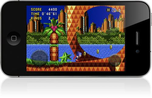
In a word, Sonic CD is incredible. It redefines what gamers can expect out of retro iOS ports, while simultaneously making all of Sega’s existing ports look absolutely horrid in comparison. The on-screen controls work great, the game performs even better than the original, and they’ve included not only the Japanese soundtrack, but also the American one. (Note: It defaults to the Japanese soundtrack, so if you’re wondering where the familiar “Sonic Boom” song is, you’ll need to toggle it in the options.) It’s even Universal. I can’t think of a single thing that’s missing or lacking in any way, in fact, they’ve even added Tails, who wasn’t even present in the original.

Sonic CD isn’t just a port of a Sega Genesis classic, but rather a complete rewrite for iOS. Being written natively for the platform, the experience is buttery smooth and the controls are solid. The folks at Touch Arcade wrote an in depth review of the iOS version of Sonic CD, which is available this evening in the App Store.

Permalink

The Game That Saved Halfbrick

The Game That Saved Halfbrick

You may recall an article we linked to a few weeks ago by Shifty Jelly, it was a post that detailed how the life of an independent developer isn’t exactly as glamorous as it sometimes seems. Their point was that the big success stories of developing for the iPhone aren’t universal. Nonetheless, Kotaku Australia today posted a long feature on Halfbrick, a small game studio that was close to closing its doors before it hit success with Fruit Ninja.

In early 2010, Halfbrick released a PSP mini called Rocket Racing. After years working on licensed titles for the GameBoy Advance and DS, they were finally working on their own IP. Rocket Racing received a lukewarm critical reception. It was abstract, sleek, complicated, and challenging. It was also a commercial failure. The studio had poured six months into developing the game — it was a heavy investment for a small studio — and it didn’t need a commercial flop at a time when things weren’t looking good for the Australian games industry.

It’s a fascinating and lengthy read that I encourage you to read for yourself. It goes into details about how Fruit Ninja was created, some of the influences for it and a bit about the company culture.

The studio has 50 employees, internally divided into smaller teams that work on their own games. So what was the transition like for the developers? How did it feel to go from working on complex PSP and Xbox Live games to back-to-basics iOS titles.

“It was so, so, so refreshing,” says Muscat.

Permalink