This Week's Sponsor:

Winterfest 2024

The Festival of Artisanal Software


Posts in links

Facebook 5.4

Facebook 5.4

The Facebook app for iOS was updated today to version 5.4, which includes the possibility to record and upload videos within the app, as well as sending voice recordings to friends.

The UI for sending voice recordings in private messages is interesting. You can tap the “+” button in a conversation to bring up a menu to attach a photo, snap a new one, send emoji, or create a voice recording. To create a recording, you have to “touch and hold” to talk; an audio file will be sent once you release the button, and it can be played inline in a conversation. It’s a very simple interaction. I don’t know if this is new in this version, but the “+” button rotates to an “x” when tapped – just like the “+” button in the OS X Dashboard used to rotate when clicked.

Because the file gets sent after the user lifts the finger off the screen, Facebook implemented its own way to cancel the action: you can swipe to the side while holding to cancel a recording in progress. Doing so will reveal a red “cancel bar” at the top of the screen as confirmation. Recordings can also be played inline on the Facebook website.

The improved Nearby tab is also well designed. With an embedded MapKit view, the Nearby section lets you check out “favorite places” in your area. Like Apple’s Maps app, Nearby has floating controls at the bottom to pinpoint your current location and hide/view a list of results. At the top, there’s a large button to bring up a search for places that includes categories like Coffee and Hotels, as well as your “History”. I like how moving the map around brings up delimiters to “Search This Area”.

Facebook 5.4 is available on the App Store.

Permalink

Nasturtium Player

Nasturtium Player

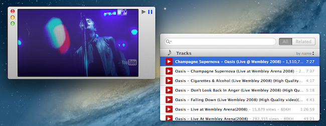
I first mentioned the public beta of Nasturtium Player back in November 2012. Nasturtium is an interesting take on an “iTunes mini player” mixed with a queuing system and a way to play videos from YouTube within a single interface. I wrote:

The concept of combining local music with YouTube videos resonates with my music workflow. While I tend to listen to music on Rdio, there are some older albums and songs that I need to keep locally either in iTunes or, most recently, Plex with PlexSync; similarly, there are YouTube videos of older demoes or live concerts of my favorite bands that I want to access every once in a while. I like how Nasturtium unifies search of local media and YouTube videos in a single interface.

Nasturtium has been out on the App Store for a few weeks now, and I like the improvements that went into the final version. There are keyboard shortcuts to control playback and playlists, and YouTube videos (while not resizable) now have preview thumbnails. Adding items to the queue is still as easy as hitting Enter, but you can also drag a song (from either iTunes or YouTube search results) into the main playlist interface, or use a “+” button. I particularly appreciate the possibility to collapse headers in search results to filter down results to Tracks or Albums (sorting options are also available).

As usual when trying new apps, it’s the care about small details that stands out to me. I like the thinking process that went into Nasturtium. The amount of minutes “remaining” in a playlist is available in the status bar at the bottom, but you can click it to show total minutes; similarly, while you can click the Play/Pause buttons to trigger playback, you can double-click the Play one to skip a track. As detailed in the app’s Help page, you can search by rating and genre as well simply by typing the information you need. I recommend reading more about the design process of the app here.

Nasturtium Player is $5 on the App Store.

Permalink

Evernote Image Extractor

Evernote Image Extractor

Nice AppleScript by Chris Sauve:

A recurring knock against Evernote has been its poor exportability. The best option for moving my library would have been to export the Evernote notes as HTML, but any images that were captured using Evernote’s web clipper come out with inscrutable names, each of which would have to be changed manually. So, I did what I have been doing lately: I built an Applescript.

Evernote is often criticized for its exporting options, but the app has been improved from this standpoint in the past major updates. For instance, I like how you can select multiple notes containing attachments and save them to a folder in the Finder. More importantly, I like how Evernote keeps supporting AppleScript and how they’re still introducing more scripting features (it happens rarely these days). Chris’ AppleScript is a great example: it offers a simple interface to pick a notebook containing notes with images, and it’ll export those images using the filename of their respective notes – not the name of the image files.

Go download it here.

Permalink

The Verge: Redesigning Google

The Verge: Redesigning Google

Excellent story by Dieter Bohn and Ellis Hamburger at The Verge on Google’s efforts to find a new design consistency across its apps, services, and platforms. Make sure to watch the video (as usual with The Verge, their video material is top-notch).

The central design metaphor that Duarte and the team eventually landed on was one he’d used before in webOS: cards. The cards in Google Now also show up in Google search, when it displays “Knowledge Graph” results on the web. In both cases, cards seem to represent the information Google gives you directly instead of through a list of blue links. Cards are like a digital equivalent to the traditional architectural concept of marrying form and function — so that the way a thing looks is inseparable from what the thing is. “These are objects,” Duarte says, “They feel, not necessarily real, but they feel virtual. They’re not trying to be fake things, not … fake leather, fake wood, fake brushed aluminum.”

Right now, I can count three Google apps on my Home screen: Chrome, Gmail, and Google Maps. I’ve always been a fan of Google’s Search app – the one that was actually well designed and intuitive before Google started redesigning its other apps – but I keep that on my second screen.

I like the design choices Google made in the past months, but I primarily use Google’s new apps for another reason: they work better than Apple’s apps for me. It takes seconds for Google Chrome to sync a bookmark or an open tab; I wish I could say the same for Safari and iCloud. Google Maps works better than Apple Maps in my area. The Gmail app isn’t perfect, but it makes going through Gmail faster than dealing with Apple’s Mail app.

It used to be that if you liked Google’s apps more than Apple’s ones and if you relied heavily on Google services, then you should have considered switching to Android. But I don’t want to switch to Android: I use some Google web services, but I like Apple devices and iOS for everything else. The iOS third-party ecosystem is thriving and a source of continuous inspiration and workflow improvements. iOS is my platform of choice, but Google is behind many of the services that I prefer.

For this reason, I’m glad Google found its design voice on iOS.

Permalink

TaskAgent for Mac

TaskAgent for Mac

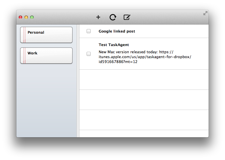
I like Francisco Cantu’s TaskAgent. It’s a simple iOS app that lets you manage to-dos as text files in Dropbox. I previously covered the app when Francisco released version 2.0 last year, and I also described how I was integrating it with my Dropbox writing workflow.

Francisco has released a first Mac version of TaskAgent today. The Mac app comes with the same settings of the iOS clients: you can link it to Dropbox, create multiple lists (which are actually multiple text files), move done tasks to the bottom of a list and new ones to the top. On the Mac, there’s also an OmniFocus-like “quick entry” to bring up a panel with a keyboard shortcut; from the panel, you can quickly add a task to a specific list.

There are some improvements that I’d like to see in a future version of the app. The interface is a bit rough and the app could use more polished toolbar icons; the quick entry panel should be automatically dismissed after you hit Enter; I’d also like to be able to drag & drop tasks between lists and have hyperlinks recognized as clickable. I am confident Francisco is already considering these fixes.

For existing TaskAgent users, TaskAgent for Mac is a worthy companion. The app is available at $3.99 on the App Store.

Permalink

App Icons

App Icons

Louie Mantia (former designer at Apple and Square, among others) has a thoughtful take on designing app icons:

Consider walking down a candy aisle at a drugstore. If you have a craving for Reese’s Peanut Butter Cups, you know how to find it. Of course, it’s the bright orange wrapper with a bubbly yellow word on it. Instant. Most candy bars have very distinct brands which can be instantly recognizable at a glance of the entire aisle. This should be precisely how you approach your app icon design.

An ideal app icon reminds users of an app through shape, color, and texture. Take the Phone icon, for instance. It has evolved a tiny bit since Steve introduced it in 2007, but has remained mostly the same. Today, it is a bright green, with diagonal stripes, and a white phone symbol. These three elements together (read: by our powers combined) form an instantly recognizable mark for users. When a user needs to use the phone, it’s a no-brainer.

I may have argued in the past that the iOS Home screen needs improvements, but I would never argue against a well designed icon. I use Alfred on my Mac to launch apps, but I also rely on the dock to quickly reach out to an app and make it visible. On iOS, I rely less on Spotlight (though I use it regularly) and I value the “recognizability” of icons in the Home screen.

Read Louie’s post about app icons here. His suggestions for new Zappos, Amazon, and Apple icons look great.

Permalink

Automattic Acquires Simplenote Creator Simperium

Automattic Acquires Simplenote Creator Simperium

As reported by AllThingsD, Automattic, the company behind WordPress.com and other products, has acquired Simperium, creators of popular note-taking app Simplenote.

This isn’t one of those talent acquisitions where the products aren’t part of the equation; Automattic expects to continue and extend work on both Simperium and Simplenote. “Simperium seems like a genuiune utility for our own apps and for other people as a service,” said Automattic founder Matt Mullenweg yesterday. “And Simplenote as a product I love and it’s just darn handy.”

According to Simperium, they will keep expanding their platform as a “tool for building apps”. They have already open-sourced the iOS and JavaScript components of their code, but it doesn’t look like the existing Simplenote apps will be going away any time soon. In a different blog post, the Simplenote developers explain how Automattic will help them “supercharge” Simplenote and bring it to more platforms:

You know how sometimes, the services you love just disappear when they’re bought by someone else? Or they wither and die a slow and painful death? Not the case here. We made sure of that.

Simplenote is one of the most popular third-party note-taking apps for iOS, with native clients for the iPhone and iPad that sync to a variety of desktop and web clients. On the other hand, Automattic has been criticized on several occasions for features lacking in its WordPress client for iOS, and it appears the Simperium acquisition will enable them to bring more intelligent and reliable sync to the app, though it’s unclear how and when.

You can read the details of the acquisition and transition to Automattic in the blog posts linked above. If you’re looking for Simplenote alternatives, Shawn Blanc recently shared his thoughts on the best note-taking apps for iOS and OS X. You can find our past coverage of Simplenote (including reviews of the apps) here.

Permalink

Watermarker 1.1 with Batch Processing

Watermarker 1.1 with Batch Processing

When my dear friend and MacStories writer Don Southard released the first version of Watermarker, I didn’t know whether posting about it here on MacStories would be appropriate. However, after I’ve come to use the app and know how much Don is committed to making it great, I now think not mentioning it would be a disservice to my readers.

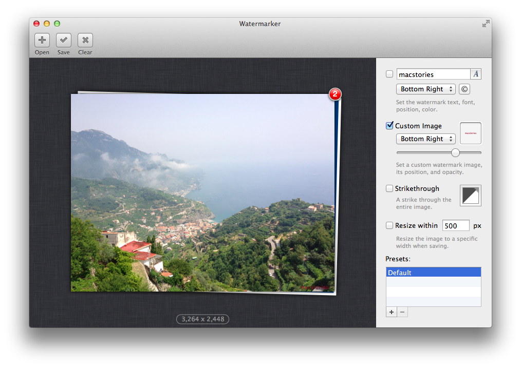
Watermarker provides a simple and automated way to add watermarks to images. You can choose between various options including text, your own logo, or even a customizable strikethrough. The app has a clean interface with the “canvas” (the area where you can drop an image) displayed on the left, and watermarking settings on the right. I like how you can save presets (so I can have one for my “large” MacStories watermark, another one for the smaller version), and the fact that an image’s size is reported right below its preview. Don’t take my word for it – I’m not the only one who thinks Watermark is a fine app.

Today’s update is particularly interesting for my workflow because it adds batch processing. You can drop multiple images at once into the canvas or dock icon (you can also drop an entire folder), and Watermarker will display a red badge in the canvas on top of your “stack” of photos (I wish I could click on the photos in the stack to select them). Once imported, you can set your watermark, and the app will apply it to all images at once; I like how Don also created a slider to set opacity for an image. To export, you can simply drag the images out of the canvas or save them. In both cases, a copy will be created.

I don’t like watermarking images, but Watermarker makes it extremely easy and fast. If I had to nitpick, I’d say that it’d be nice to navigate images in the canvas using the arrow keys (so you could still get a preview of the images you’re watermarking) and have AppleScript support for deeper automation workflows. Even without AppleScript, however, version 1.1 is a great improvement over Watermarker 1.0, which required you to import images one-by-one.

Go check out Watermarker here. The app is available at $7.99 on the Mac App Store.

Permalink

Create New Byword Notes From Mr. Reader

Create New Byword Notes From Mr. Reader

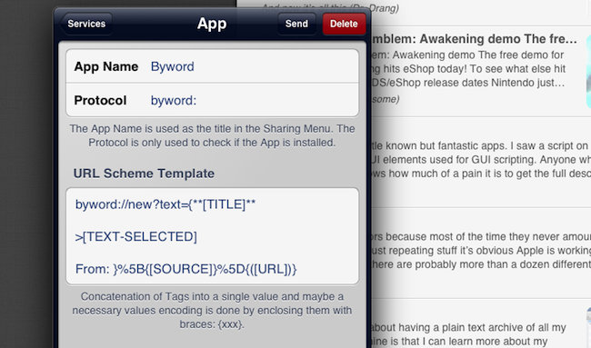
I’m a big fan of Mr. Reader’s new services menu. Through URL schemes (documented here), it allows the app – a Google Reader client – to send selected text, URLs, or article titles to other apps. One of the custom actions posted by the developer allows you to create a new note in Byword, possibly formatted as a linked post for your blog.

The action (which you can download here) uses by Byword URL scheme to create a new note. In the note, you can have the article’s original title, some selected text, and a source link formatted as Markdown. As shown in the image above, you can modify the template with any characters you want. For instance, I added a > character before [TEXT-SELECTED] to format the selection as a quote block in Markdown.

I personally use Nebulous Notes and Poster to create articles for MacStories on the iPad, but a lot of folks like Byword. Check out the Mr. Reader action if you’ve been looking for a way to send text and links from Google Reader to Byword.

(Bonus: here’s a quick video showing the action)

Permalink