This Week's Sponsor:

Winterfest 2024

The Festival of Artisanal Software


Posts in links

Temple Run 2: 20 Million Downloads In 4 Days

Temple Run 2: 20 Million Downloads In 4 Days

Imangi Studios has today announced that Temple Run 2, the highly anticipated sequel to Temple Run, has been downloaded over 20 million times in four days on the App Store. The original Temple Run was downloaded 170 million times across the App Store, Google Play, and Amazon Appstore.

Temple Run 2 generated 6 million downloads in the first day, making it one of the most successful iOS launches to date. Looking back at previous record-breaking numbers for iOS apps and games, Rovio reported 10 million downloads in 3 days, but on several platforms; the Google Maps app (also free like Temple Run 2) was downloaded over 10 million times in 48 hours. Imangi Studios also announced that Temple Run 2 is currently the #3 Top Grossing App on the App Store.

It’s no surprise that Temple Run 2 is doing well as far as in-app purchases are concerned. The game is clearly more optimized for IAPs, with unlockable upgrades, virtual items, and re-plays: if a player loses, he/she can choose to continue the same run using “gems”. Gems can be collected in the game, but they’re quite rare; the easiest way to get gems is to buy them. The “play again” menu is named “Save Me” and it appears in the middle of the screen every time a player reaches Game Over: it’s a very easy target to tap, it’s worded in a way to entice players towards continuing a run, and it mixes IAP with items that can also be collected in the game, albeit less frequently. For the developers, I believe it’s a very intelligent implementation of IAP (a subject we covered last year); for the players, it can become annoying because – as far as I can tell – there’s no quick way to dismiss the “Save Me” screen, which disappears after ~2 seconds.

Temple Run 2 is optimized for IAPs in other ways as well. Users can “like” Temple Run on Facebook or follow the game on Twitter to “get free stuff” (again, gems). In the in-app Store, they can buy coin packs, a “coin-doubler” upgrade, and gem packs that go from $0.99 for 5 gems to $19.99 for 500 gems. Unsurprisingly, the App Store page of the game reveals the top in-app purchases so far: the $0.99 5 Gem Pack, the $0.99 5,000 Coin Pack, and the $4.99 50 Gem Pack. I’d be curious to know the percentage of users who bought gem packs by following the “Save Me” button.

Speaking of Temple Run, make sure to check out The Telegraph’s interview with Imangi’s Keith Shepherd. In the interview, Shepherd talks about the history of Temple Run and their decision to rely on IAPs, but the first answer is my favorite. Making a game feel like a natural “extension of the player” has always been a top priority of another company that knows how to make games.

Permalink

Due’s Natural Language Input

Due’s Natural Language Input

I like Due. Both on the Mac and iOS, it’s a fast and easy-to-use reminder/alarm app with tons of options and iCloud/Dropbox sync. Due is simple yet powerful under the hood, as I’ve shown in my article on automating iOS.

I was playing around with Due again last night, and I noticed a nice detail worth its own mention here. Due supports natural language input for new reminders: you can write something like “Send email in 45 minutes” and Due will parse the “in 45 minutes” portion as a date input relative to your timezone. For instance, you can create a reminder on a Monday at 11 AM and write “in 2 weeks”, and Due will understand it’ll have to remind you after 14 days.

The way the developer got around parsing recognized language input is interesting. On iOS, if the app recognizes a date it will display it under “Set to…” in the title bar (a popover on iPad, as shown in the image above). Tapping that will set the date picker to your input. But there’s more: once set, you can tap again to remove the actual text from your reminder, because you don’t need the reminder’s name and date fields to say “in 2 days” at the same time.

Due for Mac comes with this subtle implementation as well. You can write something like “Meet Chris in 3 days”, hit Enter to accept the date, and the app will highlight the parsed text so you can hit backspace to delete it quickly.

It’s the little details that turn apps into great apps. Make sure to check out Due, and, if you’re geek enough, its powerful URL scheme.

Permalink

Predicting Apple’s Change

Predicting Apple’s Change

People have different opinions as to whether Apple should “change” or not. By “change” most people mean a “new hit product” or “changes to existing product lines”.

Here’s Michael Lopp, in November 2012:

Apple’s doom will start quietly and I doubt anyone can predict how it will actually begin. It will be historians who, decades from now, will easily pin its demise to a single event that will appear obvious given years of quantifiable insight. And it will only be “obvious” because the real details will have been twisted, clouded, or forgotten entirely, so it will all seem clearer, faster, and simpler. Their explanation will start with the passing of Steve Jobs, and they will draw a clear line to a subsequent event of significance and will say, “Here. This is it. This is when it began.”

John Gruber, last week:

Why just Apple? Why does no one argue that Samsung “needs” to unveil a major new disruption? What harm would Apple suffer if they spent the next five years refining and growing the products already in their stable? They’re already the most profitable technology company in the world, and their three major platforms — iPhone, iPad, and Mac — are all growing. They don’t need to change a damn thing.

John Siracusa, in our interview:

Apple needs to at least select its next big mountain to climb, even if it won’t be scaled for years to come. In 2012, Apple made louder rumbling noises about TV, but didn’t commit to anything. In 2013, Apple needs to put up or shut up about TV.

Apple also needs to start diversifying the iPhone line (as it did with the iPad mini this year), beyond just keeping old models around for sale.

Clark Goble, in response to John Gruber:

Here’s the thing. Not that long ago you could have said the same thing about Microsoft. However ten years ago I think the signs of their decline were already starting to be obvious. Fast forward to today and PC sales are stagnant, Win8 is a disappointment, their phone/tablet strategy failed, and Bing is still losing billions of dollars.

With Apple the signs are there too. Network services that still don’t work right and are unreliable. Design that seems to have lost that Apple strength of cutting out the unnecessary. They don’t “just work.” Important product lines that have gone ages without needed updates. (Numbers, Pages, Keynote, and arguably even iTunes since iTunes 11 was a disappointment to basically everyone) Even Apple’s famous ease of use and simplicity met its match with iOS’ system preferences.

I see both sides of the argument. For a company that was revolutionized by breakthroughs in innovation, it’s hard to imagine how they can avoid other major groundbreaking products for the next years. But on the other hand, with their three major platforms growing, why would Apple need to change anything now?

I think people have diverging opinions that are difficult to reconcile, both technically and philosophically. In the long term, perhaps Lopp is right – historians will look back at decades of Apple and understand what went wrong at some point in time. In the short term, perhaps Gruber is right – nothing needs to change.

I’d take a “the truth lies somewhere in the middle” approach. Apple is healthy, profitable, and still growing. But there are areas where they have shown they’re not infallible, such as services. They have problems that are far beyond leather textures and witty Siri jokes. I believe it’s fair to be concerned about Apple’s weakest areas, but I don’t think they spell doom for the near future. It would be silly to ignore those problems, just like it would be absurd to think Apple can go bankrupt next year. There are too many factors at play to ascribe today’s concerns as the single reason Apple “needs to change”. But it doesn’t mean we shouldn’t be criticizing Apple’s problems, or proposing better ways to solve them.

We can only wait.

Permalink

Dolphin Browser With Evernote Clipper

Dolphin Browser With Evernote Clipper

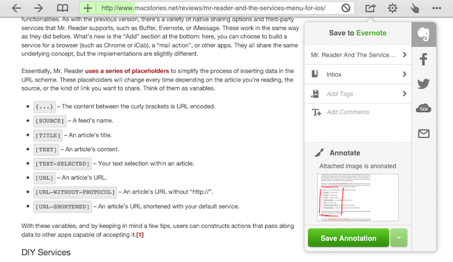
Dolphin, an alternative browser for iOS that I covered in 2011, has been updated today to version 6.0. Google Chrome is my go-to browser on iOS, but I had been testing this new version of Dolphin because of one feature: a native Evernote clipper.

Dolphin comes with lots of features and design choices, some of which I don’t like (case in point: the tap & hold popover menus). Given how Chrome keeps my tabs in sync across the iPhone, iPad, and Mac, I have no use for Dolphin’s Connect service and extensions. However, the built-in Evernote integration intrigued me as no major iOS browser to date has offered a native clipper for web content: some of them offered a bookmarklet-based clipper, but the experience of clipping URLs and text selection left much to be desired. Dolphin’s clipper is baked into the app, and it’s accessible from an action button in the toolbar.

The Dolphin clipper automatically grabs a webpage’s title and current selection (if any). It uses your default notebook as destination, and it lets you add tags and comments to a clipped item. Like the desktop Evernote clipper, you can save a full page, or just an “article” if the app recognizes you’re trying to clip a blog post. One thing I’ve noticed is that, in spite of my attempt to clip rich text, web clips from selections were sent to Evernote in plain text; when I chose “save full article”, Dolphin saved the page as rich text into Evernote, and quite beautifully as well.

A feature I really like is the possibility to annotate webpages before sharing them. This works with other sharing services in Dolphin, not just Evernote. There’s only a red brush and an eraser to choose from, but it’s enough to draw attention to a portion of a page and save it as a 768x924 .jpeg file in Evernote.

If you’re an Evernote user and have been looking for a better iOS web clipper, check out the latest Dolphin Browser for iPhone and iPad.

Permalink

Mute All iOS Notifications

Mute All iOS Notifications

Lex Friedman, writing about an iOS feature (or lack thereof) that has annoyed me for months as well:

Thus, what I’d like to see is the ability to silence notifications permanently in specific apps. I can envision a few ways configuring such a setting might work: The mute switch could appear in Notification Center, perhaps only if—as on Mountain Lion—you scrolled up past the visible top of the list; if you’re in an app when you visit that switch, it could optionally be a setting limited only to the current app itself. Another option might be a listing of all your apps tucked away in the Notifications section of the Settings app; you could select the specific apps on that list in which you never want alerts to appear.

Whenever I play a game on my iPad – especially one of those that require attention and precision like Fruit Ninja – I always wish iOS had a simple setting to “mute all notifications”. Do Not Disturb has been a nice addition to iOS 6, but it hasn’t made silencing all notifications while a device isn’t locked any easier.

I see some pros and cons for wanting a) a setting that mutes all notifications at once or b) one to selectively mute notifications on app-by-app basis. The latter is admittedly more intriguing in its promise of granular control over the kind of apps that can display notifications (in my case, I’d mute notifications in Fruit Ninja, but I’d leave them while I’m in Google Chrome); however, we’ve already seen how the iOS Settings app is already complex enough. On the flip side, while being easier, the more general “mute all” option could become annoying over time (what if I forget to turn it off once I turned it on? Do I have to open the Settings app every time?).

It’s difficult to imagine how Apple can keep adding controls to the iOS Settings app without substantially altering its presentation, choices, or, perhaps more importantly, quick access. Better control over notifications is another aspect I’d add to my iOS 7 wish list.

Permalink

“Open In” and Mobile Safari

“Open In” and Mobile Safari

Continuing the discussion about the “Open In” menu for iOS, David Chartier proposes “Open In” for Safari URLs:

Finally, Document Sharing in Mobile Safari would further promote an app-centric workflow on iOS. Bookmarklets are often designed to open another web service in a new browser tab, and let’s face it, working on the web is a crummy experience. But even if they’re wired to open an app, bookmarklets are still a colossal pain to install which cuts off most attempts at the knees. This largely confines Mobile Safari and its content to an island, making iOS’s URL-to-app workflow needlessly tedious for anyone brave enough to try it.

In its current form, Mobile Safari only supports “Open In” for documents displayed in the browser, such as PDFs that Safari can render. The (new in iOS 6) share sheet doesn’t come with options to send a URL around, but only to copy it to the system clipboard.

Bookmarklets were never meant to take off among consumers, because they require a minimal amount of knowledge (or steps) that average users don’t want to deal with. However, developers had to resort to using bookmarklets because it was the only way to provide something that worked to pass a URL from Safari to a third-party app/web service. Some developers have gone out of their way to provide an “Install Bookmarklet” experience that wouldn’t scare off the majority of users.

Overall, “Open In” for links doesn’t sound like a bad idea. Imagine being able to quickly send a YouTube video to Facebook or a link to the Twitter app with an Apple-sanctioned menu and not some JavaScript hack. There are aspects I don’t know how I’d solve right now (How do supported apps appear in the iOS 6 share sheet? Are they available in a dedicated page, or can users re-arrange them? Could Siri be told to perform such actions?), but, generally speaking, providing better web-to-apps communication would be a good start.

Two years ago, Marco Arment offered some ideas on a possible “Send To” panel for Safari. This is absolutely still relevant today, because it hasn’t gotten better.

Obviously, that would be far from my envisioned iOS automation for power users. I’ve been trying the beta release of Alfred 2 lately, and I like how the developers created a workflow visualization that is both powerful and intuitive in the way it connects visually triggers to actions and outputs. Ideally, I’d love to see Apple considering an “Automator for iOS” – the kind of feature that most users don’t care about but that would likely make a subset of them reconsider iPads as “real work” machines. Apple could even go as far as making that kind of user automation look “cool” with the right interface decisions and a powerful inter-app communication layer that is not limited to Apple apps (read: with an API).

I hope this kind of stuff is in the cards for iOS 7.

Permalink

“Open In” Is Not The Solution

“Open In” Is Not The Solution

Ben Brooks writes about iCloud and file management:

The only thing that iCloud really needs is an iOS style “open in” dialog for transporting files around. Add that dialog to all iCloud enabled apps and I can’t see any need for Dropbox if you stay within Apple’s “world”.

And this is yours truly, almost a year ago:

I think the same iTunes File Sharing feature would work a lot better as a dedicated, native iCloud app for iOS devices (and maybe the Mac too). After all, if Apple is providing an iTunes-based file management utility for Mac users, why couldn’t they build an app that enabled any third-party iOS app to save and import files from iCloud? This app would be built into the system and allow users to simply collect documents, like iTunes File Sharing. Developers could easily add options to their apps to import files from “iCloud File Sharing” and export files to it.

After a year of trying to rely on iCloud for document management, I’ve come to the conclusion that “Open In” is not the solution. The problem is still the same as September 2011: duplicates.

Decades of computing have shown that the filesystem is the single most complicated aspect of managing documents for the majority of users. People forget about “where they put stuff on the computer” all the time, and others keep simple levels of hierarchies because going deeper into the filesystem is, for them, annoying, “dangerous”, complex, or a combination of all these factors. In this regard, Apple’s “silo” model had a liberating effect: here are your documents, available in an app with a nice icon that you can immediately recognize.

However, the silo model – as opposed to the central “Finder” repository of files – has one big drawback: communication between silos. Therefore “Open In”: a menu that copies a file from Location A to Location B, getting from one document to two documents, now available in two different locations. And I would argue that the second most complicated aspect of managing documents is: figuring out the “right” version of a file.

Suppose you want to annotate a photo and save it in the Evernote app for iOS. You know that the iPhone’s Camera app sends photos with iCloud Photo Stream to the Mac, and they end up in iPhoto. From iPhoto, you know you can drag your photo out of Photo Stream and drop it into the Desktop, which creates a copy of the photo. Double-click it, and it launches Preview, which you know has the Annotate feature. There, you can add arrows and bold red text. Preview has this big iCloud library, but it doesn’t sync to the iPhone because there’s no Preview for iOS, otherwise you’d have used that instead. By the way, you’ve just saved the annotated image to the Desktop, but you can’t drag it back into Photo Stream on iPhoto because that’s read-only. Eventually you either give up and install Dropbox, start using the Evernote Mac app that you don’t like, or email the photo to yourself and use “Open In” or “Copy” from Mail for iOS to add another version of the file to Evernote.

You just used five apps and created four copies of a file (two of them are iOS Camera Roll + Photo Stream) to annotate a photo. Lather, rinse, repeat for note taking, PDF reading, electronic bill management, and assembling that nice slideshow of your vacation in Italy. Plus all those other things.

iCloud’s promise is powerful, and file management should be easier, but “Open In” is not the solution.

Permalink

1Password 4.1

1Password 4.1

A new version of 1Password for iOS has been released on the App Store, and it contains several fixes and improvements, including some that I suggested in my initial review of the app. Aside from sync improvements and Display settings (I can now set Inconsolata as my password font), I particularly appreciate the possibility to double-tap on a tab on the iPad to go back to root view, and search in portrait mode on iPad. It is no longer needed to tap & hold on rows on item view to show the popup menu, and tapping a secure note shouldn’t bring up the keyboard anymore (as I mentioned in my review, I found that behavior confusing). If you have attachments in secure notes, they’ll now be shown as well in version 4.1.

My favorite feature of 1Password 4.1 is the new URL scheme. There are two types of 1Password URLs: one for search, and another to quickly open a website into 1Password’s built-in browser. The search URL is: onepassword://search/ followed by your search string. You can easily configure this with Launch Center Pro’s keyboard prompt to automatically bring up a search for an item in 1Password starting from Launch Center Pro. If you launch 1Password via URL scheme while it’s locked, 1Password will obviously ask you for the master password first, then proceed to visualize results that match your search.

The URL scheme for opening websites is far more useful for me. You can prepend “op” to a normal Safari URL (so it’ll look something like “ophttp://”) to open it directly into 1Password. For instance, typing ophttp://google.com in Safari will launch Google in 1Password’s browser. Therefore, I made a bookmarklet that you can click in Safari to open the current website in 1Password even faster; simply create a bookmarklet with this code:

javascript:window.location='op'+(window.location.href);

…And 1Password will launch the website you’re currently viewing. I tested the bookmarklet in Safari and Chrome for iOS; it has become a huge timesaver to quickly log into websites that I access on a frequent basis.

There are many other improvements in 1Password 4.1 that make the app faster, more stable, and that fix some of the graphical glitches that I mentioned in my review. There are some subtle additions as well, such as different colors for digits and symbols in the password field when a cell is selected. 1Password is one of my must-have iOS apps, and make sure to check out the new 4.1 version on the App Store.

Permalink

App Store Screenshot Changes

App Store Screenshot Changes

Earlier this week, Apple announced a change in iTunes Connect for developers: app screenshots will be “locked” to an approved app, and developers may only change them upon submitting a binary for an update to an existing app (or new app). This has quickly been summarized as a way to slow down a popular tactic for App Store scammers; on the other hand, it also affects legitimate developers, who will now have to more carefully select app screenshots.

Craig Grannel comments on the change:

Users can now look at an App Store grab and be sure that’s the app they’re going to get. This means they will be more likely to trust the system and more likely to use it. That leads to increased income. The compromise: you can’t change your App Store grabs approximately every six seconds

This is one of those changes with consequences that are clearly visible and direct for those who follow development and App Store news, but more nuanced and indirect for the general consumer. Developers will find the change annoying, because it has become common practice to “tweak” screenshots even after an app has been released to highlight different features and/or include text overlays with quotes from positive reviews, and so forth. Now screenshots will perhaps be treated more like app icons, which have to be chosen and studied carefully upon submitting an app. Developers now have less chances to “get screenshots wrong”, unless they want to submit an app update to fix them.

On the flip side, this is the kind of news that average users won’t care about. The billions of App Store downloads are made by people who have no clue about scamming strategies and who definitely don’t read Apple’s developer news. They trust Apple to provide a quality App Store experience, they don’t know about the inner workings of iTunes Connect. This screenshot policy won’t be directly noticed by consumers, but it will help Apple provide a better experience by crippling a common trick scammers used to sell one app for another.

What’s the solution? Enabling a “trusted developer” tier could be an idea. But then again, how does Apple determine “trusted developers”? By making them pay more, or by manually selecting companies they know and trust? And if the latter solution is feasible, how can a kid with a legitimate idea become “trusted” if he has no connections at Apple? Should there be a “request verification” process? And so on.

As the App Store grows bigger and older, dealing with thousands of sellers will become harder for Apple; sooner or later, they’ll have to face the fact that the current App Store infrastructure wasn’t built for a million apps. That is already true for search and curation. Trusting more and more developers is just another consequence of growth.

Permalink