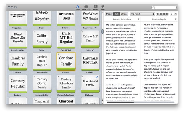
Fresh off the letterpress, Fontcase 2.0 succeeds its previous design with grace and elegance, wowing us like any great font would with a tailored design built for the 22nd century. Re-imaging the font case with the kind of class only a design built for Lion could brag about, comparing fonts underneath the new Fontcase hood embraces a simpler restyling with basic (yet intuitive) drag and drop finesse. Curate your fonts with the font manager that’s re-writing Apple’s Font Book into an interface anyone from the casual web developer to the mindful graphic designer can appreciate: the focus is always on previewing fonts, and never on extraneous UI or flashy features. There are, however, some delightful surprises waiting inside the second generation of this svelte, font briefcase.
Posts in reviews
Fontcase 2.0: Rewriting The Rulebook On Typography
CloudApp 1.5 Released With Lots Of New Features
Popular desktop sharing tool CloudApp – the app that was once teased “every Mac user’s dream” – is receiving a major update today that sees the release of the app in the Mac App Store for the first time since the January 6th grand opening, and the addition of several new features built on top of a complete rewrite aimed at making the app more stable, faster, and better integrated with OS X. CloudApp 1.5, available for download here, is a milestone update that turns a simple utility to share screenshots and files on the Internet into a full-featured “clipboard in the cloud” that now works in real-time, and can plug directly into a Mac’s system clipboard.
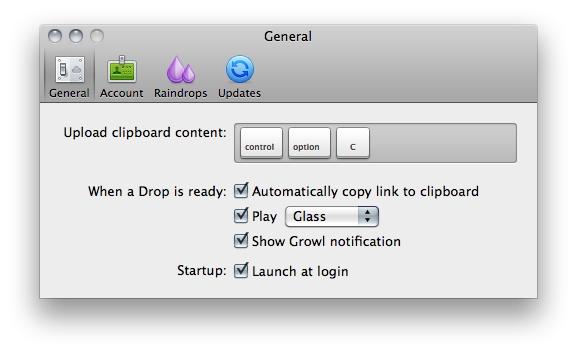
The first version of CloudApp, released last year, allowed users to quickly share almost anything on a Mac (links, images, documents, .zip files) by hitting a hotkey that sent selected items to the cloud, automatically returning a short URL to share with your friends on Twitter, Facebook, or email. What made CloudApp stand out from the crowd of Mac sharing utilities (like Tinygrab or Droplr) – elegance of the design aside – was the powerful Raindrop system that enabled developers to build plugins that connected CloudApp with other third-party applications like Chrome, Aperture, Photoshop and iTunes. With a single desktop shortcut, users could instantly share a .png of the Photoshop project they were working on, post a link of a song playing in Spotify, or shorten the URL of the frontmost browser window. And if you selected multiple files in the Finder and hit the shortcut, CloudApp would upload them simultaneously, too. Not to mention the fact that there was an option to automatically upload any new screenshot taken with the Mac’s Grab utility, and check out most recent files’ view count in the menubar. CloudApp 1.5 still has all these features, only they’re backed by a new Streaming API and a second hotkey that doesn’t require Raindrops, but simply uploads the latest item in your Mac’s clipboard, whatever it is.
As seen in the latest Cloud2go update, the Streaming API means files and shortened URLs pop up everywhere (desktop app, web, mobile clients) as soon as they’re shared, and the view count in the menubar and webapp updates in real-time as well. The app is constantly communicating with its servers to push recent items and display how many users have clicked on your links. Alongside bug fixes, however, the biggest new feature is the separation of the Raindrops’ keyboard shortcut and system hotkey: whatever you copy with the standard CMD+C action can be accessed and uploaded by CloudApp using a second shortcut that gets the latest entry directly from your Mac’s clipboard. This is incredibly handy in my opinion as you don’t have to rely on app-specific raindrops and conditions – you just copy something like you normally do and hit a shortcut to upload. It works everywhere, and it’s fast. The Raindrops are still there, though: they’ve been improved with an official SDK and update notifications, and I’m told new raindrops to upload new files from a specific Finder folder and QuickTime recordings will be released soon.
Overall, CloudApp 1.5 is a solid update that dramatically enhances the functionalities of the app. While retaining the simplicity that made the app popular in the first place, CloudApp 1.5 adds a series of new features that extend the app’s capabilities to a whole new level, making it extremely integrated with Mac OS X. Get it here.
Planetary: Your iPad’s Music Library Becomes A Galaxy
In what might be the coolest music experiment that has landed on the iPad to date, company Bloom Studio released earlier today Planetary, a new way to explore your iPad’s music library. Bloom Studio promises to deliver “playful, explorable, visually compelling views on personally relevant information from services like Facebook, Twitter, Instagram, and iTunes”, and Planetary is the realization of this mission statement: not only it’s based on the crazy concept of turning your iPad music library into a galaxy, it also works exceptionally well. Since I got my eyes on the teaser website a few days ago, I was looking forward to trying the actual product and see whether it could really bring a different way of exploring music to the tablet: now that I’m using the app, available for free, I have to say Planetary is one of those apps you have to try for yourself, rather than watching in some YouTube demo videos.
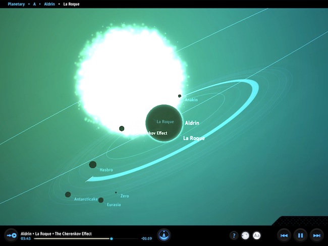
So here’s the gist: your music is a galaxy, artists are stars, albums are planets. In the 3D view of Planetary, no two planets are the same as the graphics are generated automatically off an album cover from the iPod app. Similarly, songs are moons: the more you listen to a song, the bigger the moon grows. And there’s more: each moon orbits at a speed related to the song’s length. Indeed, crazy stuff that doesn’t really make any sense until you try it. But on the other hand, it’s clear Bloom Studio set out to create an interesting experiment based on data visualization that merges files synced to your iPad, music, and space. I’m sure Buzz Aldrin would be proud.
While Planetary features some standard music controls like play / pause and back / forward, the key area of the app is support for multitouch gestures: you can pinch the galaxy to zoom on a star, pan and rotate a planet to check out all moons and orbits – overall, do all sorts of zooming and viewing to enjoy the pleasure of having your music available in the form of a galaxy. Like I said above, you just have to try it and see how it works with your music.
At the price of free, Planetary needs to be downloaded now and experienced with a rich iPod library synced to your iPad. Personal recommendation: for greater results, try to sync some Explosions In The Sky.
Review: Driver Feedback App Evaluates Your Driving Performances
Following recent news of Apple building a crowdsourced traffic service to launch in the next few years, it’ll be interesting to see whether competitors and third-party developers will start playing around with more car-oriented and traffic-based services for iOS devices. Insurance company State Farm – which I had never heard of before, but it turns out they’re pretty huge in the United States – released a new iPhone app a few days ago that’s aimed at monitoring your driving performances and giving you a score based on various factors like braking, acceleration and cornering. The concept is really simple: the worse you drive (severe acceleration or braking, for example), the lower score you get at the end of the test. How does the app keep track of all this? Again, simple: it uses a mix of Google Maps, iPhone accelerometer and GPS data to see where you’re going, and how you’re driving. I took the app for a spin tonight to see whether or not it would really work with the awful road that connects San Martino al Cimino to my town, Viterbo.
The app starts up with a screen that asks you to create a new user profile, although everything stays locally and it’s not sent to State Farm’s servers. You can create as many profiles as you want for all members of your family who drive and would like to try Driver Feedback. Once a profile is ready, the app will also ask you to place the iPhone on a flat surface in your car but not on the dashboard, so you won’t be distracted and the iPhone’s accelerometer can work properly to register brakes and stops. Tonight I decided to drive a little faster than I usually do (75 km/h on average instead of the usual 60 km/h on the aforementioned terrible road) to see if Driver Feedback could really give me a bad score once I arrived at my destination. Once you’re ready to go, all you have to do in Driver Feedback is wait for a sound effect (a countdown related to the iPhone being placed on a flat surface, luckily I have one in my VW Polo) and start driving.
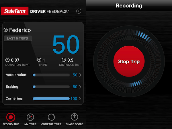
It usually takes me less than 10 minutes to drive from San Martino to Viterbo. As I decided to drive relatively worse tonight (of course, without putting anyone to risk) to evaluate the app’s functionalities, I didn’t consider that it was raining, badly. So it turned out to be a pretty awful 7-minute car trip that I honestly won’t repeat ever again. And the app did notice after I was done: I got a 50/100 score with multiple severe acceleration and braking points, and lots of suggestions to improve my driving in the future. Driver Feedback can even keep a log of all your trips and it allows you to check out data points on a Google Map, too. In the Alerts tab, the app explains what you did wrong and why you should improve your driving style, whilst the main screen offers an option to share scores via email or text. The UI is minimal, and elegant.
From what I’ve seen so far, Driver Feedback is a well-realized product that might really help you fine-tune the way you drive. I’d like to see more factors being considered in the future (such as traffic, or weather conditions), but as it stands now State Farm’s Driver Feedback is a cool app for drivers, and a useful product to remind everyone that good driving can save gas, and lives. Go download the app here. Read more
TweetyPop Is Like Time Machine For Twitter
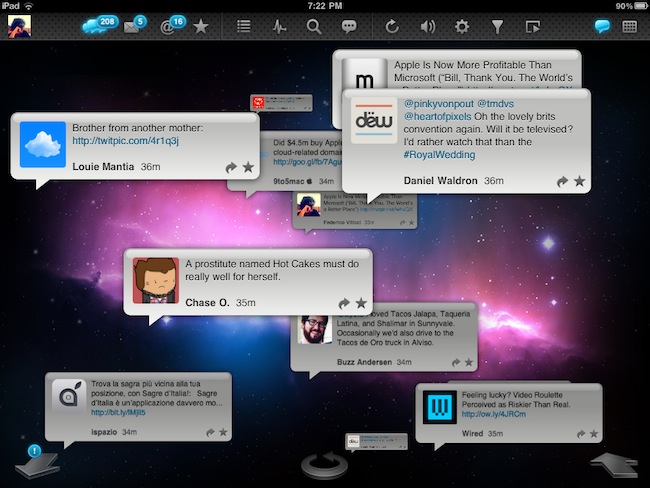
Released yesterday in the App Store at $1.99, TweetyPop wants to offer a different way to read your Twitter timeline and interact with status updates. While regular Twitter clients like Twitter for iPad, Twitterrific and Osfoora are focused on empowering you to read tweets in a vertical timeline which you can interact with to reply, fave tweets, or just discover cool links to check out later, TweetyPop resembles the Mac’s Time Machine in the way it operates: tweets are placed on a three-dimensional space, and you have to move the tweet “bubbles” with your finger to fling them off the screen and move forward in the timeline. Just like Time Machine, you make progress in time: only you have tweets instead of files and you can do stuff with these tweets, too.
The app’s got a traditional list view as well, but that’s not really the point. What TweetyPop wants to achieve – and I guess the reason why the developers created it in the first place – is being the alternative app that lets you sit down and explore Twitter in time. A scrollbar on the right lets you quickly move to a couple of hours ago or a just a few minutes back; big arrows at the bottom allow you to dismiss old tweets and load new ones, or go back in time again. The concept’s really simple if you’re used to Time Machine or Lion’s Versions. In fact, the app’s even got the same space-inspired background that you can’t change. Once you get the hang of it – you can scroll, move tweets around, reply, fave and follow links – you might want to check out the additional icons along the top. These buttons enable you to use Twitter’s usual functionalities like replies, DMs and favorite tweets, as well as lists, trends, or search. In every section, tweets are displayed as bubbles against a Time Machine-esque timeline like in the main page. This might be a little disorienting at first for mentions and direct messages, but I believe TweetyPop wants to disorient you, in a good way. It’s very, very different from anything else I’ve tried on the iPad in a year of existence of the platform.
I also like the fact that the app’s got some interesting options to play with. You can send items to Instapaper or OmniFocus, filter the timeline by “all tweets” or “new tweets only” and enable auto-play to let the app automatically scroll for you and create a slideshow for your tweets. The slideshow speed is configurable in the settings.
At $1.99, I’d give TweetyPop a try if only because it’s different. Sure, it won’t replace Twitter for iPad or Twitterrific, but it has the chance to become that alternative Twitter app that does one thing well and surprises you with its original ideas and interactions. Plus, the time exploration effect for tweets is just neat. Go download the app here. Promo video below.
Terra Is A Powerful, Free Alternative To iPad’s Safari
Currently the #1 free app in the iPad App Store, Terra Web Browser is one of those apps I didn’t know if I should take for a spin at first. There’s no shortage of alternative browsers for iPad: from the excellent iCab Mobile (which I use on a daily basis) to more innovative solutions like Sleipnir, it’s very easy to achieve the perfect browsing experience on the tablet if you think Safari is too limited and you’re willing to spend a few extra bucks. It needs to be mentioned, however, that unofficial browsers don’t get access to the latest Nitro Javascript engine goodness, and there’s no way on iOS to set a default browser other than Safari. Still, many users like me feel like having a (perhaps slower as far as webpage rendering goes) browser companion to Safari is necessary for more complex tasks like saving files locally, or displaying open pages as tabs under the main app’s toolbar. Again, iCab is quite possibly the perfect app if you’re looking for desktop-like interactions on the iPad.
Back to Terra, it comes from the guys behind ReaddleDocs and Calendars, and it’s free. I was a little skeptical at first because I really don’t need another browser on my iPad, but for what it does and for its current price, I have to say Terra is a really good app. All those positive ratings in the App Store can’t be completely wrong, after all. The app’s got a minimal interface with tabs, and you can go fullscreen with the tap of a button. Unlike many, many other apps that try to replicate fullscreen mode with semi-transparent icons on top of a webpage, Terra places a single button in the upper right corner. If you want to focus on something you want to read, hit fullscreen and forget about it. Thanks to the implementation of multitouch gestures, you can switch between open tabs with a three-finger swipe. The top toolbar gives you access to the usual functionalities of an iOS browser, such as address bar, refresh button, Google search, settings, bookmarks and action button. In the settings you can set a passcode for the app, choose to navigate in incognito mode (your cookies and history won’t be saved), change the user agent and modify the selected search engine. You can also import bookmarks from your computers, but you’ll have to use iTunes File Sharing for that. Bookmarks, history and “saved files” are located in a bookmarks popover on the left, but I couldn’t figure out how to export my Chrome’s bookmarks bar to Terra. I guess I’ll have to properly edit my exported .html file to make it work. The action button has got some interesting features as well: you can create a new bookmark, AirPrint a page, save a page locally for offline access, mail a link or forward to Safari.
What most impressed me about Terra, though, is how it handles tabs. Not only the app is stable and can handle dozens of open pages just fine (tested last night, 13 open tabs and none of them reloaded after several minutes of navigation), it’s also got a nice popup menu that will show a webpage’s full title as you tap & hold a tab. If you have a lot of open tabs and you can only see the favicons, that’s quite handy. Switching between tabs is not as fast as iCab, but it’s more than acceptable. The animations are smooth and, overall, the system works well.
Terra for iPad was a surprise. The app is free, but it does a lot of things better than many apps priced at $2.99 and above, without sacrificing its minimal approach to UI and responsiveness. Get it here.
Music Hunter: Intelligent Music Discovery For iPad
If there’s another industry the iPad is disrupting (together with media consumption, digital reading, medical applications – you name it), that’d be music discovery. The category isn’t nearly as popular as news readers and social aggregators and RSS apps, but two apps that came out in the last months which I also reviewed here on MacStories, Aweditorium and Discovr, are leading the way towards better, more interactive, beautiful discovery of new artists and songs on mobile devices. Where Ping failed at empowering people to share, buy and discover new music, apps like Aweditorium make it super-simple to “touch” music you’ve never listened to, explore genres and albums you didn’t know you might be interested in, share the results with your friends on Twitter and Facebook. The iPad does its job extremely well in this case: with a large screen that’s meant for swipes and taps, it easily becomes a piece of glass functioning as a wall for music. Like those walls in guitar shops advertising this week’s shows from those unknown bands your friend keeps talking about all the time. Here, that’s what music discovery on the iPad is all about: the intertwinement of social, digital stores, and personal taste.
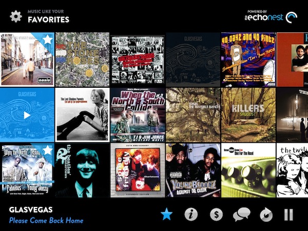
Music Hunter is the latest entry in the music discovery market for the tablet, and at $0.99 it offers a sweet way to find new songs to purchase later on the iTunes store. While Aweditorium and Discovr are based on indie artists and correlation between music you already know, respectively, Music Hunter starts up with a window displaying two sliders: one for genres, one for styles. As you move the sliders, you can get to results like “high energy hip hop” or “90’s electronic music” that will load a wall of artists with the first song picked for you. The results are generally accurate as they’re based on the echonest engine, the same infrastructure that powers Discovr for iPad. Like Discovr, song previews are fetched from iTunes and a button allows you to quickly jump to the store and hit Buy. You can scroll through the wall to see more songs and previews, or mark something as favorite and start exploring from there as the app allows you play “music similar to your favorites.” There’s no support for AirPlay (unlike Aweditorium), but you can check out quick artist bios from a popup window that can be activated from the bottom toolbar. What I like about Music Hunter is that it packs a lot of features: you can search, adjust the settings at any time (and thus load other genres and styles) or aggregate different artists and music styles into the Favorites for the ultimate personal playlist. Everything’s really minimal and good looking.
If you’re a fan of Aweditorium and Discovr, Music Hunter is the app to add to your collections of music discovery tools. It’s elegant, well integrated with iTunes and “intelligent” in the way it aggregates results from echonest. Go download the app here.
Percolater: A Visual Take On Feed Reading
There are mostly three ways to read articles coming from the web on the iPad nowadays: with an RSS reader; with social aggregators like Flipboard or News.me; with Instapaper or Read It Later. While aggregators and read later services are actually ways to plug into a social stream or a website, respectively, to fetch content to consume on an iPad, RSS is the most direct way to interact with a website: you log in with your Google Reader credentials, and you get the most recent feeds from your saved sources in chronological order. There are several great RSS apps for iOS out there, but the biggest problem of RSS is that articles lose their original “feel” – the way they look on a website as the author intended. Percolater, a $4.99 news reader for the iPad, wants to be an alternative that’s entirely based on the opposite concept: getting articles the way they would look in a web browser.
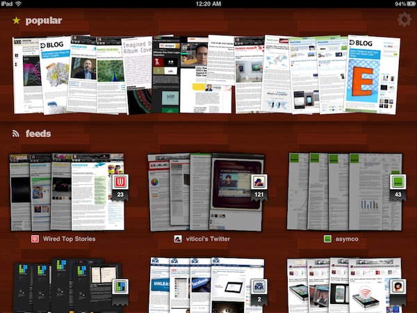
As the developers write in the app’s iTunes page, Percolater gives you the Internet “unprocessed” and “unfiltered.” Articles aren’t fetched in the form of textual excerpts or brief summaries with accompanying images: rather, the app loads a thumbnail preview for each article of your favorite sources, and allows you to swipe through these visual previews as if you were scrolling through the pages of a magazine – only the magazine is made of pages that look exactly the way they’re rendered in a web browser. Indeed, everything’s unfiltered. Including images, video, and ads.
Percolater can get content from your Twitter and Google Reader accounts. On the top section of the main page (which has a wooden background), the app also displays “popular” content it found on the web on a specific day, but I’m not sure how this section works. Maybe it gets the most popular articles from your Twitter account, or maybe it just runs a Google News search. You can import all your sources from Google Reader (and edit them later in the Settings), but you can’t add specific Twitter streams like users, favorite tweets, or lists. I wish Twitter integration went to a deeper level – as it stands now, Percolater only gets links from your timeline and renders them as browser previews in-app. So what happens when you tap on a thumbnail? You’re brought to another view that displays these “images” of articles stacked on top of each other, and you navigate between them with a vertical swipe. Alternatively, you can go back to the main screen with a horizontal swipe. The original tweet is displayed below the preview, and the quality of images is generally acceptable – obviously they’re not saved in super high-resolution, but it’s enough to get a glimpse of an article without reading it. If you do want to have a broader view of a post, however, you can tap on the preview to see the full-sized image Percolater saved. Tap the browser icon and, boom, Percolater loads the original link in a real browser window – meaning it will let you select text and do all the stuff a regular browser allows you to do. You can also share articles on Twitter or send them to Instapaper.
Percolater isn’t a product for everyone and it’s not perfect either. The app could use some speed optimizations and more Twitter functionalities, as well as a few fixes to reduce crashes on heavy load when the app is refreshing multiple sources at once. Still, Percolater is an interesting app in the way it puts the focus on the real web you see with a web browser. The app is available here at $4.99, and I’m looking forward to future updates. Read more
iPhone App Transmits GPS Data to WiFi iPad Using Personal Hotspot
Back in March, a series of reports from several blogs and publications claimed a WiFi-only iPad connected to an iPhone via Personal Hotspot was able to receive GPS data through the established connection, even if the iPad itself didn’t have any GPS capabilities. If GPS data was being transmitted thanks to Personal Hotspot, many speculated getting a 3G iPad was basically useless as the last advantage of internal GPS could be replaced by an iPhone and proper tethering. With Personal Hotspot and wireless GPS data transmission, many said, users could install navigation software on a WiFi-only iPad and obtain GPS points thanks, again, to Personal Hotspot and iOS 4.3. However, while the reports about WiFi iPads displaying semi-accurate locations in the Maps app were accurate, rumors about GPS and Personal Hotspot were quickly debunked as, it turned out, a WiFi iPad couldn’t rely on tethering for location purposes for more than a few minutes, as also demoed on video here. Rather, it seemed like a WiFi iPad could get location info while on the move thanks to WiFi access point and hotspot discovery – considering the recent debate on Apple and location cache, this doesn’t surprise anymore.
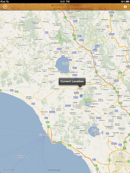
As it usually happens in the Apple community, though, what started as an inaccurate report or a simple proof of concept eventually turned into an app available for download on the App Store. AirLocation, a $0.99 universal app released today, enables WiFi iPad users to achieve the workflow described above: once connected to an iPhone using Personal Hotspot, an iPad running AirLocation will be able to fetch accurate GPS data from the iPhone and update your location in real-time as you move. AirLocation will have to run on the iPhone as well in order for the whole setup to work. I’ve personally tested the application during a 20-minute car trip to Viterbo, my town, and it really works as advertised: although AirLocation doesn’t come with all the features of the Maps app for iOS, it does keep track of your location in real-time on the iPad using GPS and it didn’t stop working after a few minutes. I could see the blue dot indicating my location moving on screen at the same time of the iPhone, which was transmitting data via Personal Hotspot.
AirLocation doesn’t come with many functionalities, but it does one thing well: getting accurate GPS data with iOS 4.3’s Personal Hotspot. Get it here.


