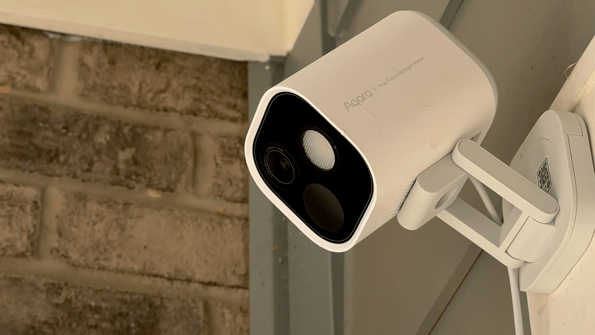
I’ll cut to the chase: Aqara’s G5 Pro is the best HomeKit-compatible camera I’ve ever used. The device’s capabilities go far beyond its HomeKit integration, and I’ll touch on those below. However, given how hard it can be to find high-quality hardware like the G5 Pro that works with HomeKit Secure Video, that’s been my primary focus while testing this camera.
Posts in reviews
Rugged, Reliable, and HomeKit-Ready: A Review of Aqara’s G5 Pro Outdoor Camera Hub
Mela 2.5 Adds Web Search Engine and Recipe Import from YouTube, Instagram, and TikTok Videos
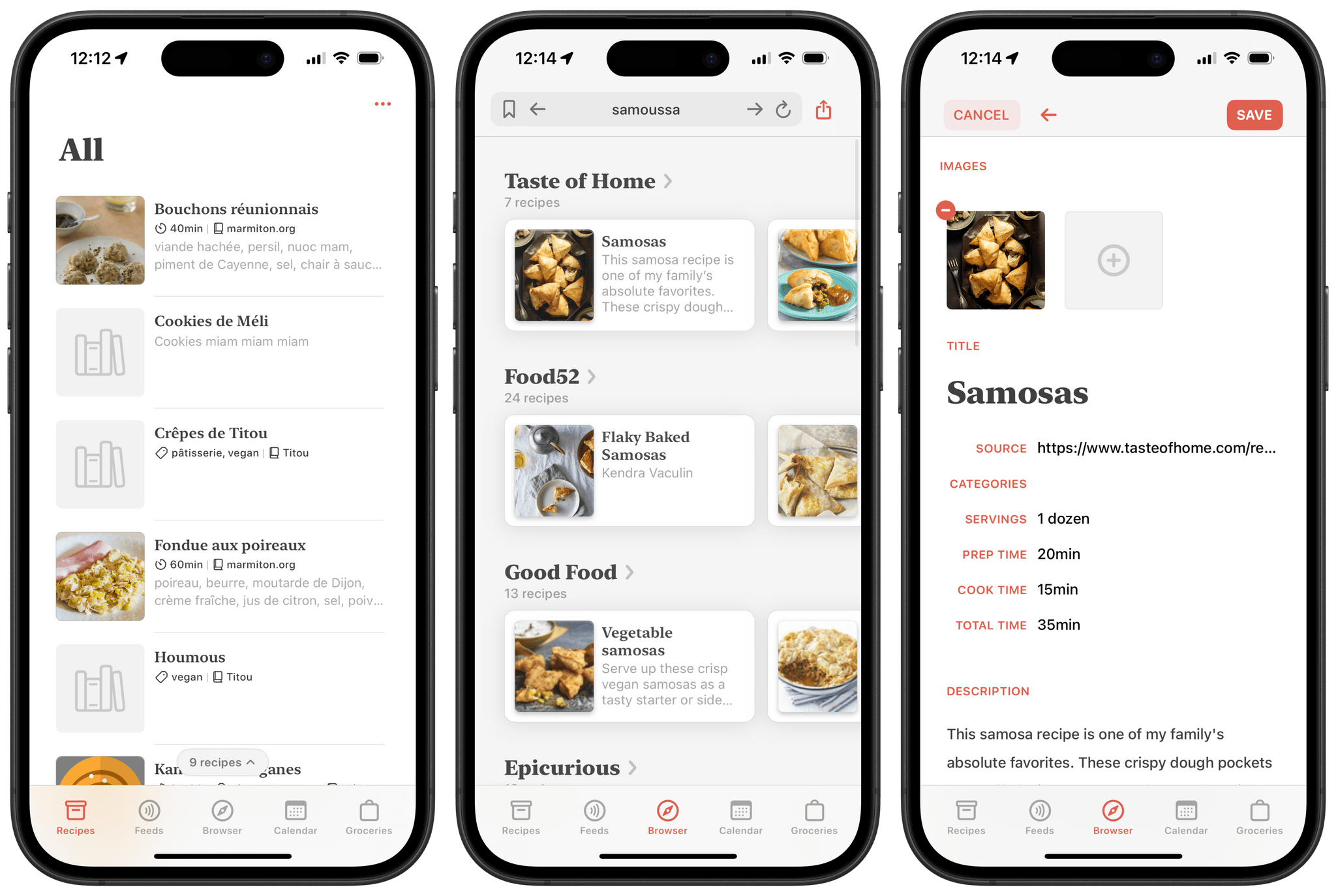
Back in 2021, Silvio Rizzi, developer of the all-time great RSS client Reeder , released Mela, an app for importing, collecting, and sharing recipes. Right from the start, Mela stood out as a delightful take on the recipe app genre. Just like Reeder, it features a beautiful design and is a joy to browse and use. The app originally shipped with the ability to import recipes directly from the web, subscribe to RSS feeds, and even scan recipes found in physical cookbooks and magazines. Combining those features with its built-in tools for converting measurements and dynamically adjusting meal sizes, Mela truly cooked up the perfect recipe (pun intended) for becoming your one and only cooking app companion. You can check out John’s original review of the app on MacStories to learn more.
This month, Mela was updated to version 2.5 with several improvements, including an option to search for recipes on the web using a new native recipe search engine and the ability to import recipes from video descriptions on YouTube, Instagram, and TikTok, all of which have become popular platforms for discovering and sharing cooking ideas. This new version takes the app’s web scraping capabilities even further than before, and I was curious to see how it fared.
Let’s check it out.
Game Tracker: A Powerful App to Track, Organize, and Customize Your Videogame Library
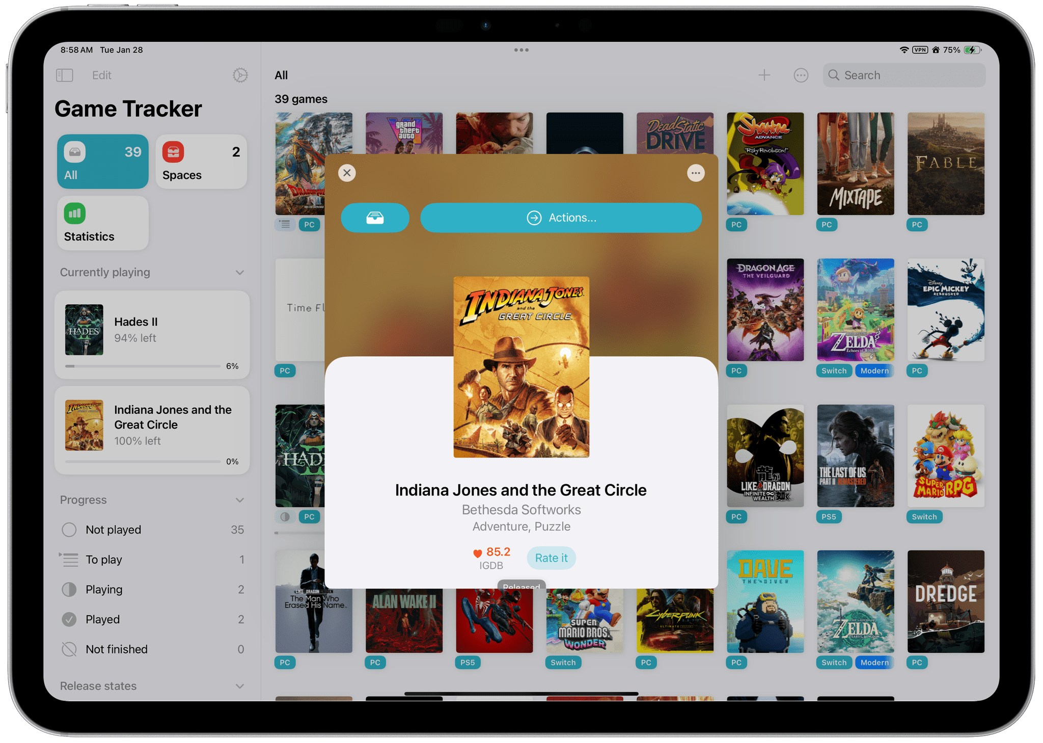
Game Tracker is a new videogame tracking app for iPhone, iPad, and Mac from Simone Montalto, who is probably best known to MacStories readers for developing the excellent Book Tracker. In fact, Montalto has created an entire suite of tracking apps that also includes Movie Tracker, Music Tracker, and Habit Tracker. That experience with various tracking apps shows with Game Tracker, which does a fantastic job of tailoring to the particularities of videogames and leveraging metadata to allow users to make the app their own.
Let’s take a closer look.
BANG!CASE: Push-Button iPhone Automation

I’ve been intrigued by the BANG!CASE ever since it was introduced by Bitmo Lab as a Kickstarter campaign about a year ago. The case includes a programmable button that can be used to automate actions using your iPhone’s accessibility features. However, because I don’t normally use a case with my iPhone, I never followed through on buying the BANG!CASE.
Fast forward to early January at CES when I visited the booth for JSAUX, an affiliate of Bitmo Lab. In addition to JSAUX’s portable displays and gaming accessories, the company was showing off the BANG!CASE and GAMEBABY. (More on that on NPC soon.)
It just so happens that since the holidays, I’ve continued my quest to refine how I collect and process information throughout my day. That’s led me to test a dozen or so apps, build new shortcuts, and explore other new setups. As a result, I was primed to give the BANG!CASE a try when Bitmo offered me a review unit at their booth, and I’ve been using it for a couple of weeks.
The case has a couple of minor drawbacks that I’ll get to, but by and large, it’s the most unique and useful case I’ve ever put on an iPhone. After enjoying my iPhone without a case for nearly two years, I’ve found that the utility of the BANG!CASE is significant enough that I’ve decided to keep using it, which I didn’t expect. So today, I thought I’d lay out why I like the BANG!CASE so much and how I’m using it.
Default Browser: A Mac Menu Bar Utility for Quickly Switching Browsers

Sindre Sorhus has released more apps than most indie developers I’ve covered, and many are among my favorite utilities. I suspect that a big part of Sorhus’ success is the tight focus of most of those apps, which are designed to eliminate specific points of friction for users.
Sorhus’ latest utility is called Default Browser. It’s a Mac menu bar app that, as the name suggests, lets you change your Mac’s default browser on demand. Just head to the menu bar, and with a couple of clicks, you can switch between any browsers you have installed.
Switching default browsers can be simplified even further by setting a hotkey to reveal the app’s menu and then hitting the number associated with the desired browser. Alternatively, holding down Option as you click on a browser opens it without making it the default. Another nice touch is that, among the multiple menu bar icon options in the app’s settings, there’s an option to use the icon of the currently active default browser, a great reminder of which is active.
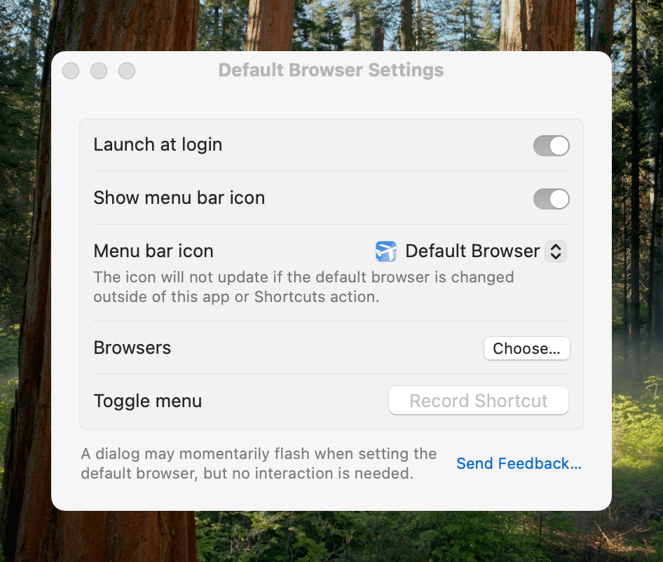
Default Browser works with Shortcuts, too, with actions to get and set your default browser programmatically with actions. That makes it easy to assign browsers to a device like a Stream Deck or Logitech Creative Console for push-button convenience. As Sorhus suggests in the app’s documentation, combining Default Browser with an app like Shortery, which has shortcut triggers for Mac events like connecting to a Wi-Fi network or launching a particular app, opens up a wide array of possibilities as well.
Default Browser also offers a Focus filter, giving you the ability to associate a particular browser with a Focus mode. I don’t have Focus modes for contexts where using a different browser would be useful, but I can imagine it working well for separating web browsing at home from browsing at your workplace or school, for example.
I primarily use Safari, but I’ve been experimenting with Microsoft Edge more, and I’m testing Surf, a browser fused with an AI assistant. I expect we’ll see many more browsers like Surf that aim to combine traditional search and web browsing with the best of what AI can do to organize and provide insights into data. That’s why I purchased Default Browser. The app is available directly from Sorhus for $4, and it makes it easy to quickly switch between browsers whether you’re testing them like me, you’re a developer testing code in different browsers, or you simply prefer certain browsers for certain tasks.
iOS and iPadOS 18.2: Everything New Besides Apple Intelligence
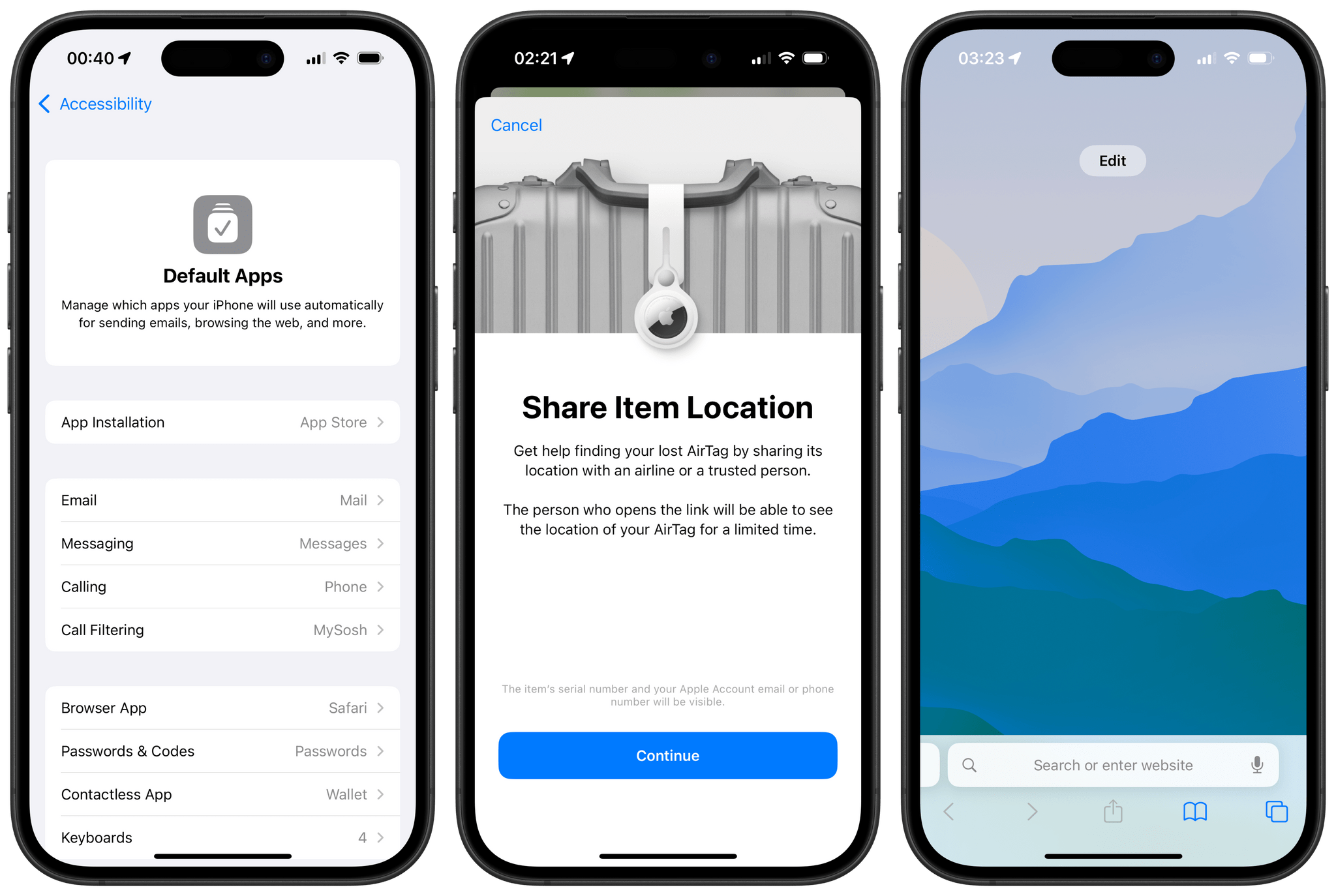
Today, Apple is releasing iOS and iPadOS 18.2, the second major updates to the iPhone and iPad’s latest operating system versions. Once again, this release’s main highlight is a wave of new Apple Intelligence features that are now available to the public. And just like in October, we’re covering these new AI features separately in a special story for MacStories readers. Be sure to check out Federico’s story, which goes over the new Apple Intelligence features included in iOS and iPadOS 18.2.
But besides another batch of Apple Intelligence features, this release also includes a series of changes to the system, from updates to Safari, Find My, and Photos to the arrival of new system-wide settings for Default Apps and more. Here’s a roundup of everything new besides Apple Intelligence in iOS and iPadOS 18.2.
HomePass 2 Brings a New Design, Maintenance Features, and a Freemium Model
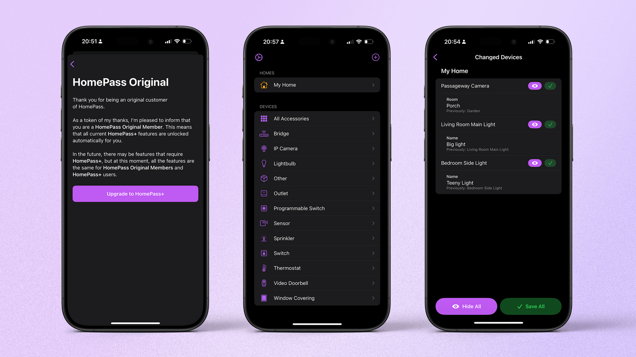
Back in 2020, John opened his review of HomePass 1.7 in this way:
My HomeKit setup started out simple enough with a few Hue bulbs, but over time, it has grown to include security cameras, door sensors, electrical outlets, and more. As the number of accessories connected to my network grew, so did the hassle of managing them.
I know this is the case for many people, myself included. There seems to be an ever-growing selection of third-party apps for HomeKit, and developer Aaron Pearce has released some of the best. Where other apps add more functionality and, thus, complexity, Pearce has focused on simplicity and pure utility. The best example of that approach has always been HomePass.
Horse Browser Tries Its Hooves at a New Take on Tabs
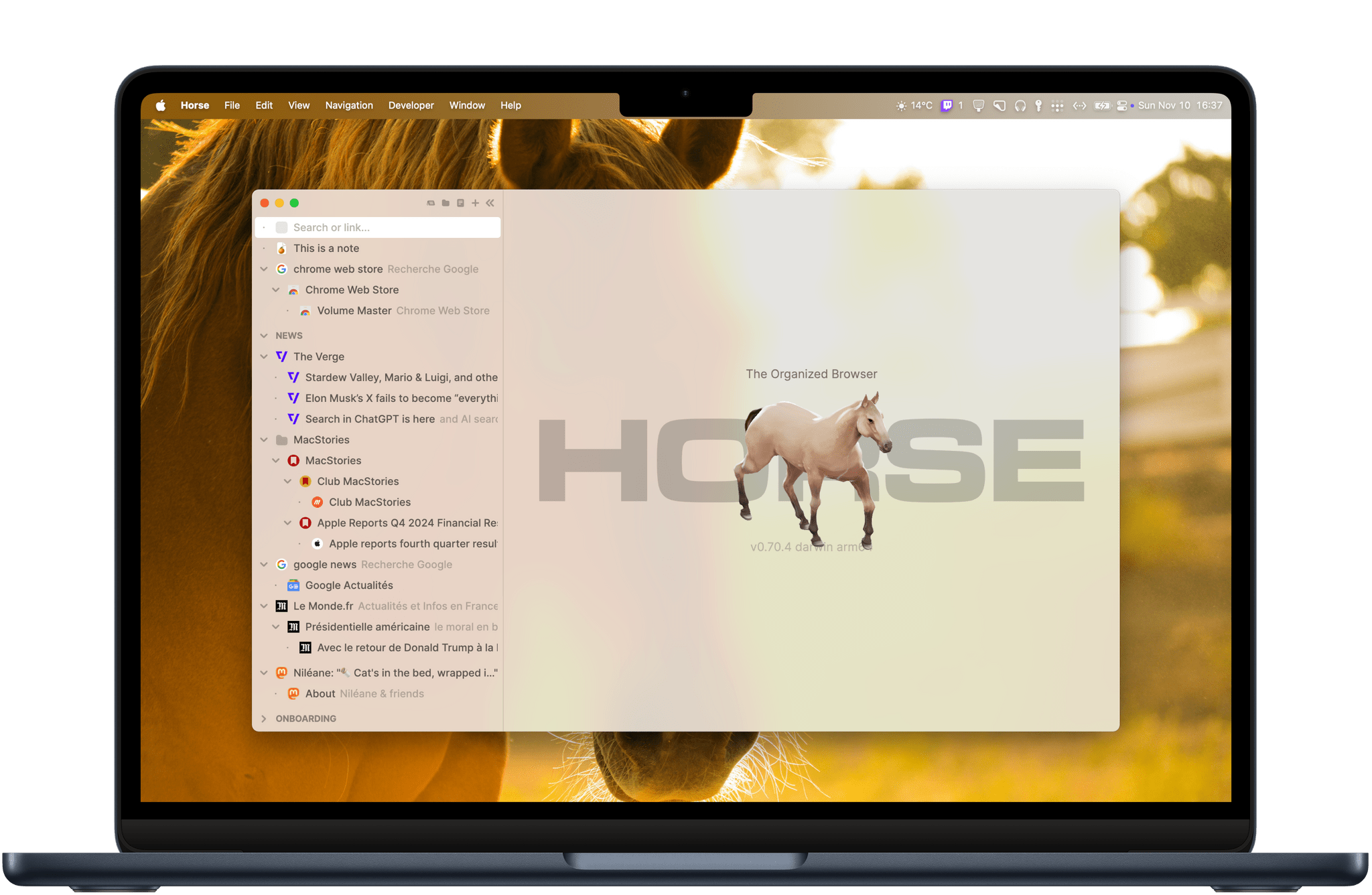
In 2024, web browsers mostly all look the same. Their user interfaces always feature an address bar at the top of the window and horizontal tabs that allow you to navigate through multiple websites. So whenever a new browser tries to shake things up and innovate on this basic premise, it’s inevitable that it will elicit a certain amount of interest – sometimes to the point of fashioning its own fanbase. For example, with a novel approach to organizing, pinning, and managing tabs in a customizable sidebar, Arc Browser by The Browser Company has been a great showcase of what creating a brand new user experience for browsing the web can look like.
Last week, though, I stumbled upon a newcomer called Horse Browser by Pascal Pixel that immediately caught my attention. Horse is unlike anything I’ve ever seen in this space. The browser is based on a new approach that completely does away with the traditional address bar and horizontal tab layout. Instead of tabs, navigation in Horse Browser is structured in hierarchical trees called ‘Trails.’ The resulting UI is unique, appealing, and clever. But how does it hold up in everyday use?
Let’s find out.
Raycast Overhauls Its Notes Feature
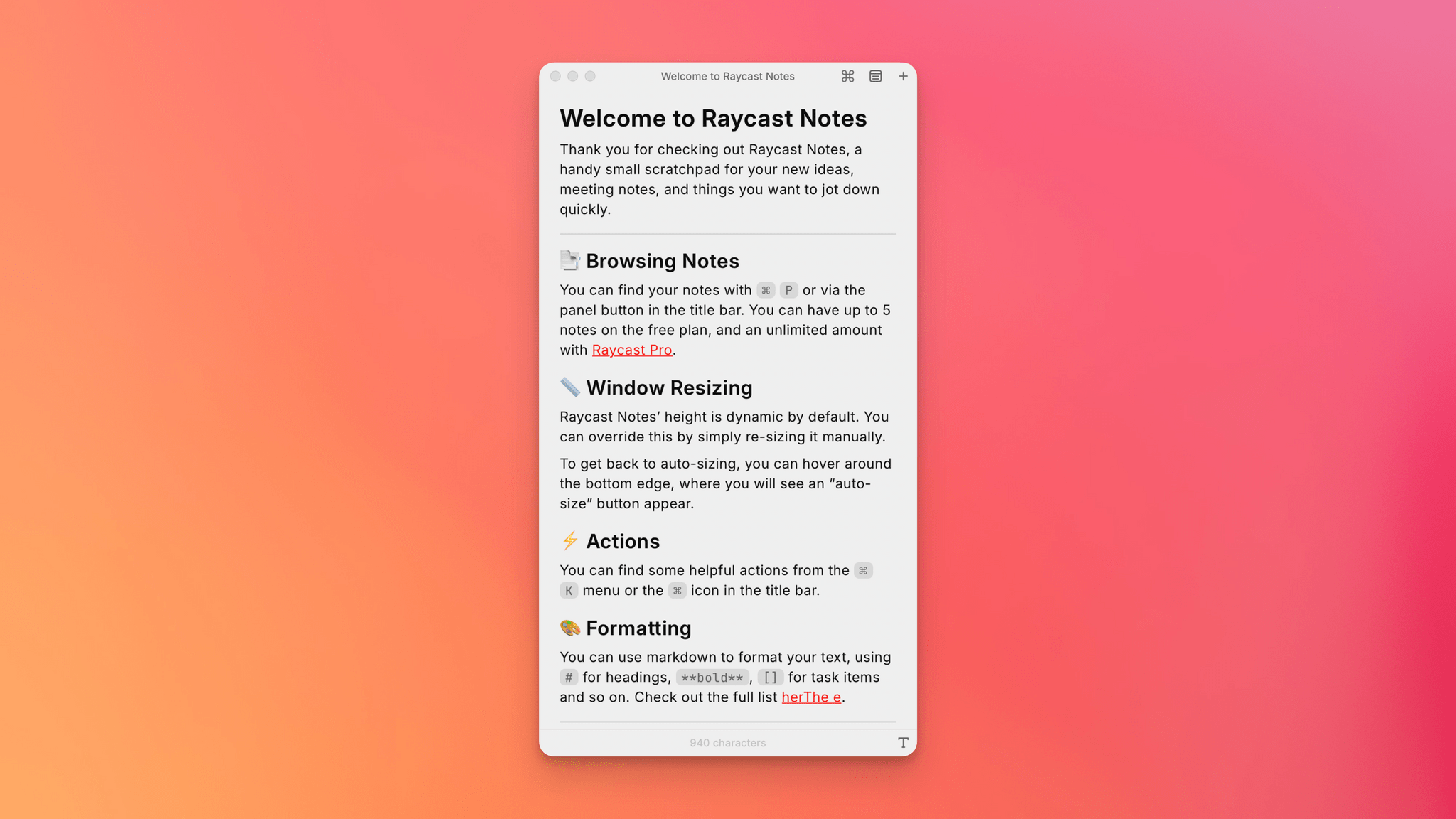
Raycast has always been more than an app launcher. From the start, it has included a multitude of other handy utilities, including Floating Notes. I’ve used Floating Notes now and then to park a bit of text where I knew I’d be able to find it later. Because the note floated above other windows, it was easy to access, but Floating Notes always felt a little too rudimentary to use for much more than that.
Today, Raycast released an extensive update to the feature and renamed it Raycast Notes. Your notes still occupy a floating window, but now, the window auto-resizes to fit the content by default. The window’s width is fixed, but you can always resize its height to adjust how much space it occupies on your screen.