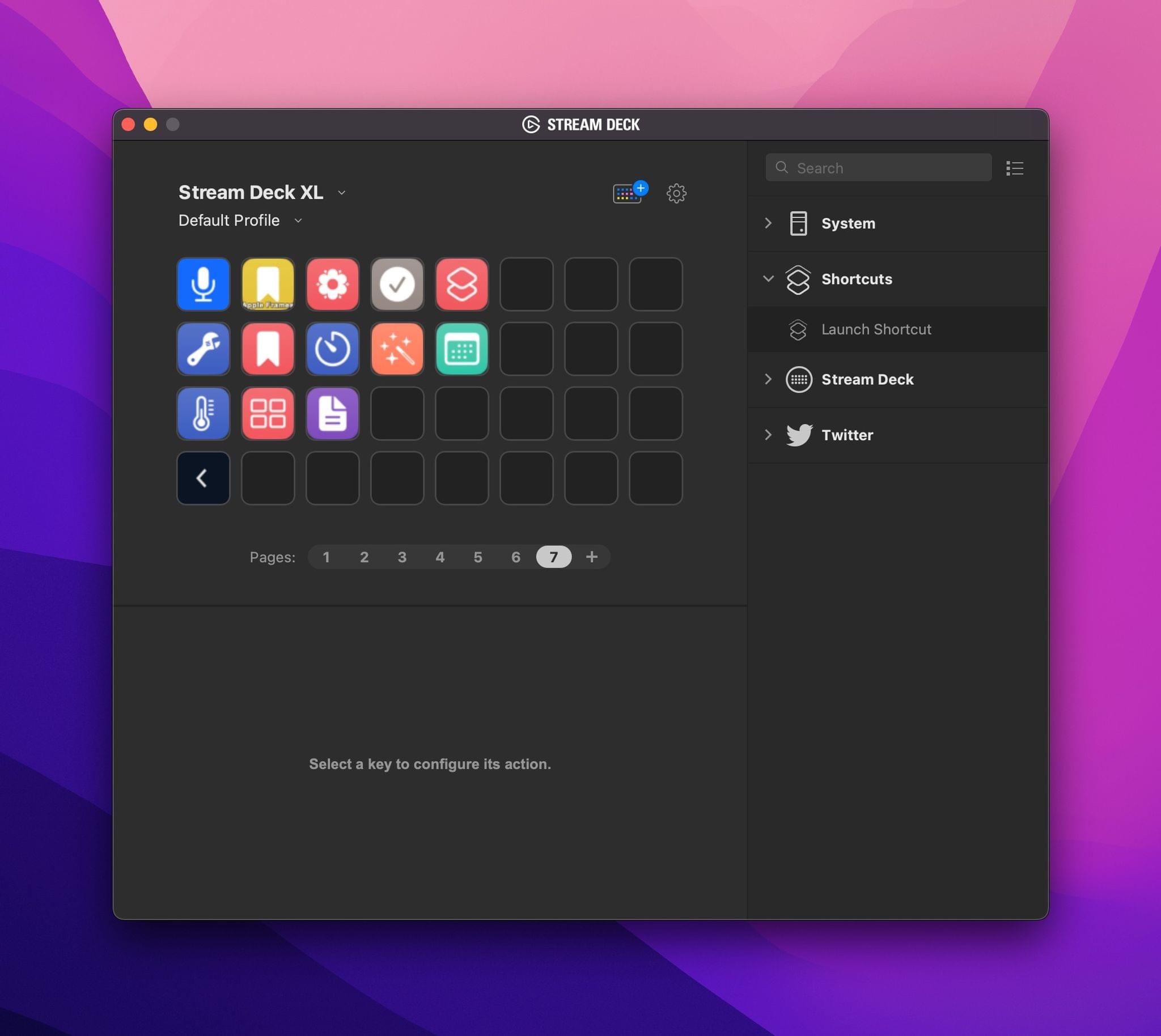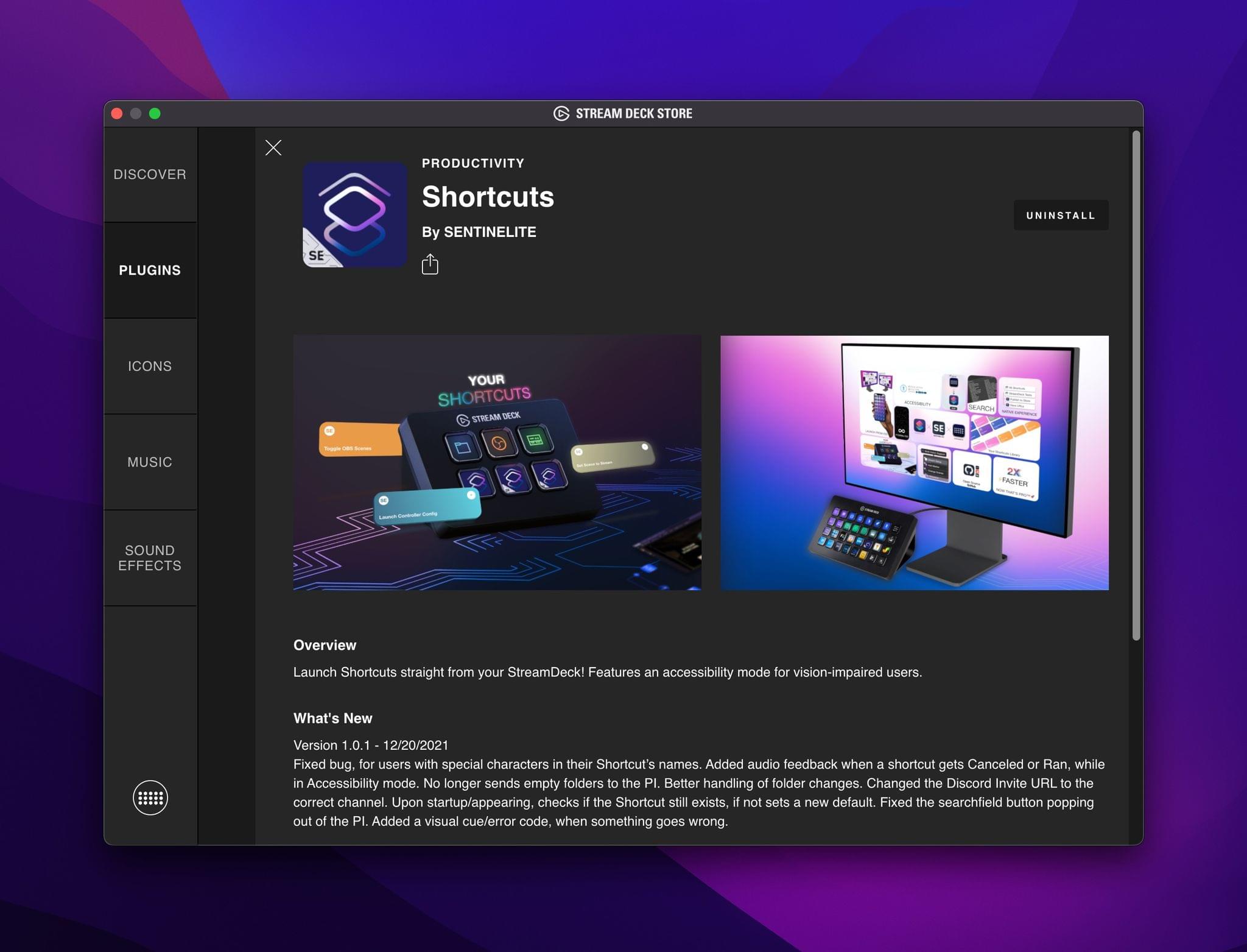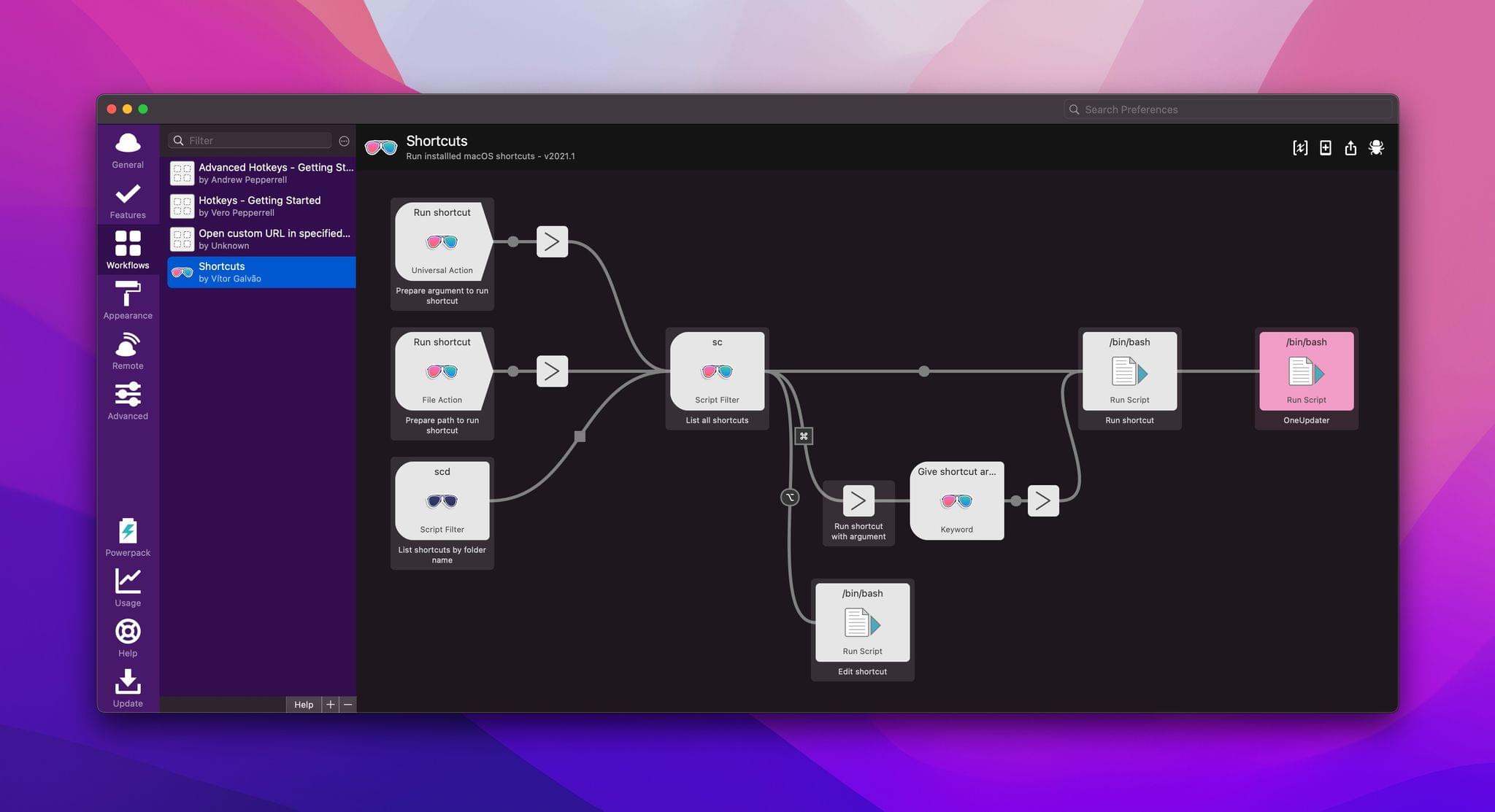
Alfred users can now access their library of shortcuts on the Mac, thanks to an official Alfred workflow by Vítor Galvão. The workflow allows users to access individual shortcuts and folders of shortcuts, as well as pass text and files to shortcuts for processing. It’s a nice approach that uses Alfred’s existing workflow system to invoke Ruby and Bash scripts under the hood.
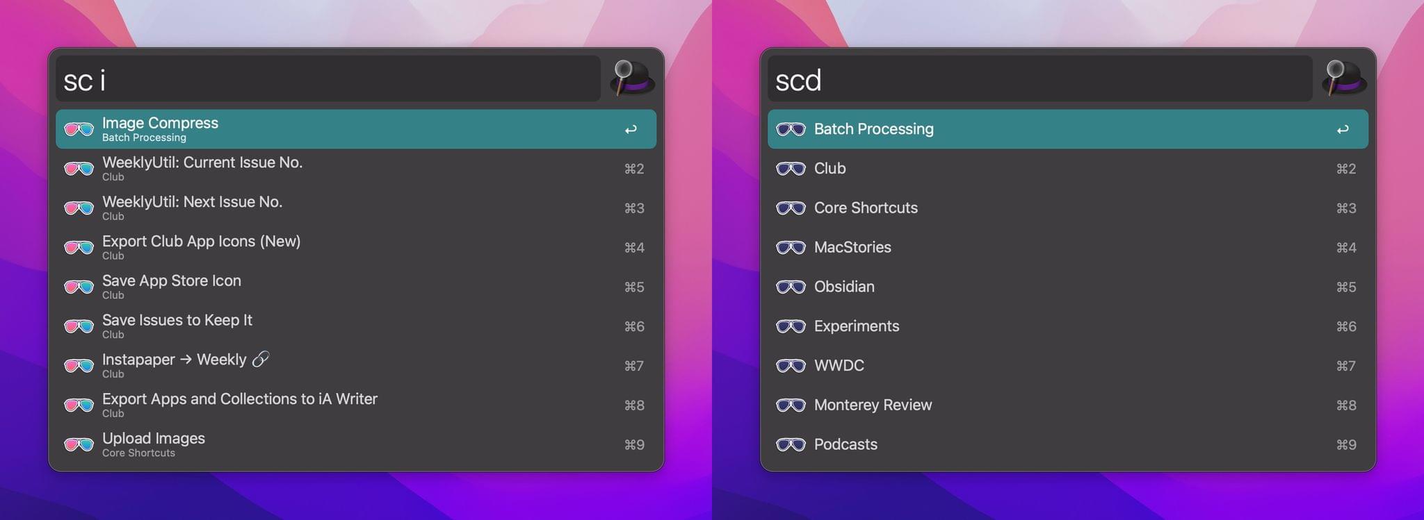
Let’s start with the easiest approach first. Invoke Alfred with the hotkey you’ve assigned to the app, then type ‘sc’ for Shortcuts. Any shortcuts you’ve recently accessed through Alfred will appear at the top of the list for quick access. If you need a different shortcut, though, start typing its name to filter the results until you see the one you want. Press Return and the shortcut will run.
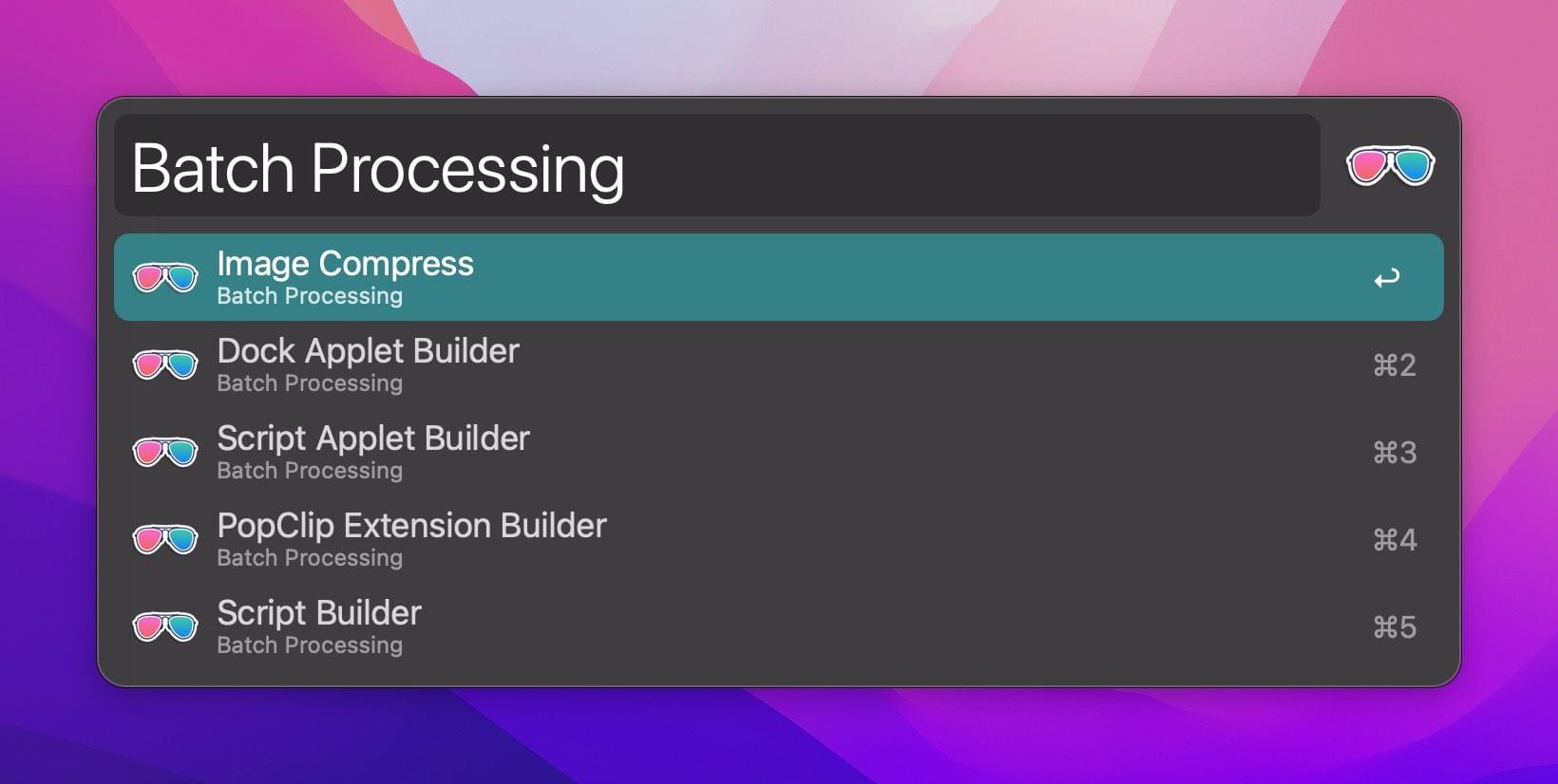
If you don’t recall the name of the shortcut you want or want to browse a folder of shortcuts before running one, type ‘scd’ instead, which lists all of your shortcuts folders. Highlight one and hit Return to see all of the shortcuts in that folder.
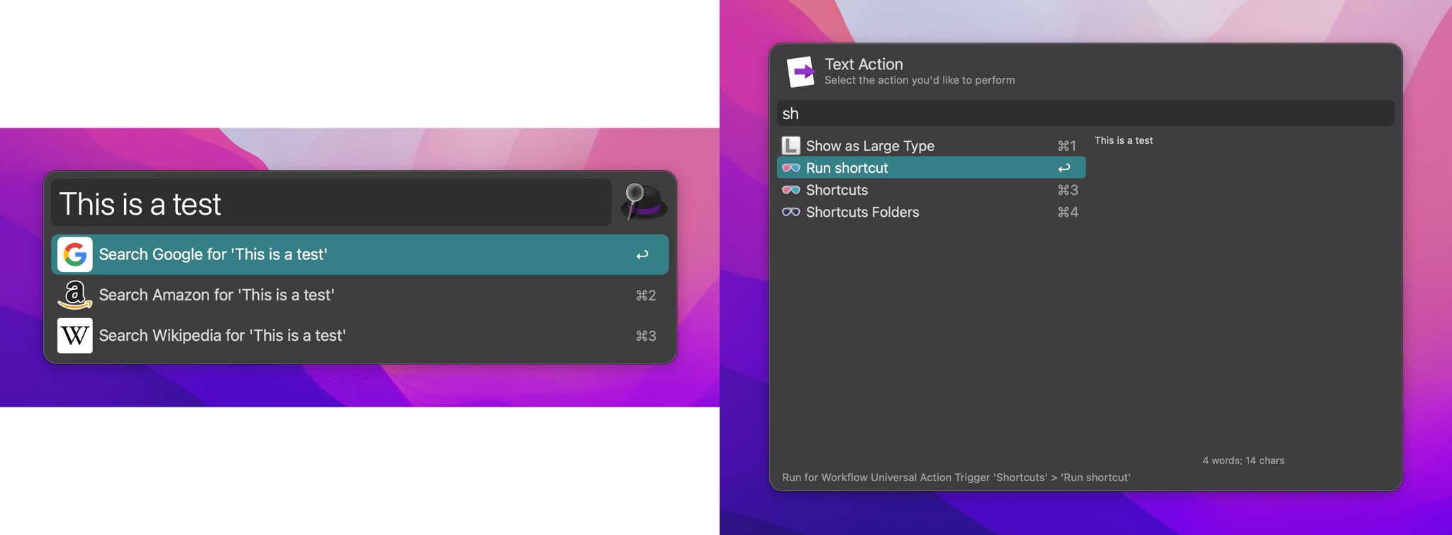
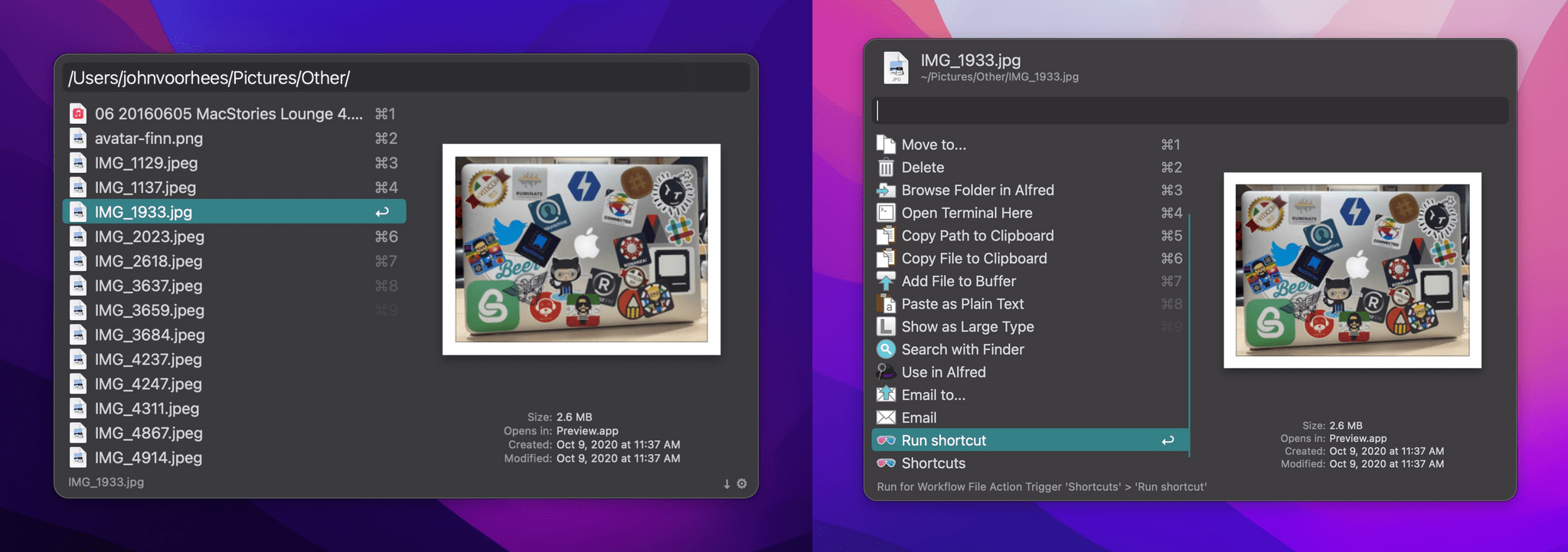
Alfred’s Shortcuts workflow also incorporates its Universal Actions feature, which was introduced last year. The simplest way to pass some text to a shortcut is to invoke Alfred, type, or paste some text into its UI. Then, invoke Alfred’s Universal Actions to display a list of commands that can be performed on the text you provided.
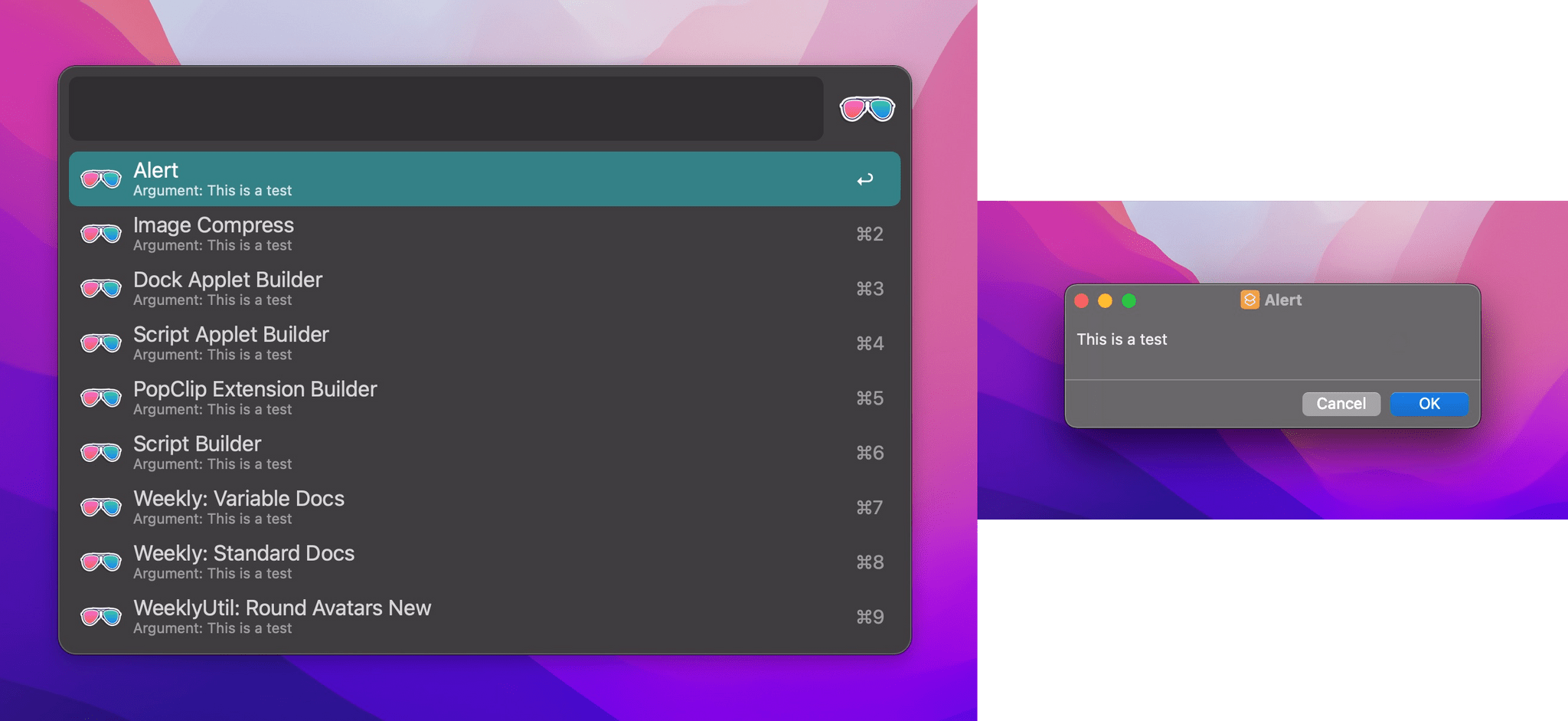
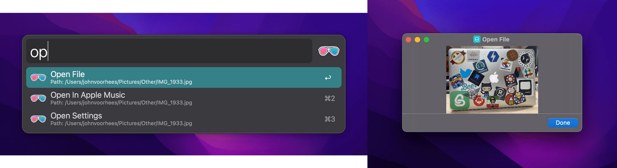
The list of Universal Actions includes ‘Run shortcut,’ ‘Shortcuts,’ and ‘Shortcuts Folders.’ ‘Run shortcut’ lets you pick from your list of shortcuts and then uses the text you provided to Alfred as its input. The ‘Shortcuts’ action locates any shortcuts that match the text you provided, and ‘Shortcuts Folders’ does the same searching instead for folder names that match your text. URLs and files work similarly when the ‘Run shortcut’ action is selected, passing the URL or file as input.
Vítor Galvão’s Alfred workflow for Shortcuts, which you can download from GitHub, is an excellent example of Alfred’s extensibility, which makes a series of Ruby and Bash scripts approachable for more users through Alfred’s simple UI. The workflow is also another of the many examples of just how well Shortcuts for Mac integrates with third-party utilities thanks to its scripting support and other integrations with macOS.