The intersection of tasks and notes poses an interesting problem. Often, a task requires notes for context and details that can’t be captured with a single line of text. Likewise, notes very often spawn tasks of their own. The difficulty is how to harmonize the two coherently.
If you’re a Club MacStories member, you know this is something that has bedeviled Federico’s annual iOS and iPadOS review for years. He solved the problem by combining Obsidian with Todoist’s web API linking the two apps together in a way that complements the way he writes.
Federico’s approach takes advantage of the web technologies underlying those apps. It’s a powerful solution, but it’s not a fully native approach technically or from a design standpoint. The technique is also less suited for someone who isn’t writing thousands of words most days, and instead, just needs to flesh out their tasks with context than the single line of text many apps offer. Fortunately, there are many alternative approaches to the task and note-taking conundrum, including a new one out today from Cultured Code, the maker of Things that I like a lot.
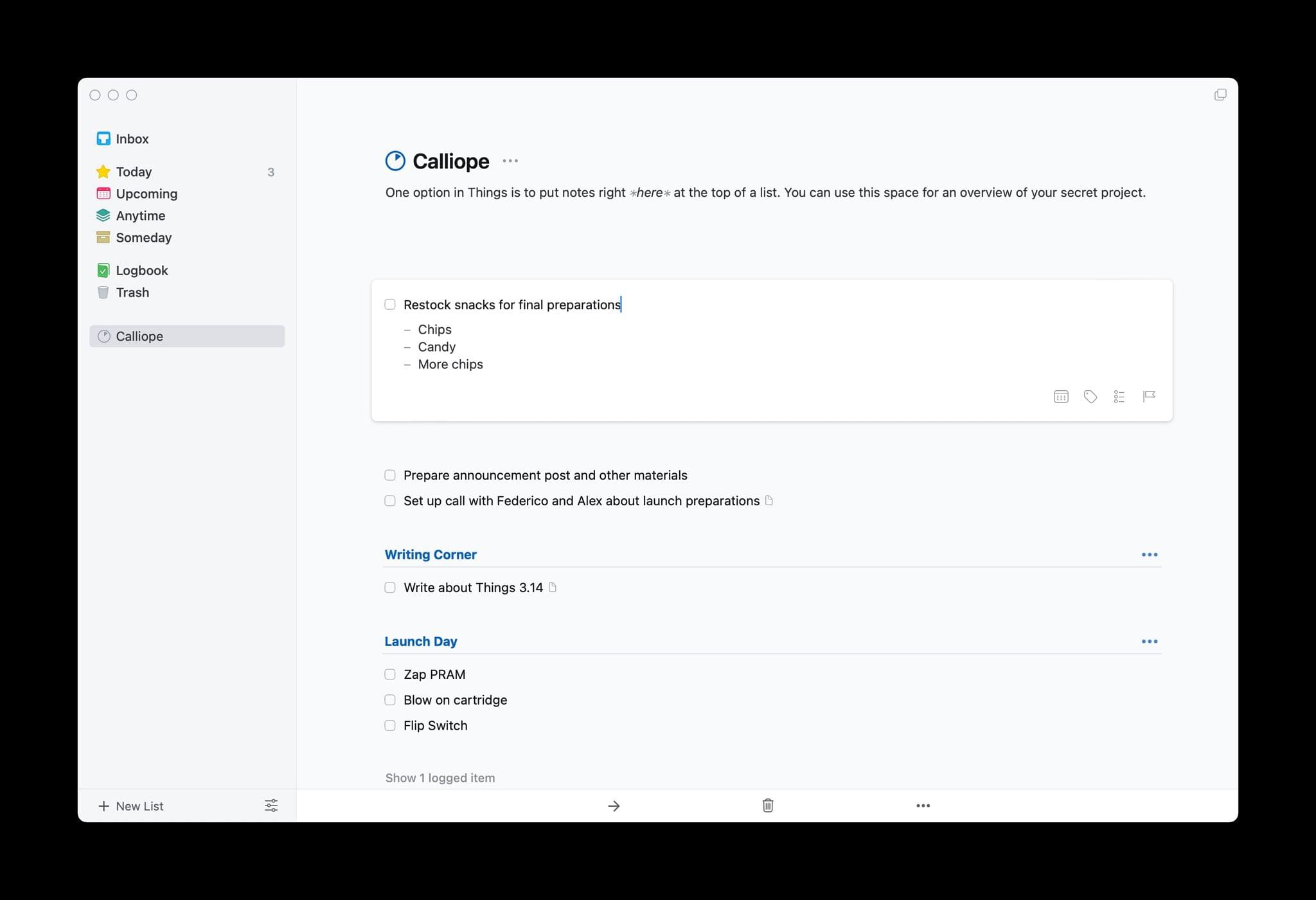
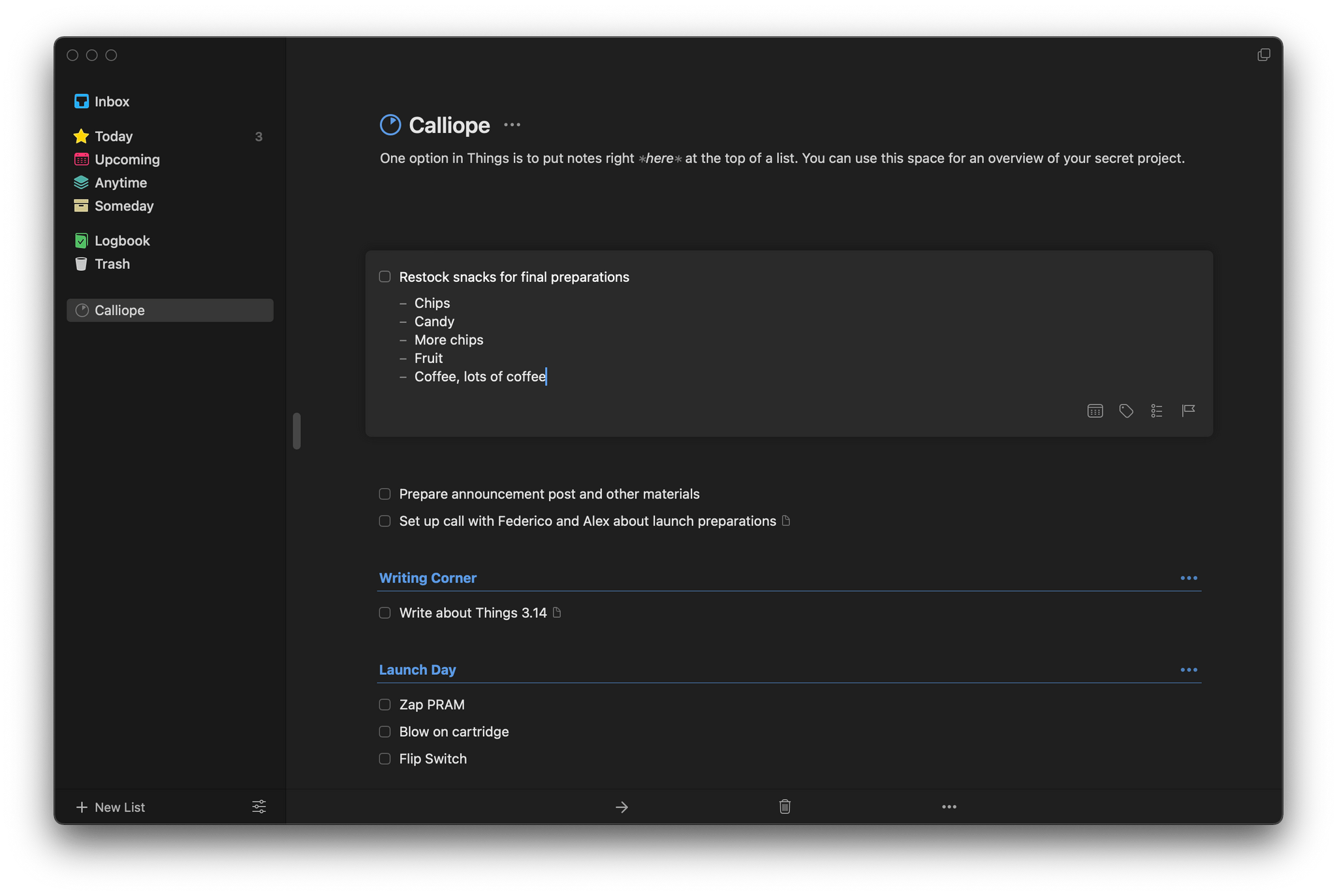
Instead of injecting tasks into notes, Things brings a full-featured note-taking solution into version 3.14 of Things. Adding a note to a task isn’t new to Things, but the latest update expands the feature significantly. Using Markdown syntax, you can now create headings, make text bold or italic, and add bulleted and numbered lists, links, code blocks, and highlight text. The formatting is rendered inline, providing a sense of structure and style to notes. For anyone unfamiliar with Markdown syntax, Cultured Code has also created a handy guide.
Things’ bulleted lists support multiple levels of indentation based on the number of spaces that precede the bullet. Everything is neatly lined up and orderly, although I do have one quibble. I’m used to using the tab key to indent and Shift + Tab to outdent bulleted lists, which is common to most text editors and note-taking apps. Unfortunately, because the tab key is used to move the focus between UI elements in Things, to increase the level of indentation, creating a nested list, you’ll need to back up, add a space, and then move back to where the text of your note goes. I do appreciate, however, how you can cut and paste a bulleted item from one spot to another in a list without winding up with a duplicated bullet at the beginning of the item that you have to delete.
Because notes attached to tasks can be full-blown documents now, Things has also added the ability to search inside a note. On the iPhone and iPad, tap the More button and select Find in Text. On the Mac, you’ll find the option in the Edit menu, or you can use the keyboard shortcut ⌘⇧F, which also works on iOS and iPadOS. Things offers the option to Find and Replace text too. Finally, Cultured Code has improved its sync engine, making the syncing of notes more efficient and faster, which should benefit anyone who uses it to take extended notes.
I wish every developer that offered notes functionality in their app would put as much care and attention into them as Cultured Code. Few apps provide formatting, let alone what is effectively a mini Markdown text editor just for notes. It’s the sort of flexibility that sets Things apart from other task managers. I expect the new notes functionality will be perfect for anyone who has felt constrained by the typical one-liner plain text notes found in most alternatives.
Things is is sold separately for the iPhone, iPad, and Mac for $9.99, $19.99, and $49.99 respectively.