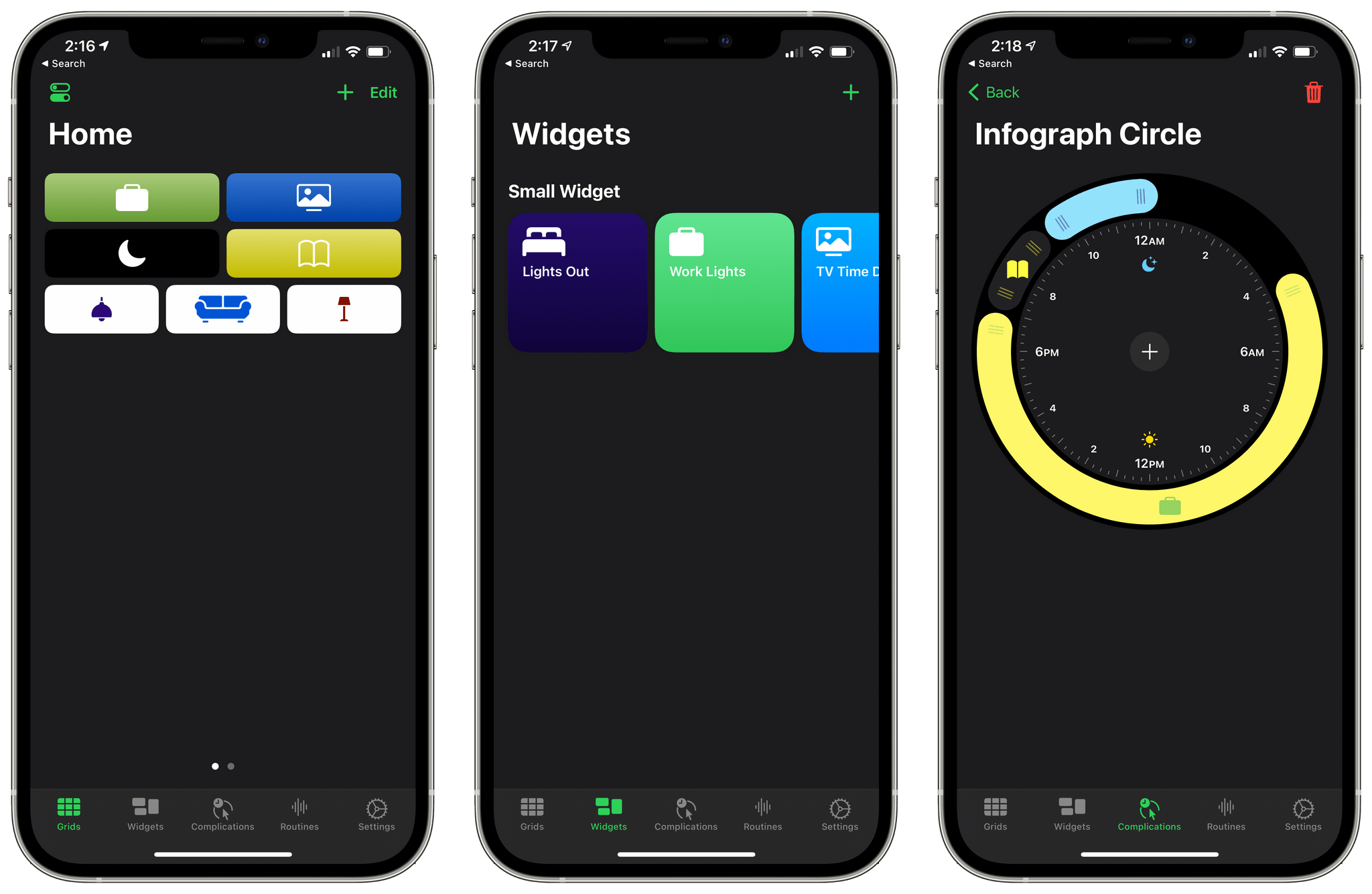
I’ve long considered HomeRun by Aaron Pearce a must-have app if you’re into HomeKit automation. With version 2, which is available for the iPhone and iPad and is out today, HomeRun adds all-new ways to access HomeKit scenes with in-app grids and Home Screen widgets, along with an updated Apple Watch complication editor. Although the initial setup process can be a bit laborious, investing some time in a setup on multiple devices pays off, allowing you to trigger scenes in many more ways than is possible with the Home app.
Posts in reviews
HomeRun 2 Launches as a New App with Home Screen Widgets, an In-App Grid System, and an Updated Watch Complication Editor
MindNode for iPad and iPhone Adds Editable Outline Mode
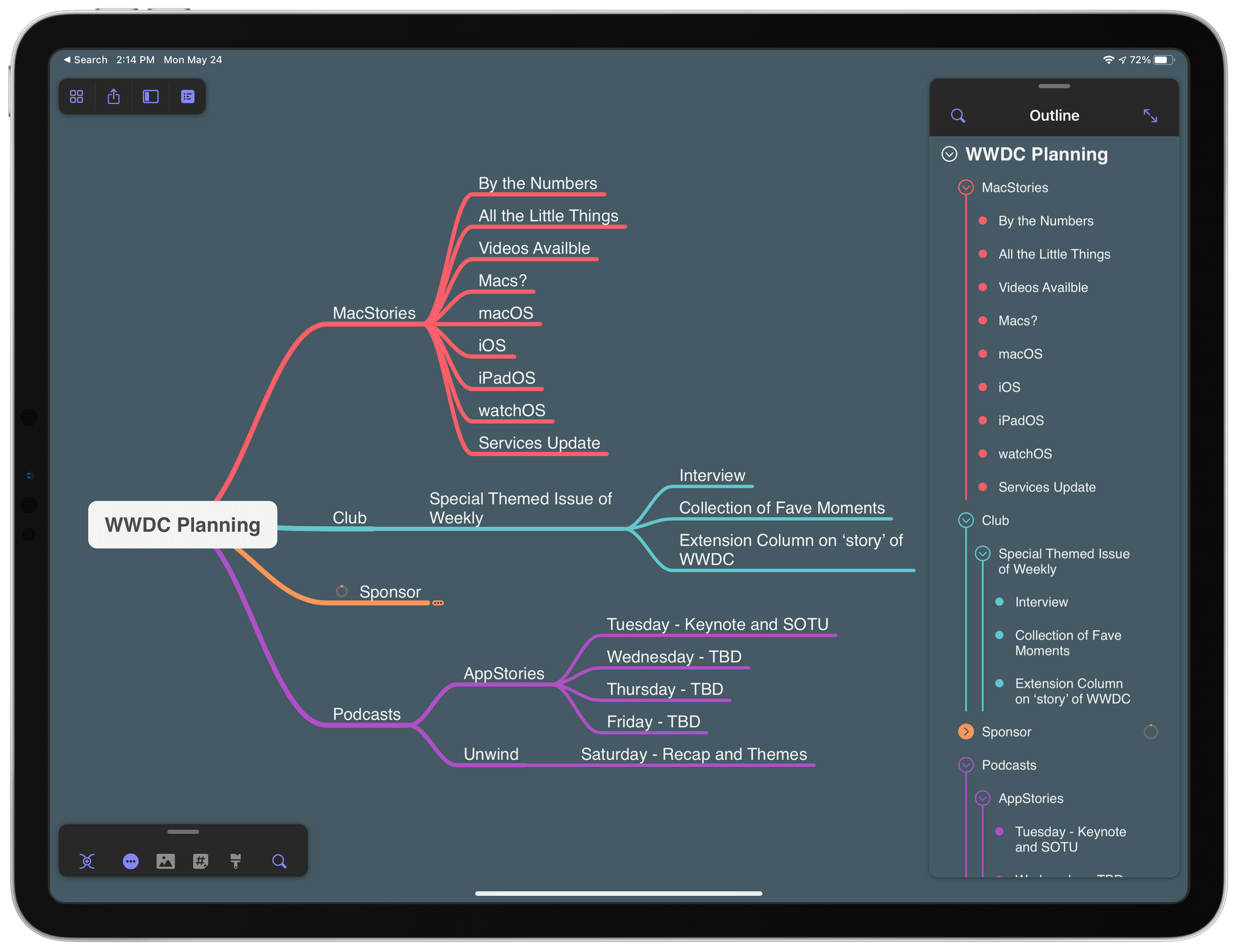
First seen in the mind mapping app’s Mac version earlier this year, MindNode has added an editable outline mode to its iPad and iPhone versions. I was impressed with MindNode’s editable outline mode on the Mac, and I’m happy to report that the iPad and iPhone versions are every bit as good. The app’s editable outline takes advantage of the iPad and iPhone’s unique features to provide the same useful alternative perspective on your mind map that the Mac version offers.
Pok Pok Playroom: A Delightful Digital Toybox for Kids
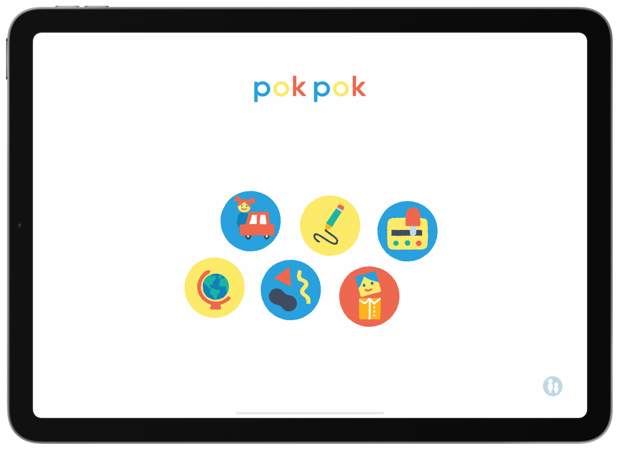
My youngest son just finished his junior year in high school, so it’s been a while since my kids sat on the floor, absorbed by the toys surrounding them. Still, that was a big part of my life for a long time as a parent, so I think I still have a feel for what my kids would have liked when they were little, and Pok Pok Playroom is definitely one of those things.
Lux Delivers an iPad Version of Halide That Addresses the Unique Challenges of iPad Photography
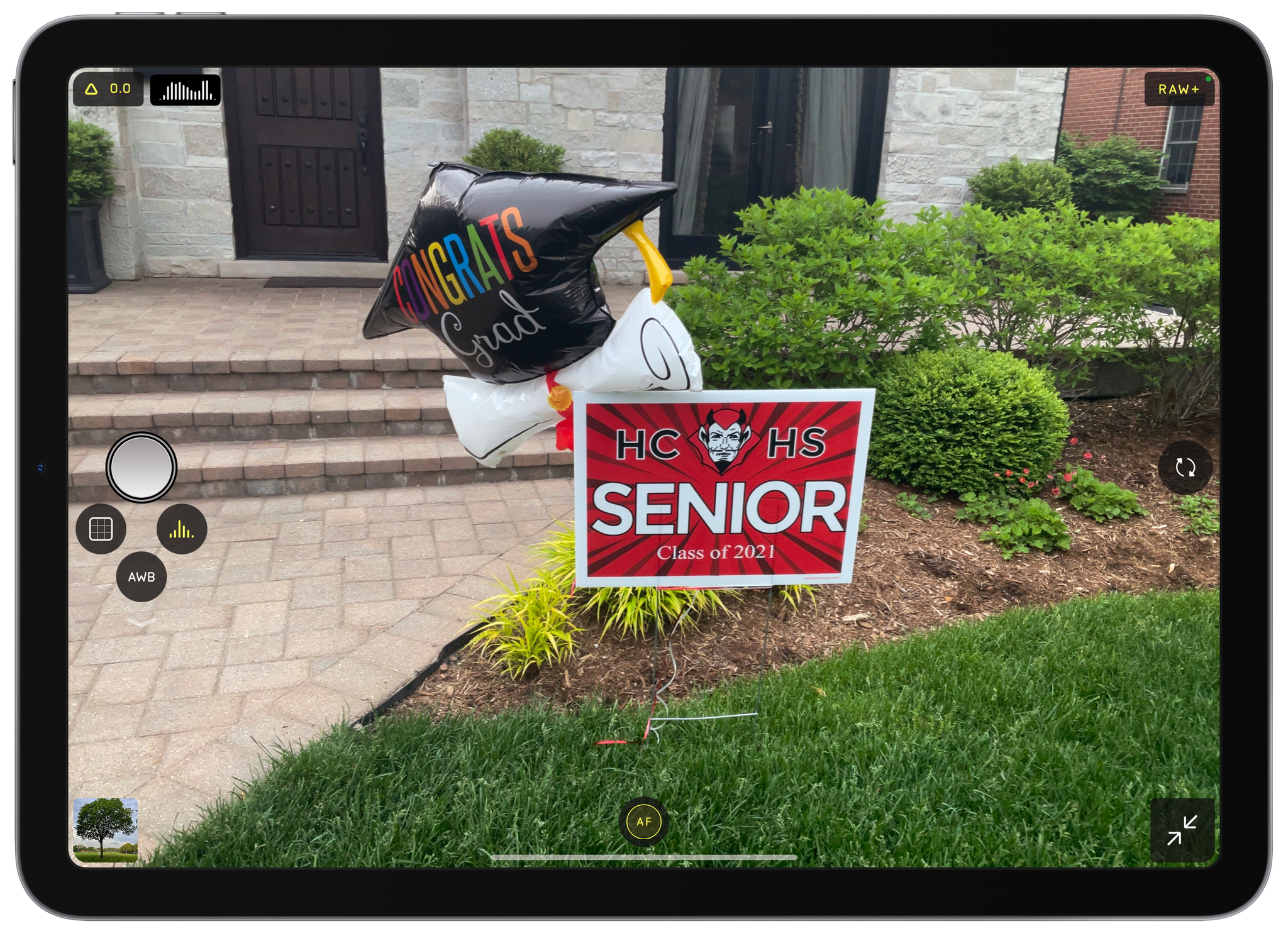
Students are finishing up the year here in the US, and nothing says graduation season like a relative gripping an iPad with two hands to snap photos of a graduate at a family gathering. It’s easy to poke fun at iPad photography, but those aren’t easy shots to get with Apple’s tablet. Both of your hands are occupied, and the viewfinder is huge and partially obscured by the app’s UI. If you’re at one of these events and see a relative struggling to take the perfect family portrait with their iPad, before you assume that they cut you out of the frame on purpose, show them Halide. The brand new iPad version of the app from the team at Lux makes taking iPad photos more natural and, of course, offers all the advanced features available in the iPhone version of the app.
I don’t take many photos with my iPad, and I doubt I ever will. The camera hardware isn’t as good as it is on the iPhone, and I don’t find myself in situations where I have my iPad but not my iPhone. However, once in a while, I’m using my iPad and want to capture a moment quickly without digging my iPhone out of my pocket. For those occasions, I’m going to use Halide because the app’s thoughtful design makes the experience far superior to other camera apps I’ve tried on the iPad.
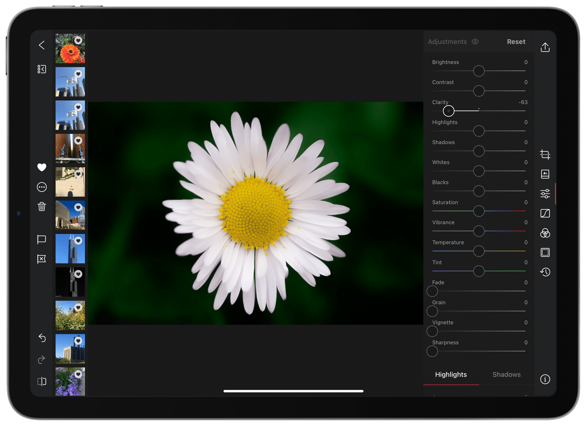
Photo Editor and Organizer Darkroom Adds New Clarity Tool
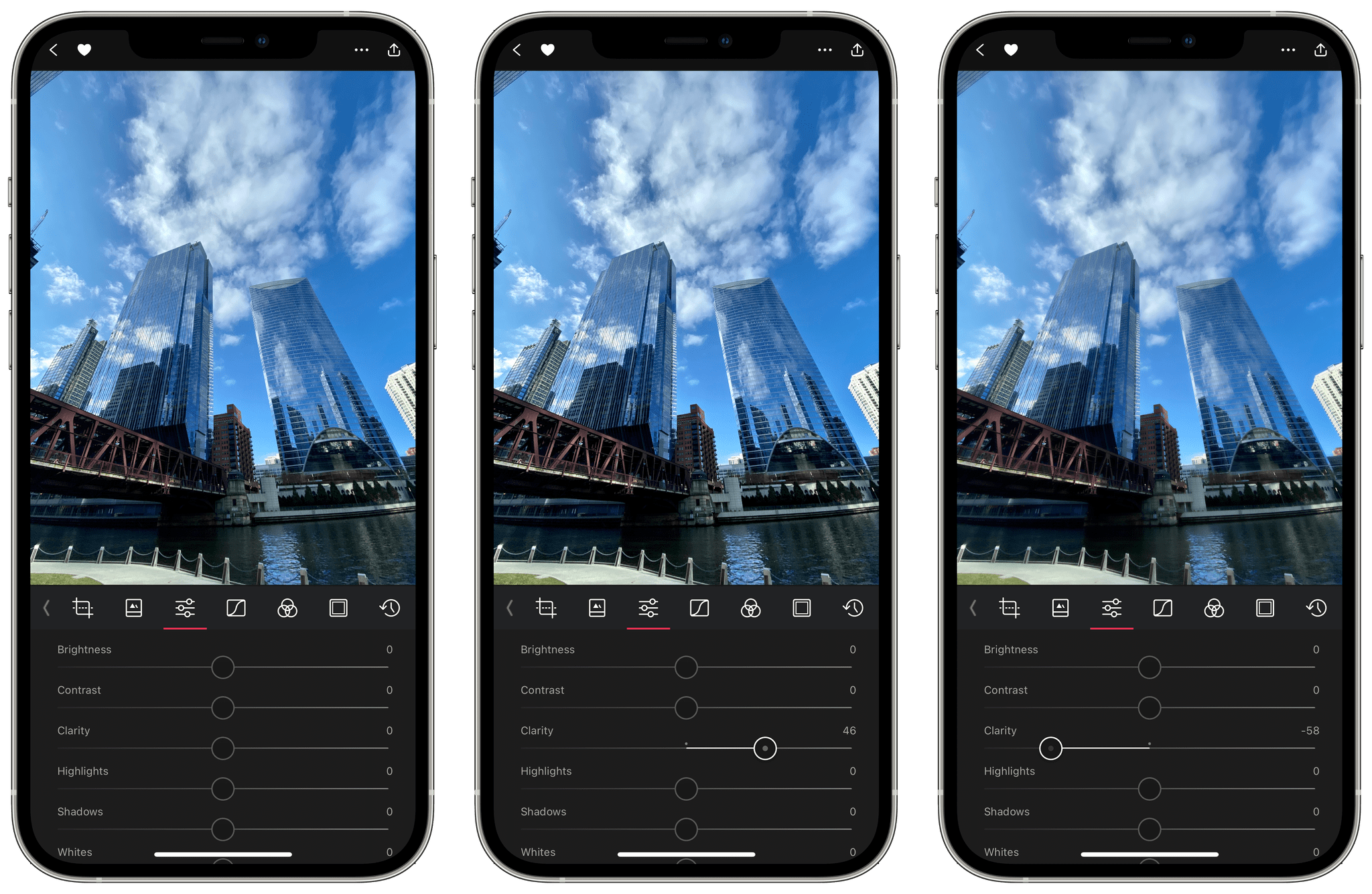
Photo editing and management app Darkroom has been updated with a new Clarity slider that I’ve been testing on the iPhone and iPad for a couple of weeks now.
The new slider in the app’s editing panel is deceptively simple. Move the slider to the right to make the details of an image pop or to the left to smooth out the details. If you look carefully, though, you’ll notice that the increase in contrast isn’t uniform across a photo. You can turn the Clarity of a portrait down to smooth a person’s skin, for instance, without affecting their hair or eyes.
As Jasper Hauser explains on the Darkroom blog, the Clarity slider is logarithmic, meaning that the effect intensifies more quickly as you approach the endpoints. Picking a point in the middle of the slider’s range produces a subtler effect.
The effect works well with landscapes like the photo of skyscrapers along the Chicago River at the beginning of this story. You can see that increasing Clarity brings out the details in the windows of each building, and turning Clarity down softens areas like the water.
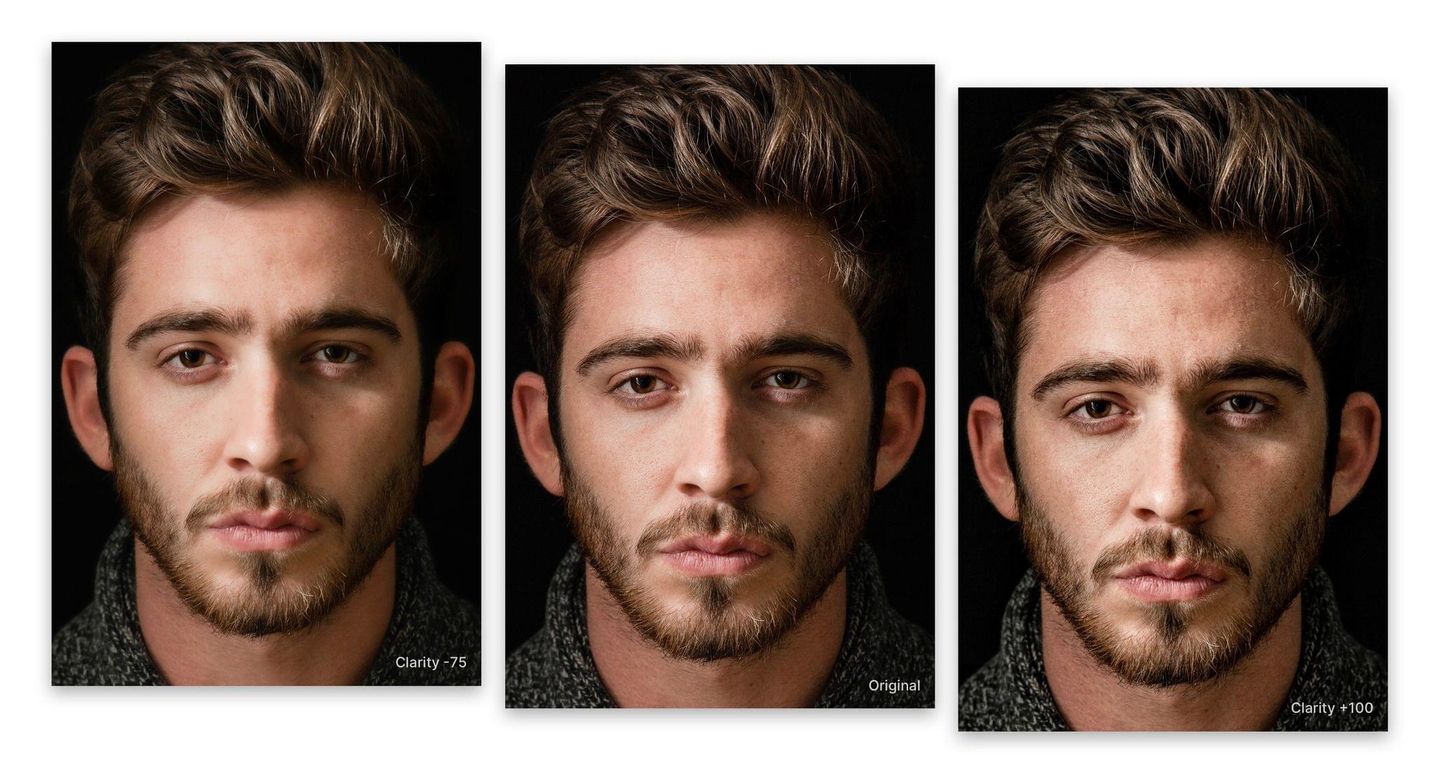
Clarity can achieve a wide range of effects like this shot where it is turned down, smoothing details

As Hauser explains, Clarity works by building a detail map of an image and then adjusting the contrast of its regions using an algorithm called a Fast Local Laplacian Filter. There’s a lot of math happening under the hood that Hauser links to if you’re interested in learning more behind what the Darkroom team has managed to incorporate into a simple slider interaction that’s yet another excellent addition to this Apple Design Award-winning app. To learn more about Darkroom’s features, be sure to check out our past coverage and interview on AppStories with Darkroom co-founder Majd Taby.
Darkroom’s latest update is available on the App Store.
CARROT Weather 5.2 Revamps Layout Customization and Adds New Sections and Data
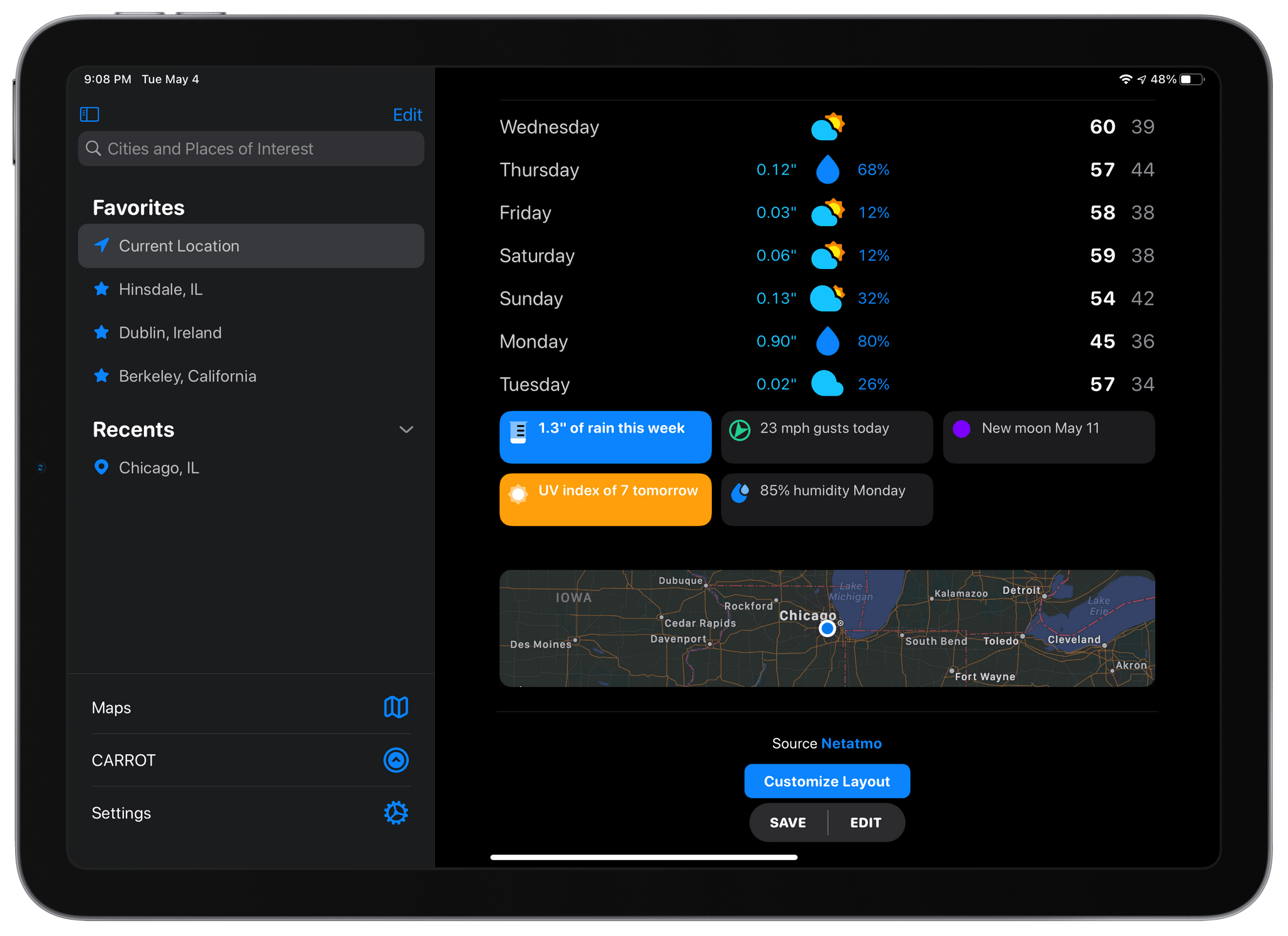
When CARROT Weather 5 was released in January, it became one of the most highly-customizable apps available on the iPhone, iPad, and Apple Watch. With that came a level of complexity that required a bit of a learning curve. With a bit of experimentation and the progressive unlocking of customizations, though, I thought version 5’s layout features were manageable. However, with the update released today, developer Brian Mueller has overhauled CARROT Weather’s layout functionality making it easier to get started and faster to build a personalized weather dashboard than ever before.
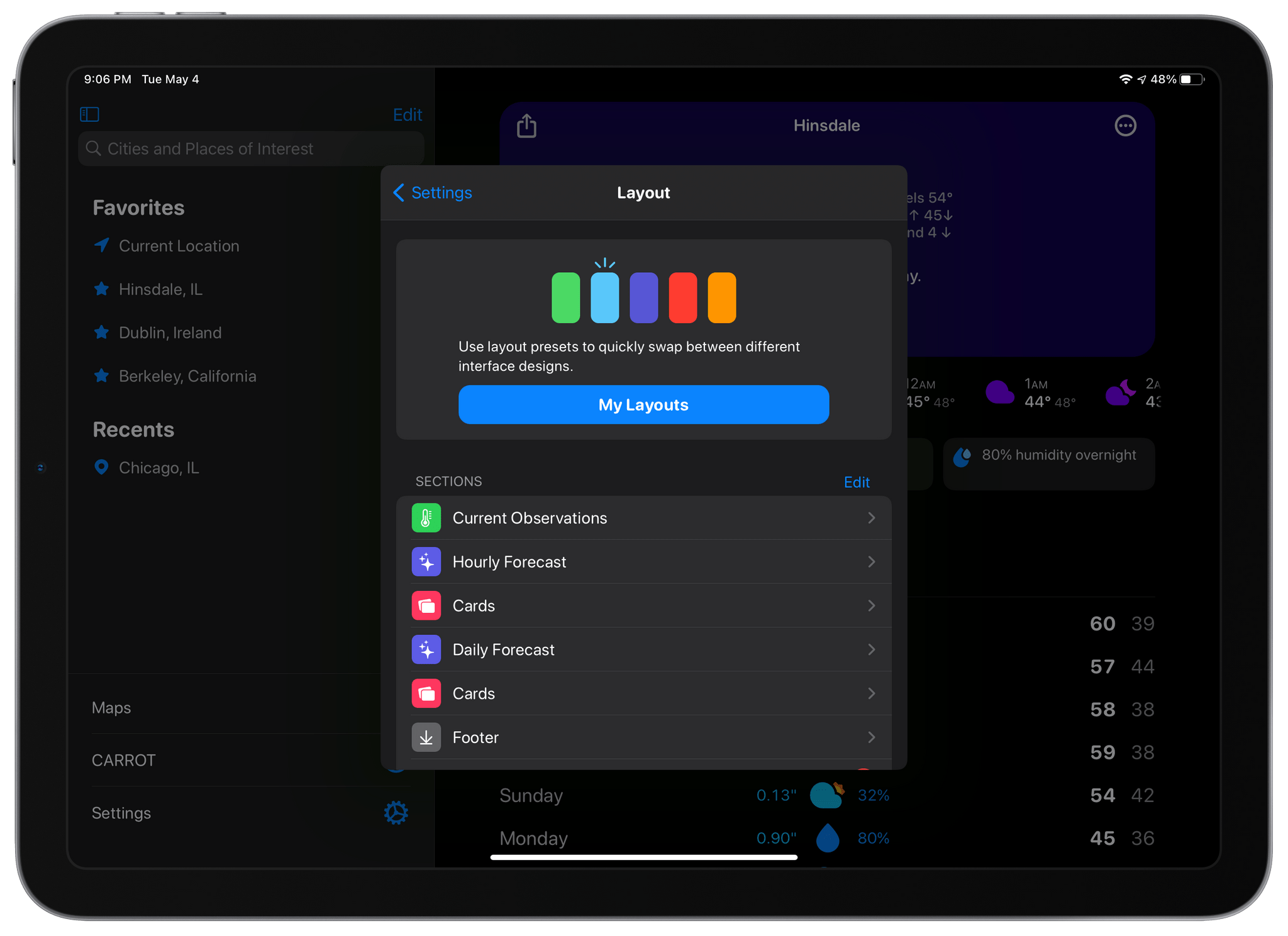
The Layout section of CARROT Weather’s settings is where you choose from layout templates and add individual data components called Sections.
The app’s settings include a new group of related items: Layout, Display, and App Icon, the first two of which are new. Layout replaces Customization and is divided into preset layouts and sections that can be added to the app’s main view. Layout presets, like Odin, Siren, and Chronos, are a great place to start when planning your CARROT Weather layout. You can preview any that you aren’t using, which takes your data settings and applies it to the new preset, so you can see how it would look. From the preview, you can tap ‘Set’ to begin using the new theme or ‘Cancel’ to return to the app’s Layout settings to make more adjustments.
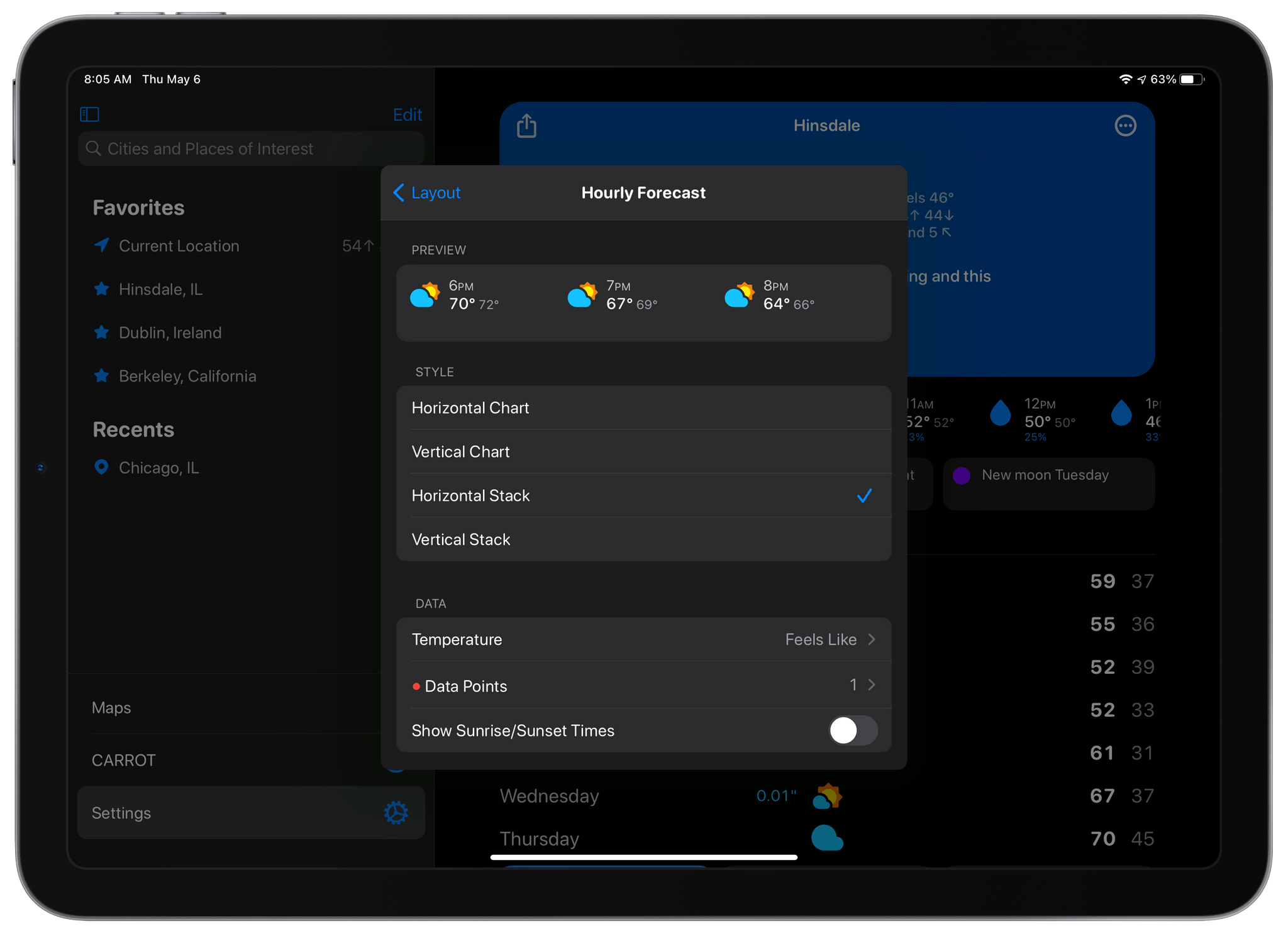
The settings for each section now includes previews of what that section will look like before you add it to your layout.
The Sections part of Layout is where you pick and customize the individual data components for your layout. The big change here is that at the top of each section’s individual settings is a preview of what it will look like based on the options you’ve chosen. It’s a big improvement because it eliminates the guessing about what each change will look like before you add the section. Together with the Layout previews, the new Sections picker short-circuits the trial and error loop of version 5.0, making it much faster to design the perfect weather dashboard.
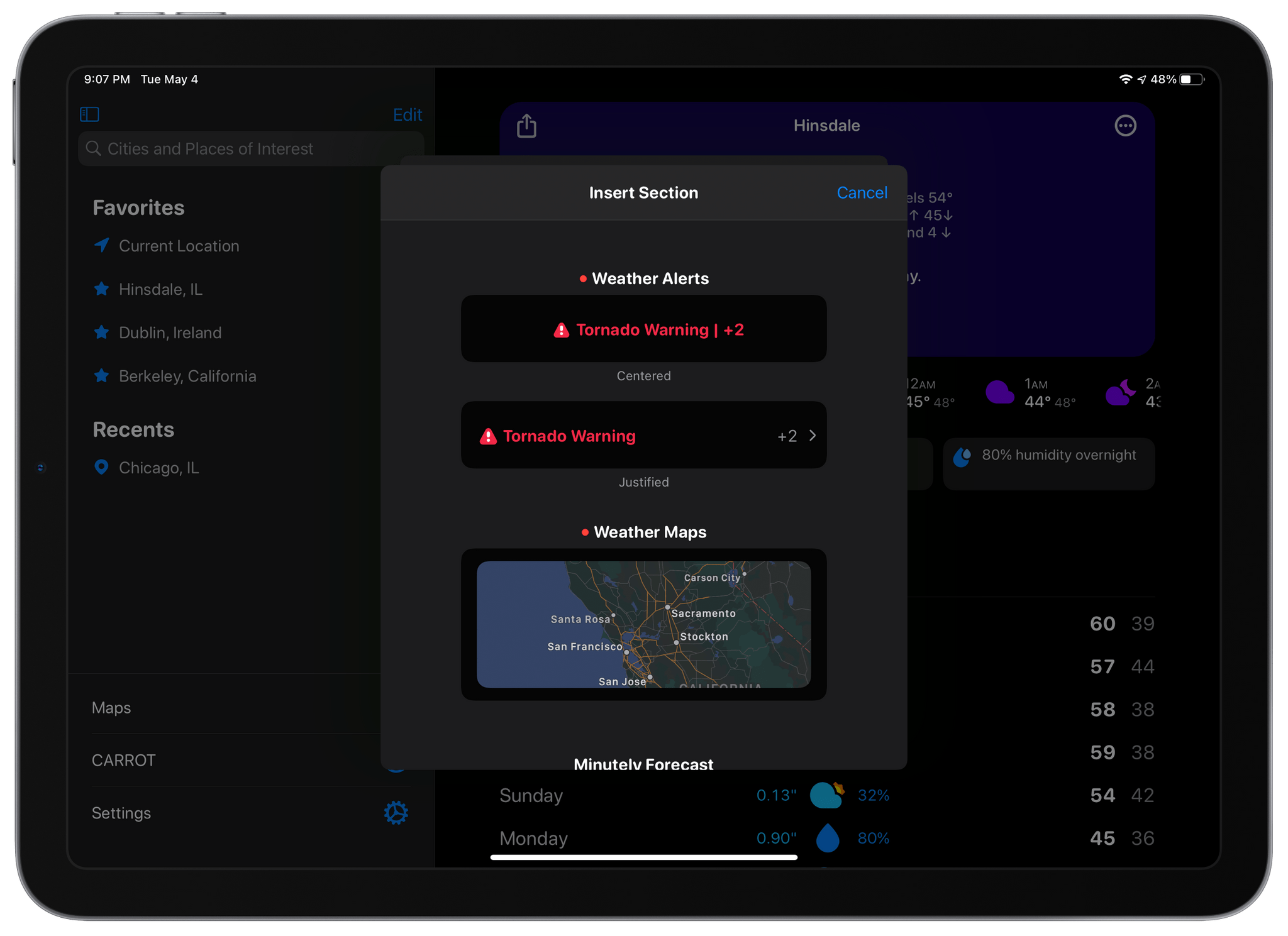
CARROT Weather has added a couple of new sections too. The first, which is exclusive to Premium Ultra subscribers, is a Weather Maps section that allows you to add weather radar to your dashboard. You can add multiple layers of data to the map, pick from three different sizes and zoom levels, and choose a handful of additional style and appearance settings, all of which are previewed for you at the top of the screen. There’s also a new alerts section that can be added to notify you of severe weather and other unusual conditions, as well as new tide data available in certain existing sections. Finally, you can adjust the text size and pick among multiple font choices in the new Display section of the app’s settings.
When CARROT Weather 5.0 came out, I spent some time coming up with a layout that I liked, and I never touched it again. It’s not like I spent hours trying every possible combination to come up with something that I liked, but there was enough trial and error involved that I didn’t feel like testing out anything else after that initial setup. With the new layout system, that has changed. Tweaking the size of sections and their layout is much faster with the new previews, making experimenting easier. As a result, I’ve tweaked my hourly view a little, added a Map section, and modified the data reported by a couple of other sections. The changes weren’t drastic, but it’s even better now, which I love. If you haven’t played with CARROT Weather’s customization options in a while, now is definitely the time to do so.
CARROT Weather is available as a free update on the App Store and offers multiple subscription tiers for its more advanced, data-rich features.
1Blocker 4.0 Adds In-App Tracker Blocking with Its New Firewall Feature
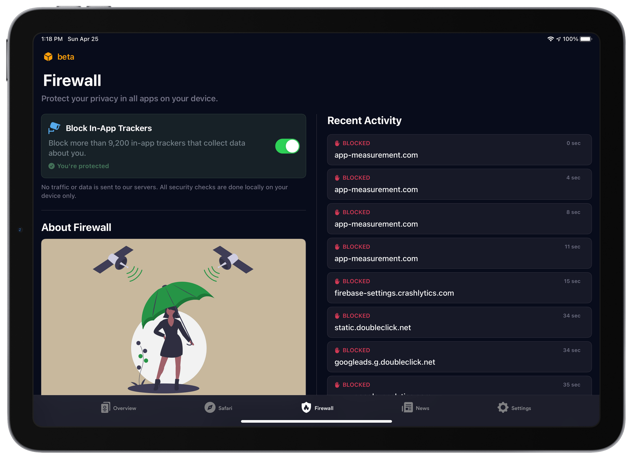
I’ve used 1Blocker to block ads from cluttered websites for years. No ad blocker is perfect. Some ads still get through, and blockers can sometimes interfere with the functionality of a website, but of all the ones I’ve tried, 1Blocker strikes the best balance. The app is also available on all of Apple’s platforms, making it easy to block intrusive ads but allow them on sites where they don’t wreck the reading experience.
1Blocker, which I have covered many times in the past on MacStories, was the first iOS app I know that bundled multiple sets of content blocking rules to offer more filters than the iOS would otherwise allow. The system also allows 1Blocker to filter more than just advertising, such as social media widgets, comments, and adult sites.
Today, 1Blocker has expanded its coverage even further with a feature called Firewall. If you’ve read Federico’s in-depth story about iOS and iPadOS 14.5, you’re familiar with App Tracking Transparency. That’s the OS feature that requires apps to request permission before tracking your activity across multiple apps and websites. Firewall takes that a step further by automatically blocking trackers and doing so even if the trackers are what are known as first-party trackers because they don’t correlate your data with data collected by other companies. It’s an extra layer of protection between you and data brokers.
Bartender 4.0 Offers Powerful New Control Over Your Mac’s Menu Bar Apps
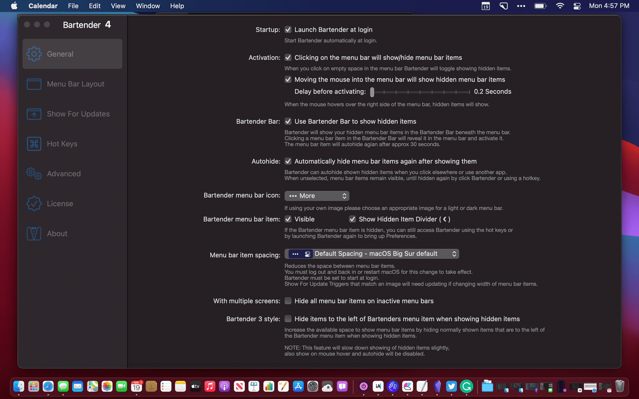
Bartender 4.0 was in beta for a long time, and the time and attention to the details paid off. If you were waiting to update until the app was officially released, now’s the time to act because it’s out, and the update is excellent.
I use Bartender on all my Macs, but I appreciate it most on my MacBook Air. The updated app, which manages your menu bar apps, retains its core functionality, allowing you to rearrange your menu bar apps and hide the ones you don’t need regularly. However, with version 4.0, Bartender does a lot more too.
Albums 4.0: A Must-Have App for Music Lovers
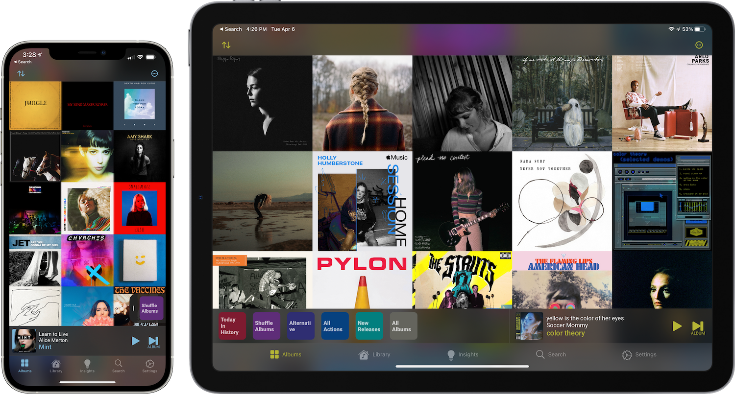
Albums 4.0 is a beautifully designed, feature-rich app with more filtering and discovery tools than any other music app I’ve tried. The app is also opinionated, favoring album playback over individual songs or playlists. It’s the sort of focused, deep approach to music that Apple’s Music app doesn’t offer because it’s designed to appeal to a wider audience.
If you’re an albums-first music fan, you’ll love Albums. However, even if you prefer singles, playlists, and jumping around the Apple Music catalog as I do, Albums is worth checking out. The app’s powerful filtering opens up brand new ways to enjoy your music collection that any music fan can appreciate.
It just so happens that Federico and I are in the midst of an AppStories miniseries on music. This week we discussed how we listen to music and how it influences the services we use. Next week, we’ll cover third-party apps including Albums and many more. You can check out this week’s episode here: