This Week's Sponsor:

Washing Machine X9

Spring Clean Your Mac Effortlessly


Posts in reviews

Text Case Adds Customizable Flows: User-Created, Multi-Step Text Transformation

Text Case is a text transformation app that includes 37 text transformations. The app can capitalize titles according to multiple style manuals, trim whitespace, URL encode and decode text, change text to all uppercase or lowercase lettering, generate Markdown, and more.

You can type or paste text into Text Case to transform it, but with the introduction of Shortcuts support in 2018, Text Case became an app that could be used exclusively as a series of Shortcuts actions too. The hasn’t changed, but now, you can also create multi-step text transformations for use in the app itself or from Shortcuts or the share sheet, adding a new level of convenience. The update marks an interesting shift of focus from a tool that applied individual transformations to text one at a time to a text workflow creation tool that uses a UI that is reminiscent of Shortcuts.

Read more


MindNode’s Newly-Editable Outline View Adds a Terrific New Dimension to the Mind Mapping App’s Mac Version

When I think about my writing, I think in outlines, which is a remnant of my days as a law student. A big part of every law school’s first-year curriculum is teaching students how to synthesize vast quantities of research materials into carefully-organized outlines. Outlines are a system of organizing my thoughts that have served me well, but it’s not the only approach, nor is it always the best.

Mind maps provide a more visual way to organize your thoughts and afford more room for creativity by making it easier to spot connections between related ideas and organize them in a less constrained way. Outlines suffer from a linearity and information density that makes those connections harder to find. However, when you pull back and consider most mind maps and outlines from a birds-eye perspective, they’re complementary rather than alternative ways to approach the same problem.

Last year, as I planned my Big Sur review, I briefly considered switching from MindNode to an outlining app to organize my notes. MindNode has included an outline view for years, but it wasn’t editable, which always bothered me. I appreciated the alternate visualization but wanted the ability to move nodes around within the outline’s hierarchy.

Read more


Puppr Review: Teach Your Dog New Tricks

I came across Puppr during its recent feature as Apple’s App of the Day and decided to give it a try. The app is a simple and fun instructional tool for teaching your dog new behaviors and tricks. Since I’ve been staying with my parents for the last couple of months, I decided to take it for a spin doing some training with the family dog.

Puppr’s Home view consists of a scrolling list of categories for dog lessons. You can start simple with the ‘New Dog’ or ‘Basics’ categories, but it quickly ramps up from there. Each category consists of a series of behaviors or tricks, and tapping one opens its details view. Within this view you can see a brief video of the trick in action with a real dog. There’s also a difficultly rating, a description, and a badge for whether it’s safe to teach this trick to puppies. Each trick includes a status dropdown which you can use to note that you’re in progress of teaching it to your dog, or that your dog has mastered it.

Read more


Two Months with the HomePod mini: More Than Meets the Eye

As a smaller, affordable smart speaker tightly integrated with Apple services, the HomePod mini is a compelling product for many people. The mini is little enough to work just about anywhere in most homes. At $99, the device’s price tag also fits more budgets and makes multiple HomePod minis a far more realistic option than multiple original HomePods ever were. Of course, the mini comes with tradeoffs compared to its larger, more expensive sibling, which I’ll get into, but for many people, it’s a terrific alternative.

As compelling as the HomePod mini is as a speaker, though, its potential as a smart device reaches beyond the original HomePod in ways that have far greater implications for Apple’s place in customers’ homes. Part of the story is the mini’s ability to serve as a border router for Thread-compatible smart devices, forming a low-power, mesh network that can operate independently of your Wi-Fi setup. The other part of the story is the way the mini extends Siri throughout your home. Apple’s smart assistant still has room to improve. However, the promise of a ubiquitous audio interface to Apple services, apps, HomeKit devices, and the Internet is more compelling than ever as Siri-enabled devices proliferate.

For the past couple of months, I’ve been testing a pair of HomePod minis that Apple sent me. That pair joined my original HomePods and another pair of minis that I added to the setup to get a sense of what having a whole-home audio system with Siri always within earshot would be like. The result is a more flexible system that outshines its individual parts and should improve over time as the HomeKit device market evolves.

Read more


Dato Review: Calendar Events and Time Zones From Your Mac’s Menu Bar

My calendar needs are pretty simple. I have a shared family calendar to keep tabs on personal obligations and a personal MacStories calendar for work-related events. I also share a calendar with Federico for scheduling podcast recording times and other events, but that’s about it.

If you spend lots of time in a calendar app because you have lots of meetings, having calendar sets, tasks, scheduling, video call support, weather, and other pro features inside your calendar app makes sense. My work is far more task-focused than event-focused, though. I don’t want to lose track of important events, but most days, Apple’s calendar widget on my iPhone is all I need.

The Calendar widget doesn’t quite cut it for me on the Mac, though. Widgets are out of sight in Big Sur, and there’s no way to trigger the widget panel with a keyboard shortcut. So, instead, I’ve been using a Mac menu bar app called Dato for quick glances at my calendar. The app isn’t new, but the recent addition of time zone support caught my eye, and it has played an important role in my daily workflow ever since I began using Apple’s Calendar app again.

Read more


Scenecuts Adds Effortless Access to HomeKit Scenes in Your Mac’s Menu Bar

Scenecuts is a new utility app for controlling HomeKit devices from your Mac’s menu bar. The free, open source app, by Seattle developer Nick Hayward can control HomeKit scenes from the menu bar app’s drop-down menu, customizable per-scene menu bar icons, or the keyboard. It’s a terrific trio of options that makes controlling your smart devices immediate by freeing them from the confines of the Home app.

In its default configuration, Scenecuts adds its icon to your menu bar, and clicking on it reveals a drop-down menu of all the HomeKit scenes you’ve created in Apple’s Home app for controlling your smart devices. However, the app’s real power lies in its preferences, where you can edit Scenecuts’ drop-down menu, add individual scenes to your menu bar, and assign them to global keyboard shortcuts.

Scenecuts' preferences.

Scenecuts’ preferences.

The HomeKit scenes you want to control with a particular Mac may vary. For instance, you may only care about the lights in the room where your desktop Mac sits, but want to control any of the lights in your home with a laptop that you carry with you. Scenecuts recognizes this by providing checkboxes next to every scene in its preferences. By default, all of your scenes are available in Scenecuts’ drop-down menu, but each of them can be turned off by unchecking its checkbox, which is a nice way to tidy up a long list of scenes. I turned off a bunch of scenes to make it easier to quickly locate the ones I use most often.

Scenes turned into individual menu bar items with SF Symbols icons.

Scenes turned into individual menu bar items with SF Symbols icons.

Another series of checkboxes, which are unchecked by default, controls whether scenes are shown as individual menu bar items. The feature is a lot like the ability to drag items out of Control Center to the menu bar. You can also add an icon for any of the scenes you add to the menu bar using Apple’s SF Symbols. I immediately added separate menu bar items for the space heater in my office and the settings for my overhead lights that I use for product photography because those are two scenes I find myself wanting to trigger from my desk regularly. The use of SF Symbols is an excellent way to pick something that is meaningful and memorable for triggering scenes.

The third way to use Scenecuts to trigger scenes is by using global keyboard shortcuts. Keyboard shortcuts are optional but extremely handy when you’re working with the keyboard instead of a trackpad or mouse. I appreciate, too, that Scenecuts displays the keyboard shortcuts you’ve assigned in its drop-down menu. The visibility provides a little reminder that has helped me memorize the shortcuts faster than I might otherwise have.

I’ve leveled my fair share of criticisms against the Home app, especially on the iPhone, but it’s grown on me when using my Mac. There’s more screen real estate than on the iPhone, which means its tile UI is less of an issue. Still, for quickly toggling my space heater or switching off a set of lights, opening a full-blown Mac app is overkill. By surfacing individual scenes in the menu bar, Scenecuts is the perfect complement to Apple’s Home app.

Scenecuts also highlights the anemic state of Control Center on the Mac. As I explained in my Big Sur review, I like the concept of Control Center on the Mac a lot, but it’s disappointing that so much of the functionality found in iOS is unavailable. Until Apple expands Control Center to incorporate scene support, Scenecuts is an excellent solution.

You can download Scenecuts for free from the Mac App Store.


Fitness Totals Review: Effortlessly Surface Fitness Data and Track Your Progress

The Apple Watch and iPhone can collect a lot of fitness data. The trouble is, there’s so much information available that it can be a little overwhelming and difficult to sift through in Apple’s Health app. The situation has left an opening for third-party apps like Fitness Totals that use smart design and leverage new features like widgets to make sense of the piles of data and provide useful insights.

Fitness Totals benefits from its tight focus on applying a consistent approach to 16 fitness metrics using its app and companion widgets. The app compares fitness data over daily, weekly, monthly, and annual time periods, providing answers to questions like ‘Have I burned as many calories today as yesterday? and ‘Is my step count higher or lower this week than last?’ The data is available in the app, but its greatest strength is its widgets.

As much as I like Fitness Totals’ widgets, though, I want to start with the app. This is where you set up which metrics you want to track, and you can view even more data than is available in the widgets. Fitness Totals can track:

  • Steps
  • Walking and Running distance
  • Walking workouts
  • Running workouts
  • Hiking workouts
  • Cycling
  • Wheelchair distance
  • Wheelchair pushes
  • Swimming strokes
  • Swimming distance
  • Downhill snow sports
  • Resting calories burned
  • Active calories burned
  • Flights of stairs climbed
  • Exercising minutes
  • Standing minutes

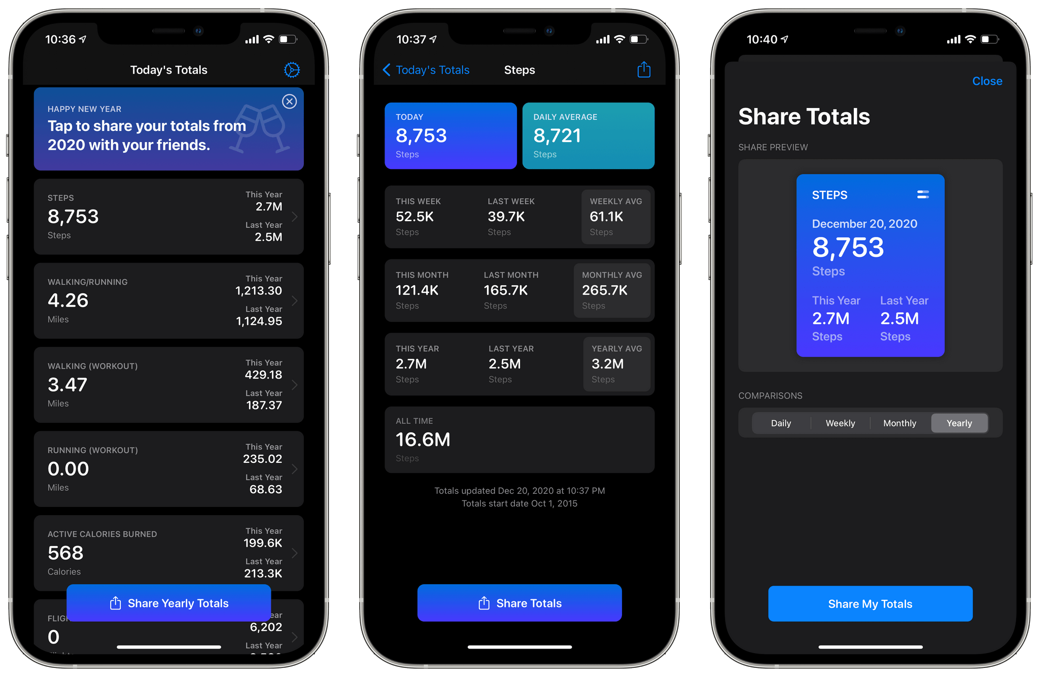
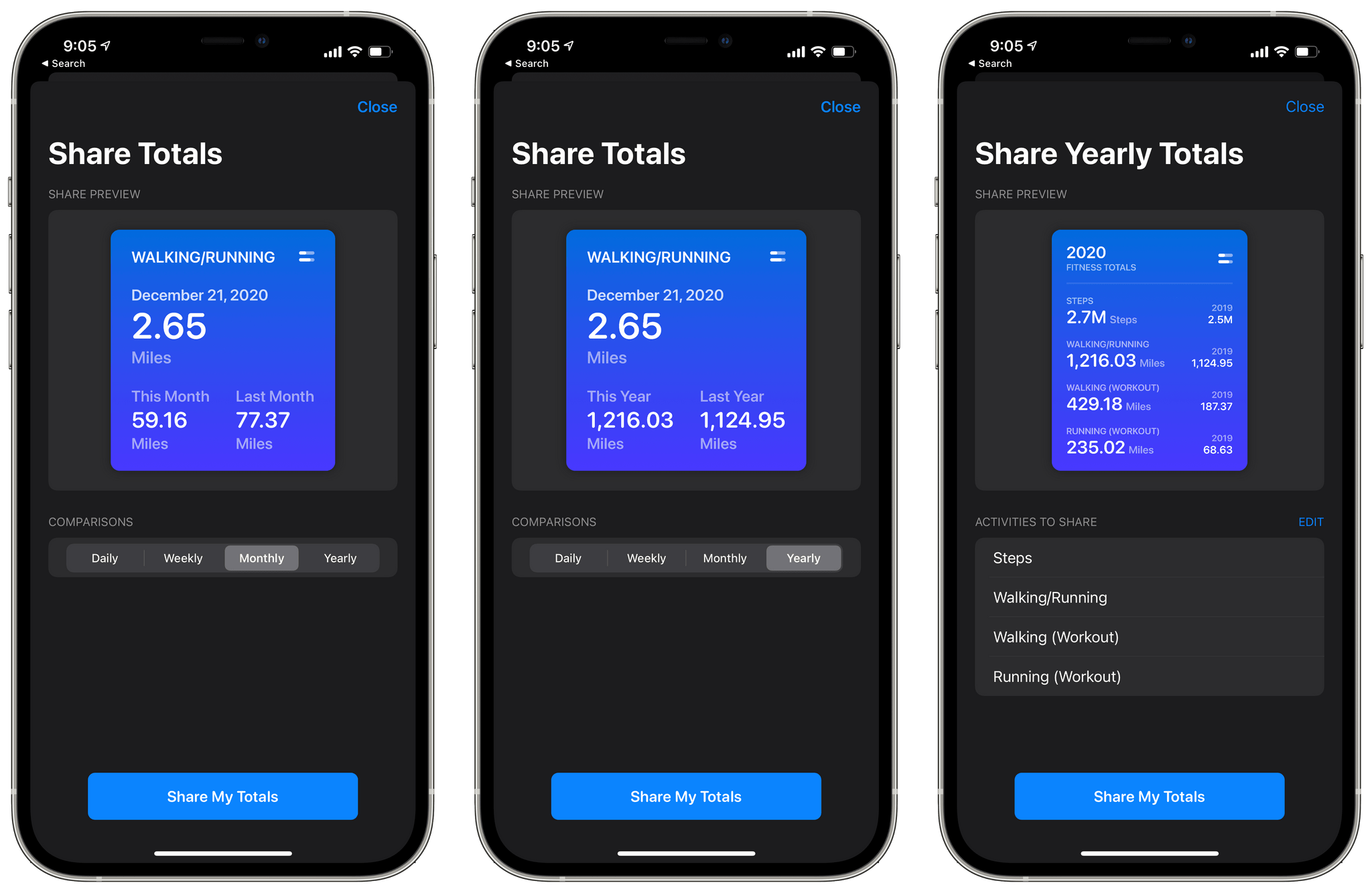
The app’s main view displays a series of cards for each category you’ve chosen to track. Each card lists your total for the day and the current year compared to last year. Tapping a card opens a detailed view with more statistics. For example, my step details included today’s total and my daily average along with totals for this week, month, and year compared to last week, month, and year, and the averages for each. Finally, there’s an all-time number totaling all the data recorded and a button for sharing a daily, weekly, monthly, or yearly summary with a colorful graphic.

Sharing your stats.

Sharing your stats.

The main view of the app also has a share button that lets you compose a graphic showing your yearly totals for any of the metrics you’re tracking. Currently, there’s also a banner at the top of the app prompting users to share their yearly totals, which does the same thing as the share button at the bottom of the screen.

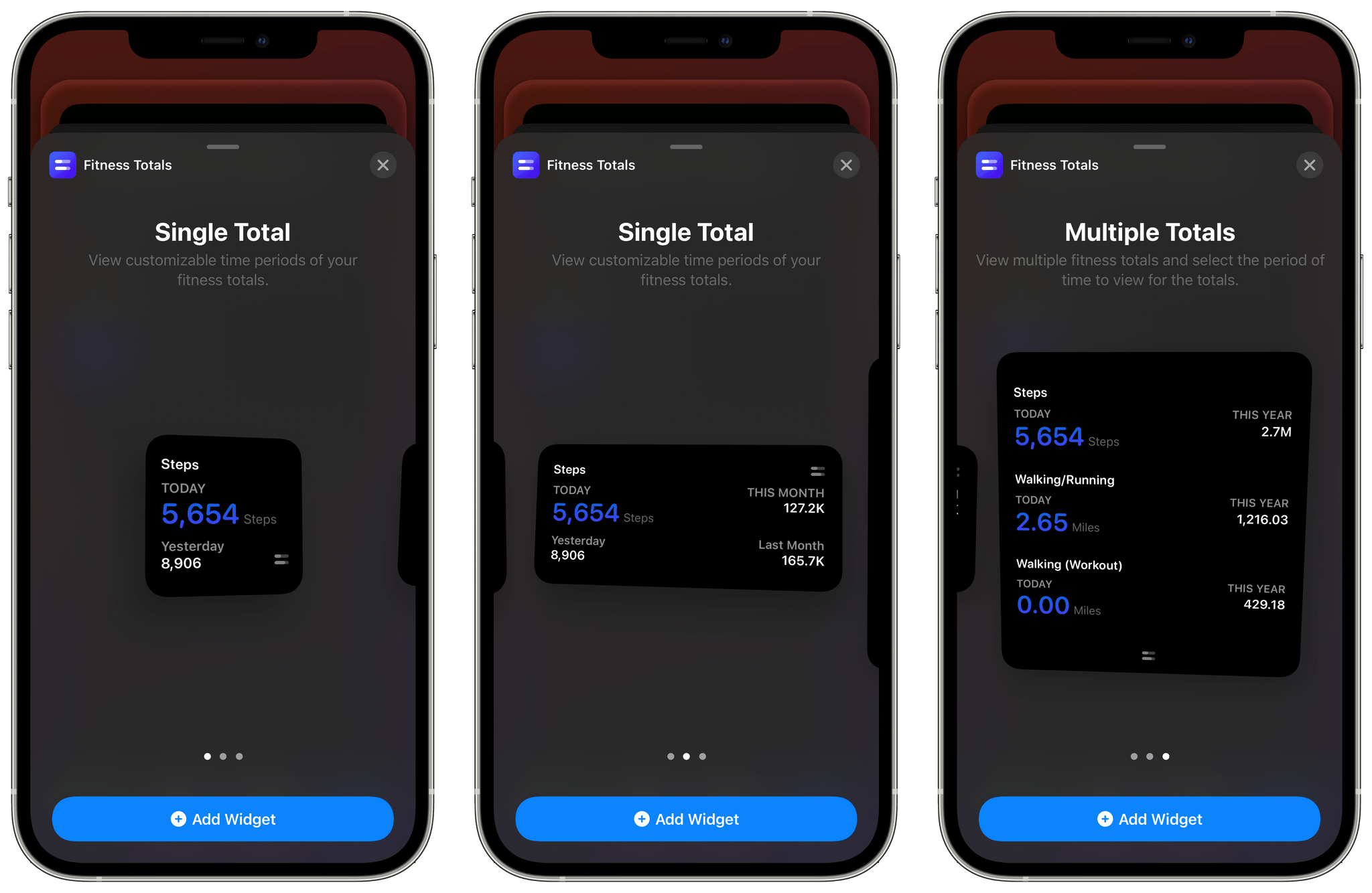
The app’s three sizes of widgets are similar to the graphics its share functionality creates. The primary difference between each widget size is how much data it can display. The small widget displays one pair of statistics: today compared to yesterday or this week, month, or year compared to last week, month, or year. The medium widget adds a second set of data points, and the large one allows for three points of comparison.

Fitness Totals' widgets.

Fitness Totals’ widgets.

I’ve been using a medium widget to remind me of my step count for today, yesterday, and last week versus this week. The widget serves as a quick way to gauge how active I’ve been as the week progresses and is a nice addition to the health and fitness stack that I’ve created on a secondary Home Screen. I may add additional Fitness Totals widgets over time, but for now, the step count widget is doing a good job of reminding me to stay active.

The one thing I’d like to see added to Fitness Totals’ widgets is color and typeface customization options. The widgets are pure black, and some statistics are a dark purple that looks good but doesn’t offer much contrast against the black, which can make the numbers difficult to read. The black background can also be a bit stark against some wallpapers.

Even so, Fitness Totals fills a nice gap Apple has left wide open. Apple’s Health app has all the data Fitness Totals displays, but the company doesn’t offer a Health widget. Fitness Totals also benefits from its focus on just a handful of fitness metrics that can be turned on or off by users surfacing the data far better than the Health app. If you’re looking for a periodic Home Screen reminder to keep you on track with your fitness plans for 2021, Fitness Totals is an excellent choice.

Fitness Totals is available on the App Store for $2.99.


Level Touch: A HomeKit-Enabled Smart Lock That Everyone in Your Household Can Appreciate

Source: Level.

Source: Level.

I’m fairly conservative about the HomeKit devices I add to my home these days. Most of my early HomeKit experiments were limited to my studio, where the impact on the rest of my family was minimal. That approach has worked well for many accessories, but it’s not possible to do with everything.

My studio doesn’t have an exterior door, so although I’ve been intrigued by smart locks for what feels like forever, I’ve been hesitant to test them. Security is clearly a question, but so is convenience. I didn’t want to subject my family to a HomeKit experiment that had the potential to cause headaches for them as they were coming or going throughout the day. Smart locks need to be simple, easy, and reliable while also offering real benefits above and beyond the tried and true method of locking a door.

As a result of these concerns, I sat on the HomeKit lock sidelines for a long time. So, when the makers of the Level Touch smart lock contacted me and offered to send me one to try, I thought long and hard about it. Ultimately, though, my curiosity got the best of me.

The first thing that caught my eye was what the Level Touch isn’t. The lock isn’t one of those big bulky smart locks that you may have seen before. Instead, the Level Touch is ordinary in the sense that it looks like a normal lock on the outside. That’s because the smarts are cleverly hidden inside the lock mechanism itself.

So, a few weekends ago, I took the plunge and installed the Level Touch on an exterior door that gets a lot of use daily. Since then, I’ve been impressed with not only what the Level Touch enables as a HomeKit-enabled device, but also how well it performs as a plain old standard lock. It’s a combination that too few smart home devices accomplish, putting it in a pretty exclusive club.

Read more


macOS Big Sur: Widget Roundup

Developer adoption of new macOS features is often a little slower than it is on iOS and iPadOS. However, that hasn’t been the case with Big Sur widgets. Apple wisely took the same SwiftUI-based system used for creating widgets on the iPhone and iPad and implemented it on the Mac, providing a relatively simple approach for developers to bring their existing widgets to the Mac. The result has been an immediate explosion of widget options for Mac users.

Over the course of the summer and fall, I tried several different widgets as I ran the Big Sur betas. A few of those widgets — which have been in development the longest and were highlighted in my Big Sur review — remain some of my favorites and are recapped below. However, many more terrific widgets have been released since and deserve consideration as well, so let’s dig in.

Read more