AirBuddy is one of those handy Mac utilities that you don’t know how you’ve lived without until after you’ve tried it. The initial release that I reviewed in early 2019 was primarily designed to manage Bluetooth headphones connected to your Mac and report the status of your headphones’ batteries; something iOS and iPadOS does better than macOS. With AirBuddy 2, developer Guilherme Rambo has added a bunch of new features, including new ways to customize the app and interact with Bluetooth devices other than headphones.
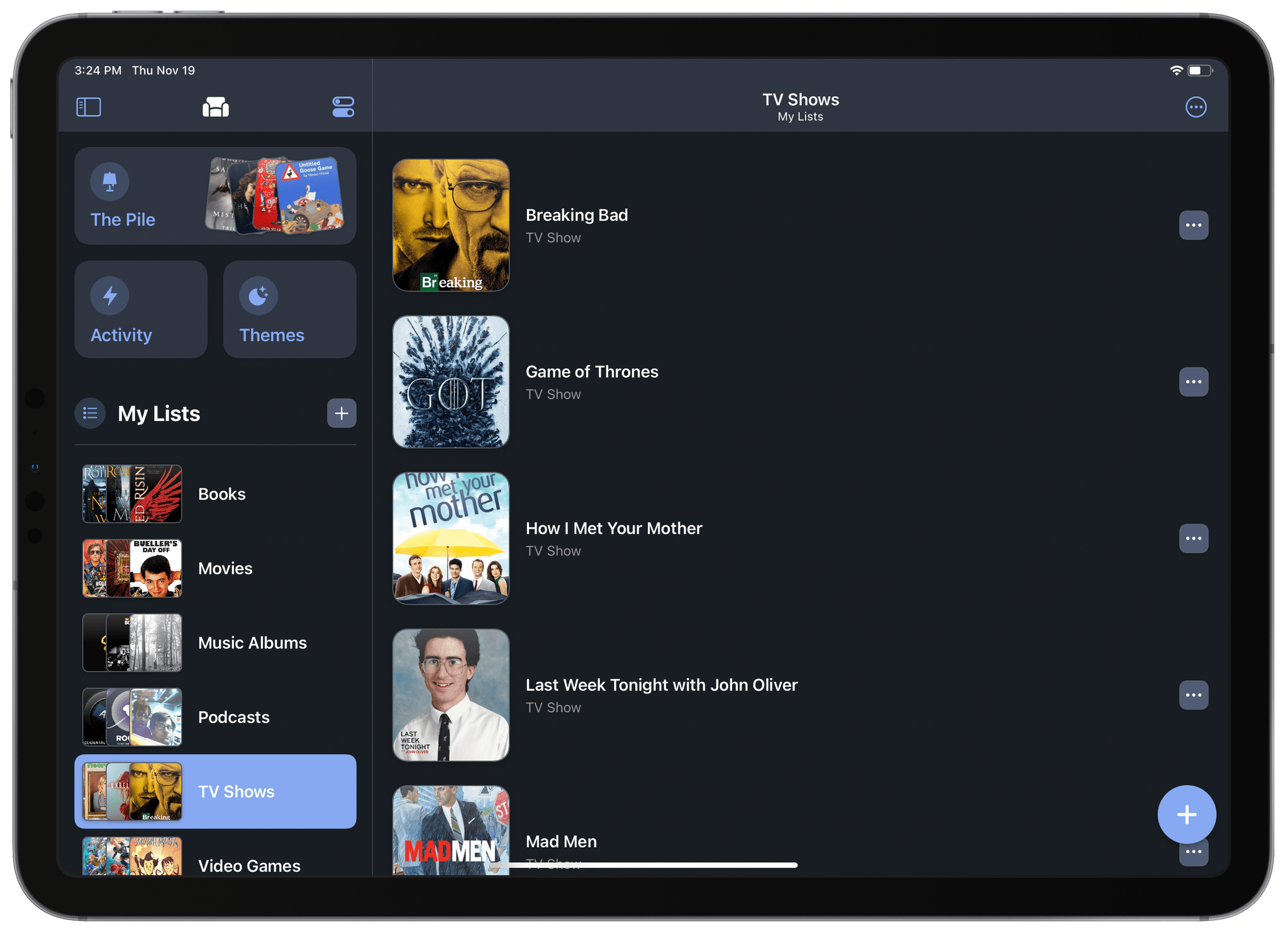
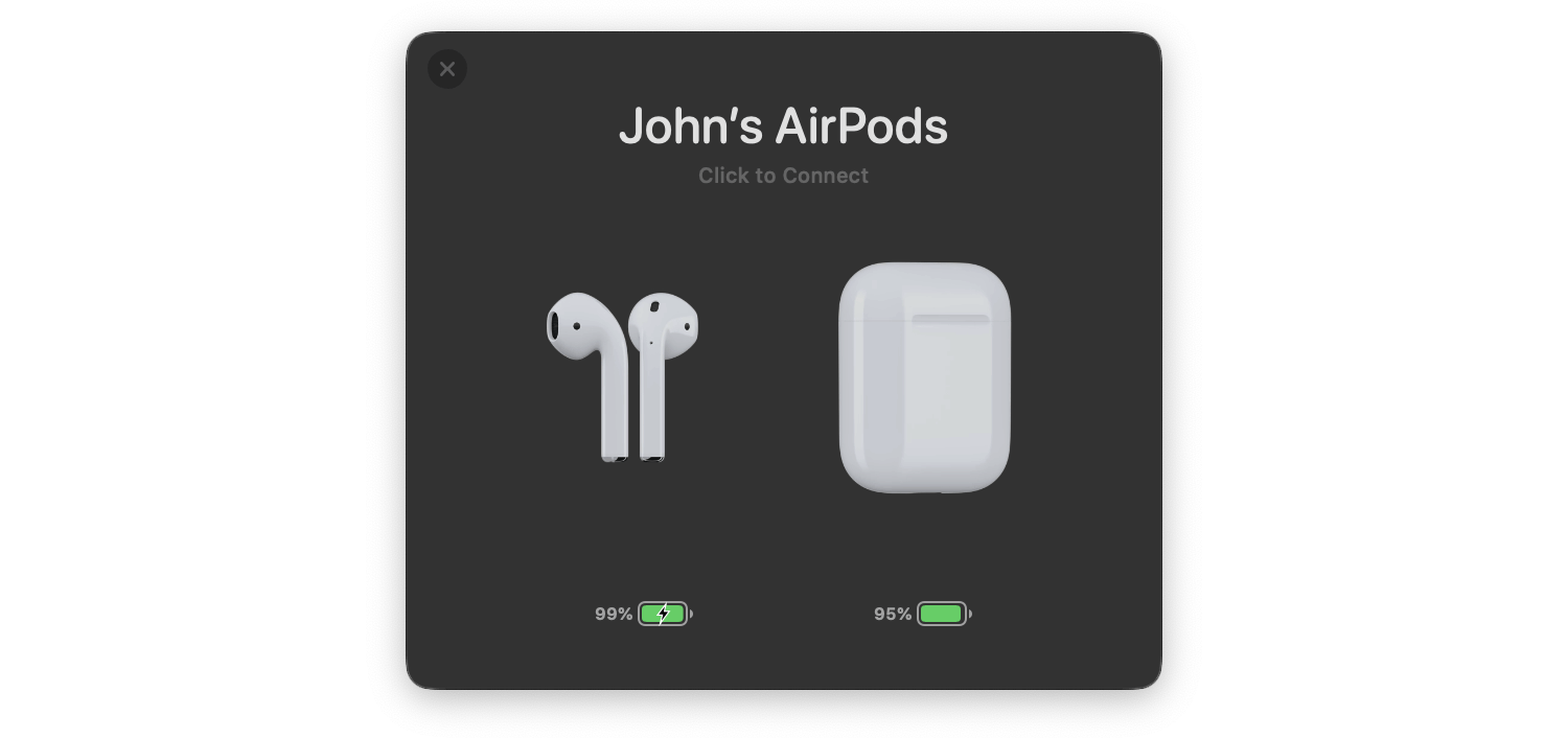
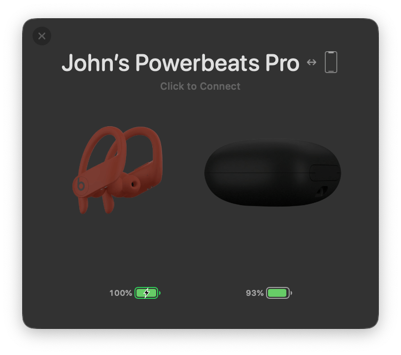
As with the original version of AirBuddy, when you open your AirPods or Beats headphone case near your Mac, a window opens, showing you the status of their batteries and connection. The app also works with Bluetooth headphones that rely on an on/off switch like the Beats Solo line. From AirBuddy’s status window, you can click to connect the headphones to your Mac or swipe to connect and set their listening mode in one gesture.
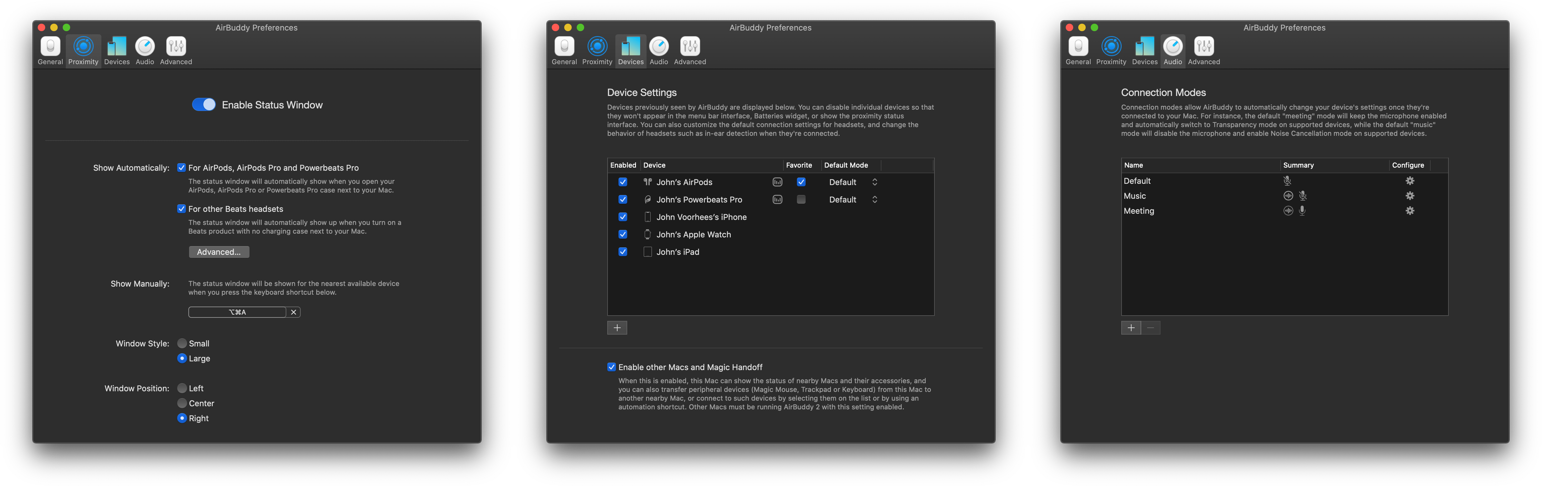
AirBuddy 2’s listening modes allow you to adjust multiple headphone settings all at once when the app connects your headphones to your Mac. For example, you can turn your headphones’ microphone on for meetings or off for listening to music and set the volume and whether AirPods Pro play audio in Normal, Transparency, or Noise Cancelling modes. The combinations you pick for your listening modes are saved as profiles in the app’s settings.
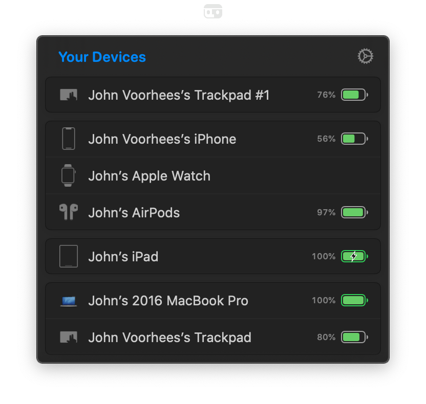
AirBuddy 2 is also a menu bar app. Clicking its menu bar icon opens a window that shows all your connected devices and their battery status, including Macs, iPhones, and iPads. The devices are grouped, so, for example, your Apple Watch shows up as connected to your iPhone as would any AirPods you’re currently using with your iPhone. If you run AirBuddy 2 on a second Mac, that Mac will show up here, too, along with any Bluetooth peripherals connected to it.
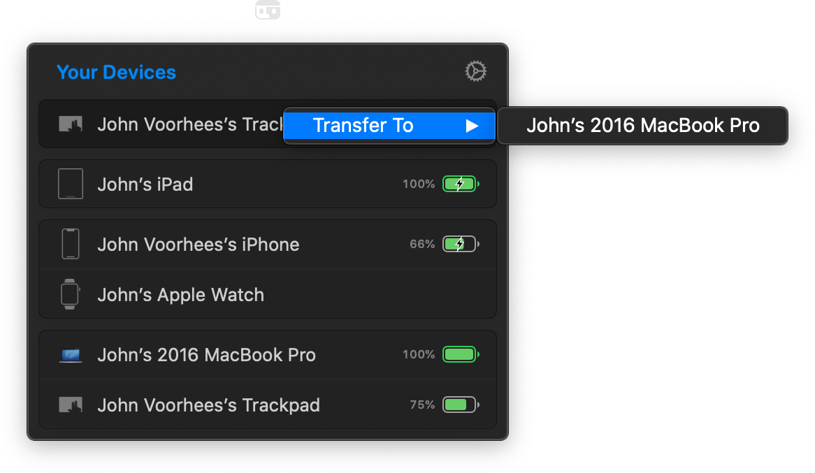
My favorite part of having AirBuddy 2 running on multiple Macs is the ability to transfer Bluetooth connections from one Mac to the other using the app’s Magic Handoff feature. I spent a lot of the summer with separate trackpads connected to two Macs as I switched back and forth, testing Big Sur. AirBuddy 2 provides an alternate desk-clearing option by letting you right-click the AirBuddy entry for a trackpad, mouse, or keyboard connected to the Mac you’re currently using and switch it to the other Mac. For anyone who runs multiple Macs, especially connected to the same display, this is a terrific feature.
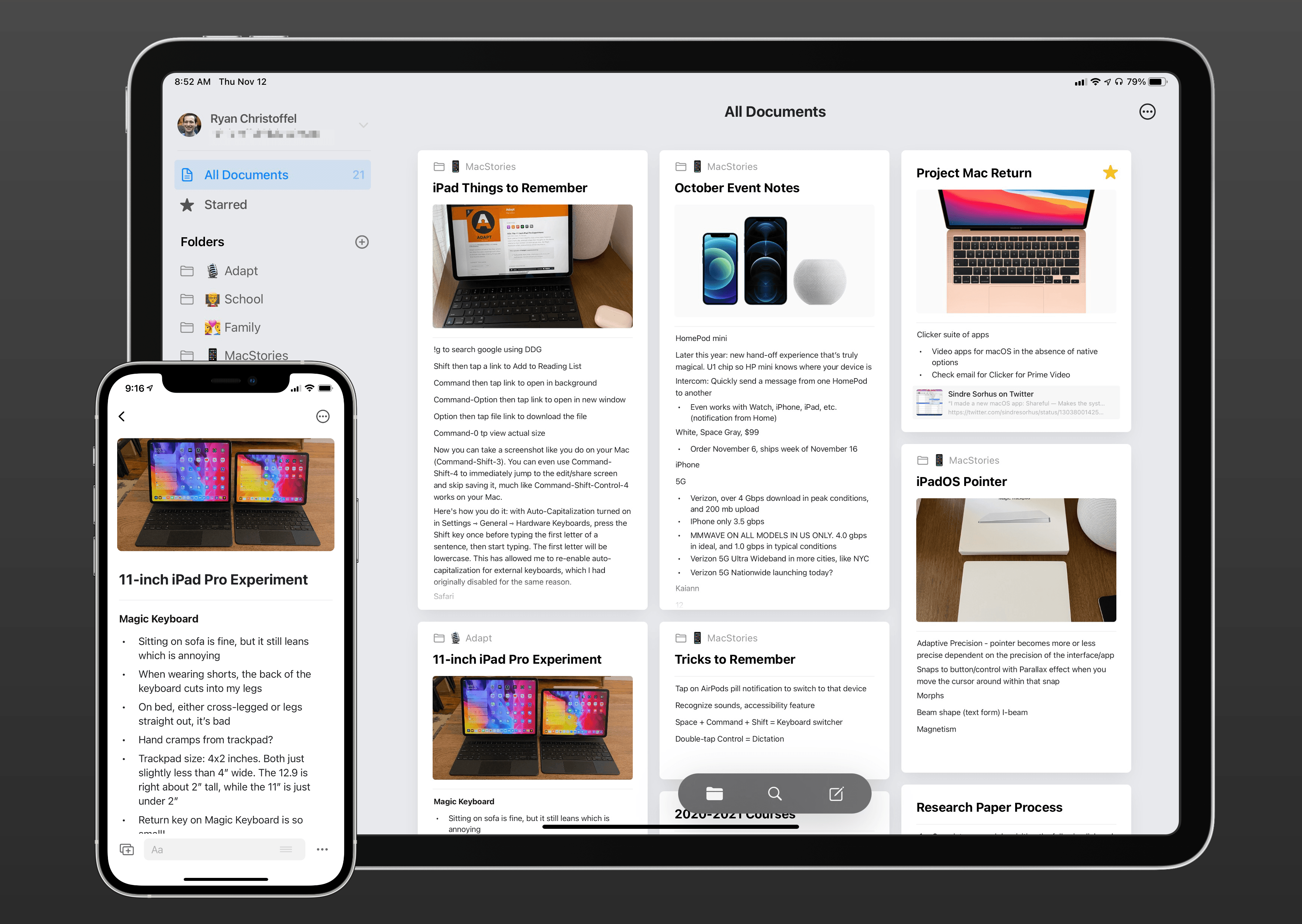
AirBuddy 2 is highly customizable too. In addition to setting up custom listening modes, which I covered above, you can open the app’s settings from the menu bar and assign keyboard shortcuts to display the headphone status window and to quickly connect to a favorite device, switch listening modes, toggle your microphone on or off, and take other actions. Settings also lets you specify the devices that are shown in the menu bar app, your favorite headphones for quick connection purposes, the status window’s size, and where it appears onscreen, among other things. You can even view historical battery and usage data from the Devices section of the app’s settings.
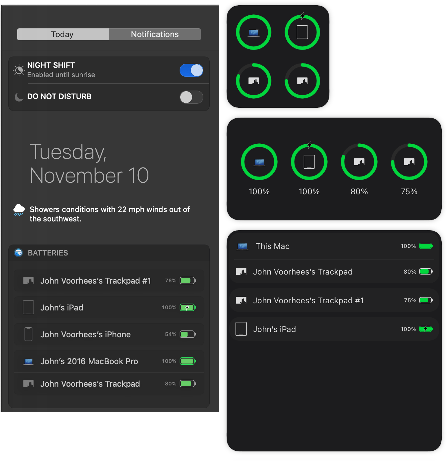
It’s also worth noting that AirBuddy 2 also includes a widget that works with both Catalina and Big Sur to display the battery status of each of the devices it tracks.
AirBuddy started as an app that brought an iOS feature for headphones to the Mac. With AirBuddy 2, the app’s functionality has been greatly expanded beyond anything Apple offers, making it indispensable for anyone who connects multiple wireless devices to their Macs. Not only can you quickly connect headphones, so they’re immediately ready for a meeting or for listening to music, but the app helps keep you on top of the battery status of every connected device.
AirBuddy has been available for pre-order since last month, but today is its official release date. You can purchase the app directly from the AirBuddy website for $9.99 for new users, $4.99 as an upgrade from the first version of AirBuddy if you bought it in 2019, and for free if you purchased the app in 2020.