Posts in reviews

Service Station Review: A Handy Utility to Customize Your Finder’s Contextual Menu

I wouldn’t be surprised if you’ve never heard of Finder Sync Extensions. I haven’t run across many apps other than Dropbox and HoudahSpot that support the feature. Finder extensions allow third-party developers to customize the Finder on the Mac with buttons in the Finder’s toolbar or changes to the contextual menu that’s displayed when you right-click on a file.

Service Station adds apps and scripts to the top level of your Mac's contextual menu based on rules you define.

Service Station adds apps and scripts to the top level of your Mac’s contextual menu based on rules you define.

Service Station is a new Mac utility that takes advantage of Finder extensions by letting users create rules to control when and which apps are displayed in the right-click contextual menu. The app can also be used to kick off AppleScript and shell scripts and Automator workflows. These are all tasks that macOS already supports in one way or another, but Service Station surfaces them as top-level contextual menu options and can be customized to suit your individual needs, which makes this a very handy tool.

Read more


HomePass 1.7 Brings Refreshed UI, Customizable Data Fields, and Improved Shortcuts Support

My HomeKit setup started out simple enough with a few Hue bulbs, but over time, it has grown to include security cameras, door sensors, electrical outlets, and more. As the number of accessories connected to my network grew, so did the hassle of managing them.

The initial setup of a device is rarely the problem. Instead, the trouble starts when you need to set up an accessory again later. In that case, you may have discarded or lost the documentation containing the HomeKit accessory code, or it may be in a hard to reach location. That’s where HomePass by Aaron Pearce comes in handy. It stores and manages your HomeKit accessory codes and other relevant information in one place.

Digital spring cleaning is something that’s been on my mind as I’ve been stuck at home and had some extra free time. We discussed the topic on AppStories this week in the context of apps, but HomePass provides the opportunity to extend digital spring cleaning to your HomeKit devices too.

We’ve covered HomePass before, so I won’t go into all the details of its core functionality. Instead, I’ll focus on what’s new and the features that make HomePass one of my favorite HomeKit utilities.

As with prior versions, HomePass remains incredibly easy to use because it pulls information about your HomeKit accessories from the Home app’s database. Add to that the fact that accessory codes can be added by scanning the stickers that you find on most devices or entering them manually, and you’re starting with a lot of information with virtually no effort.

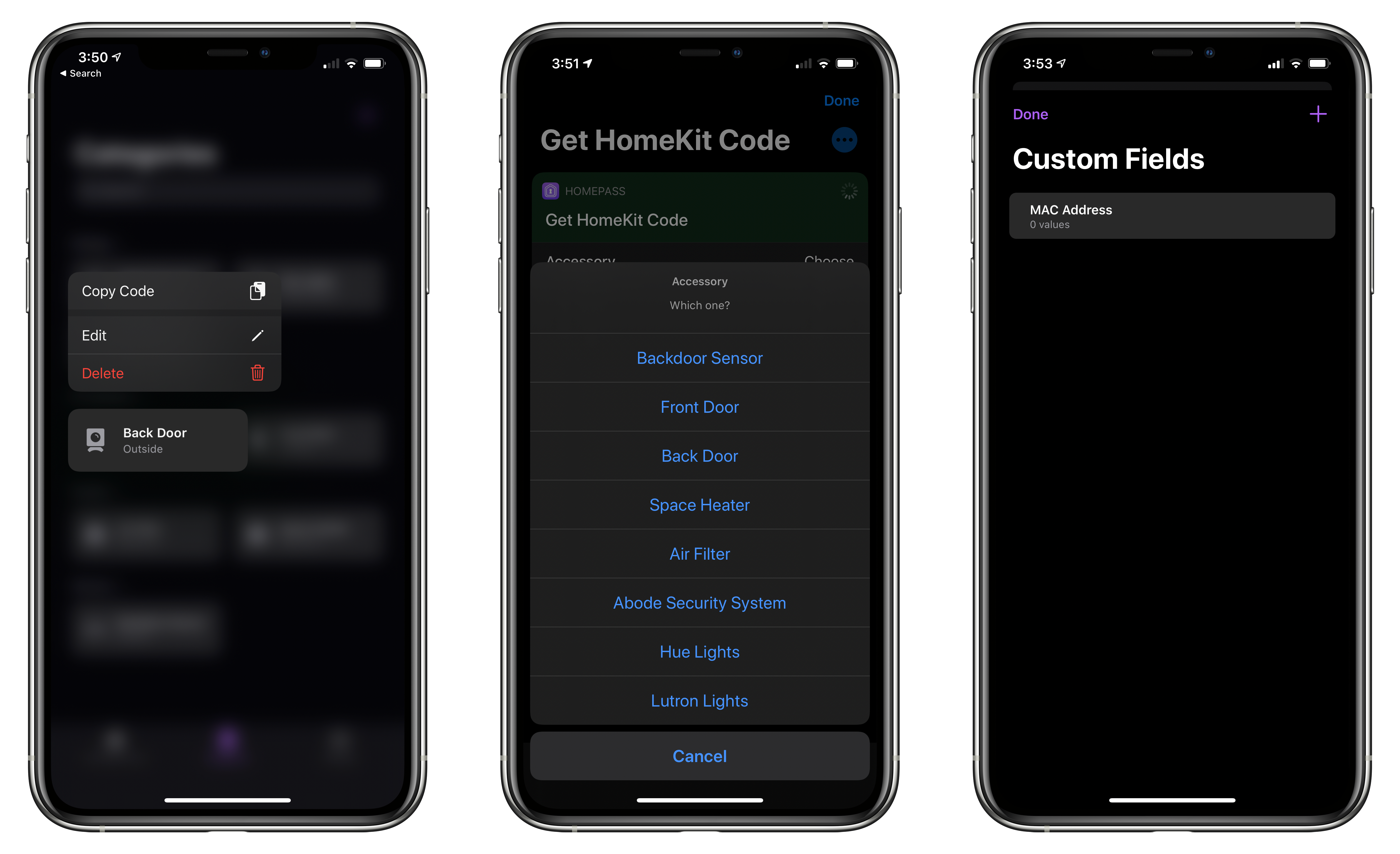
With the latest update, HomePass has added greater flexibility and a more compact UI that works better with larger collections of HomeKit devices. For instance, sometimes you want to add more information about an accessory than is available in the Home app. With version 1.7 of HomePass, you can now add custom fields to a device’s entry to collect additional details. I’ve been satisfied with the existing fields that are auto-filled from the Home app, plus HomePass’s notes section, but it’s also something I’m glad will be available if the need arises for me in the future.

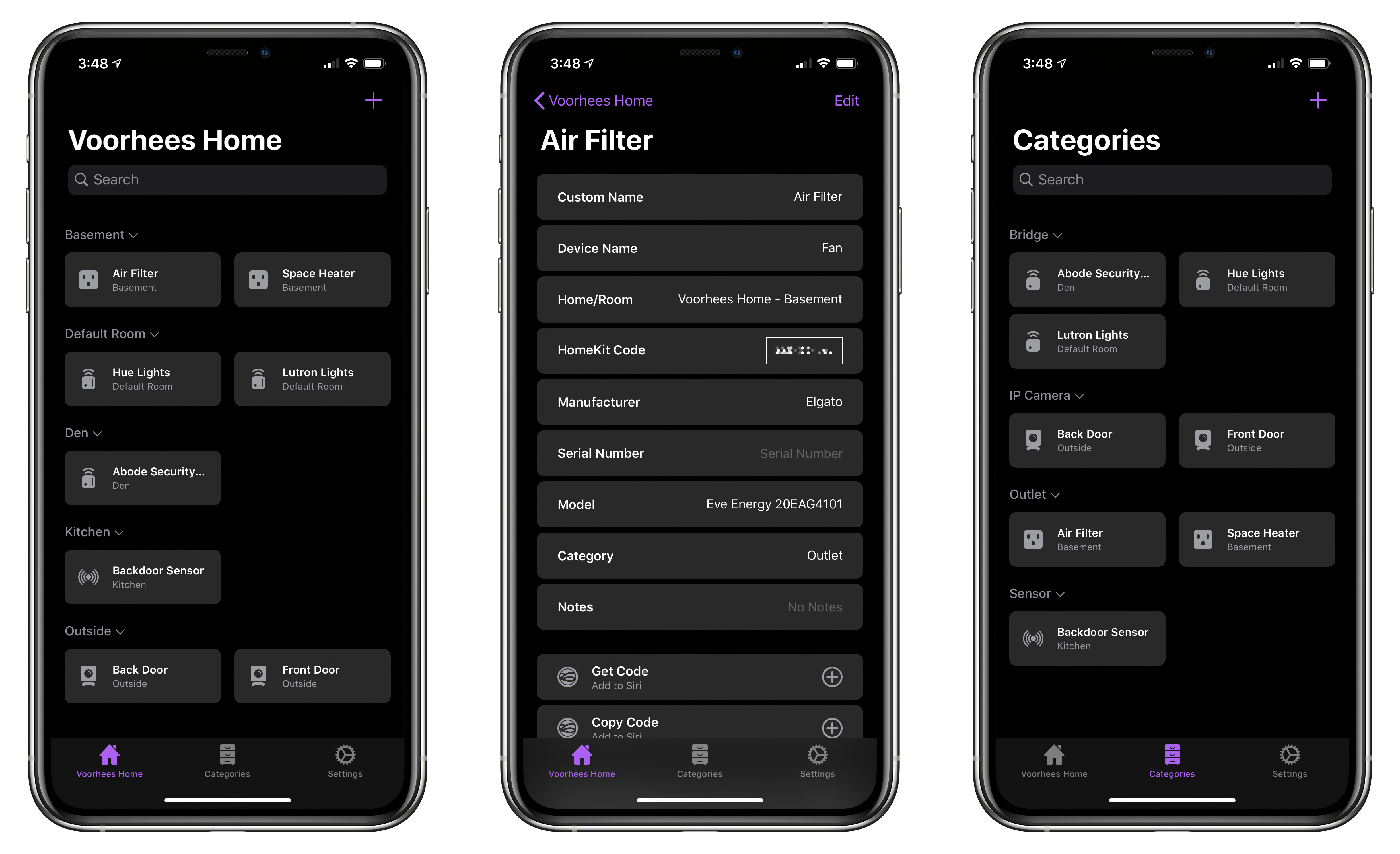
On the iPhone, devices stored in HomePass are now organized in a two-column grid of rounded rectangles a little like the tiles found in the Home app. Like Home+ 4 by Matthias Hochgatterer, HomePass does something Home can’t, though, which is collapse rooms by tapping on their names to hide away devices you don’t want to see. Combined with the new layout on the iPhone, which is similar to the existing layout on the iPad, it’s easier to manage a large collection of devices from a single screen.

From HomePass's Settings tab you can manage custom fields, export your data, and pick from four different icons.

From HomePass’s Settings tab you can manage custom fields, export your data, and pick from four different icons.

HomePass is organized into tabs now too. The first tab organizes devices by your home’s rooms. The second tab organizes the same accessories by category like ‘Bridge,’ ‘Camera,’ ‘Outlet,’ and ‘Sensor.’ Like rooms, devices are laid out in a grid, and sections can be collapsed. Categories is an excellent alternative way to break down your HomeKit devices functionally.

Device tiles support context menus now too. Long-pressing on a tile offers options to edit or delete the device or copy its code. It’s a terrific way to quickly grab a code when that’s all you need.

Tapping on an item opens up a view with the details about each device. Long-pressing on the HomeKit accessory code allows you to copy it. Also, at the bottom are buttons to set up ‘Get Code’ and ‘Copy Code’ actions using Add to Siri. Once set up, the actions can be triggered using Siri voice commands or included in custom shortcuts you build.

HomePass now supports context menus, better Shortcuts support, and custom device fields.

HomePass now supports context menus, better Shortcuts support, and custom device fields.

In addition to device-specific actions, the app comes with the following built-in Shortcuts actions that have been improved by the addition of parameters:

  • ‘Copy HomeKit Code,’ which presents a list of your devices by default, and copies the code for the one you pick to the clipboard. The action can also be used to grab the code of a specified device and pass it to the next action.
  • ‘Get HomeKit Code’ also retrieves a device’s code, but passes it to the next action without copying it.
  • ‘Get Accessory,’ which the app’s description seems to suggest retrieves all of the information about a device, though it only returns the name of a specified accessory when I’ve used it.
  • ‘Get All Accessories,’ which retrieves a list of all your HomeKit devices.

The app includes an x-callback-url scheme that developers can use to automatically add devices to HomePass from their apps too.

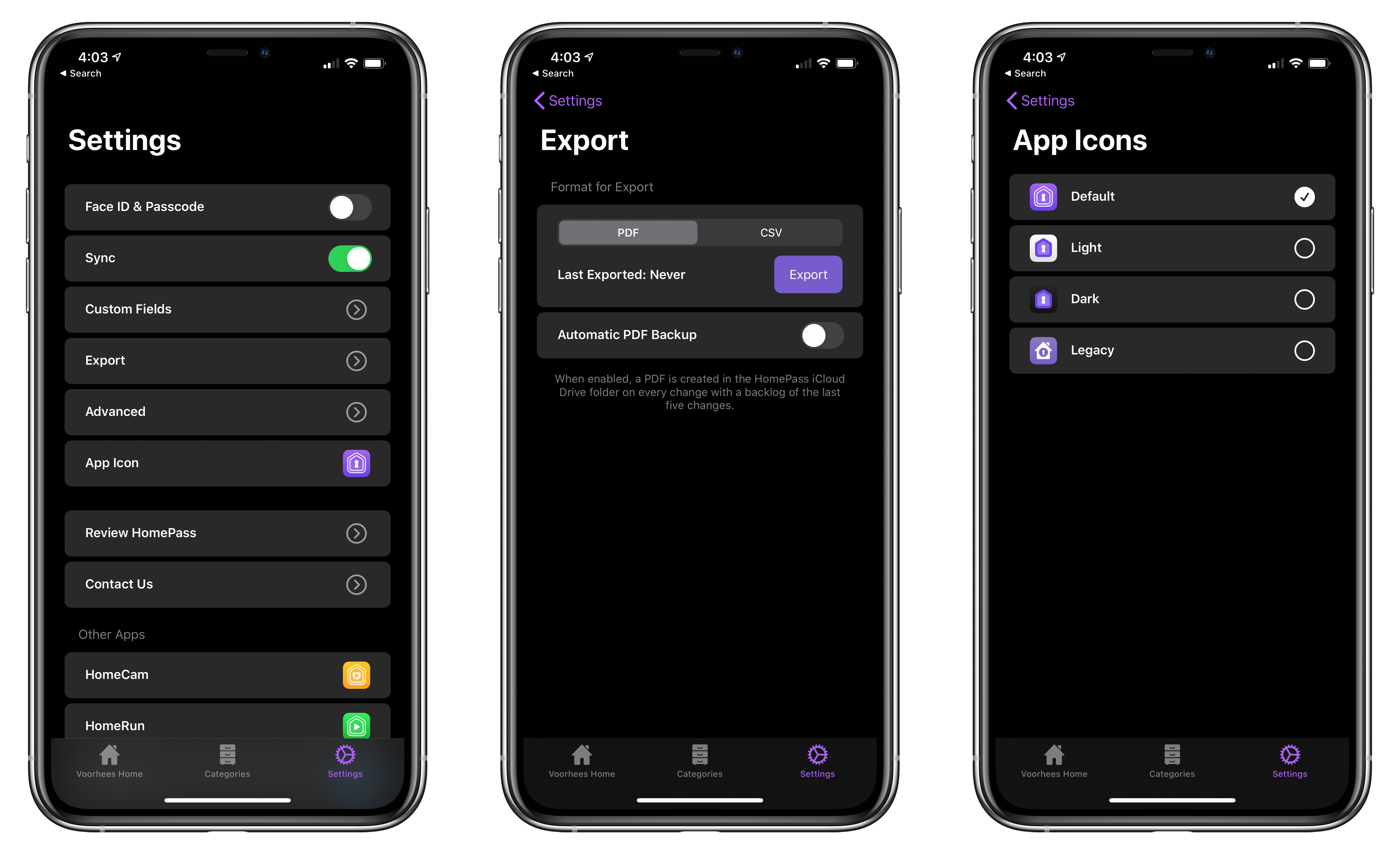
The app’s final tab is Settings, where you can manage the new custom fields, pick from among four Home screen icons, and export your device data as a PDF or CSV file for safekeeping.

I don’t use HomePass often, but it’s one of those utilities I’m glad is on my iPhone because it eliminates frustration when I need it. Too often in the past, I’ve had to dismantle gear to find a HomeKit code. Now that I’m in the habit of adding codes to HomePass when I get a new device, troubleshooting issues with my setup is far easier. Moreover, with a larger collection of devices than I had when I started using HomePass, version 1.7 has substantially improved their management.

HomePass is available on the App Store for $2.99.


PDF Expert’s New Reading Mode Offers the Best iPhone PDF Experience

Original PDF (far left) vs. PDF in Reading Mode (all other images).

Original PDF (far left) vs. PDF in Reading Mode (all other images).

If you’ve ever read a PDF on your iPhone, you know the experience is less than ideal. For short documents you can manually zoom to make the text readable and pan from line to line. For long documents though, that’s a pretty painful option. The best method you can use involves a Max-sized iPhone turned into landscape mode, but even that comes with drawbacks, such as the weight distribution making it uncomfortable to hold your phone one-handed while reading. A solution has long been needed, and now it’s arrived.

PDF Expert is launching a new feature today, Reading Mode, which offers easily the best PDF reading experience available on iPhone. When viewing a PDF in the app, there’s a new button in the bottom-right corner that opens Reading Mode. This mode takes the contents of the PDF, converts it to a simplified layout that’s optimized for your device’s size, and provides custom view settings you can tweak to your liking. It reminds me a lot of Safari’s own Reader view, but for PDFs rather than websites.

Read more


Highlights for iPhone and iPad: An Excellent Companion for Researchers

I wish I had Highlights for iOS and iPadOS when I was a lawyer. Back then, it wasn’t unusual for me to review PDFs of legal documents that were hundreds of pages long. Unfortunately, the digital tools I had for annotating those documents were primitive. So instead, I typically fell back on marking up hard copies with highlighters and adding notes in the margins.

Highlights is a PDF annotation app that’s been available on the Mac for a long time but is brand new on iOS and iPadOS. The app translates the analog process of marking up a PDF to the digital world very well by providing tools that demonstrate an understanding of the needs of students, researchers, and anyone who spends a lot of time with PDFs.

I don’t have the same PDF needs I once did, but as I’ve used Highlights the past couple of weeks, I’ve appreciated its flexibility and power, and I expect that anyone who works with lots of PDFs will too.

Read more


Watchsmith Review: Create Your Own Apple Watch Complications

Watchsmith, the latest app from David Smith, was birthed from the inability to create third-party watch faces on the Apple Watch. As Smith has previously explained, while third-party faces may never be possible, several first-party faces already offer significant room for customization. The Infograph face, for example, contains eight different complication slots; if a rich array of third-party complications were available, you could build a highly customized watch face using the existing faces provided by Apple.

Watchsmith exists to provide that rich set of complications. The app offers 37 types of complications, each adaptable to different watch faces and complication slots, and all fully customizable so they can look exactly the way you prefer. Additionally, Watchsmith offers scheduling functionality to cause different complications to appear on your Watch at different times throughout the day.

Custom complications made with Watchsmith.

Custom complications made with Watchsmith.

In the absence of third-party watch faces, Watchsmith offers the next best thing: third-party complications that are highly customizable and can be optimized to your daily schedule.

Read more


Pixelmator Photo 1.2 Adds Cursor and Split View Support, ML Match Colors, and More

The Pixelmator team has released version 1.2 of Pixelmator Photo for the iPad with iPadOS cursor and Split View support and Pixelmator Pro’s ML Match Colors feature. The update also includes a new way to change the intensity of color and preset adjustments and a ‘Recents’ section for its filter tool.

Pixelmator Photo uses a custom cursor for tasks like cropping images.

Pixelmator Photo uses a custom cursor for tasks like cropping images.

The addition of cursor control is a welcome enhancement to Pixelmator Photo, which already supported keyboard shortcuts. Now it’s possible to make edits to a photo with a combination of the keyboard and either a trackpad or mouse without reaching up to touch the screen. Combined with the addition of Split View, Pixelmator Photo is far more powerful when used in combination with another app than it was before.

For example, when I’m working on an article and want to touch up a photo, I often use Pixelmator Photo to touch up any photos I plan to use. Before the update, if I was doing that with my iPad Pro in a stand, I would usually remove the iPad and edit with it lying flat on a table because it was easier than reaching up repeatedly to navigate Pixelmator Photo’s UI.

Editing images while I write in iA Writer.

Editing images while I write in iA Writer.

With cursor support, my iPad can remain in the stand while I edit. Better yet, with Split View, I can edit an image alongside the article I’m writing and use the app’s share sheet support to use a shortcut that uploads the final image to our CDN and returns a URL that I can paste into the story. The pairing eliminates the need to switch back and forth between Photos and my text editor, saving time. It’s worth noting that Pixelmator Photo does not support iPadOS’s multiwindowing feature, which I imagine could be valuable in some editing scenarios.

Read more


Arcade Highlights: Crossy Road Castle

Anti-gravity rainbows, cute animal characters, prize machines, co-operative play, and endless tower platforming: if this all sounds like the perfect diversion during a long stay indoors, you’re absolutely right.

Crossy Road Castle is a long-awaited sequel to the original Crossy Road and one of the newest Apple Arcade titles. But don’t let the word ‘sequel’ mislead you – Crossy Road Castle offers an entirely different gaming experience than its predecessor. Think less “crossing the road” and more “climbing an endless tower, one micro-level at a time.”

Read more


HeartWatch 4: A Streamlined Dashboard for Your Health

HeartWatch 4 released today on the App Store as a major redesign of the health dashboard app from David Walsh, creator of the popular AutoSleep app.

HeartWatch takes the existing heart and activity data captured by your Apple Watch and presents it in a different way than Apple’s own Health app. The app has long offered fresh approaches to visualizing your data, but the sheer amount of information, and how it’s organized, can easily feel overwhelming. The main goal of HeartWatch 4 was to simplify everything, making it easier to navigate and thus more approachable. Spend just a couple minutes with this update and it’s clear that it succeeded.

I’m not going to re-hash all of the functionality of HeartWatch, since we’ve covered that in the past. You still have access to important metrics like your heart’s average daily bpm, sedentary bpm, sleep data, movement stats, and more, accompanied by charts, graphs, and comparisons over time. But the way everything’s organized has been drastically improved.

In the last version of HeartWatch, a navigation bar divided the app into four main sections: Vitals, Dashboard, Activity, and More. The difference between each of these screens wasn’t immediately obvious, so until you spent significant time getting situated in the app, it felt like work trying to find what you wanted. All of that’s changed now thanks to a design that puts everything in a single scrolling view.

The new HeartWatch design is broken into Wellness, Activity, and Workout sections that are stacked vertically in the new one-stop dashboard. Inside each section is a collection of tiles for different data points, not unlike what Walsh did with the Today dashboard in AutoSleep last year. The tile design provides a great overview of data, and it’s entirely customizable so you can, from the Settings screen, disable any tiles you don’t want to see.

All of HeartWatch's great graphs and charts are just a swipe or tap behind its tiles.

All of HeartWatch’s great graphs and charts are just a swipe or tap behind its tiles.

At first glance, HeartWatch’s tile design may seem like it’s eliminated much of the valuable data comparisons and visualizations previously found in the app, but all of that is actually just hidden behind each tile. You can swipe on a tile to flip it over and get more info, or tap, or even tap and hold to view more details; personally I think loading different screens depending on whether you tap or tap and hold is overly complicated, but regardless the whole system remains a major improvement. The simple data is kept front and center, and when you want more, you can easily get to it in an intuitive way.

HeartWatch 4 includes other improvements too – like its custom activity metrics as an alternative to Apple’s rings, support for automatic system switching between light and dark modes, and an upgraded Watch app – but the highlight here is definitely the redesigned iPhone app. If you ever found HeartWatch and all of its data overwhelming, version 4 is a compelling reason to give the app another try. It’s strong evidence of the power of iteration and simplicity.

HeartWatch 4 is available on the App Store.


Arcade Highlights: Roundguard

Roundguard by Wonderbelly Games is a delightful mashup of genres that I highly recommend. Like a lot of our readers, I’ve been looking for distractions. It’s easy to get sucked into the constant barrage of bad news delivered to our devices, which feeds an unhealthy stress loop. One effective way I’ve broken that cycle is with video games, and the more absorbing and lighthearted, the better.

Roundguard fits the bill perfectly. The game has been universally described as a combination of Peggle and a dungeon-crawler RPG. That’s a strange mix to be sure, but it’s absolutely true, and it works.

The mechanics of Roundguard are simple. You shoot your character out of a medieval-style cannon from the top of the screen at pots, potions, mana, enemies, and other items. When you collide with something, you bounce off pinball-style until eventually you reach the bottom of the screen, which ends your turn. The game requires skill and planning, but also a heavy dose of good luck as your character careens off items in unexpected ways.

Colliding with enemies, including goblins, spiders, and skeletons, causes both of you to take damage. At times, enemies can also poison you or will shoot arrows at you as you bounce around, adding elements of strategy and timing to the mix. Along the way there will be XP to earn, items to collect, abilities to acquire, and difficult boss levels like any good dungeon crawler. Of course, when your health runs out and you die, you have to start from the beginning too.

There’s a lot of depth to Roundguard. Early on, it’s fun to play the game like you would Peggle or an idle tapper game. Along the way, though, Roundguard pulls you in deeper with helpful tips without being overbearing. Before long, I found myself managing my inventory of items and planning my approach to levels in a way that was reminiscent of classic RPGs. It’s a gradual, evolutionary process that keeps the game interesting and engaging.

Source: wonderbellygames.com.

Source: wonderbellygames.com.

I’ve been playing Roundguard on a variety of devices, including my iPhone 11 Pro Max, iPad mini, iPad Pro, and even the Apple TV, and it’s hard to say which I like best. The game features excellent controller support, which I’ve been using with my iPad Pro and Apple TV. Bigger screens add dimension to the fun artwork and sound effects of the game, which gives them the edge over my iPhone. Even so, Roundguard is a truly mobile game at heart, which makes it fun to play in short bursts on the iPhone, where the rich colors really stand out too. As a result, I expect to continue to play across all of my devices, which is seamless because my progress is synced between them.

Facing a Roundguard boss.

Facing a Roundguard boss.

Stepping back, Apple Arcade feels like it is starting to really come into its own with games like Roundguard. The service started out with an extensive catalog of excellent games, but many felt like they were modified free-to-play games or were adaptations of games previously released on other platforms.

In contrast, Roundguard was released on Arcade, Switch, Xbox One, and Steam simultaneously, and it shows. Instead of feeling like it’s been retrofitted for Apple’s platforms, Roundguard was clearly developed with touch in mind from the start. The pace of new releases on Arcade has slowed considerably since its launch, but if that means more games like Roundguard and the recently released Crossy Road Castle, that’s fine by me.

It’s always a good sign when I struggle to finish a game review because every time I launch it to test something, I get sidetracked and wind up playing longer than I intended. That has absolutely been the case with Roundguard. There’s a depth of gameplay, personality, and good humor here that has made it one of my favorite Arcade titles yet. If you subscribe to Apple Arcade, Roundguard is a fun distraction you don’t want to miss.