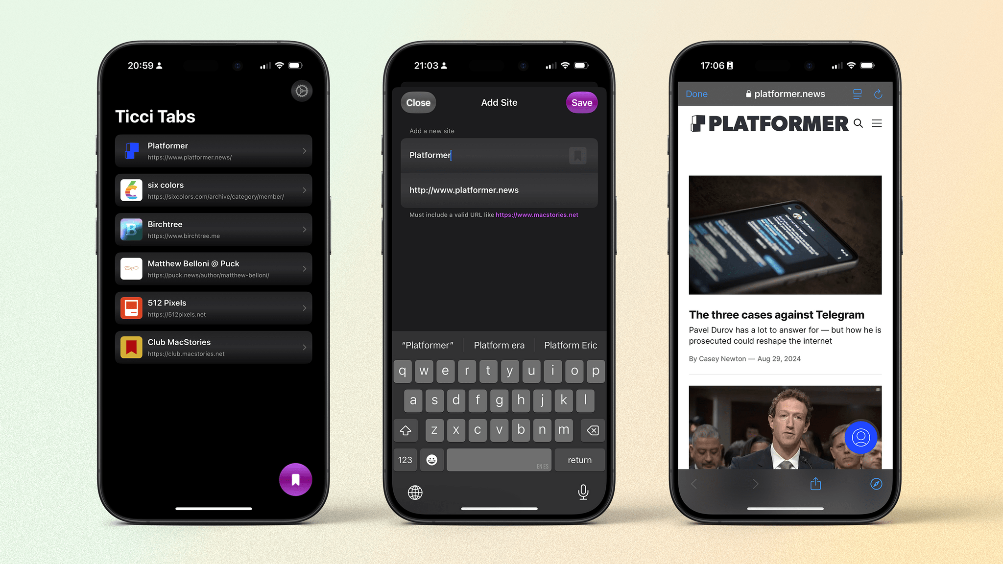
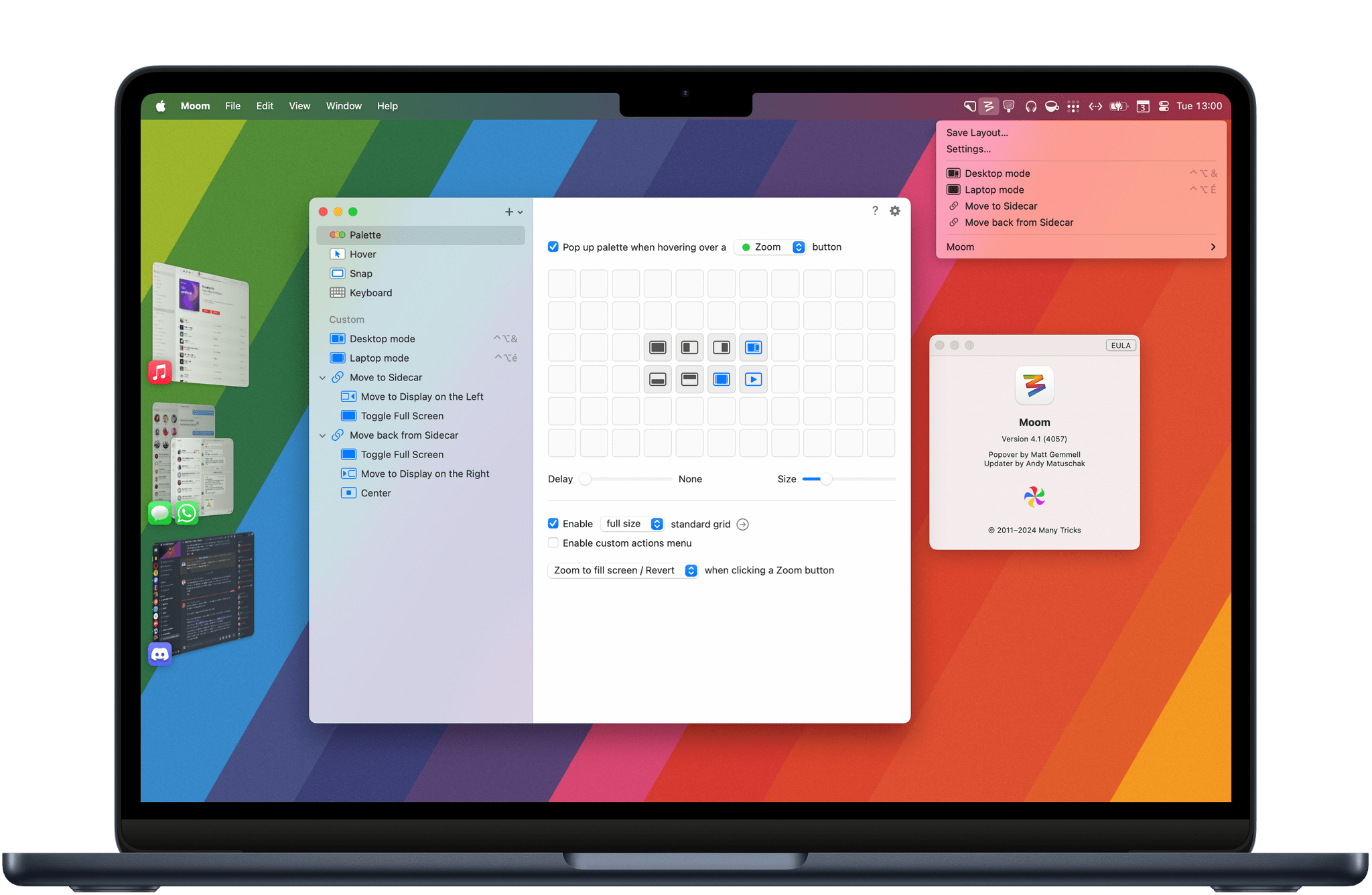
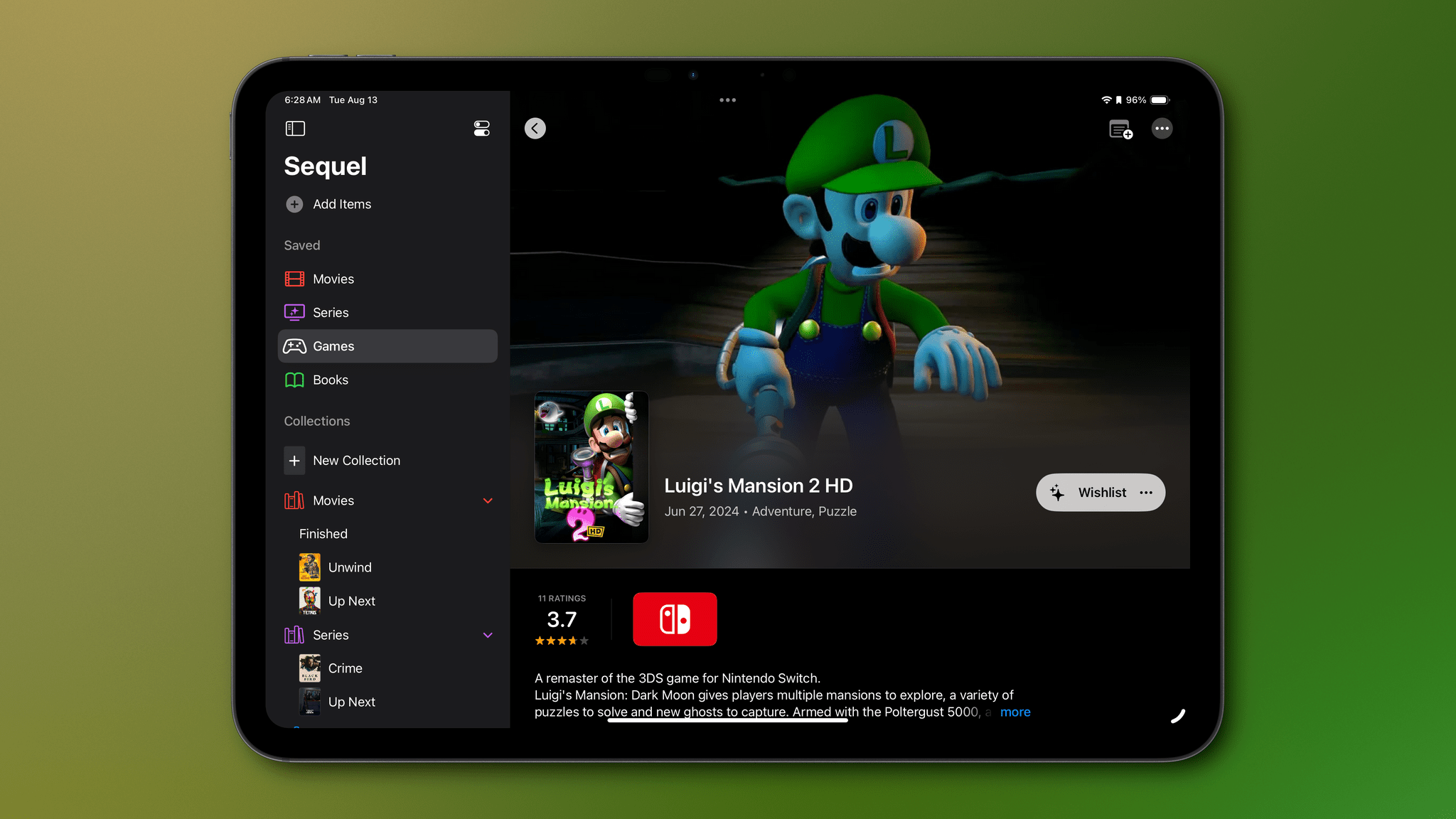
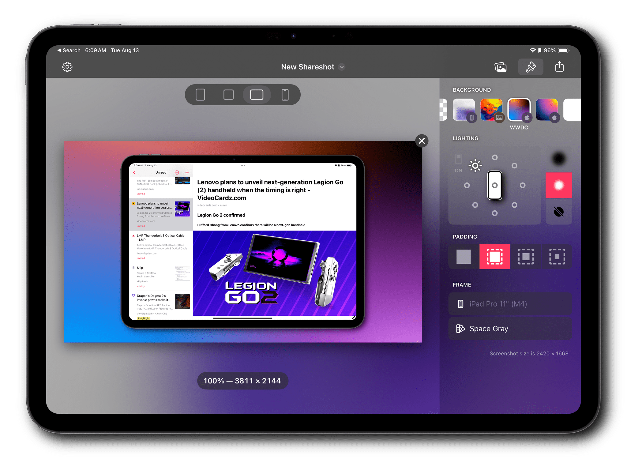
Seasons is the sort of weather app I’d hoped for ever since I ordered my Vision Pro. It’s a unique mix of detailed forecast data combined with an immersive spatial computing experience. There’s a gee-whiz, proof-of-concept aspect to the app, but at its core, Seasons is a serious weather app and a spatial widget that’s a pleasure to incorporate into an everyday Vision Pro workflow.
Posts in reviews
Vision Pro App Spotlight: Seasons Weaves Immersive Conditions Into a Comprehensive Weather App
Transit Is Still the Best-Designed Transit App on the iPhone in 2024
I like trains. I like them so much that, despite being 27 years old now, I still don’t have a driving license. I travel by train and use public transit exclusively to get around in my daily life. The island where I grew up had none of that, and it has made the car a fundamental necessity for most inhabitants there. But I’m fortunate enough to live in continental France now, in a city where I can get anywhere pretty quickly by hopping on a bus, tram, train, or even a high-speed train.
The result is that I spend a lot of time on my phone on a daily basis looking up transit itineraries and glancing at waiting times. Like in most places in the world where public transit is a thing, you can use the transit authority’s first-party application or website to do this. There is a universal truth about those apps and sites, though: they are almost always really bad. They’re slow, confusing, and often bloated with useless information. This is why, for so many years now – since I first arrived in France in 2014 – I’ve been a huge fan of Transit.
Transit is an amazing app that lets you look up transit itineraries and will even guide you along as you travel to your destination. The app has been around for a long time, but my mission today is simple: I want to tell you why I believe Transit is still the best-designed transit app available on the iPhone right now.
Let’s get into it.
Logitech’s Casa Pop-Up Desk Elevates Your MacBook for More Comfortable Computing
When I’m sitting at home in my office, the ergonomics are perfect. I have a comfortable chair with plenty of back support, my keyboard is at the right height, and my Studio Display is at eye level. The trouble is, that’s not the only place I work or want to work. As a result, I spend time almost daily using a laptop in less-than-ideal conditions. That’s why I was eager to try the Logitech’s Casa Pop-Up Desk that debuted in the UK, Australia, and New Zealand last summer and is now available in North America, too.
Logitech sent me the Casa to test, and I’ve been using it on and off throughout the past 10 days as I work at home, away from my desk, and in various other locations. No portable desktop setup is going to rival the ergonomics of my home office, but despite a few downsides, I’ve been impressed with the Casa. By making it more comfortable to use my laptop anywhere, the Casa has enabled me to get away from my desk more often, which has been wonderful as the weather begins to warm up.
Vision Pro App Spotlight: GameTrack Updated with Built-In Cloud Streaming
Late last week, Joe Kimberlin released GameTrack 5.4, an update to the iOS, iPadOS, and visionOS versions of the app that enables new ways to access your favorite games and navigate the app’s UI. Of course, the Vision Pro version of GameTrack is completely new since the last time I wrote about the app, too. So, let’s take a closer look at the latest iOS and iPadOS updates, as well as the visionOS version, which has become one of my favorite media management apps for Apple’s headset.
Vision Pro App Spotlight: Status Bar Builder’s Key Is Customization Combined with Simplicity
There’s an elegance in simplicity that I value. I use plenty of complex apps, but there’s a certain satisfaction in finding one that fits your needs perfectly. One such app that seems destined to claim a long-term spot on my Vision Pro is Status Bar Builder, a customizable utility that displays useful information without taking up much space.
The app allows you to build status bars, which are narrow, horizontal windows reminiscent of the Mac’s menu bar that you can place around your environment. Status bars come in three text sizes and can have no background, be translucent, or use a colored background.
Regardless of the styling you pick, status bars can include:
- Shortcuts
- Links
- Today’s date
- Weekday
- Numerical date
- Month
- Time
- Your calendar events
- A battery charge indicator
- A spacer
Designing status bars is easy. They’re created and stored in the app’s main window, which includes a preview of each along with buttons to open any existing status bars, make revisions, or delete them. At the bottom of the main window, there’s also a ‘New’ button to add to your collection.
You can make as many status bars as you’d like, sprinkling them around your room. There doesn’t seem to be a limit to how many items you can include in a status bar, either, but as a practical matter, if a status bar gets too long, it doesn’t look great, and some text will be truncated.
What’s more, you can add as many of each type of item as you’d like to a status bar. For Shortcuts, that means you can create a long list of shortcuts if you want. However, you better be able to identify them by their icons because the buttons in the status bar don’t include shortcut names or the colors you assigned to them.
Links work like a mini bookmark bar, allowing you to save frequently visited websites with a custom icon as a button in your status bar. However, like shortcuts, you’ll need a memorable icon because there are no link labels or other text to go by. Links support URL schemes too, offering additional automation options.
There are also a few other other item-specific settings available. For example, there are three sizes of spacers that can be added to a status bar, and calendar events can include the color of their associated calendars if you’d like. Plus, dates and times have formatting, color, size, and other style options. It’s worth noting that your next calendar event doesn’t include the scheduled time and events cannot be opened, both of which are things I’d love to see added to the app in the future.
Although you can overstuff your status bars with links, shortcuts, and other information, I’ve found that the best approach is to be picky, limiting yourself to a handful of items that make your status bars more glanceable. Then, if you find yourself adding more and more to a status bar, consider breaking it up into multiple status bars organized thematically. I find that works well and gives me more flexibility about where I put each.
I have to imagine that Apple will eventually release something like Status Bar Builder. It’s too easy to lose track of time in the Vision Pro. It needs a clock, battery indicator, date, and other basic data we’ve had on our iPhones since day one. Status Bar Builder fills that gap but goes one step further by adding links, calendar items, and shortcuts. I wouldn’t add a lot more to the app, but a weather item with the current conditions and temperature would be great. However, even though parts of Status Bar Builder may eventually wind up as parts of visionOS, I expect the app has a long and useful life ahead of it, thanks to the other components that go a step further than I expect Apple ever will.
Status Bar Builder is available on the App Store for $4.99.
Simple Scan: A Scanning Solution for People Who Don’t Scan Often
One of my favorite kinds of apps is simple utilities that solve a common problem and are straightforward to use. That’s exactly what Greg Pierce has created with Simple Scan, a scanning app for the iPhone and iPad that simplifies the process of one-off document scans.
Simple Scan is entering a crowded scanning market. Many scanning utilities also help you organize your scans, store them in the cloud, submit expense reports, and more. There are people who need that sort of extended feature set, but somewhere along the way, people with simpler needs have been forgotten.
That’s exactly my situation. I occasionally scan a receipt for one reason or another, but it’s not something I do often. As a result, it doesn’t make sense for me to pay a lot for a scanning app with features I’ll rarely use. Nor do I want to use a free version with ads, which is why I like Simple Scan so much.
Simple Scan has two options and a big ‘Scan Document’ button. Pick whether you want to create a PDF or an image, select a destination, then point your device’s camera at a document and start scanning. That’s all there is to it. Destinations include email, Messages, the Files app, and the system share sheet, covering all the obvious places you’d want to send most scans.
The destination options in Simple Scan are key. You can already scan documents into Apple Notes, but it adds to the overhead of scanning and clutters Notes with one-off scans. With Simple Scan, you’re up and running faster and with more options for where to store or send your documents.
The scanning process uses Apple’s built-in scanning feature, allowing you to drag points to the corners of your document for cropping. The app also supports:
- Manual or automatic shutter
- Color, Greyscale, black and white, and photo scans
- Automatic, on, and off settings for your camera’s flash
Plus, there’s a toggle in settings to turn OCR of PDF files on or off.
As you scan pages, they stack up as thumbnails in the corner of the screen, where you can tap on them to make basic edits or discard them. When you’re finished, there’s a Save button on the opposite side of the shutter button that sends the images to whatever destinations you’ve chosen. That’s all there is to Simple Scan, but for a lot of people, myself included, it’s also enough.
Simple Scan is free to download from the App Store and use for your first five scans. Paying $4.99 per year or $19.99 one time unlocks unlimited scans and custom destinations that allow you to pre-fill email and iMessage recipients.
Mona 6 Moves from High Visual Customization to Advanced Automation
Mona, the Mastodon client for iOS, iPadOS, and Mac from Junyu Kuang, is out today with a significant version 6 update. Mona is my choice for using Mastodon primarily due to what John referred to in his review as its ‘epic level of customization.’ Everything from how the taskbar at the bottom of the screen looks to how posts are displayed is fully customizable. Even the main app view on iOS can be vertically split in two.
But Mona is not just about looks; it’s also a solid tool for navigating Mastodon. Things like the ability to privately set colors or notes to other users, timeline syncing across your devices using iCloud, and full support for VoiceOver make it a strong choice for a wide variety of people.
Which brings us to this new update. In the year and change since the mass Twitter exodus, Mastodon has matured a lot as a platform, introducing new features that users can take advantage of while filling some of the gaps impeding the platform from growing. Version 6 of Mona includes those new features while advancing its power user functionality with powerful new Shortcuts actions, including one that takes advantage of the Action Button on the iPhone 15 Pro.
Let’s dive in.
Vision Pro App Spotlight: Longplay Adds Immersive Album Listening
The music experience on the Apple Vision Pro is excellent. It starts with the device’s built-in headphones and spatial audio, which work hand-in-hand with the visual components of spatial computing. Apple has already shown off the potential for immersive experiences like Alicia Keys: Rehearsal Room, but the music experience goes deeper than that, thanks to third-party developers.
I’ve already covered Juno, Christian Selig’s YouTube player app, which is great for watching music videos and other content, and NowPlaying, which supplements Apple Music with editorial content, lyrics, and more. Today, though, I want to focus on Longplay, Adrian Schönig’s album-oriented playback app for Apple Music.
Longplay 2.0 was released last August. It was a big update that I reviewed at the time and have been enjoying ever since. The app is available on the Vision Pro now too, complete with an immersive mode that I love.
Looks Like Rain: Visualizing the Weather on a Color-Coded Timeline
I’m always excited when a new weather app is released, especially when it’s a weather app that looks different from most of its counterparts. Looks Like Rain by Thinkbits is beautifully designed, and it certainly looks different, to say the least. The layout of the app is clean, the elements are well-spaced, and the color palette has clearly been composed with care. Most importantly, though, I’m absolutely loving its unique approach to visualizing the weather forecast on a color-coded timeline.
I’ve been using this brand-new weather app for the past few weeks on the iPhone, the iPad, and the Mac, and it has already earned a permanent place in the rotation of my favorite weather apps.
Let’s check it out.