This Week's Sponsor:

Incogni

Put an End to Spam, Scams, and Robocalls on Your iPhone


Posts in stories

CoverSutra Adds a Standalone Apple Music Client to Your Mac’s Menu Bar

CoverSutra by Sophiestication is a name that may sound familiar if you’re as ancient as Federico, who last reviewed the app on MacStories in January 2010. At the time, the app was a fully-featured iTunes controller. It could display your music in the menu bar as well on the Desktop. It also used to act as a Last.fm client and ship with a bunch of customization features.

This month, CoverSutra is back with version 4.0. This new version was rewritten from the ground up with a different approach: instead of being a controller for Apple’s native Music app, CoverSutra is now a standalone client for Apple Music on the Mac. In practice, this means that you can search your Apple Music library, pick any album or playlist, and start listening without ever having to launch the Music app.

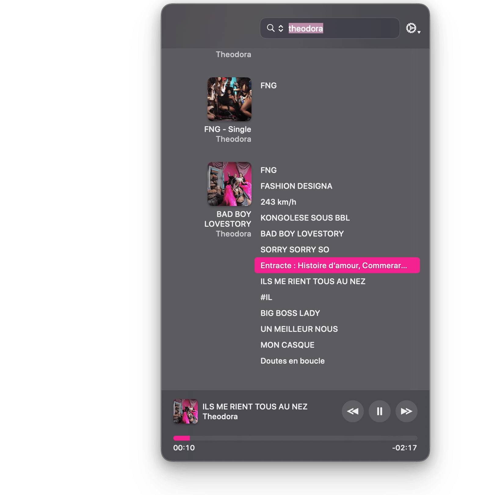
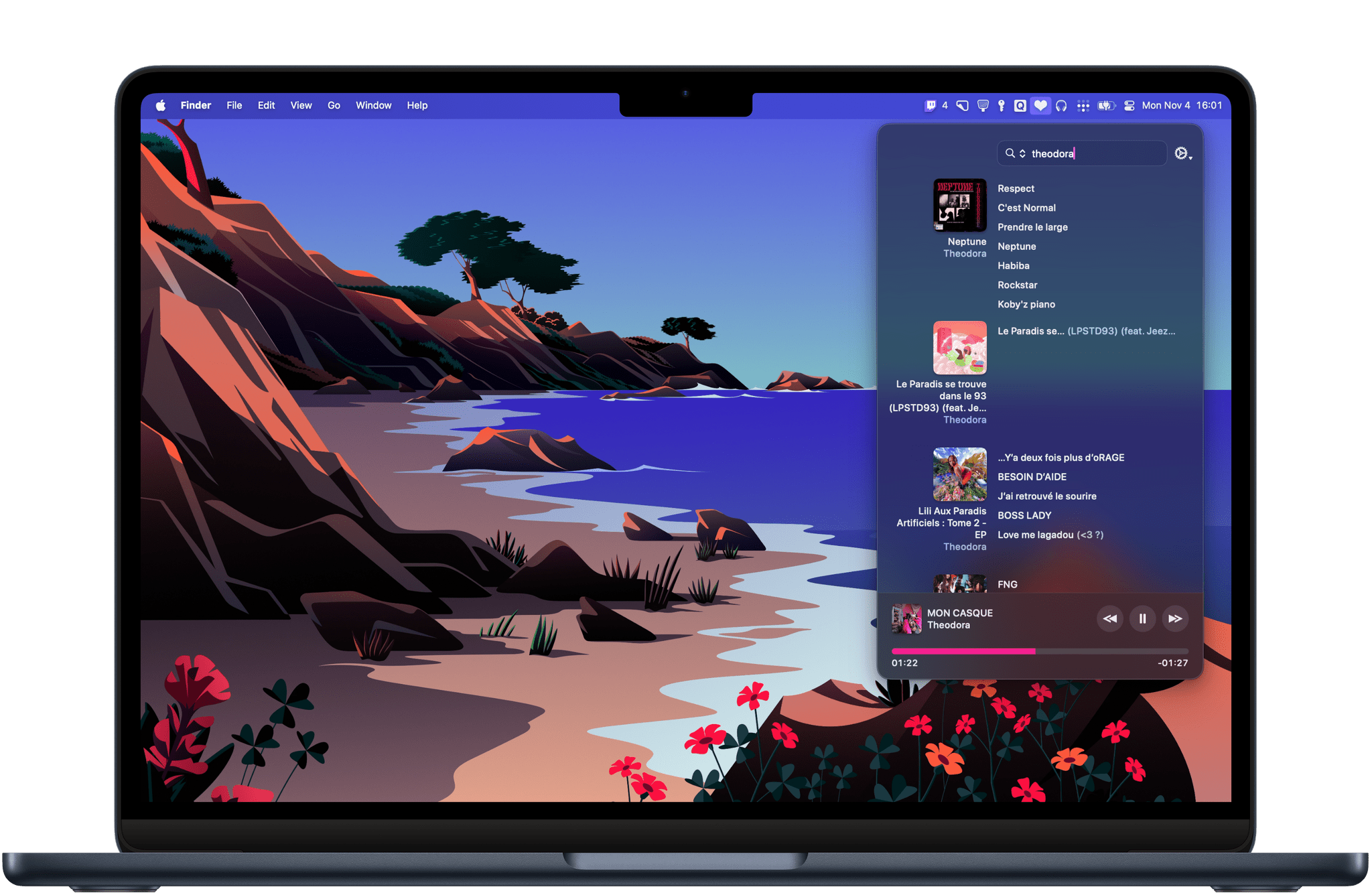
Search is CoverSutra’s highlight feature. Using CoverSutra for the past week on my Mac has made me realize how much more time I usually spend in the Music app just searching through my library. Searching with CoverSutra, on the other hand, is fast and persistent. You can start typing part of an artist’s name, album, or song title, and search results will instantly appear in the menu bar popover window. And as long as you don’t start a new search, your search results will not disappear, even if you click away from the menu bar.

CoverSutra's layout for search results puts the emphasis on album and playlist covers.

CoverSutra’s layout for search results puts the emphasis on album and playlist covers.

I’ve also found that CoverSutra suits my listening habits pretty well. As the kind of person who likes to play albums from front to back and rarely relies on curated playlists, I’ve enjoyed how CoverSutra allows me to quickly bring up an album and play it from the beginning. The layout emphasizes album and playlist covers and makes it easy to instantly spot the album you are looking for.

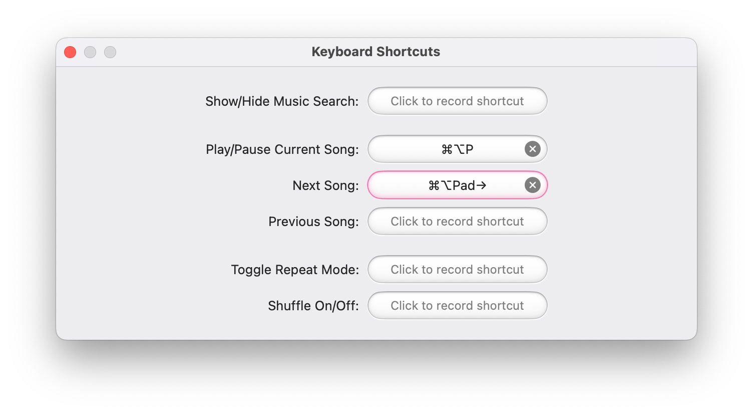
In its current shape, CoverSutra 4.0 is pretty basic. Apart from search, playback controls, and the ability to set your own global keyboard shortcuts, there are no additional features or settings. However, I’m hopeful that the app can start fresh from this new foundation. Unlike similar alternatives on the Mac like Neptunes or Sleeve, CoverSutra’s potential as a standalone player in the menu bar may enable a range of more advanced features.

CoverSutra supports custom global keyboard shortcuts.

CoverSutra supports custom global keyboard shortcuts.

CoverSutra 4.0 is available on the Mac App Store. For a limited time, the app is available at an introductory price of $4.99. If you’ve purchased CoverSutra on the Mac App Store in the past, the upgrade to version 4.0 is free.


What It’s Like to Hear Better with AirPods Pro 2

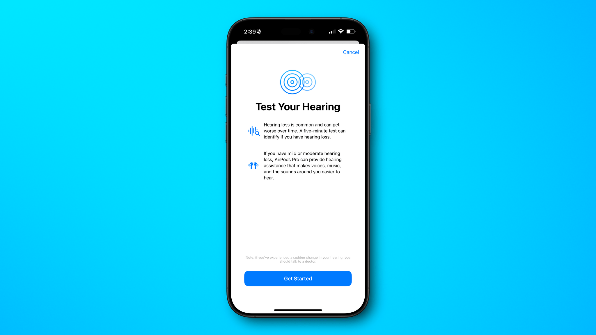
I’ll admit, I was a little apprehensive about taking Apple’s hearing test. I’ve spent my fair share of time at loud concerts and shouting above the din in crowded bars, so I was fairly certain the test would show my hearing isn’t what it once was. The question was, “How bad is it?” With the release of iOS 18.1 and an update to the AirPods’ firmware, I set out to find out.

The AirPods Pro 2 didn’t get a hardware update this fall, but they may as well have, because the new hearing features they received via a software update add a whole new dimension to them. We’ve written about the hearing features before. They include three components:

  • hearing protection, which lowers the volume of sounds that could potentially damage your hearing;
  • a hearing test to check whether you have hearing loss in either ear; and
  • a hearing assistance feature to boost frequencies where you’ve lost hearing.

Despite covering these features previously, I didn’t have a good feel for what they were like until I tried them myself, so I thought I’d share the process here and encourage others who can to give these new hearing features a try, too, because they work remarkably well.

Read more


Apple’s Commitment to AI Is Clear, But Its Execution Is Uneven

The day has finally arrived. iOS 18.1, iPadOS 18.1, and macOS 15.1 are all out and include Apple’s first major foray into the world of artificial intelligence. Of course, Apple is no stranger to AI and machine learning, but it became the narrative that the company was behind on AI because it didn’t market any of its OS features as such. Nor did it have anything resembling the generative AI tools from OpenAI, Midjourney, or a host of other companies.

However, with today’s OS updates, that has begun to change. Each update released today includes a far deeper set of new features than any other ‘.1’ release I can remember. Not only are the releases stuffed with a suite of artificial intelligence tools that Apple collectively refers to as Apple Intelligence, but there are a bunch of other new features that Niléane has written about, too.

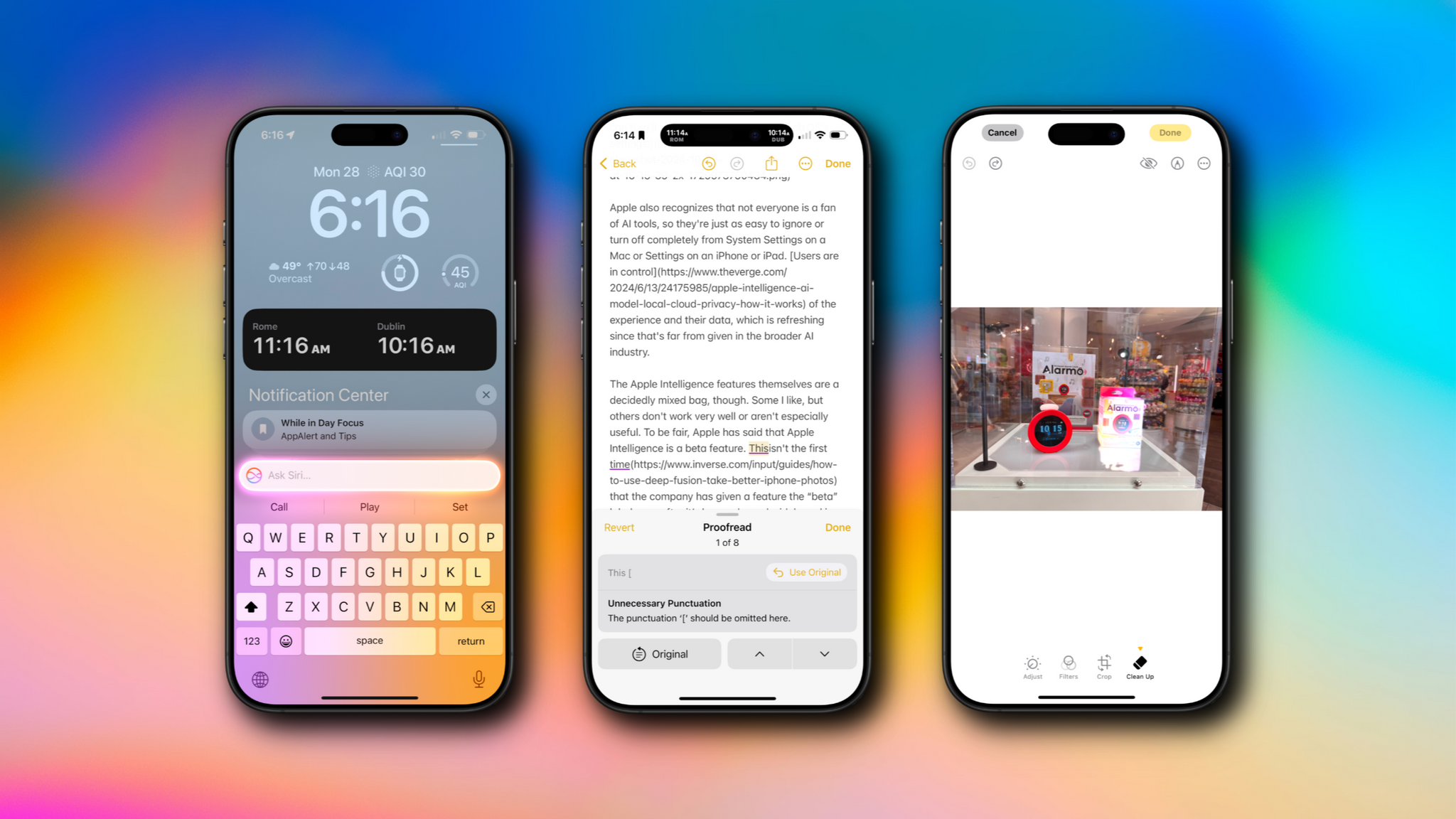
The company is tackling AI in a unique and very Apple way that goes beyond just the marketing name the features have been given. As users have come to expect, Apple is taking an integrated approach. You don’t have to use a chatbot to do everything from proofreading text to summarizing articles; instead, Apple Intelligence is sprinkled throughout Apple’s OSes and system apps in ways that make them convenient to use with existing workflows.

If you don't want to use Apple Intelligence, you can turn it off with a single toggle in each OS's settings.

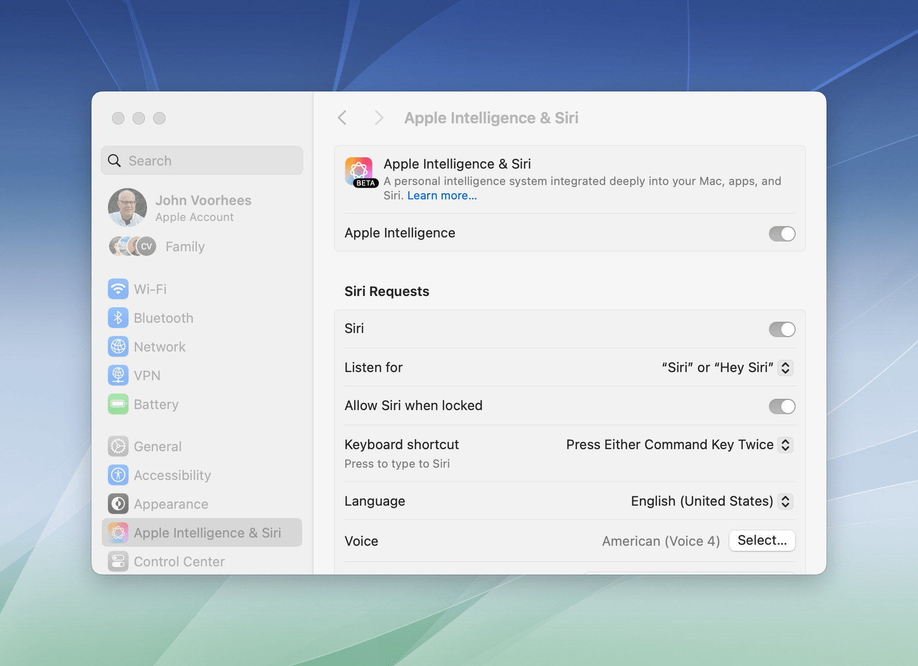
If you don’t want to use Apple Intelligence, you can turn it off with a single toggle in each OS’s settings.

Apple also recognizes that not everyone is a fan of AI tools, so they’re just as easy to ignore or turn off completely from System Settings on a Mac or Settings on an iPhone or iPad. Users are in control of the experience and their data, which is refreshing since that’s far from given in the broader AI industry.

The Apple Intelligence features themselves are a decidedly mixed bag, though. Some I like, but others don’t work very well or aren’t especially useful. To be fair, Apple has said that Apple Intelligence is a beta feature. This isn’t the first time that the company has given a feature the “beta” label even after it’s been released widely and is no longer part of the official developer or public beta programs. However, it’s still an unusual move and seems to reveal the pressure Apple is under to demonstrate its AI bona fides. Whatever the reasons behind the release, there’s no escaping the fact that most of the Apple Intelligence features we see today feel unfinished and unpolished, while others remain months away from release.

Still, it’s very early days for Apple Intelligence. These features will eventually graduate from betas to final products, and along the way, I expect they’ll improve. They may not be perfect, but what is certain from the extent of today’s releases and what has already been previewed in the developer beta of iOS 18.2, iPadOS 18.2, and macOS 15.2 is that Apple Intelligence is going to be a major component of Apple’s OSes going forward, so let’s look at what’s available today, what works, and what needs more attention.

Read more


iOS and iPadOS 18.1: Everything New Besides Apple Intelligence

Today, Apple released iOS and iPadOS 18.1, the first major release since the operating system versions that launched in September and were reviewed by Federico.

As you may know, the main highlight of this new release is the first wave of Apple Intelligence features available to the public. AI has arrived, and for better or for worse for Apple’s platforms, this is only the beginning. Be sure to check out John’s review of all the new Apple Intelligence features included in iOS and iPadOS 18.1 (as well as macOS Sequoia 15.1) for the details.

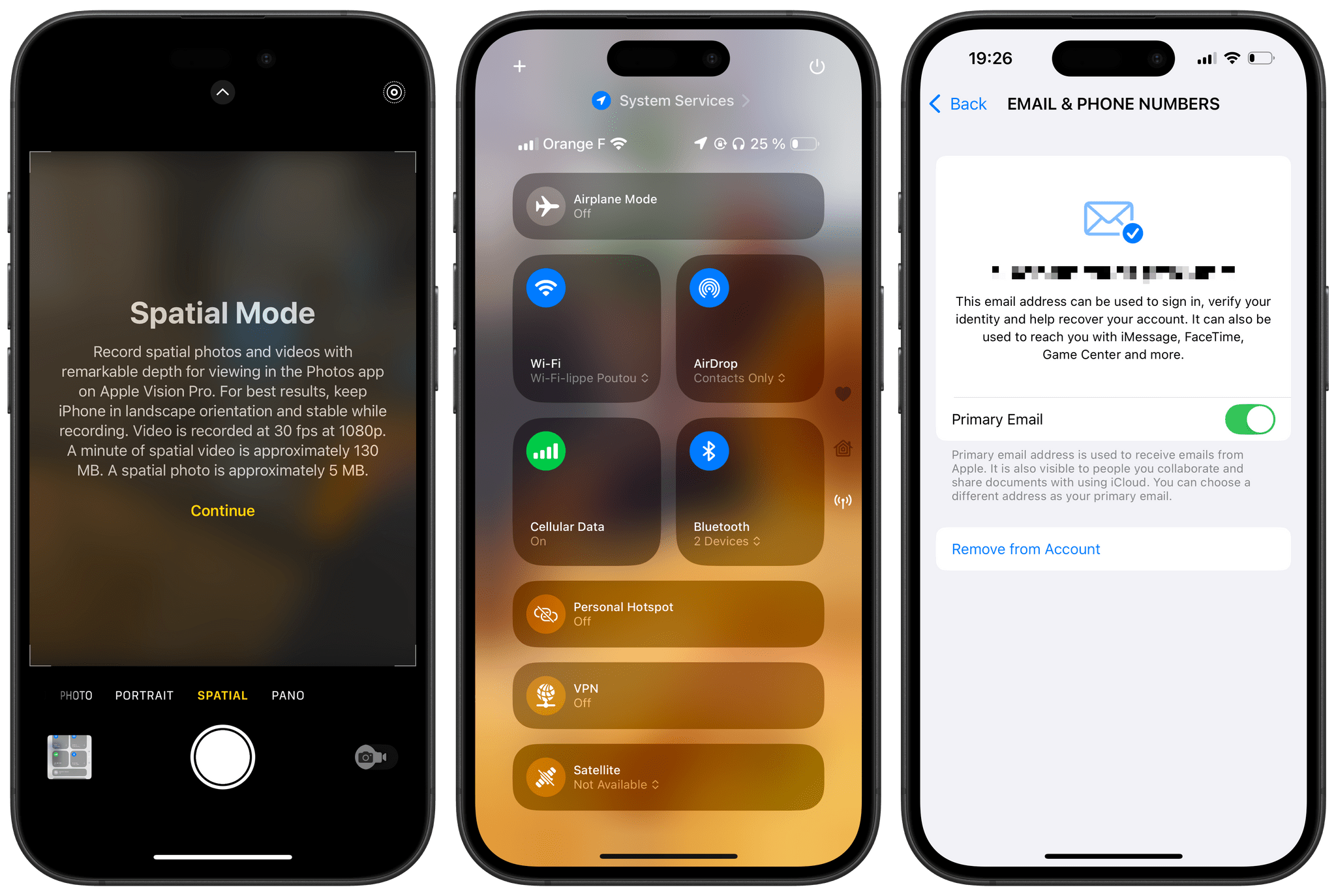
Fortunately, Apple Intelligence isn’t the only highlight of this release. It also includes a series of changes to the system, from Control Center and the Camera app to Shortcuts and the arrival of new health features for AirPods Pro 2 users.

Here’s a roundup of everything new besides Apple Intelligence in iOS and iPadOS 18.1.

Read more


iPad mini Review: The Third Place

The new iPad mini.

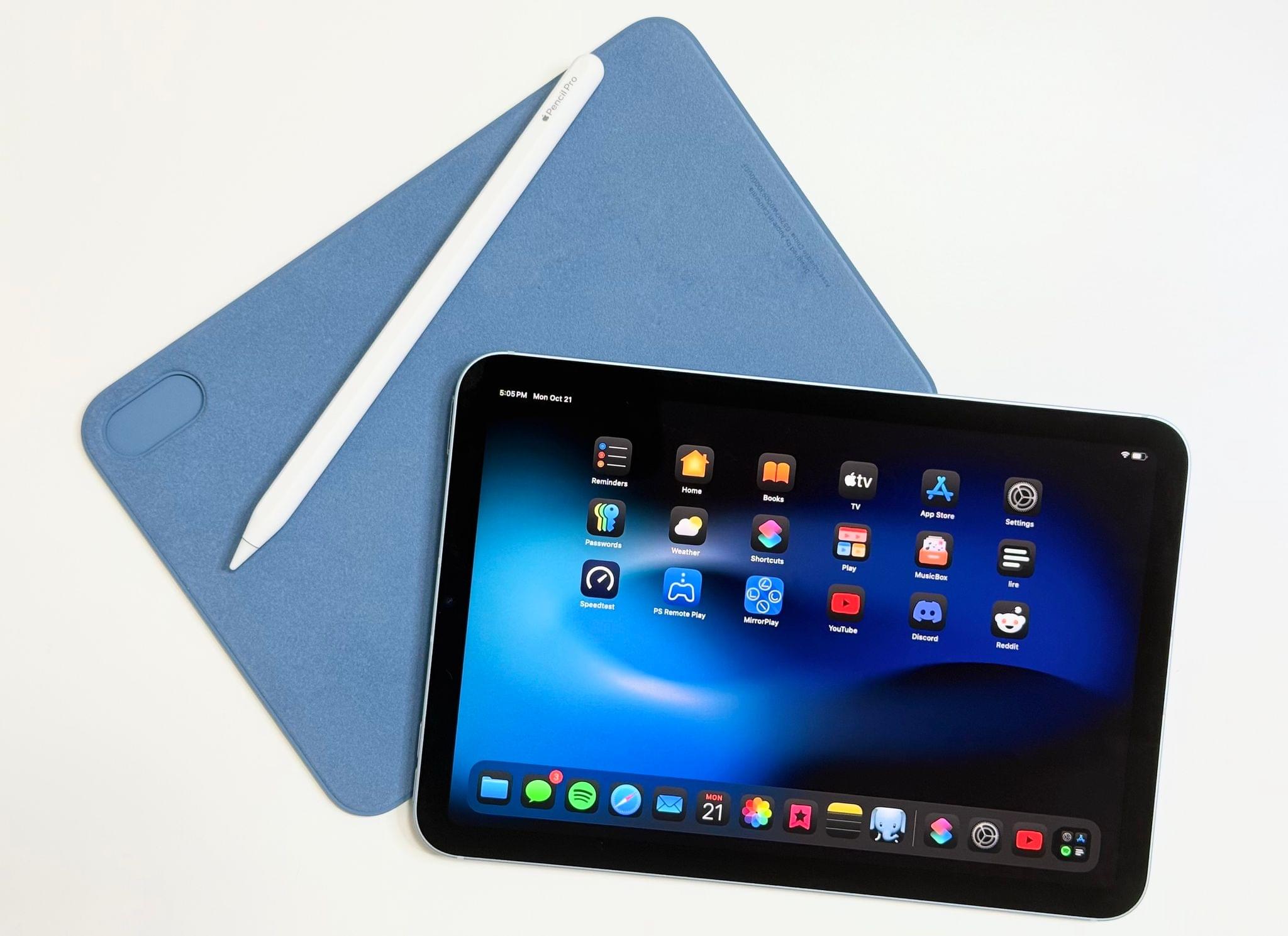
The new iPad mini.

My first reaction when I picked up the new iPad mini last Thursday morning was that it felt heavier than my 11” iPad Pro. Obviously, that was not the case – it’s nearly 150 grams lighter, in fact. But after several months of intense usage of the new, incredibly thin iPad Pro, the different weight distribution and the thicker form factor of the iPad mini got me for a second. Despite being “new”, compared to the latest-generation iPad Pro, the iPad mini felt old.

The second thing I noticed is that, color aside, the new iPad mini looks and feels exactly like the sixth-generation model I reviewed here on MacStories three years ago. The size is the same, down to the millimeter. The weight is the same. The display technology is the same. Three minor visual details give the “new” iPad mini away: it says “iPad mini” on the back, it’s called “iPad mini (A17 Pro)” on the box, and it’s even called “iPad mini (A17 Pro)” (and not “iPad mini (7th generation)”) in Settings ⇾ General ⇾ About.

I’m spending time on these minor, largely inconsequential details because I don’t know how else to put it: this iPad mini is pretty much the same iPad I already reviewed in 2021. The iPadOS experience is unchanged. You still cannot use Stage Manager on any iPad mini (not even when docked), and the classic Split View/Slide Over environment is passable, but more constrained than on an iPad Air or Pro. I covered all these aspects of the mini experience in 2021; everything still holds true today.

What matters today, however, is what’s inside. The iPad mini with A17 Pro is an iPad mini that supports Apple Intelligence, the Apple Pencil Pro, and faster Wi-Fi. And while the display technology is unchanged – it’s an IPS display that refreshes at 60 Hz – the so-called jelly scrolling issue has been fixed thanks to an optimized display controller.

As someone who lives in Italy and cannot access Apple Intelligence, that leaves me with an iPad mini that is only marginally different from the previous one, with software features coming soon that I won’t be able to use for a while. It leaves me with a device that comes in a blue color that isn’t nearly as fun as the one on my iPhone 16 Plus and feels chunkier than my iPad Pro while offering fewer options in terms of accessories (no Magic Keyboard) and software modularity (no Stage Manager on an external display).

And yet, despite the strange nature of this beast and its shortcomings, I’ve found myself in a similar spot to three years ago: I don’t need this iPad mini in my life, but I want to use it under very specific circumstances.

Only this time, I’ve realized why.

Read more


Postcards and a Mac: Niléane’s Desk Setup

It’s been a while since I last showed off my desk. The last time I did so as part of MacStories Weekly Issue 405 in February, I had just acquired an 11-inch iPad Pro, and my desk looked quite different than it does now. It had an imposing corner shelf holding a variety of plushies, accessories, and other knickknacks, in addition to providing support for my microphone arm. Overall, it felt a lot more cluttered than it does now.

As the months went on, I’ve had to rethink my desktop layout to accommodate the many changes that I’ve made to my device usage. Now more than ever, my M2 MacBook Air is at the center of everything I do – so much so that the iPad Pro is now nothing more than an eBook reader for me and rarely lives on my desk as a result. This summer, we also launched Comfort Zone, a new weekly show in the MacStories family of podcasts. Since Comfort Zone is both an audio and video podcast, I started recording video at my desk for the first time ever, which also meant that I had to tweak my desk to optimize it for lighting and a new microphone setup.

In the end, these changes have added up to a completely new desk setup. So today, I’m going to take you on a quick desk tour. Let me walk you through the main highlights of what makes this desk my favorite little corner in our home.

Read more


MacPaw Updates CleanMyMac with a Fresh Design and New Tools

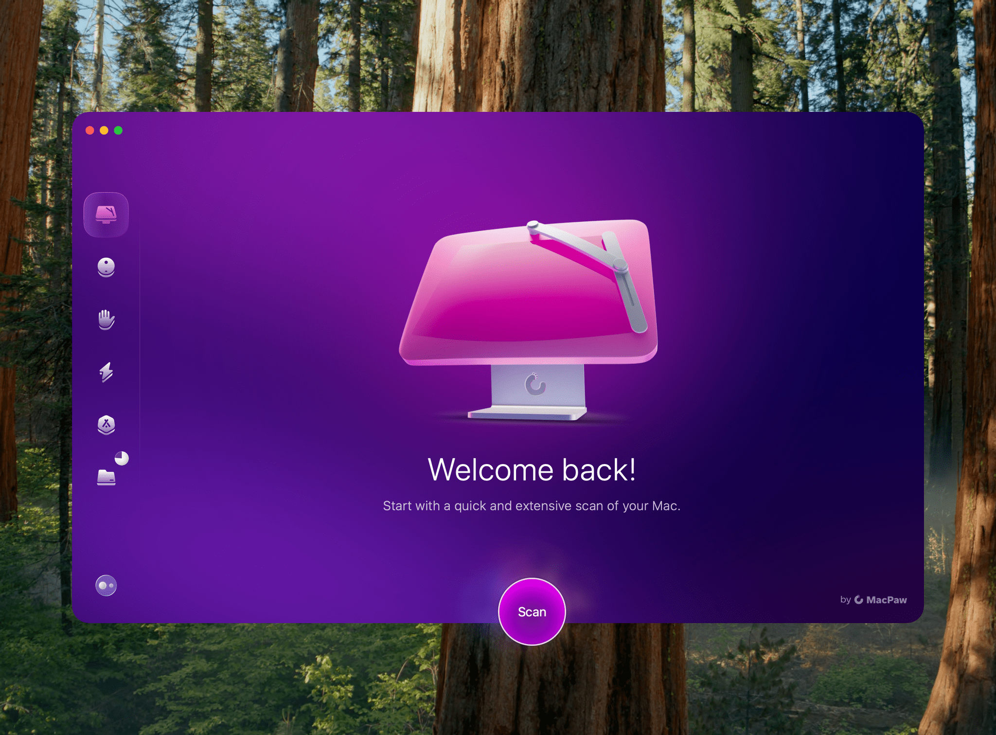
MacPaw has released a new version of its cleanup and maintenance utility CleanMyMac, dropping the “X” from its name, refreshing the design, and simplifying the app substantially.

The latest version is divided into six modules that host a variety of tools:

  • Smart Care
  • Cleanup
  • Protection
  • Performance
  • Applications
  • My Clutter

It also includes an assistant that rates the health of your Mac and recommends maintenance actions to you.

A lot of the tools available in CleanMyMac’s update will be familiar to long-time users. The difference is that the app’s modules have been simplified and explained in a less technical manner, which should make the app approachable to a broader audience.

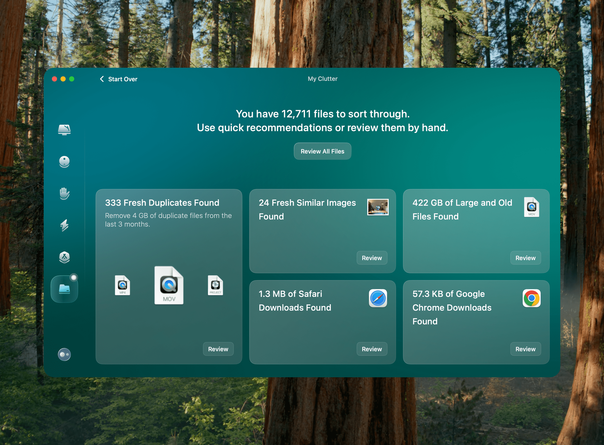
The My Clutter module does more to find file clutter than before, scanning for large, old, and duplicate files, as well as images that are the same or close matches to each other. The scan can take a while depending on the amount of storage on your Mac, but I was impressed with the volume of files it identified that I could summarily delete.

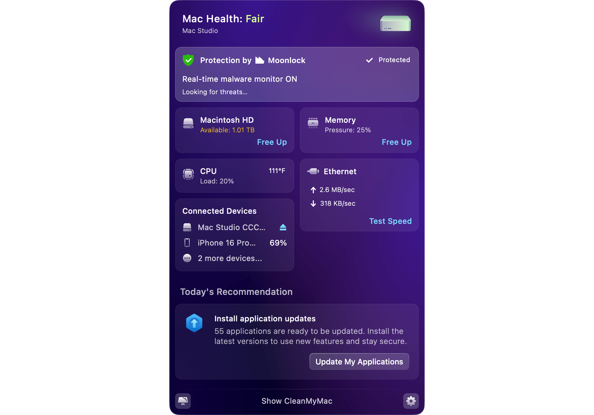
CleanMyMac's menu bar item.

CleanMyMac’s menu bar item.

The app also features a menu bar item that opens a grid of tiles reporting the highlights of your Mac’s health. Clicking on any of the tiles reveals additional details about that component.

The Smart Care, Cleanup, Protection, Performance, and Applications modules include a variety of other maintenance tools. You can tune up your Mac by clearing caches and other unnecessary files taking up your storage, free up memory, scan for viruses and malware, and uninstall or update apps to name just a handful of the many tools at your disposal.

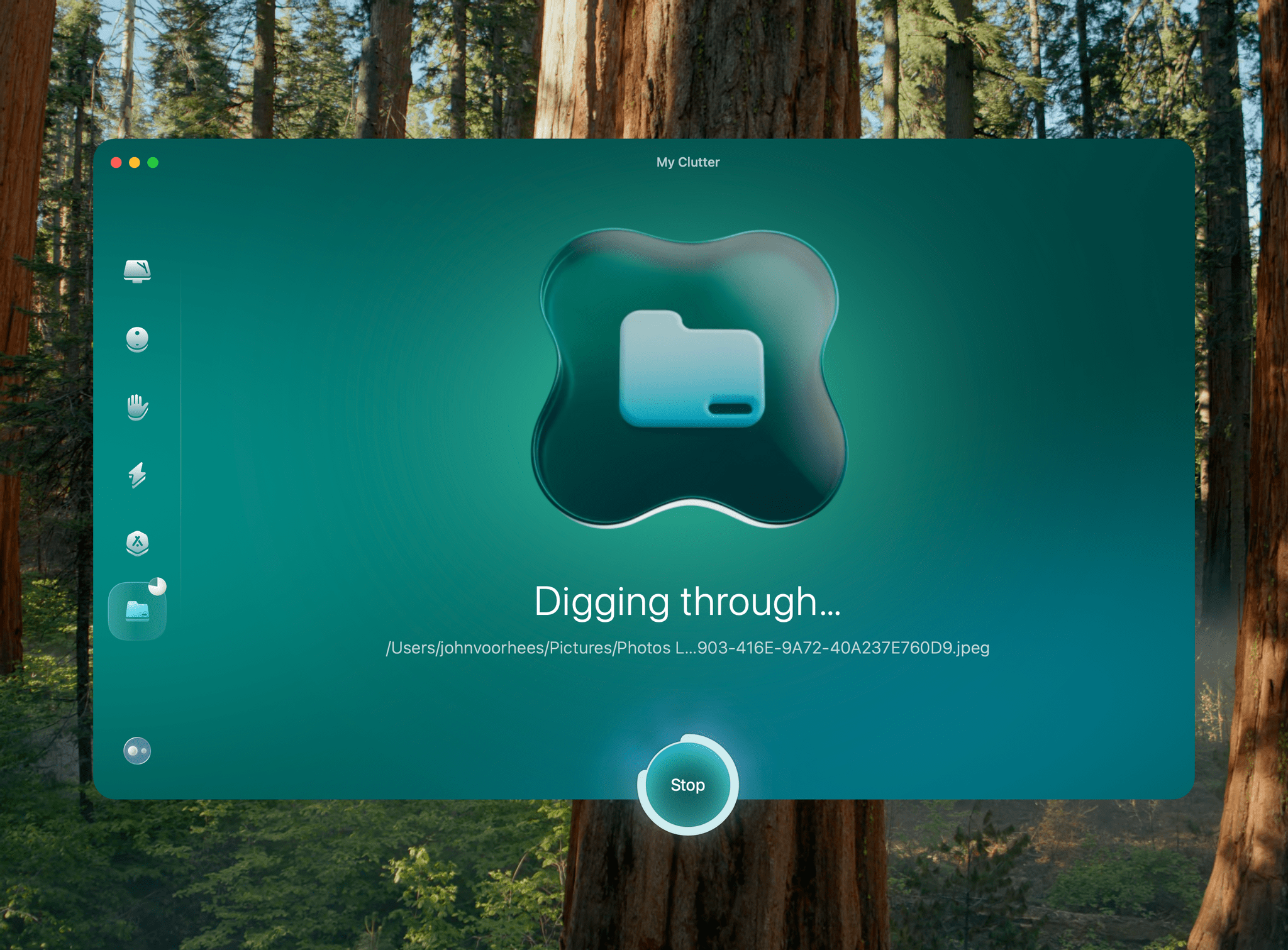
The My Clutter scan may take a while if you have a lot of files.

The My Clutter scan may take a while if you have a lot of files.

I’ve been running the new version of CleanMyMac for about a week, and it’s been running smoothly. The My Clutter file scan does take a lot of time; my 4TB Mac Studio took about 25 minutes to scan, but the app did a fantastic job identifying files I could delete. The other available scans have worked well, too, and are faster, making it simple for me to periodically maintain my Mac.

CleanMyMac is available directly from MacPaw starting at $39.95 per year for one Mac (with multi-device bundles available at a discount), or as a one-time purchase starting at $119.95. Either option includes a seven-day free trial. Alternatively, you can download CleanMyMac as part of a Setapp subscription (affiliate link).


Native Union’s Voyage Charger: A Versatile Travel Companion

The Native Union Voyage with USB-C cable and canvas pouch.

The Native Union Voyage with USB-C cable and canvas pouch.

Last week, I abandoned the Belkin BoostCharge Pro Wireless Charger because of a recent recall. Fortuitously at about the same time, Native Union sent me its Voyage 2-in-1 Magnetic Wireless Charger to test. Although I preferred having the Apple Watch charging puck integrated with the power source for charging, as the Belkin battery did, the Native Union’s Voyage has proven to be an excellent replacement and far more flexible in how it can be used.

The Voyage consists of two charging disks joined by a soft rubberized strip that allows the two halves to fold into a compact, magnetically connected unit. The device comes in sandstone or black and is made of plastic, with the soft-touch rubbery hinge extending around the exterior edge of the disks. When folded, the Voyage is about the thickness of two iPhone 16 Pros, which may be too thick for some pockets but works well in a bag with your other gear. Overall, the device feels sturdy, and the build quality is excellent.

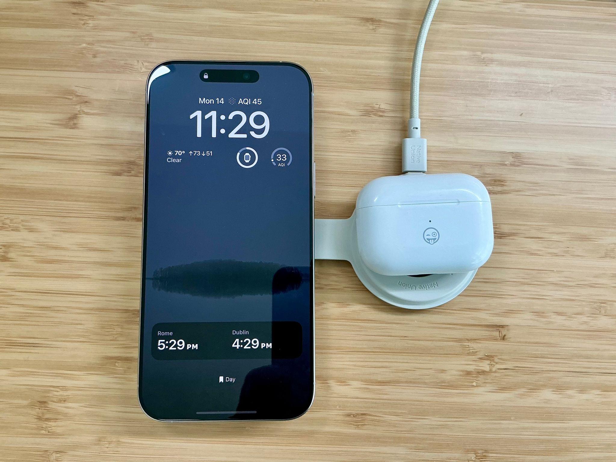
Charging an iPhone and AirPods Pro 2.

Charging an iPhone and AirPods Pro 2.

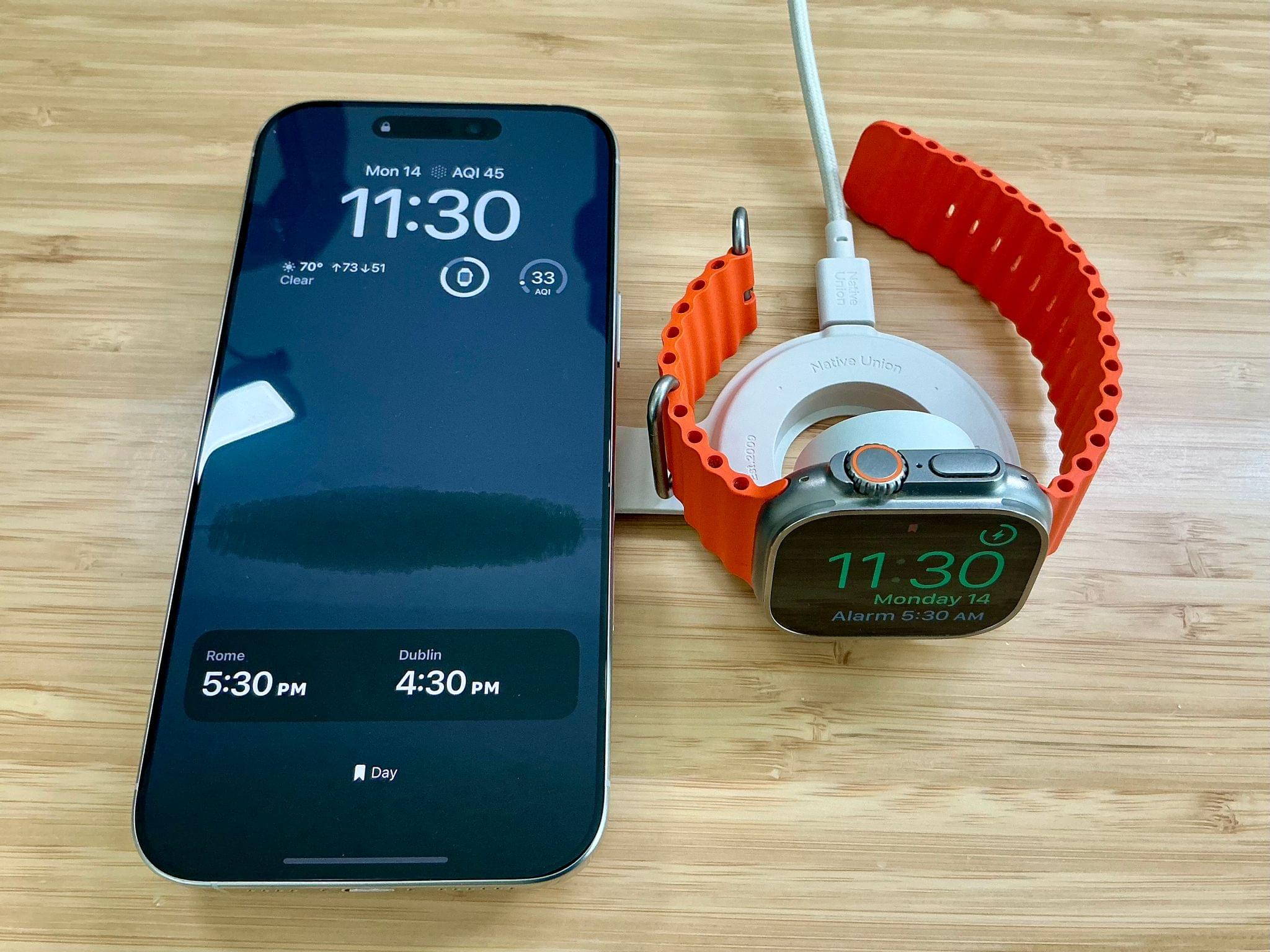
There are a few ways to use the Voyage. If you want to charge your iPhone and Apple Watch at the same time, you can fold the Voyage flat, push up on the Apple Watch charging puck so it’s perpendicular to the rest of the device, and start charging both. The Voyage is a Qi2 charger, meaning it can deliver 15W of power to an iPhone. The Apple Watch puck delivers 5W of power. Qi2’s power delivery is a step up from the original Qi standard, but it’s worth noting that you can get faster charging from Apple’s official iPhone MagSafe charger and Apple Watch charger.

Charging an iPhone and Apple Watch at 15 and 5W, respectively.

Charging an iPhone and Apple Watch at 15 and 5W, respectively.

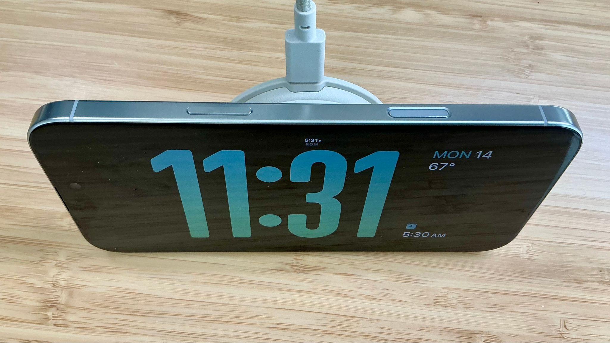
That said, there’s a benefit to the Voyage’s integrated design that Apple’s faster chargers don’t offer. Not only can you charge your iPhone and Apple Watch (or AirPods Pro) simultaneously, but you have other options, too. First, if you fold the Voyage back on itself, you can charge just your iPhone. In this configuration, the Voyage is thick enough to double as a landscape-oriented stand, allowing you to use it to watch videos whether you’re charging your iPhone or not. If you’re charging in this configuration, you’ll also have access to the iPhone’s StandBy mode.

Using the Voyage in StandBy mode.

Using the Voyage in StandBy mode.

Another option is to flip the same configuration over and drop your Apple Watch or AirPods Pro on the Voyage’s flat surface to charge. Alternatively, you can flip the charging puck up and use your Apple Watch in nightstand mode as it charges. That’s a total of four ways to charge your devices with a charger that has a footprint not much bigger than an official Apple MagSafe charger.

Using the Voyage as a stand.

Using the Voyage as a stand.

The Voyage comes with a fabric-covered USB-C cable that matches the color of the device. There’s also a canvas bag in the box for storing the Voyage and its cable, although I’ll probably use it for storing small dongles and other odds and ends instead.

So far, the Voyage has been a good substitute for the charger I was using before. I’d prefer it if the Voyage supported faster MagSafe charging, but its compact size makes up for the slower charging in most contexts. The device has been equally handy having around the house whenever I need to top off my iPhone, Apple Watch, or AirPods Pro as it’s been easy to keep in my backpack for working away from home. So while the Voyage won’t replace faster charging solutions I have connected to my desk, it’s filled the role of having a charger handy at all times very well.

The Voyage 2-in-1 Magnetic Wireless Charger is available directly from Native Union for $99.99.


POP Icon Keys: Logitech Brings Automation to a Budget-Friendly Keyboard

A couple of weeks ago, I wrote about and showed off Logitech’s MX Creative Console, a two-piece device made up of a keypad and dialpad, that takes the Elgato Stream Deck head-on. Well, today, Logitech is back with a slightly different approach in the form of its POP Icon Keys keyboard, which borrows some tricks from the Creative Console.

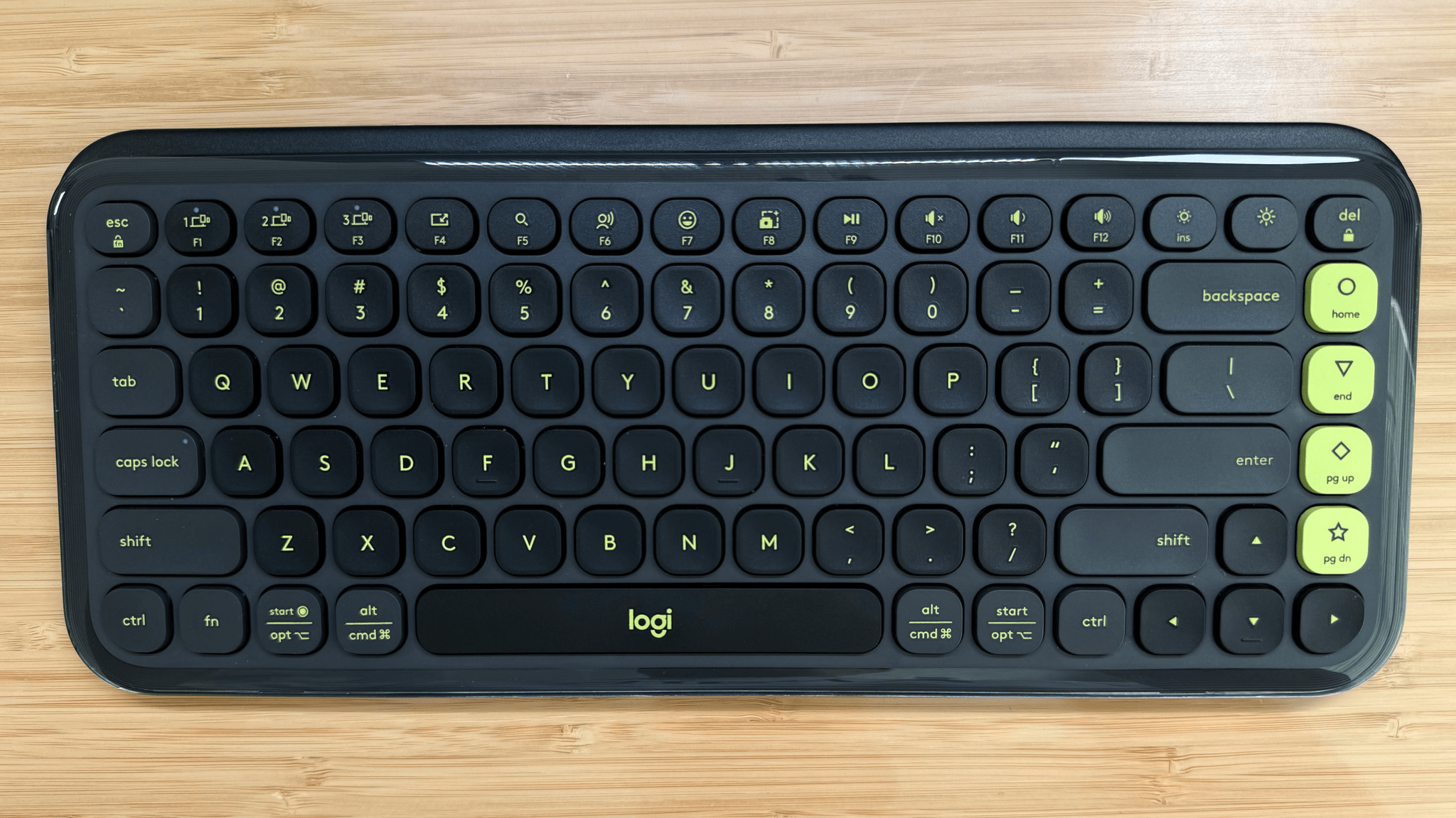
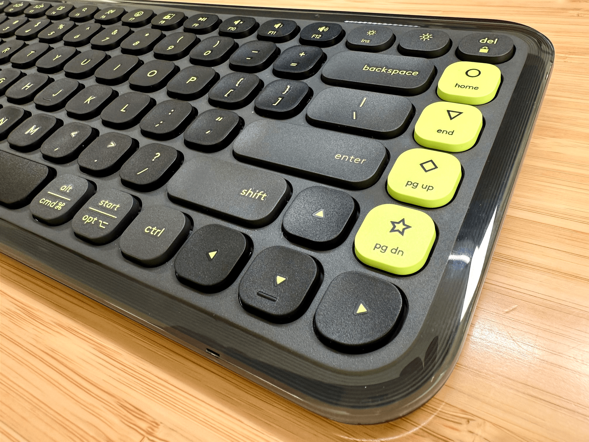
The $49.99 keyboard, shipping later this month, is solidly built and low-profile. It weighs 530g and has four big rubber pads on the bottom corners, giving it a sturdy, stable feel on my desk. The keys use scissor switches and feature aggressively rounded corners, and they’re quiet and have more throw and resistance than an Apple Magic Keyboard, but are easy to adapt to if you’re used to Apple’s keyboards. I particularly like the texture of the keys – which could be partially due to the fact that I’ve been using a worn-down Magic Keyboard – but the keys have a nice feel and don’t show fingerprints.

The POP Icon Keys comes in four color options.

The POP Icon Keys comes in four color options.

The body of the keyboard is made of a similar plastic, and the keys are surrounded by a strip of glossy, transparent plastic that adds a little flair to the entire package. The color options available for the POP Icon Keys are fun, too. I’ve been testing a black keyboard with neon yellow accents for about a week, and I like it a lot, but there are other color combinations available, including pink, orange and white, and a purpleish-blue color scheme. Also, the POP Icon Keys runs on two AAA batteries, which Logitech says can provide 36 months of operation thanks to the keyboard’s onboard power management.

If that’s where the story ended for the POP Icon Keys, I’d recommend it because it’s a very good keyboard for the price. What sets the POP Icon Keys apart, though, is that it goes a step further, adding automation features similar to those found on the more expensive MX Creative Console.

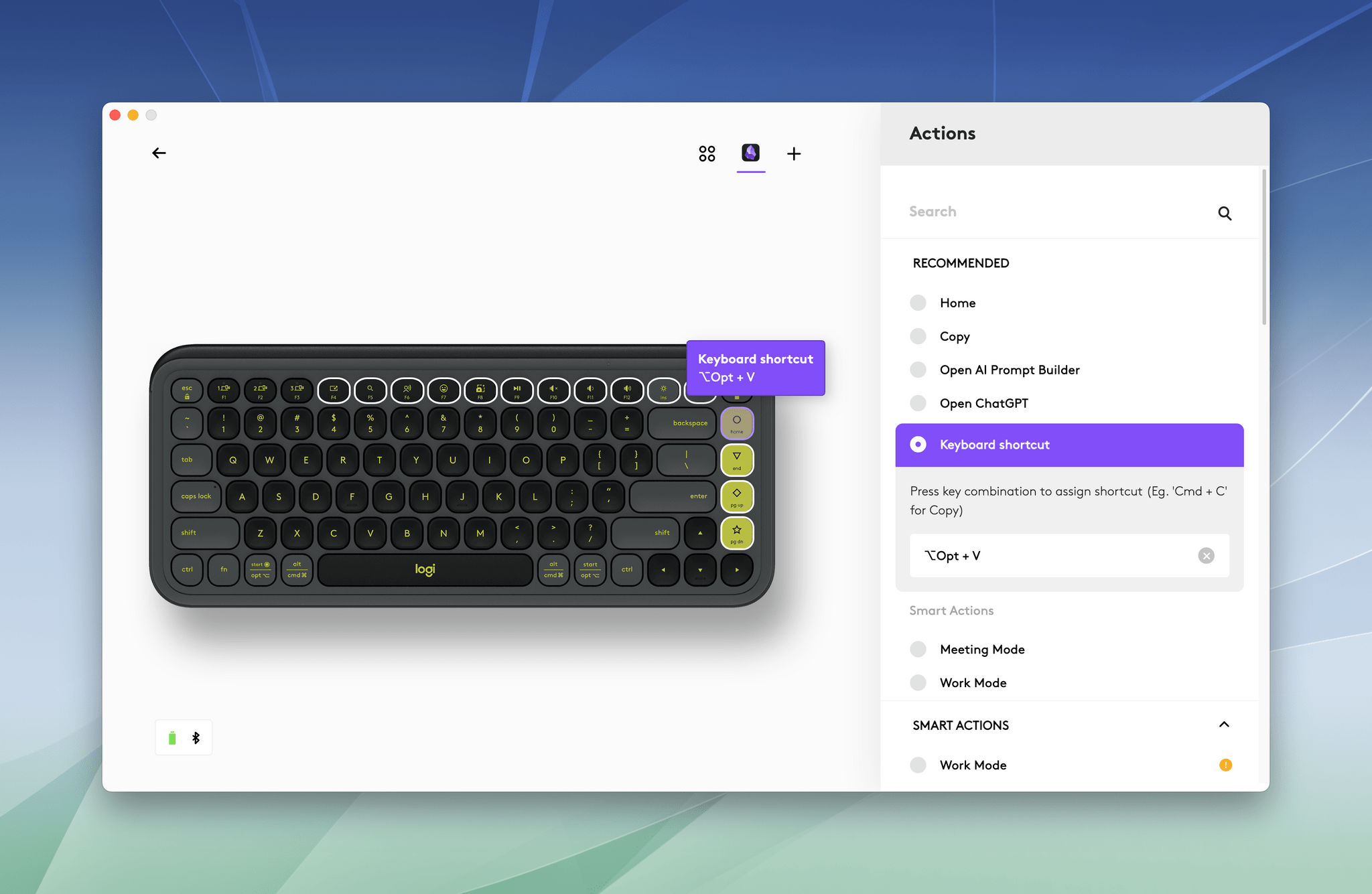
Logitech has designated the Home, End, Page Up, Page Down, F4-F12, and brightness keys as programmable via its Logi Options+ app. Among other things, you can use these keys to control system settings, execute keyboard shortcuts, and run multiple actions combined into macros. The keys’ original functionality remains available, too, if you hold down the function button. The POP Icon Keys also shares the MX Creative Console’s ability to set up app-specific profiles, meaning you can program keys to perform different tasks depending on which app is active.

For example, you could use the Home, End, Page Up, and Page Down buttons to open different sets of apps for work, a special project, or relaxing with a game. Or you could use the function keys to trigger keyboard shortcuts in your favorite apps or Shortcuts automations.

There are a couple of things I love about this functionality. First, the flexibility is fantastic, especially since you can access the programmable keys without taking your hands off the keyboard, which is an advantage over the MX Creative Console. Second, for just $50, the POP Icon Keys is a great entry point into the world of push-button automation. If it turns out that keyboard-driven automation isn’t your thing, you still have an excellent keyboard, but if it is, you can go a long way with the POP Icon Keys’ options before you graduate to the MX Creative Console or another similar device.


All in all, I like the POP Icon Keys a lot. It’s nicely built and a great way to get started with keyboard automation or supplement other automation workflows you already use. The device is available directly from Logitech and Amazon.