This Week's Sponsor:

Winterfest 2024

The Festival of Artisanal Software


Posts in stories

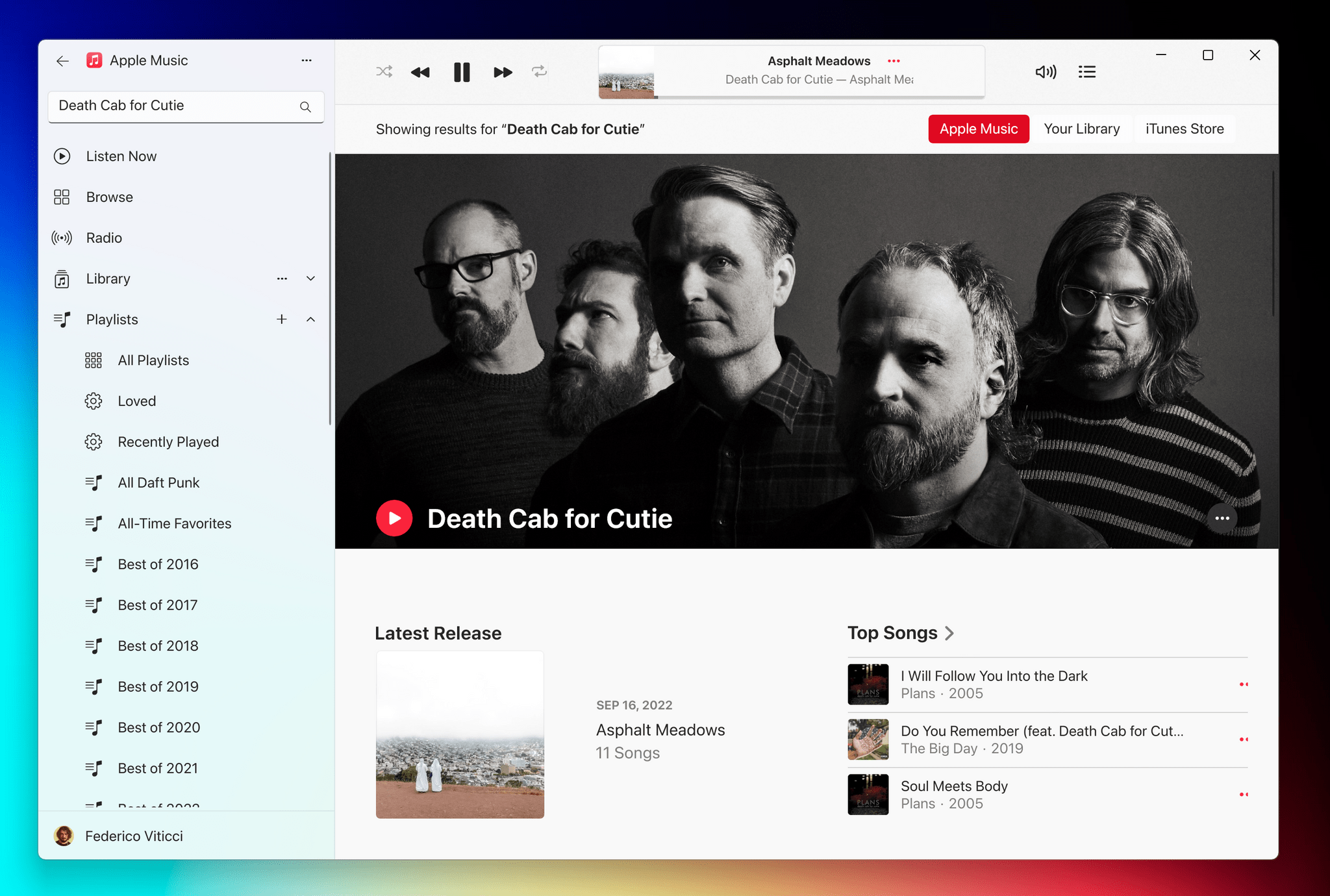
iPadOS 16.2 and Stage Manager for External Displays: Work in Progress, But Worth the Wait

Stage Manager in iPadOS 16.2.

Stage Manager in iPadOS 16.2.

Ever since I last wrote about iPadOS 16, I have continued using Stage Manager on my iPad Pro. As I wrote in October, I like the idea behind Stage Manager more than its implementation. Despite the flawed design of its multitasking concepts and bugs I still encounter on a daily basis, it’s undeniable that Stage Manager lets me get more things done on my iPad by virtue of its concurrent app windows.

With today’s release of iPadOS 16.2, the idea behind Stage Manager achieves the full vision first presented in June, while its design and technical implementation remain stuck in an unpolished, half-baked state. Which is to say: conceptually, I love that Stage Manager in iPadOS 16.2 allows me to extend my iPad to an external display and put four additional windows on it; I’ve waited years for this feature, and it’s finally here. Technically speaking, however, the performance of this mode leaves a lot to be desired, with frequent crashes on my iPad Pro and an oft-confusing design that, I will reiterate, needs a rethinking.

Over the past couple of months, I’ve learned to live with Stage Manager, accept its quirks, and use what’s good about it to my advantage. As I recently wrote for Club MacStories members, I’ve put my money where my mouth is: I’ve gone all-in with Stage Manager on my iPad Pro and completely rebuilt my work setup around the M2 iPad Pro and Apple Studio Display, using Universal Control to seamlessly control iPadOS from a nearby Mac mini. (You can read the full story here.) After all, no other device in Apple’s ecosystem can effortlessly turn from a tablet into a laptop and into a desktop workstation like the iPad Pro can.

I’ve been working toward this vision for iPad modularity and contextual computing for the past several years. So now that Stage Manager has unlocked the final piece of the puzzle with external display integration, how good is it in practice?

And more importantly: was it worth the wait?

Read more


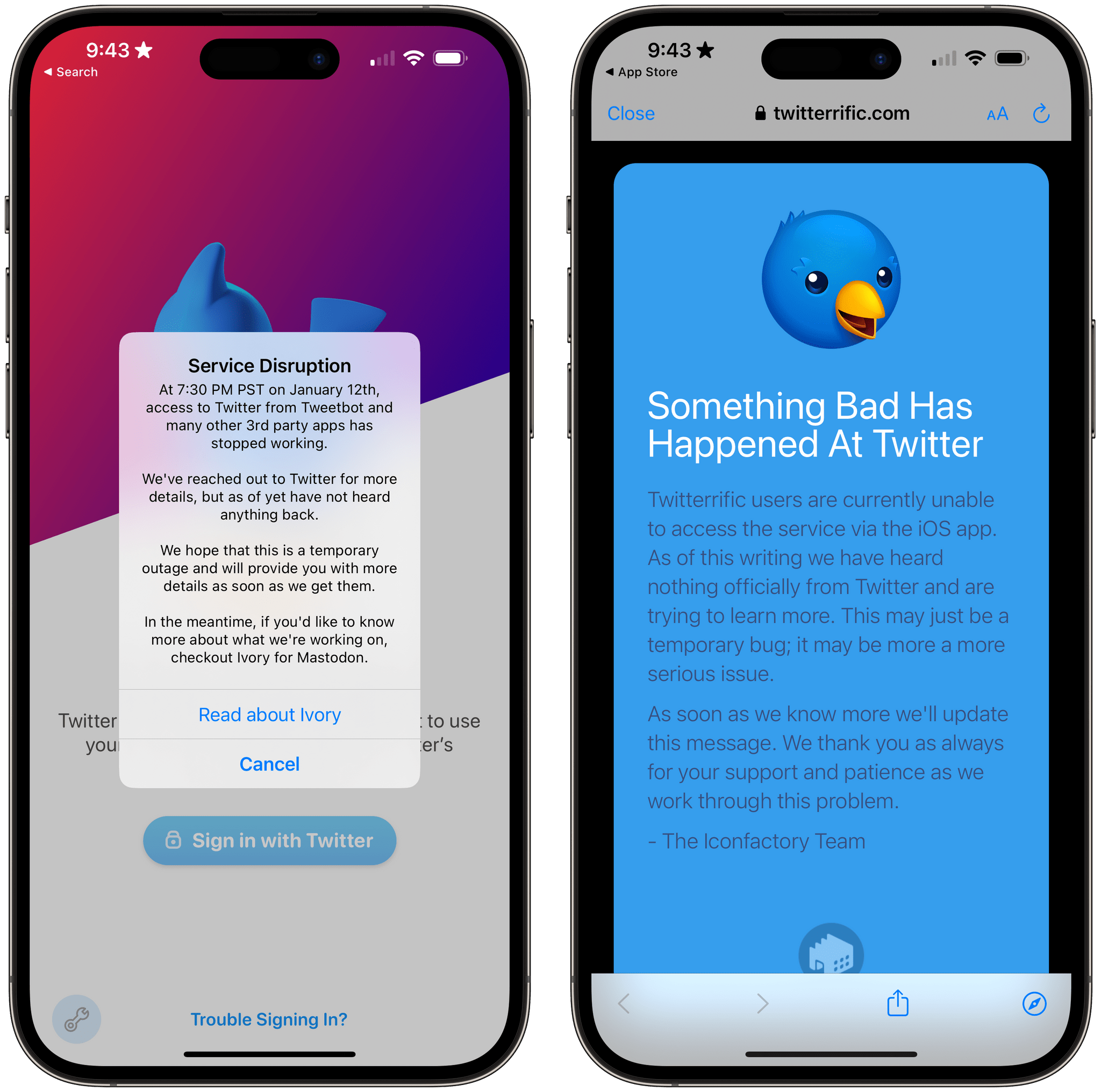
Resident Evil Village, Featuring Metal 3, Debuts on the Mac App Store

Apple spent a considerable amount of time during June’s WWDC talking about Metal 3, the latest iteration of the company’s graphics frameworks for videogames. The suite of technologies offers numerous technologies and tools for developers, including hardware-accelerated graphics, MetalFX Upscaling, which render scenes faster by taking advantage of upscaling and anti-aliasing, fast resource loading that uses asynchronous I/O techniques to speed up the delivery of data to Metal textures, and more. With the release of macOS Ventura, Metal 3 gaming is now available to all Mac users.

Resident Evil Village at WWDC.

Resident Evil Village at WWDC.

At WWDC, Apple announced three games that would be coming to the Mac later in the year that will take advantage of Metal 3:

The first of the games to be released publicly is Resident Evil Village, which is available in the Mac App Store now. I’ve had a chance to test the game in advance of its release for a few days, and from what I’ve seen in my limited time with the game, what Metal 3 enables is impressive.

For those unfamiliar, Resident Evil Village from Capcom was first released in mid-2021 and is available on every major platform. The eighth game in the Resident Evil horror series, Village follows the story of Ethan, whose wife has been assassinated and child abducted. Ethan is abducted, too, but escapes from his captors after their vehicle crashes. In short order, Ethan finds himself in a European village terrorized by zombie-like creatures.

I don’t have a lot to say about the game itself because I’ve only been playing it for a few days and horror games generally aren’t one of my favorite genres. Instead, I spent my time testing the game at various settings to get a sense of what Metal 3 can do, repeating the same section of the game multiple times at different resolutions and with other settings enabled.

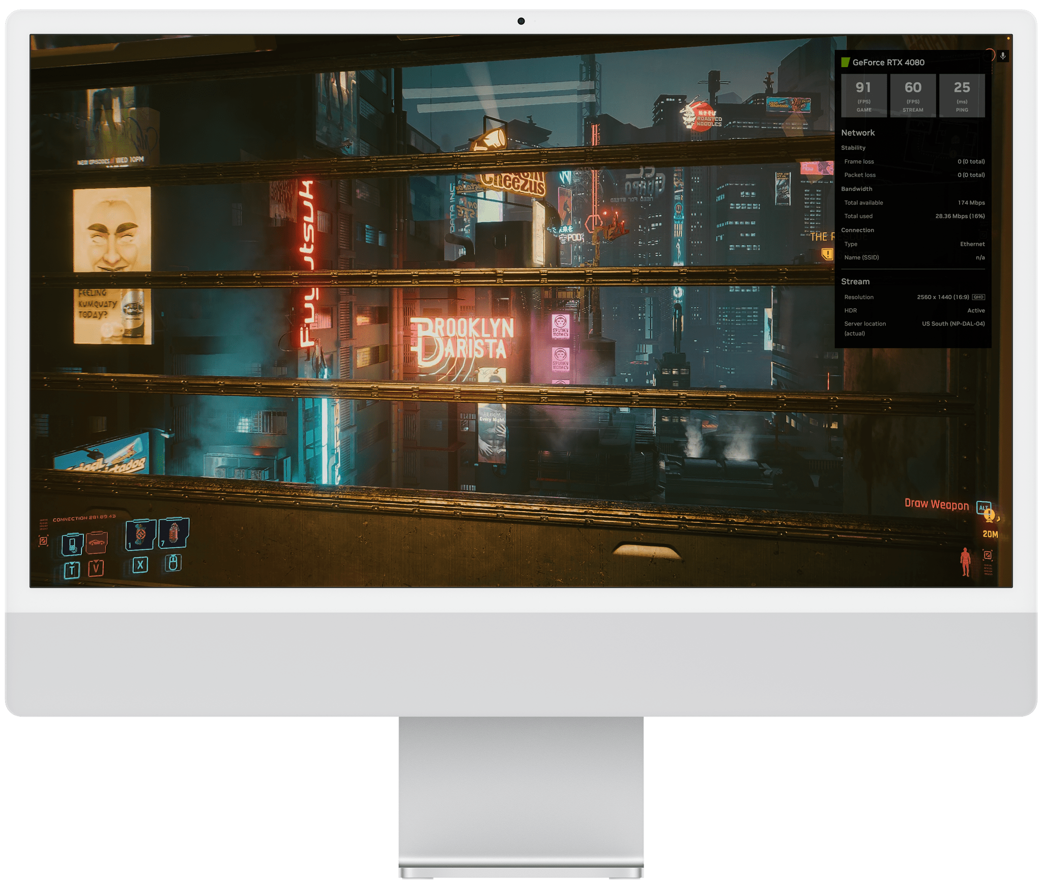
I started the game on my M1 Max Mac Studio and Studio Display at 2560 x 1440 with the game’s Prioritize Graphics preset enabled. At those settings, Village generally maintained 60-70 fps with a rare dip into the 50s during one particularly intense scene. Next, I enabled MetalFX Upscaling, which helped hold the frames above 60 and allowed me to increase other settings, like mesh quality, while maintaining 60fps.

At higher resolutions, the frame rates took a hit. For example, 2880 x 1620 dropped the frame rate to around 50 fps. However, once I enabled MetalFX Upscaling, I was right back up to 60 fps. I was even able to maintain a steady 60 fps when I bumped the resolution to 3840 x 2160 and switched the MetalFX Upscaling from the Quality to Performance setting. Bumping up other settings like the shadow and mesh quality didn’t significantly degrade performance either.

I also ran some tests with the game running on my M1 MacBook Air, where I was able to use the same sort of settings tweaks to maintain around 30 fps. The experience wasn’t bad, but Village definitely looked nicer, running on more powerful hardware paired with a Studio Display.

Overall, my first impressions of Metal 3’s enhancements to gaming on the Mac are positive. The results aren’t in the same league as a gaming PC with a dedicated graphics card. For example, I’ve seen benchmarks for Resident Evil Village running with an NVIDIA 3080 card that can run the game at over 120 fps. That’s double what I saw with my Mac Studio, but it’s still better than I’ve experienced in the past with games as recent as Village.

Metal 3 is promising. With just one big-name game taking advantage of it at the moment, it’s too early to judge its impact on Mac gaming, but it’s a step in the right direction. Hopefully, more game publishers will adopt the technology and bring their games to the Mac soon.

Resident Evil Village is available on the Mac App Store for $39.99.


macOS Ventura: The MacStories Review

macOS Ventura is a hard release to pin down. I’ve been running it for months, and it’s been running well for all my everyday work and personal tasks. Features like Continuity Camera, iCloud Shared Photo Library, and the many system app updates have, on the whole, been stable, worked as advertised, and helped me do more with my Mac. So, from an everyday workflow standpoint, Ventura is an excellent release that delivers on the promise of an OS that moves in step with Apple’s other OSes and erases artificial barriers to users coming from iOS and iPadOS. And yet, I worry about the clouds on the horizon.

The release of Ventura is just one moment in time along macOS’s evolutionary path, but it’s an important one. Each fall release is a marker laid down by Apple that says something about where the Mac has been and where it’s going.

The story of macOS Ventura didn’t begin at WWDC in June. As I wrote in last year’s macOS Monterey review, it started five years ago:

For the past few years, no narrative thread has been more important to the Mac and its operating system than their realignment within Apple’s product lineup. It’s a fundamental transformation of both hardware and software that has taken shape over years, beginning publicly with Craig Federighi’s WWDC Sneak Peek in 2018.

Before Mac Catalyst, there was Craig Federighi's 2018 Sneak Peek.

Before Mac Catalyst, there was Craig Federighi’s 2018 Sneak Peek.

Last year’s release of Monterey went a long way toward validating what came before with Catalina and Big Sur:

Monterey is one of the most tangible, user-facing payoffs of the past three years of transition. More than ever before, Apple is advancing system apps across all of its platforms at the same time. Finally, everything is everywhere.

Ventura is, in many ways, a continuation of Monterey’s storyline. Apple has delivered a second year of parallel development across its system apps, with the notable exception of Shortcuts, which I’ll cover later. That’s a big win for Mac users who, in previous years, waited multiple releases for apps like Maps and Books to catch up with their iOS and iPadOS counterparts.

The familiar interface and feature set across multiple platforms are one of the biggest and most tangible achievements of the past few years.

The familiar interface and feature set across multiple platforms are one of the biggest and most tangible achievements of the past few years.

So, with Monterey’s success of moving system apps forward in unison across all OSes looking more like a trend than a one-off novelty, what are the clouds I’m seeing on the horizon? There are three:

  • Stage Manager: Stage Manager is in far better technical shape on the Mac than on the iPad. In fact, I’ve been using it every day since WWDC and will continue to do so. There’s lots of room for improvement, which I’ll cover below, but my concern extends beyond the Mac-specific issues to what the feature’s problems on the iPad mean for Mac users long-term, which is something I covered last month for Club MacStories members and will expand on below.
  • Shortcuts: Shortcuts was in rough shape when it launched on the Mac last year. The app is in a much better place today, although bugs continue to be a problem. More concerning to me, though, is the lack of new system-level actions on the Mac. A lot of resources undoubtedly went into stabilizing Shortcuts on the Mac over the past year, which is understandable, but unfortunately, those efforts seem to have been at the expense of introducing new system-level actions or maintaining parity with new actions on iOS and iPadOS.
  • System Settings: So much of the design work we saw introduced with Big Sur was so carefully considered to harmonize macOS with iPadOS while retaining its Mac nature that System Settings is a shock to, well, the system. System Preferences was long overdue for a refresh, but System Settings isn’t the redesign we needed. Instead, it’s a clear example of why you can’t just graft iOS or iPadOS design onto macOS and call it quits.

Although each of the items above concerns me, it’s equally important to put them in context. For most users, macOS is in a very good place. My day-to-day work on the Mac isn’t affected by whether the iPadOS version of Stage Manager is buggy. I may feel constrained by the lack of some actions in Shortcuts on my Mac, but at the same time, I’ve got Shortcuts on the Mac, something I’d hoped for for years. And Systems Settings are, after all, just settings that may not be great to look at, but they still work.

However, while the issues with Ventura may not be immediate, they’re still important because they threaten the viability of the Mac in the midst of its hardware renaissance. I want to see the Mac continue to grow and flourish, and I’m convinced more than ever that aligning it and the iPad is one of the ways to accomplish that. Unfortunately, Ventura doesn’t move that ball forward in a meaningful way.

With Apple firing on all cylinders when it comes to hardware, now is no time to let macOS stall. Source: Apple.

With Apple firing on all cylinders when it comes to hardware, now is no time to let macOS stall. Source: Apple.

By tying the two together, Apple has set the stage for a healthier third-party app ecosystem that benefits both platforms by making it more economical for developers to create apps for both. I’m sent a lot of apps to try, and I can tell you that this is absolutely happening already. The vast majority of the apps I’m sent today aren’t Mac-only or iPad-only – they’re universal apps that work on both and usually the iPhone and Apple Watch too.

However, the work and the story that started with Federighi’s Sneak Peek aren’t finished. For the Mac and iPad to thrive, now is not the time for Apple to take its foot off the gas. Yet, that’s what Ventura feels like after several years of foundational changes to macOS. It’s not a bad update. There’s a lot to like among the system apps and other changes, but I can’t shake the nagging sense that Apple has taken its eye off the long-term vision for macOS with Ventura. That won’t affect your day-to-day use of the OS, but it’s certainly something worth keeping a close eye on as Ventura is updated and WWDC rolls around again next summer.

Read more


Stage Manager in iPadOS 16: At the Intersection of Bugs, Missing Features, and Flawed Design

Stage Manager in iPadOS 16.1.

Stage Manager in iPadOS 16.1.

This article wasn’t supposed to go like this.

iPadOS 16 is launching to the public today, and it carries a lot of expectations on its shoulders: for the first time since the introduction of the original iPad in 2010, Apple is embracing a Mac-like windowing system that lets you use up to four windows at the same time on the iPad’s screen. You can even resize them and make them overlap. If you’ve been following the evolution of the iPad for a while, you know that’s very unusual.

But the reason this story was meant to be different isn’t to be found in Apple’s design philosophy for iPadOS 16. Typically, MacStories readers would expect a full-blown ‘The MacStories Review’ to go alongside a new version of iPadOS. That’s what I’ve been doing for over seven years at this point, and I don’t like breaking my writing patterns. When something works, I want to keep writing. That’s precisely why I had to stop writing about iPadOS earlier in the summer and until last week.

Stage Manager, the marquee addition to iPadOS that lets you multitask with floating windows, started crashing on my M1 iPad Pro in mid-July and it was only fixed in early October. When I say “crashing”, I mean I couldn’t go for longer than 10 minutes without iPadOS kicking me back to my Lock Screen and resetting my workspaces. And that was only the tip of the iceberg. For nearly two months, I couldn’t type with Apple’s Magic Keyboard or use keyboard shortcuts when Stage Manager was active. Before it was pulled by Apple and delayed to a future release, external display support in Stage Manager was impossible to rely on for production work. The list goes on and on and on.

Normally, I would use the introduction of my iOS and iPadOS reviews to tell you how I’ve been living and working with the new operating system every day for the past three months. I’ve always tried to publish annual OS reviews that are informed by practical, consistent usage of a new operating system which, I hope, has led to highly opinionated, well-researched stories that can stand the test of time. That kind of story hasn’t been possible for me to produce with iPadOS 16 yet.

Effectively, I’ve only been able to sort-of use iPadOS 16 with Stage Manager on my M1 iPad Pro again for the past two weeks. Before that, it’s not that I didn’t want to use iPadOS 16 and Stage Manager because I hate progress; I literally couldn’t unless I was okay with my iPad crashing every 10 minutes. So, at some point over the summer, I made the call to revert to Split View and Slide Over – which are still the iPad’s default multitasking mode in iPadOS 16 – and I’d check back in on Stage Manager on each beta of iPadOS 16. It was only around two weeks ago that, despite some lingering bugs I’ll cover later, I was able to finally leave Stage Manager enabled and go back to where I was when I published my iPadOS 16 first impressions article in July.

Think about my position this way: there’s a hole from early August to early October in my typical “reviewer summer” during which I couldn’t use the biggest addition to iPadOS 16 at all. The fact that Apple delayed, slimmed down, and kept iterating on Stage Manager until the very last minute seems to suggest I wasn’t the only one desperately trying to make it work.

I started using iPadOS 16 and Stage Manager again two weeks ago; what kind of “review” should this be?

Read more


iOS 16 Lock Screen Widgets: The MacStories Roundup

As the release of iOS 16 approached, I felt a strong sense of déjà vu. TestFlight betas with Lock Screen widgets came pouring in. It felt like 2020’s debut of Home Screen widgets all over again. This time, though, those betas have been all about Lock Screen widgets.

As Federico covered in his iOS 16 review, Apple’s approach to Lock Screen widget support in its own apps is different than its approach to Home Screen widgets was. There are far fewer Lock Screen widgets available for system apps than there were when Home Screen widgets were launched with iOS 14. Part of the difference is undoubtedly because Lock Screen widgets are smaller and monochrome, but there remain gaps that aren’t so easily explained away. Fortunately for us, third-party developers have stepped into the breach with a long list of innovative widgets.

With so many choices and only three to five Lock Screen widget slots to fill, it’s hard to know where to start, so I’ve compiled a list of my top recommendations from the over 40 I’ve tried so far. Of course, this list doesn’t include the apps I already covered last week, but it goes without saying that Widgetsmith, Lock Screen One, LockFlow, and CARROT Weather would be also be included in this list if I hadn’t already written about them.

Read more


iOS 16: All the Things I Didn’t Like

Earlier this week, I published my review of iOS 16. As you may have seen, throughout the eight chapters of the story, I pointed out some of the flaws of iOS 16 and aspects I didn’t particularly like. That gave me an idea.

First, however, allow me to thank to everyone who read, enjoyed, and recommended the review. I’m glad the story resonated with MacStories readers. I take my responsibility to work on these annual reviews very seriously, and I’m excited about having found a format that lets me review a sprawling operating system such as iOS in a review that’s still approachable and fun to write.

Anyway: as I was writing the review, I realized that I had several complaints about things I didn’t like in iOS 16 (shocker, I know). So I had an idea: I asked Finn Voorhees1 to work on an update to my Obsidian plugin that lets me compile chapters of the review into a single Markdown file. This update, which will be released for Club MacStories+ and Premier members this Saturday, enabled me to mark specific passages of the review as “complaints” and extract them all at once. You will be able to use this new plugin option however you want: it’s going to work for any kind of text you want to highlight from a long-form story in Obsidian.

That being said, I compiled all my iOS 16-related complaints, organized them into sections, and you can find them below.

Here are all the things I didn’t like in iOS 16, which I hope Apple will fix in the future.

Read more


watchOS 9: The MacStories Review

As we enter the ninth iteration of watchOS, I must admit that I sometimes find myself looking back wistfully on the computer watch that the Apple Watch once was. My inner tech nerd misses the wild, blind shots at digital connection and interface design which we were gifted by an Apple that had not yet figured out what the mass market wanted from this device.

In many ways, the early days of the Apple Watch feel like echoes from a bygone era of Apple; an era in which it was more willing to throw things at the wall just to see what stuck. This is, after all, the company which brought us the buttonless iPod shuffle, the hockey puck mouse, brushed metal, the tape-recorder Podcast app, and so much more. We tend to call it Apple’s sense of “whimsy”, and early watchOS had plenty of it.

Time Traveling in watchOS 2.

Time Traveling in watchOS 2.

In watchOS 2, Apple shipped a feature called Time Travel where you could spin the Digital Crown to “travel backwards and forwards in time”. Complications would move alongside the watch hands to reflect their past or predicted future values. Time Travel was demoted to a setting in watchOS 3, and quietly removed entirely some time later.

There was also the concept of Glances beginning all the way back in watchOS 1. Glances were single-page app interfaces accessible by swiping up from the watch face, then swiping side-to-side to switch between them. Third-party apps could create these, and the watch supported up to 20 of them. Glances were also canned in watchOS 3. They were replaced by the Dock, which never quite managed to capture the same energy.

For years, Apple seemed particularly interested in the potential of the Apple Watch to be a core hub for personal communication. Until watchOS 3, the hardware side button on the device was dedicated to opening the Friends interface. When interacting with your friends, you could send giant animated emojis — perhaps a very early precursor to the Memoji that we have today. And of course, no one could forget Digital Touch. Who among us did not feel more connected to our loved ones when tapping out pings and drawing shapes on their wrists1?

The Friends interface in watchOS 2.

The Friends interface in watchOS 2.

What leaves me feeling so conflicted is that, ultimately, all of the above features were pretty bad. No one used the Friends interface, Time Travel wasn’t particularly useful, third-party Glances were kneecapped by their lack of interactivity, and communicating from an Apple Watch has always just been way more work than pulling out your iPhone. Apple was right to kill all of these features in their time, but I still can’t stop missing the days when my Apple Watch was searching for more variety in purpose than it exists with today.

Read more


  1. I imagine Digital Touch is unfazed by my mockery; likely too busy feeling satisfied that it is the only one of the features described above which has (somehow) endured into modern iterations of watchOS. ↩︎

iOS 16: The MacStories Review

Customization is back, and Apple’s having fun again.

When is the last time your iPhone truly surprised you?

The answer to this question is a fascinating Rorschach test that can say a lot about a person’s relationship with Apple’s mobile platform. Some might say it was over a decade ago, when they feasted their eyes upon the Retina display for the first time in 2010. Some might say it happened when the iPhones got bigger – and sales skyrocketed – with the iPhone 6 lineup in 2014. Others might argue that it happened with Face ID on the iPhone X, or the first time they tried Portrait or Night mode, or perhaps when they first took an ultra-wide shot.

My point is: if you ask someone about the last time an iPhone truly surprised them, chances are they’ll reply with a hardware feature. That’s not a shocker: Apple prides itself upon the tight integration they’ve been able to achieve between the iPhone’s hardware and iOS; they’ve successfully managed to turn their design philosophy into a selling point of their entire ecosystem.

People buy iPhones because they know they’re going to work well for a long time, and, usually, because the model they’re getting has a cool new gimmick they want to try. For this reason, it’s not absurd to postulate that, by and large, the iPhone’s software serves to enable hardware sales and subscriptions. I do not mean this pejoratively: I like Apple’s approach, otherwise I wouldn’t be writing annual reviews about their operating systems. But I also recognize that on the iPhone (the situation is the exact opposite on iPad) the software now largely takes the backseat compared to hardware and services.

Which is why whenever the iPhone’s software truly surprises me, I get excited.

Software-related surprises are more rarefied on iOS these days, but the kind of people who are reading this story can point to a few examples in our recent history. Apple buying Workflow, turning it into a system app, and outright claiming that Shortcuts is the future of automation was a surprise. The extent to which Apple integrated dark mode in iOS 13 was a surprise.1 The arrival of two iPad features – Picture in Picture and inter-app drag and drop – on iPhone felt like a surprise. But, of course, no modern feature comes close to the surprise that we all witnessed with iOS 14 two years ago: a renewed focus on user personalization with custom Home Screen widgets and the ability to create multiple Home Screens.2

That’s why, following last year’s welcome (if perhaps a tad uninspired) quality-of-life update that was iOS 15, I’m excited about a new version of iOS again.

iOS 16, launching today for a variety of iPhone models dating back to the iPhone 8, marks Apple’s triumphant return to user personalization, with a twist: while in 2020 customization might have felt like a happy consequence of Apple’s engineering, this time the company has intentionally marketed iOS 16 as an update that will make an iPhone feel truly your own. As we explored in June and July, the first thing you see on your iPhone – the Lock Screen – is fundamentally changing in iOS 16. With the ability to create multiple Lock Screens, choose from a diverse collection of wallpaper sets, and customize each one with widgets, you’ll now have endless possibilities for the screen you always see when you pick up your iPhone.

Sure, there’s an argument to be made for Lock Screen widgets also being developed in service of new hardware, but I don’t think that takes away from the breadth of this feature and how Apple created a whole narrative around wallpapers, widgets, photos, and Focus modes this year. As you’ll see, the customizable Lock Screen will be the main character of this review: I’ve had a lot of fun exploring different permutations of my Lock Screen this summer, and I’ve been able to test dozens of widgets from third-party developers, which I’ll also showcase in this story.

In keeping with my theory that modern iOS updates always need to have a little bit of something for everyone, there’s a ton of other (some bigger, some smaller) features I’ll be covering in this review.3 Messages, one of my most used apps on iPhone, has received a substantial update with the ability to edit and un-send messages, making it, in some ways, even superior to WhatsApp for me now. Mail – of all apps – has gotten a major upgrade with modern features such as scheduled send and, almost unbelievably, a revamped search that actually works. Reminders has officially turned into a serious task manager with even more filters for smart lists and the ability to create and share templates with others.

The new Lock Screen takes center stage this year and everything else pales in comparison to the massive update it received, but, overall, I find iOS 16 a more fun and useful update than iOS 15.

So, as with every September: let’s dive in.

Read more


  1. Then again, wasn't that in service of OLED displays? ↩︎
  2. Perhaps the iPhone 14 Pro's Dynamic Island will be another major surprise for iPhone users. Fascinatingly, it's going to be a unique blend of hardware and software that shows how Apple has been playing the long game with their design strategy for the past few years, which is now paying off. However, the iPhone 14 Pro is not out yet and I haven't tested the Dynamic Island, so that's beyond the scope of this review. ↩︎
  3. That's in addition to the apps and features we've already covered in our annual OS Summer Series on MacStories↩︎

The 2022 MacStories OS Preview Series: Everything New Coming to Apple Mail

Email isn’t going anywhere anytime soon despite its flaws. Tools like Slack have replaced the lion’s share of internal communications at many companies, and a long list of messaging apps have chipped away at conversations among individuals. Still, email has proven resilient.

One of email’s many problems is how hard it can be to manage the volume of messages so many of us receive. Over the years, developers have come up with innovative tools layered on top of the core email protocols to improve the experience. However, few of them are with us anymore. Remember Sparrow? How about Mailbox or Acompli? Notice a trend? There are still some bright spots, like Mimestream on the Mac and Spark, but with so few survivors, having a strong choice from Apple has never been more important.

That’s why the situation with Apple’s Mail app has been so distressing in recent years. Mail sat, barely touched on any platform for what seemed like forever. However, this fall, across iOS, iPadOS, and macOS, Apple is finally bringing many of the features pioneered by others to its own Mail app. You won’t find every cutting-edge modern email feature in Mail. Message collaboration and back channel chat about email messages among team members, which Spark and other apps offer, is a good example of a feature Apple has left to others. However, I expect most individuals and teams that aren’t looking to use email as though it were Slack will like what they see in Mail, so let’s dig into the details.

Read more