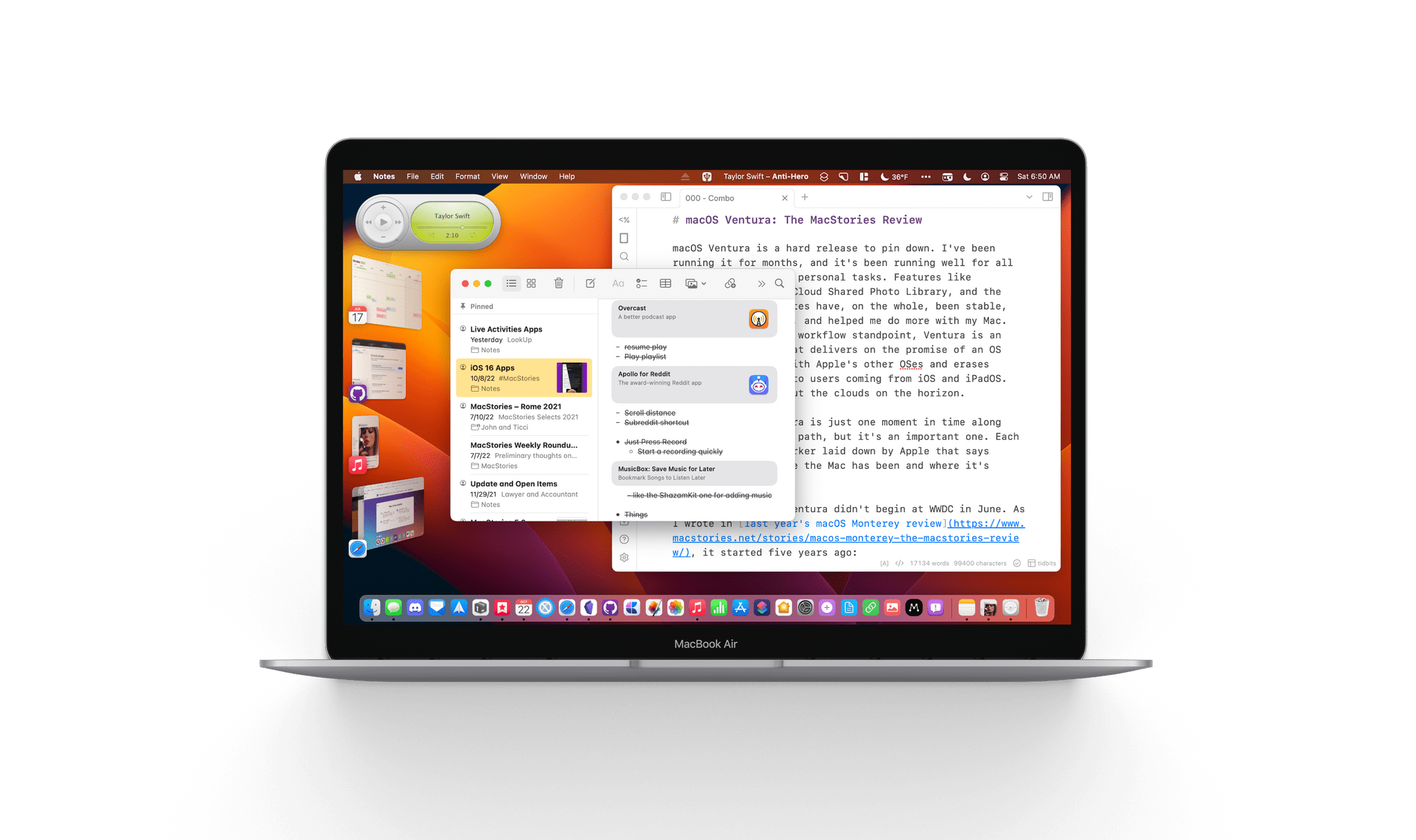
macOS Ventura is a hard release to pin down. I’ve been running it for months, and it’s been running well for all my everyday work and personal tasks. Features like Continuity Camera, iCloud Shared Photo Library, and the many system app updates have, on the whole, been stable, worked as advertised, and helped me do more with my Mac. So, from an everyday workflow standpoint, Ventura is an excellent release that delivers on the promise of an OS that moves in step with Apple’s other OSes and erases artificial barriers to users coming from iOS and iPadOS. And yet, I worry about the clouds on the horizon.
The release of Ventura is just one moment in time along macOS’s evolutionary path, but it’s an important one. Each fall release is a marker laid down by Apple that says something about where the Mac has been and where it’s going.
The story of macOS Ventura didn’t begin at WWDC in June. As I wrote in last year’s macOS Monterey review, it started five years ago:
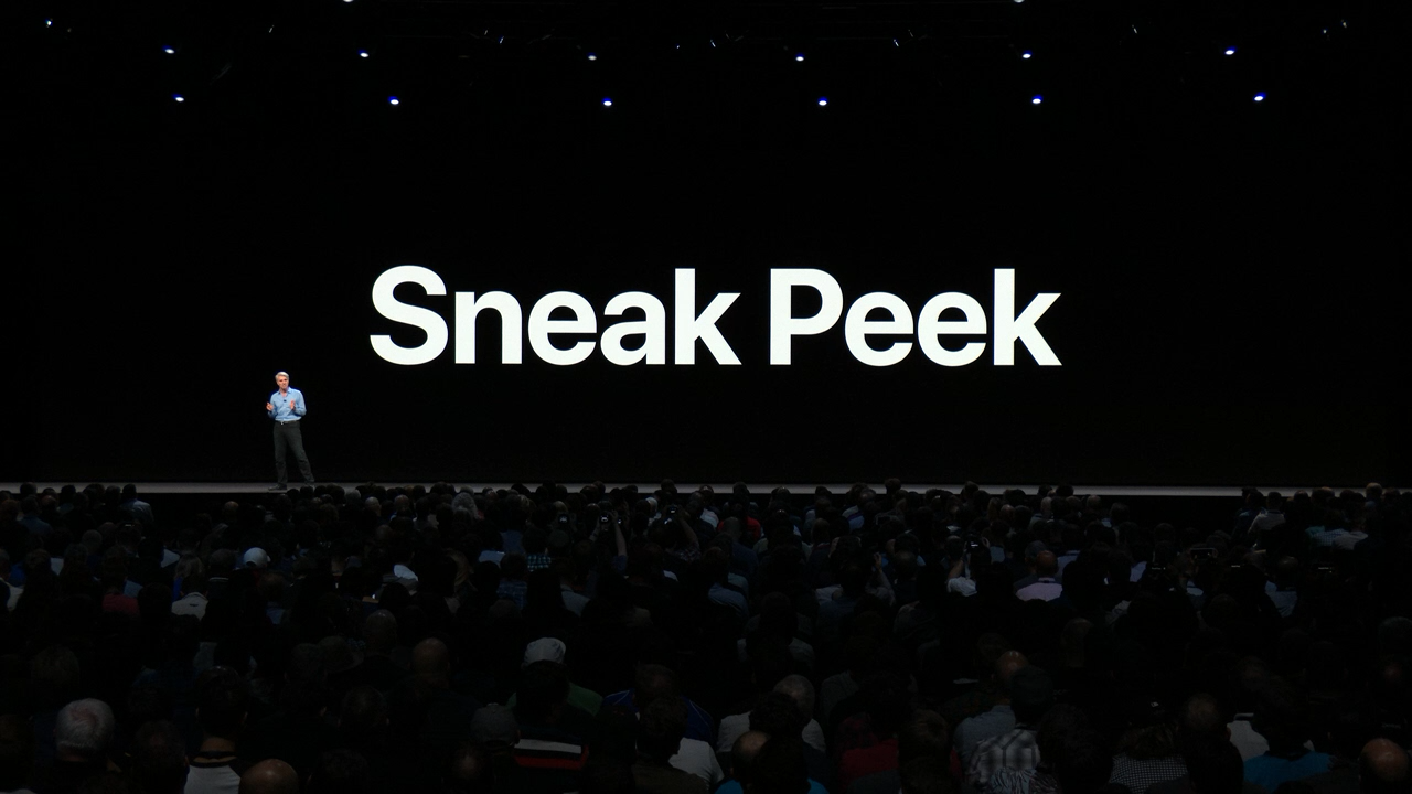
For the past few years, no narrative thread has been more important to the Mac and its operating system than their realignment within Apple’s product lineup. It’s a fundamental transformation of both hardware and software that has taken shape over years, beginning publicly with Craig Federighi’s WWDC Sneak Peek in 2018.
Last year’s release of Monterey went a long way toward validating what came before with Catalina and Big Sur:
Monterey is one of the most tangible, user-facing payoffs of the past three years of transition. More than ever before, Apple is advancing system apps across all of its platforms at the same time. Finally, everything is everywhere.
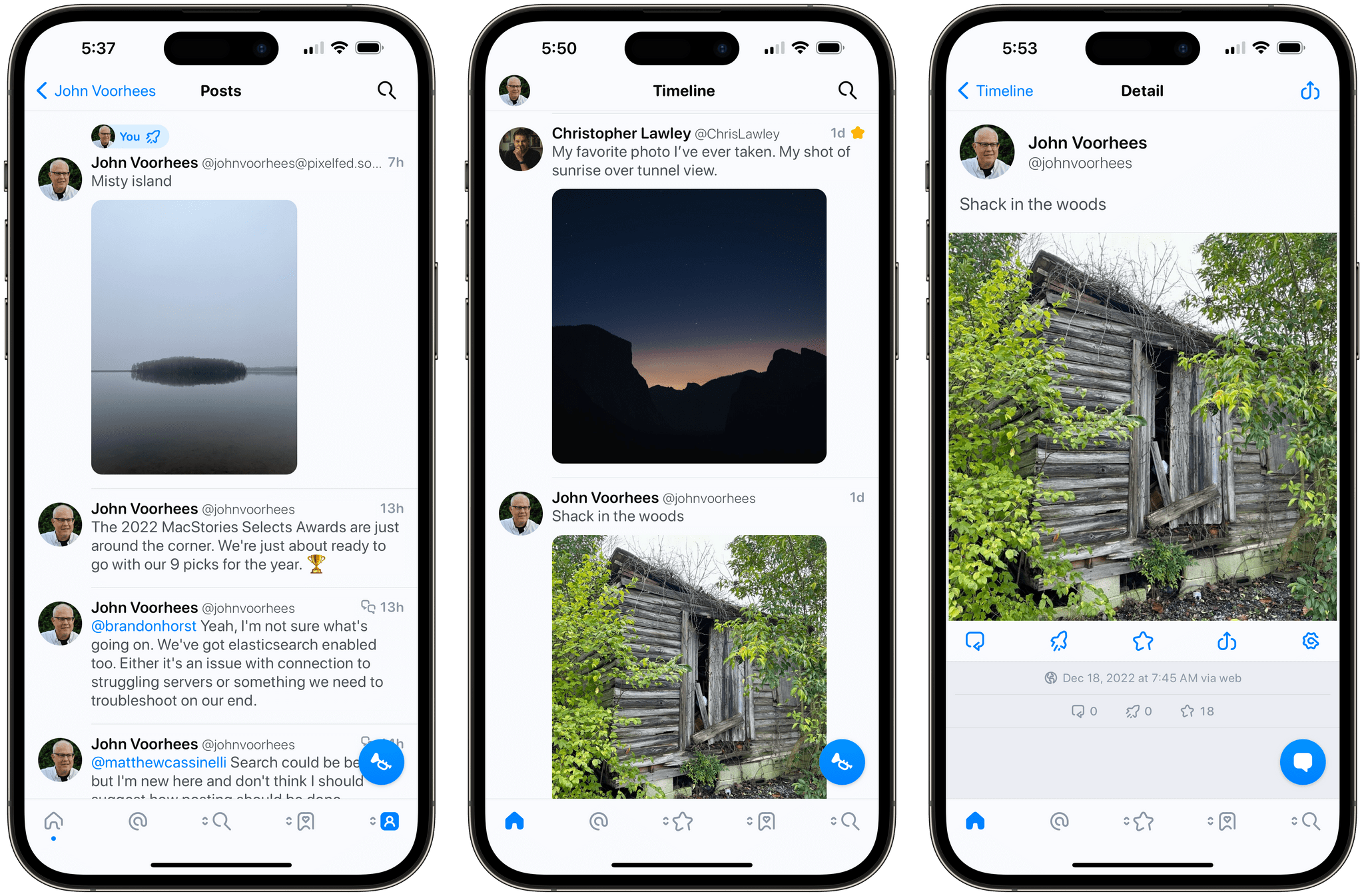
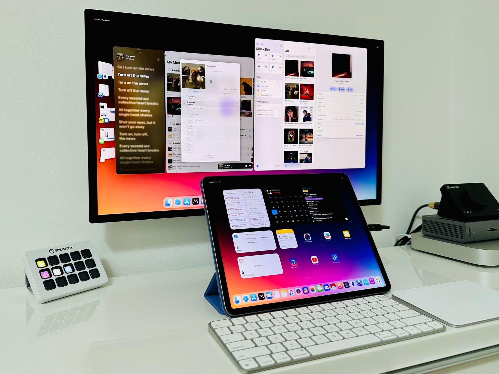
Ventura is, in many ways, a continuation of Monterey’s storyline. Apple has delivered a second year of parallel development across its system apps, with the notable exception of Shortcuts, which I’ll cover later. That’s a big win for Mac users who, in previous years, waited multiple releases for apps like Maps and Books to catch up with their iOS and iPadOS counterparts.
So, with Monterey’s success of moving system apps forward in unison across all OSes looking more like a trend than a one-off novelty, what are the clouds I’m seeing on the horizon? There are three:
- Stage Manager: Stage Manager is in far better technical shape on the Mac than on the iPad. In fact, I’ve been using it every day since WWDC and will continue to do so. There’s lots of room for improvement, which I’ll cover below, but my concern extends beyond the Mac-specific issues to what the feature’s problems on the iPad mean for Mac users long-term, which is something I covered last month for Club MacStories members and will expand on below.
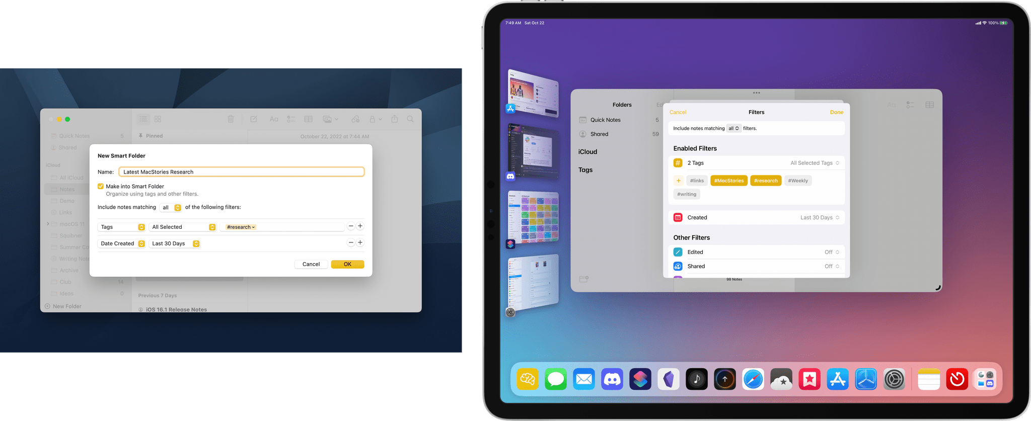
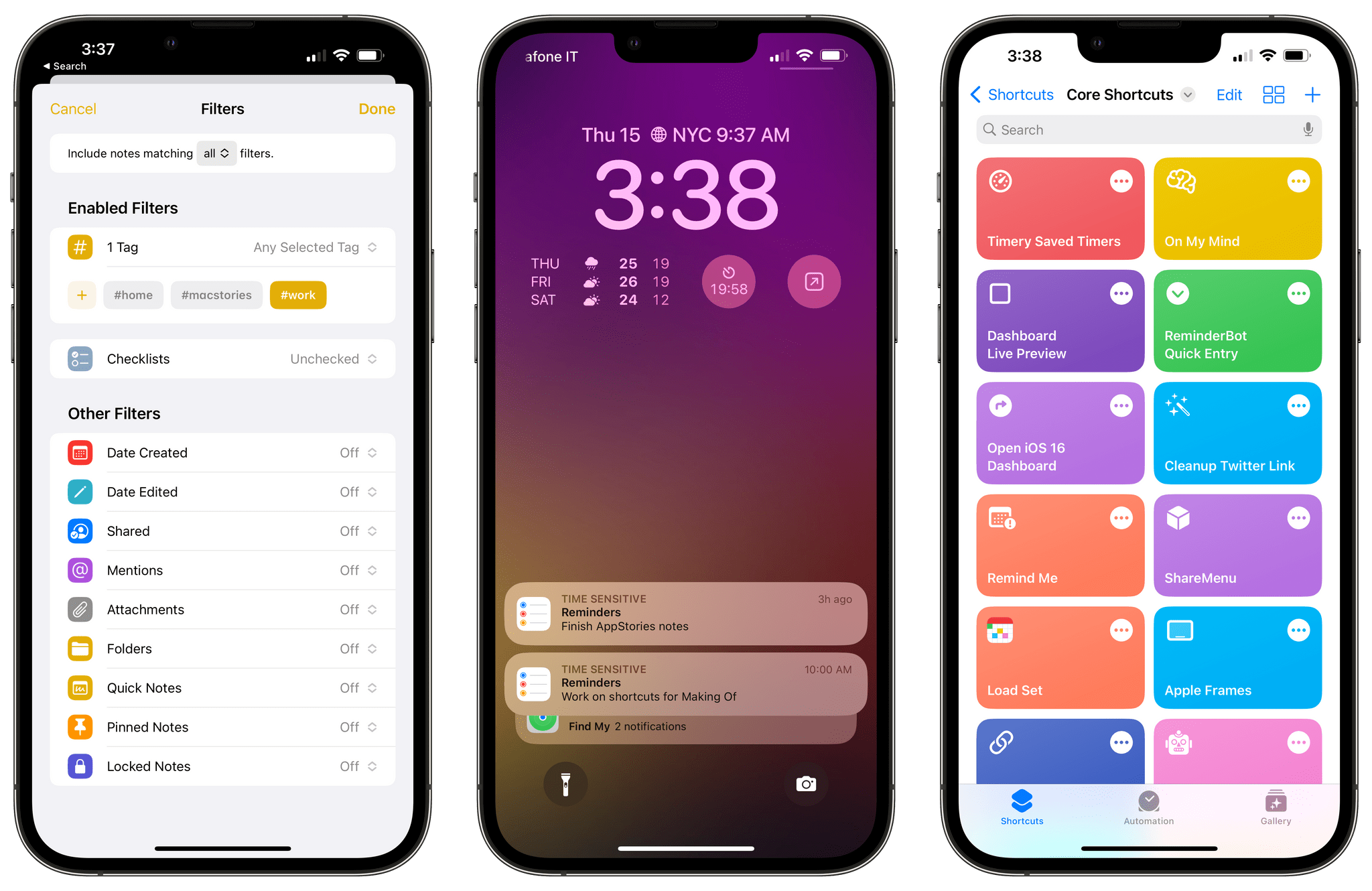
- Shortcuts: Shortcuts was in rough shape when it launched on the Mac last year. The app is in a much better place today, although bugs continue to be a problem. More concerning to me, though, is the lack of new system-level actions on the Mac. A lot of resources undoubtedly went into stabilizing Shortcuts on the Mac over the past year, which is understandable, but unfortunately, those efforts seem to have been at the expense of introducing new system-level actions or maintaining parity with new actions on iOS and iPadOS.
- System Settings: So much of the design work we saw introduced with Big Sur was so carefully considered to harmonize macOS with iPadOS while retaining its Mac nature that System Settings is a shock to, well, the system. System Preferences was long overdue for a refresh, but System Settings isn’t the redesign we needed. Instead, it’s a clear example of why you can’t just graft iOS or iPadOS design onto macOS and call it quits.
Although each of the items above concerns me, it’s equally important to put them in context. For most users, macOS is in a very good place. My day-to-day work on the Mac isn’t affected by whether the iPadOS version of Stage Manager is buggy. I may feel constrained by the lack of some actions in Shortcuts on my Mac, but at the same time, I’ve got Shortcuts on the Mac, something I’d hoped for for years. And Systems Settings are, after all, just settings that may not be great to look at, but they still work.
However, while the issues with Ventura may not be immediate, they’re still important because they threaten the viability of the Mac in the midst of its hardware renaissance. I want to see the Mac continue to grow and flourish, and I’m convinced more than ever that aligning it and the iPad is one of the ways to accomplish that. Unfortunately, Ventura doesn’t move that ball forward in a meaningful way.
By tying the two together, Apple has set the stage for a healthier third-party app ecosystem that benefits both platforms by making it more economical for developers to create apps for both. I’m sent a lot of apps to try, and I can tell you that this is absolutely happening already. The vast majority of the apps I’m sent today aren’t Mac-only or iPad-only – they’re universal apps that work on both and usually the iPhone and Apple Watch too.
However, the work and the story that started with Federighi’s Sneak Peek aren’t finished. For the Mac and iPad to thrive, now is not the time for Apple to take its foot off the gas. Yet, that’s what Ventura feels like after several years of foundational changes to macOS. It’s not a bad update. There’s a lot to like among the system apps and other changes, but I can’t shake the nagging sense that Apple has taken its eye off the long-term vision for macOS with Ventura. That won’t affect your day-to-day use of the OS, but it’s certainly something worth keeping a close eye on as Ventura is updated and WWDC rolls around again next summer.
Read more