This Week's Sponsor:

Incogni

Put an End to Spam, Scams, and Robocalls on Your iPhone


Posts in stories

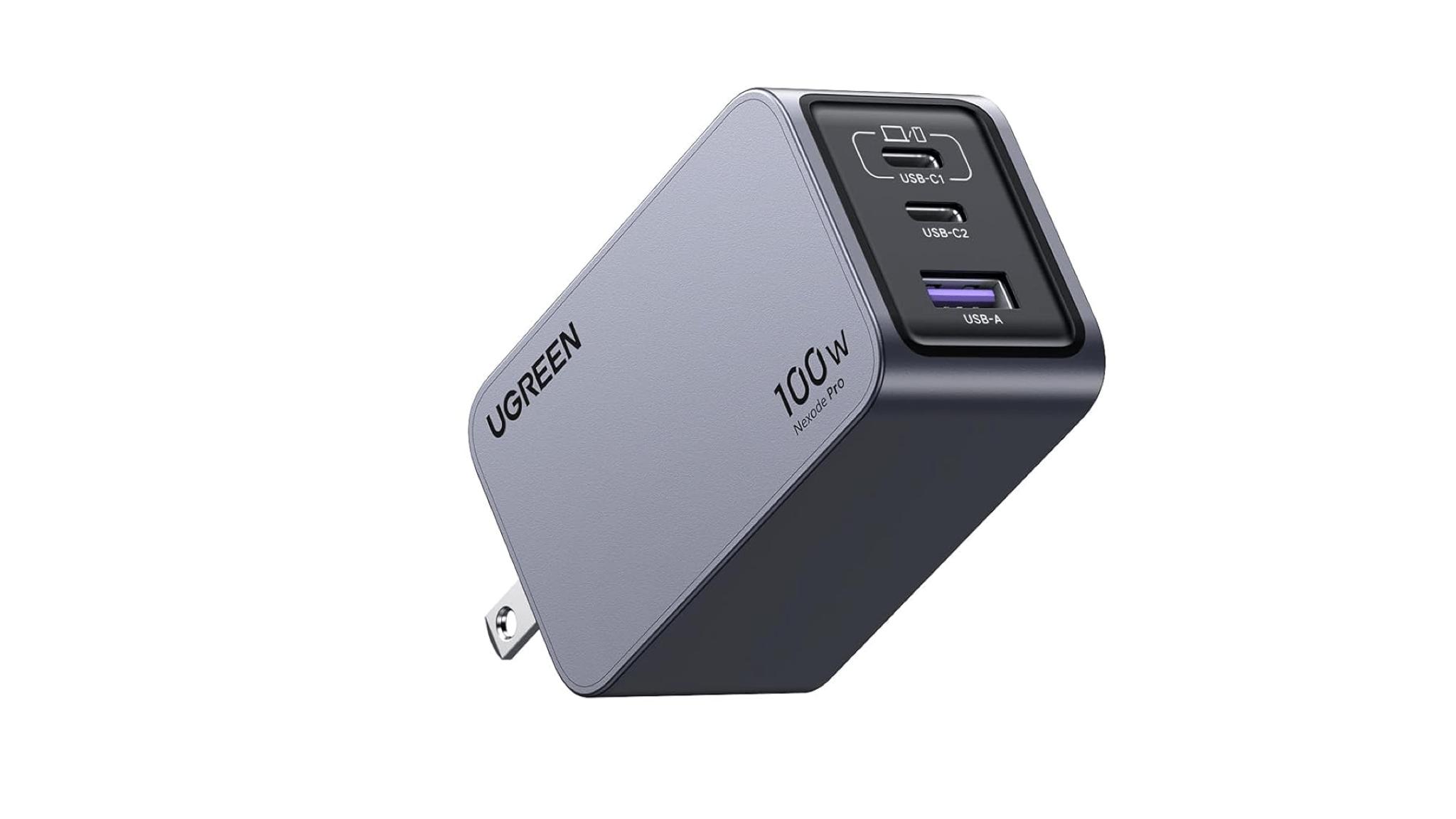
A Single Apple EarPod Has Become My Favorite Wired Earbud for Gaming

Nintendo Switch with [Hori's Split Pad Compact](https://amzn.to/3zlDpZD) controllers, Steam Deck OLED, and Ayn Odin 2. Also, [you should play UFO 50](https://wavelengths.online/posts/ufo-50-a-review).

Nintendo Switch with Hori’s Split Pad Compact controllers, Steam Deck OLED, and Ayn Odin 2. Also, you should play UFO 50.

Picture this problem:

Because of my podcast about portable gaming NPC with John and Brendon, I test a lot of gaming handhelds. And when I say a lot, I mean I currently have a Steam Deck, modded Legion Go, PlayStation Portal, Switch, and Ayn Odin 2 in my nightstand’s drawer. I love checking out different form factors (especially since I’m currently trying to find the most ergonomic one while dealing with some pesky RSI issues), but you know what I don’t love? Having to deal with multi-point Bluetooth earbuds that can only connect to a couple of devices at the same time, which often leads to unpairing and re-pairing those earbuds over and over and over.

Read more


First Look: Logitech’s MX Creative Console Is Poised to Compete with Elgato’s Stream Deck Lineup

Source: Logitech.

Source: Logitech.

Today, Logitech revealed the MX Creative Console, the company’s first product that takes advantage technology from Loupedeck, a company it acquired in July 2023.

I’ve been a user of Loupedeck products since 2019. When I heard about the acquisition last summer, I was intrigued. Loupedeck positioned itself as a premium accessory for creatives. The company’s early products were dedicated keyboard-like accessories for apps like Adobe Lightroom Classic. With the Loupedeck Live and later, the Live S, Loupedeck’s focus expanded to encompass the needs of streamers and automation more generally.

Suddenly, Loupedeck was competing head-to-head with Elgato and its line of Stream Deck peripherals. I’ve always preferred Loupedeck’s more premium hardware to the Stream Deck, but that came at a higher cost, which I expect made it hard to compete.

The Logitech MX Creative Console slots nicely into my existing setup.

The Logitech MX Creative Console slots nicely into my existing setup.

Fast forward to today, and the first Logitech product featuring Loupedeck’s know-how has been announced: the MX Creative Console. It’s a new direction for the hardware, coupled with familiar software. I’ve had Logitech’s new device for a couple of weeks, and I like it a lot.

The MX Creative Console is first and foremost built for Adobe users. That’s clear from the three-month free trial to Creative Cloud that comes with the $199.99 device. Logitech has not only partnered with Adobe for the free trial, but it has worked with Adobe to create a series of plugins specifically for Adobe’s most popular apps, although plugins for other apps are available, too.

Read more


visionOS 2: The MacStories Review

In the lead-up to this year’s WWDC, it was hard to predict what an update to visionOS would look like. After all, the initial version had only shipped four months earlier when Apple Vision Pro became available for purchase in the United States. Given how late in the software cycle visionOS 1 shipped, it was reasonable to wonder if there would be a visionOS 2 announced at all, and if so, how much it could realistically add to an operating system that had just debuted the previous quarter.

Of course, Apple’s software cycle waits for no one, so like watchOS before it, visionOS is receiving a 2.0 version rapidly on the heels of its initial release. But the shortened development window doesn’t mean that this update isn’t a significant one. I believe that the 2.0 moniker is well deserved based on the features and enhancements included in this release, especially given the quieter updates across all of Apple’s platforms this year in the wake of Apple Intelligence.

visionOS 2 moves spatial computing forward with an array of welcome quality-of-life improvements, deeper integration with some of Apple’s other platforms, additional tools for developers to create spatial experiences, system app updates in line with Apple’s other platforms, and a new way to experience photos that you have to see to believe. The combination of user experience refinements and new features makes for a solid update that Vision Pro users are definitely going to notice and enjoy.

Some of the changes we’ll dive into feel so obvious that you might wonder why they weren’t included in visionOS to begin with. Having used Vision Pro almost daily since it was released, I fully understand the sentiment. But then I remember that the iPhone didn’t gain the ability to copy and paste text until iPhone OS 3, and I’m reminded that developing new platforms takes time – even for a company as big as Apple.

So while some might seem basic, many of the changes included in visionOS 2 improve users’ experiences in significant ways every time they interact with the platform. The end result is a smoother, more intuitive operating system that will delight Vision Pro believers and, if Apple has its way, convince more skeptics to take the plunge into spatial computing.

Let’s jump into what visionOS 2 has to offer.

Read more


    macOS Sequoia: The MacStories Review

    Sequoia is unlike any major macOS update in recent memory. Annual OS releases usually tell two stories. The first is the tale of that release, which consists of a combination of design, system, and built-in app changes that add to the existing Mac experience. The second story plays out over time, taking multiple years to unfold and reveal itself. The best macOS releases are those that strike a balance between the two.

    Often, a macOS update’s multi-year story revolves around new developer technologies that signal a change in direction for the entire platform. Swift and Catalyst were like that. Neither had an immediate impact on the day-to-day experience of using a Mac. However, even though the final destination wasn’t entirely clear at first, the corresponding macOS releases included concrete first steps that provided a sense of where the Mac was heading.

    It’s possible to look at macOS Sequoia and see something similar, but the resemblance is only skin deep. This year’s release includes meaningful updates to system apps and even a brand new one, Passwords. Plus, Apple Intelligence promises long-term, fundamental changes to how people use their Macs and will likely take years to fully realize.

    But Sequoia feels fundamentally different from Swift, Catalyst, and other past releases. It’s light on new features, the design changes are few and far between, and Apple Intelligence isn’t part of macOS 15.0 at all – although more features are on the way and are currently part of the macOS 15.1 developer beta. So what sets Sequoia apart isn’t so much what you can do with it out of the box; what’s unique about this release is that you could install it and not even notice the changes.

    That’s not to say that Sequoia is a bad update. There’s more to like than not, with excellent additions like iPhone Mirroring, window tiling, the new Passwords app, and Safari’s video viewer. The trouble is that the list of changes, good or bad, falls off steeply after that. A half loaf may be better than none, but Apple has taught us to expect more, which makes Sequoia vaguely unsatisfying and out of balance compared to other releases.

    It’s clear is that Apple is placing a big bet that artificial intelligence will pay off for macOS the same way magic beans did for Jack and his mother. The question heading into macOS 15.1 and beyond is whether Apple’s beans are magical too. Perhaps they are, but based on what I’ve seen of macOS 15.1, I’m not feeling the magic yet. I’ll reserve judgement and revisit Apple Intelligence as it’s incrementally rolled out in the coming months. For now, though, let’s consider macOS Sequoia 15.0’s morsels that readers can actually dig into today.

    Read more


      watchOS 11: The MacStories Review

      After years of steady, iterative updates to watchOS, last year, Apple dropped one of their most significant releases in years with watchOS 10. The design language was updated for all of their first-party apps, watch faces were upgraded to take full advantage of the larger screens on current models, and the Smart Stack was introduced to make glanceable information much easier to access. To make way for the Smart Stack, Apple also reassigned the Digital Crown and side button to new functions. These changes, along with the usual updates for health and fitness, made for a release that every Apple Watch user took note of.

      The awkward recalibrating of muscle memory aside (I still very occasionally swipe up on my watch face to try and reveal the Control Center), it was an excellent update. My only worry coming out of it was that Apple would dust off their hands, reassign lots of their talent to something else, and go back to the usual, iterative, health- and fitness-focused updates with watchOS 11.

      Thankfully, that was far from the case. Not only has Apple made some solid updates to the Apple Watch hardware line this year, but they’ve also enhanced and added to the software in ways that signal they are far from done.

      The question is, are these changes going to enhance your daily use of Apple’s most personal device, or are they just, well, changes?

      I’m excited to dive into this question in my first watchOS review for MacStories, but before I do, I want to thank Alex for his years of excellent watchOS coverage. I hope I can live up to the standards he set.

      Right, let’s do this.

      Read more


      iOS and iPadOS 18: The MacStories Review

      There is still fun beyond AI.

      There are two versions of iOS 18 coming out this year.

      Or, think about it this way:

      Inside Apple, there are two versions of iOS 18. The version I’ve been able to test since June, and which will be the focus of this review, is the debut of iOS 18, which emphasizes user customization and smaller app updates. The other one – and, arguably, the version most are anticipating since WWDC – is iOS 18.1, which will mark the launch of Apple Intelligence in the United States later this year as well as the beginning of a process to roll out more AI features over time.

      Technically, iOS 18.1 is going to be a major update to iOS 18.0, which will introduce the first slate of AI features on iPhones and iPads; in spirit, it might as well be the version of iOS 18 that is going to steal the spotlight and become The Conversation in our community for months to come.

      However, due to a mix of legal and political reasons, as an Italian citizen, I won’t be able to participate in that discourse just yet. Thankfully, there’s plenty to like in iOS 18 even without Apple Intelligence, especially if, like yours truly, you’re the kind of MacStories reader who cares about apps, minor system tweaks, and making your Home Screen look nice.

      This is what my review will focus on this year. There are two versions of iOS 18: I’m going to cover the fun, nerdy one.

      I’ve been writing annual reviews of iOS (and later iPadOS too) for ten years now. During this time, I’ve seen my fair share of mobile OS trends, and I’ve observed how Apple judiciously iterated on their post-iOS 7 design language and stoically ignored the majority of the tech industry’s fads, staying the course of their vision for what their ecosystem of devices and OSes should empower people to do.

      Never have I been in the position to witness the company finding itself unable to ignore a major industry shift. That’s exactly what is happening with AI. As we saw back in June, Apple announced a roadmap of AI features that will be gradually doled out to users and developers over the iOS 18 cycle. Most of them won’t even be launching this year: I wouldn’t be surprised if we see them just in time before the debut of iOS 19 at WWDC 2025.

      What’s even more fascinating is realizing just how much of a priority Apple Intelligence must have been for the iOS, iPadOS, and macOS teams. Let’s face it: if it weren’t for the handful of additions to iOS, which are also cross-compatible with iPadOS, I wouldn’t have much to cover today without Apple Intelligence. This is quite apparent in macOS Sequoia: as John will cover in his review, with no Apple Intelligence, there are only two main features worth analyzing in detail.

      Thus, dear reader, don’t be surprised if this will be my shortest annual iOS review to date. Plus, it’s not like I was particularly looking forward to Apple Intelligence anyway.

      In any case, as I argued in my preview story back in July, the smaller features that found their way onto iOS and iPadOS this year are still interesting enough to justify a “traditional” review. And it’s not just that these are good features: they’re also my favorite kind, for they’re primarily about customization and apps. From more flexible Home Screens to Control Center finally becoming extensible with third-party controls, some big improvements to Notes and Journal, plus a brand new Passwords app, how could I not be excited about iOS 18?

      This intrinsic duality of iOS 18 is the reason why I’ve never felt so ambivalent about a new version of iOS. Or, think about it this way:

      Inside me, there are two takes. I fundamentally dislike generative AI tools and, from what I’ve seen so far, I don’t think I’m ever going to take advantage of Apple’s features that modify text or create images. At the same time, I’m excited about the prospect of a smarter Siri that is better integrated with apps; and today, with the version of iOS 18 that is shipping to customers, I think there are plenty of smaller features worth appreciating, especially if you’re into customization.

      Today, we don’t need to reconcile those two takes. We don’t have to be grownups for this one. We’re just going to dive into what makes iOS 18 a smaller update than previous years, but a fun one nonetheless.

      Read more


        Maybe I’m Not a Pro Anymore

        Apple just wrapped up their September event revealing a bunch of updates to the Apple Watch, AirPods, and iPhone lineups, and I have only one major takeaway as a person who was absolutely, positively going to get the iPhone 16 Pro if it came in gold: I am seriously considering downgrading to the non-Pro iPhone 16 this time around. 

        I’ve been an iPhone Pro user since it was first announced — and in some ways even earlier if we consider the iPhone X to be the first true Pro iPhone when it was released alongside the 8. I always went Pro because I take a huge amount of photos with my phone and, despite currently owning four dedicated photography cameras, none beat the ease of use, access, and versatility of the iPhone. It made sense to use the best camera system available. In a lot of ways, I credit the Pro models with keeping me interested in photography throughout all these years, and learning to utilize the different lenses for different scenes and subjects has felt like learning a skill, like the iPhone Pro was helping me become a pro. I truly believe a lot of those skills transferred directly to the photography I create today.

        I read a piece by Allison Johnson over the weekend about the base iPhone experience that resonated with me. She wrote:

        At the very least, it looks like Apple is about to bring a little more balance back with the iPhone 16 series. I think that’s how it should be — the Pro iPhone should feel like you’re getting something extra, not being cornered into paying more for an essential feature.

        It occurred to me watching today’s presentation that this is the first year where the iPhone’s Pro models feel like they were actually made for professionals. The “extras” Allison is referring to used to be the marquee features of the newest lineup — the Dynamic Island, the Action button, etc — but are now seriously professional features. The latest additions and the reasoning behind their inclusion all felt completely alien to me. I kept wondering: how many people will actually use camera options like the ability to dynamically shift the audio mix while recording in ProRes or capturing 4K content in slow motion to use for a music video? It became clear that the reach of what “Pro” means to Apple has outpaced my own photographic use case. I simply went with the Pro models year after year because I liked having a third lens in my kit and also got some kind of fun bonus feature to mess around with, but I don’t think that’s enough of a reason to justify the jump anymore. And that’s okay!

        The base iPhone lineup seems to have pretty much everything I could ever need this time around — including the dedicated Camera Control button and the more fun colors I’ve always been so envious of — so the idea of downgrading seems almost prudent despite being a nonstarter for me as early as this very morning. I think I can be perfectly happy with one less lens and Halide’s Process Zero to keep experimenting with. And maybe the limitation of having one less lens will help me grow as a photographer in an entirely new way this time around. That would be nice!

        I’m legitimately very happy for the people out there who will get the iPhone 16 Pro and make use of the latest and greatest Apple’s incredible product design teams have to offer, but I think it’s finally time I step down from the precipice of what the iPhone is capable of. In some ways, it feels simpler now, and the “Pro” name has the weight it should have all along. No artificial reasoning behind which features make it to which device, just one iPhone for the people who need it and one iPhone for the rest of us.

        I’m fine being lumped into that second bucket this time around.


        You can follow all of our September 2024 Apple event coverage through our September 2024 Apple event hub or subscribe to the dedicated September 2024 Apple event RSS feed.


        iPadOS 18’s Smart Script: A Promising Start But Don’t Toss Out Your Keyboard Yet

        Source: Apple.

        Source: Apple.

        The carefully controlled demos of Smart Script at WWDC reminded me of every time Apple shows off the Photos app, where each picture is a perfectly composed, beautiful image of smiling models. In contrast, my photo library is full of screenshots and random images like the blurry one I took the other day to capture my refrigerator’s model number.

        Likewise, handwriting demos on the iPad always show someone with flawless, clear penmanship who can also draw. In both cases, the features demonstrated may work perfectly well, but the reality is that there’s always a gap between those sorts of perfect “lifestyle” demos and everyday use. So today, I thought I’d take iPadOS 18’s Smart Script for a spin and see how it holds up under the stark reality of my poor handwriting.

        Smart Script, meet John's handwriting (auto-refine enabled).

        Smart Script, meet John’s handwriting (auto-refine enabled).

        The notion behind Smart Script is to make taking handwritten notes as easy and flexible as typing text. As someone who can touch type with my eyes closed, that’s a tall order, but it’s also a good goal. I’ve always been drawn to taking notes on an iPad with the Apple Pencil, but it’s been the constraints that held me back. It’s always been easier to move and change typed text than handwritten notes. Add to that the general messiness of my handwriting, and eventually, I abandoned every experiment with taking digital handwritten notes out of frustration.

        Smart Script tries to address all of those issues, and in some cases, it succeeds. However, there are still a few rough edges that need to be ironed out before most people’s experience will match the demos at WWDC. That said, if those problem areas get straightened out, Smart Script has the potential to transform how the iPad is used and make the Apple Pencil a much more valuable accessory.

        Read more


        New Projects, New Setup

        The past few months have been busy at MacStories. The release of new iPads was followed by our launch of new podcasts and then WWDC. Along the way, my gear setup has changed a little, too.

        Portable Setup Changes

        11” iPad Pro and Accessories

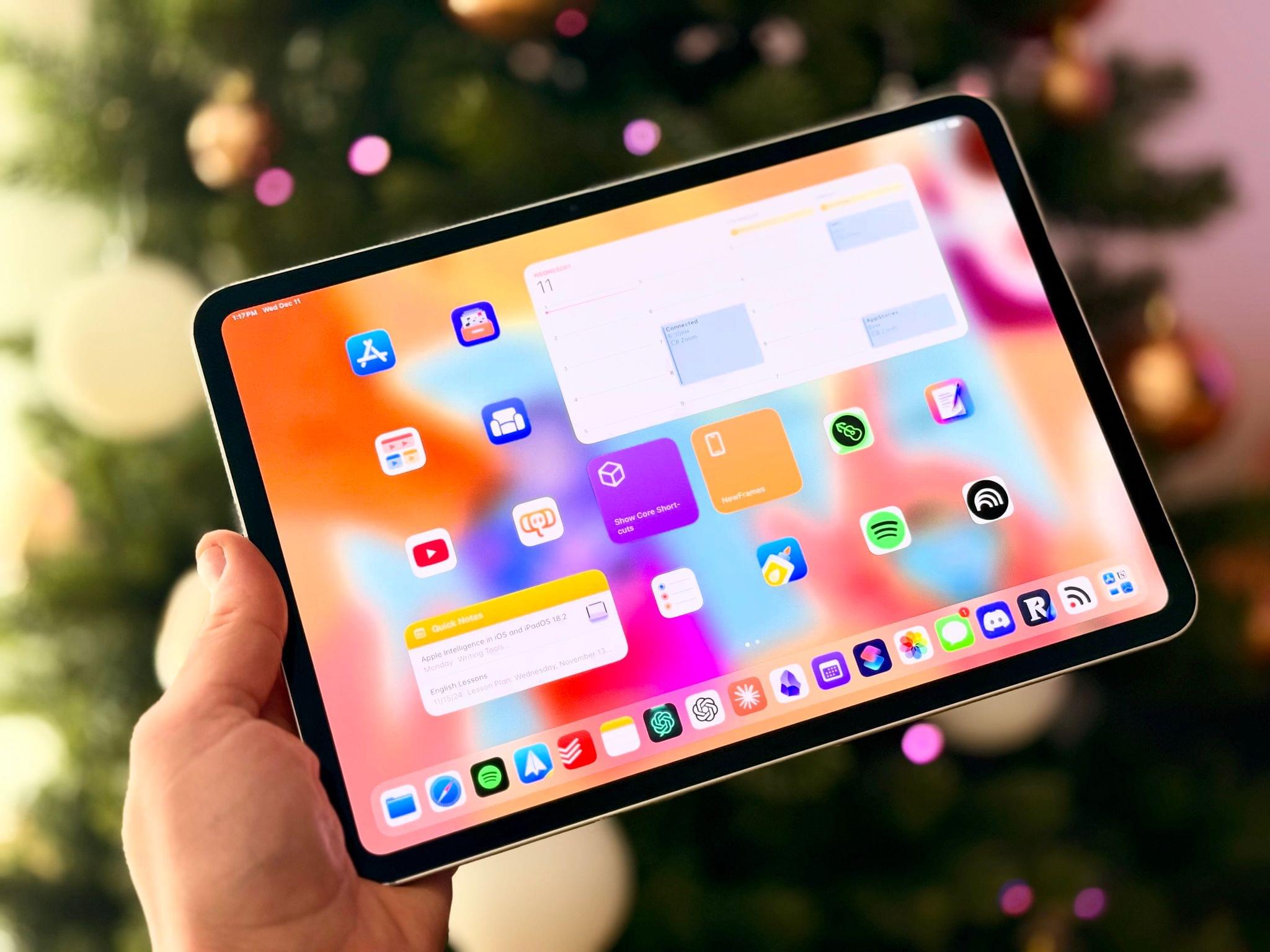
        Leading up to Apple’s spring event and knowing that it would feature new iPads, I was on the fence about buying one. The Pencil Pro and the Tandem OLED display tipped the balance, though, and I ended up getting the 11” Wi-Fi-only model with a Magic Keyboard Case, a Smart Folio cover, and Apple Pencil Pro.

        I was tempted by the nano-texture display but ultimately passed on it as well as cellular connectivity. I expect there’s a nano-texture device of some sort in my future, but even without it, the iPad Pro’s Tandem OLED display works better in sunlight than previous displays. I don’t use an Apple Pencil often, but with the new Pro model, I plan to play around with it more to see if I can find a place for it in my day-to-day computing. The lack of meaningful iPadOS 18 updates coming this fall is a letdown, but I’m still pleased with my purchase because the smaller form factor and fantastic display have led me to use my iPad Pro more.

        Desk Setup Changes

        Balolo's tablet holder accessory.

        Balolo’s tablet holder accessory.

        With the change in iPad sizes, the articulating arm I used for the 12.9” iPad Pro no longer worked for me. Instead, I’ve transitioned to another Balolo accessory, the Tablet Holder. It sits neatly in the center of my Desk Cockpit shelf, where I can set my iPad for use with Sidecar or Universal Control. If you’re a Club member and interested in Balolo’s Desk Cockpit setup, which I covered in detail this past February, there’s a coupon code for 10% off on the Club Discounts page.

        My new video gear from Elgato.

        My new video gear from Elgato.

        I have been experimenting more with video in recent weeks, too. That led to the addition of an Elgato Facecam Pro and Key Light to my desk, along with an Elgato Mini Mount stand for the camera.

        Read more