This Week's Sponsor:

PowerPhotos

The Ultimate Toolbox for Photos on the Mac


Posts in stories

Magnets: A Common Apple Magic Trick

As a young kid, I thought magnets were about the coolest things ever. Here in my 30s, I kind of feel the same way.

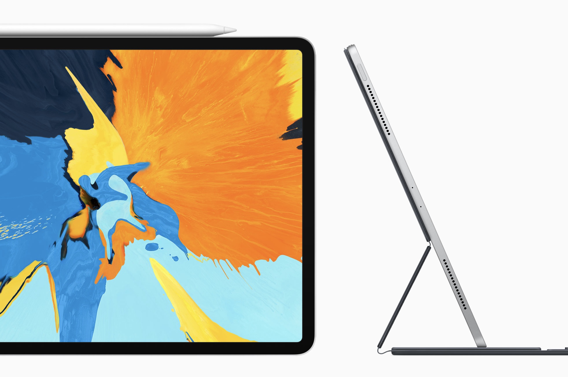
Magnets made nerdy headlines recently, with the new iPad Pro, which is chock-full of them to keep its Smart Keyboard Folio in place. Marques Brownlee had a tweet showing off just how many are in the tablet’s thin chassis:

Apple’s use of magnets in its products goes back further than the most recent iPad Pro, with its keyboard and Apple Pencil, or even the fun and functional AirPod case. Magnets allow Apple to do things without the need of mechanical components, keeping the design of its products clean and streamlined. Here are a few of my favorites over the years.

Read more


My Must-Have iOS Apps, 2018 Edition

Putting together my annual list of Must-Have iOS Apps is an exercise in analyzing the trends of the year and considering which ones had the biggest impact on how I use my iPhone and iPad. Two years ago, it was web services and open APIs; last year, I focused on collaboration with the MacStories team and making my workflow consistent across devices; this year, there isn’t a single overarching theme behind this list, but rather a collection of trends and changes that I’ve observed over the course of 2018.

First and foremost is the switch to a subscription-based business model by some of my favorite apps. As we noted in our look at the modern economics of the App Store earlier this year, it is becoming increasingly challenging for indie developers – the ones who make the apps we tend to use and cover most frequently on MacStories – to find a balance between reaching new customers with paid app updates and supporting an app over the span of multiple years for existing users who already paid once.

A subscription seems like an obvious solution: new customers can try an app for free and later decide to subscribe; longtime users of an app get to support their favorite app over a longer period of time; developers are more incentivized to keep making an app better thanks to the financial security provided by an ongoing revenue stream. Recurring subscriptions for all apps launched two years ago just before WWDC, and it feels like we’ve only now reached a point where more and more developers are willing to experiment with them. This major shift in app pricing wasn’t always met favorably by longtime users of existing apps, which has resulted in developers testing different approaches such as optional subscriptions, bundles containing subscriptions and In-App Purchases, or even multiple ways to unlock the same features. In looking at the apps included in this list, I was surprised by how many now include some form of recurring subscription; I think this transition will only become more prominent in 2019.

The second trend I noticed in my usage of third-party apps is a strong preference for those that fully embrace modern iOS technologies. From Siri shortcuts (by far, the most important iOS developer framework of 2018) to Files integration and support for external keyboards on iPad, I tend to prioritize apps that eschew proprietary functionalities and adopt native APIs such as iCloud, the Files document browser, or Reminders. With iOS growing more powerful and complex each year, I think it’s only natural that I’ve stuck with apps that shy away from Apple-provided solutions as little as possible; those frameworks are always going to be more integrated with the rest of the system than any alternative a developer can come up with, and I seek that level of integration because I enjoy the comfort of an ecosystem where all the pieces work well together.

Lastly, I’ve noticed some overall changes in the kinds of apps I consider my must-haves for iPhone and iPad. In the “pro” app department, the Photography and Development lists have grown to include apps such as Lightroom, Scriptable, Darkroom, and Halide – all new entries this year. One of my goals with the new iPad Pro is to use it as a workstation for editing photos and programming my own little additions to iOS; I felt like my increased usage of these apps warranted some changes in the annual picks. You will also find more apps designed to interact with macOS as a result of my purchase of a Mac mini (which I’m using as a home server for various tasks) and different utility apps as some of the old ones have been replaced by Shortcuts. An app that, by the way, I can no longer include in this roundup due to my self-imposed rule of not featuring Apple apps because they’re kind of obvious choices for an iOS user (this also applies to Shazam, officially acquired by Apple this year).

Below, you’ll find a collection of the 60 apps I consider my must-haves on the iPhone and iPad, organized in nine categories; whenever possible, I included links to original reviews and past coverage on MacStories. What you will not find is the usual list of awards for best new app and best app update, which we’ve relaunched as a team effort under the MacStories Selects name this year. Instead, at the end of the story you’ll find my App of the Year, which is also joining MacStories Selects as an award that recognizes an overall outstanding iOS app that had a profound impact on my workflow over the past year, regardless of its release date.

Let’s dig in.

Read more


Introducing MacStories Selects: The Best New Apps, App Updates, and iOS Games of 2018

Over the course of a year, the MacStories team tries hundreds of apps. We test them, live with them, poke, prod, and break them, and then we write and talk about them. Collectively, it amounts to thousands of hours of thought and analysis that on a macro level seeks to answer the question: what makes a good app? There’s no single factor or simple formula; if there was, nearly every app would achieve greatness. But after evaluating as many apps as we have, each of us has a fine-tuned instinct for standout apps when they come onto our radar.

We write about lots of terrific apps, but every year a handful stand out as exceptional. The precise quality that sets an app apart is often harder to identify than the app itself. Some are apps that push the boundaries of Apple’s OSes into new territory, while others are fresh takes on old problems. Despite the millions of apps on the App Store, every so often an app emerges that is truly inventive and opens up a whole new category of apps.

This year, we’re starting something new to celebrate those apps that stand out from the pack with a new feature we call MacStories Selects. For this inaugural year, we are covering three app categories: Best New App, Best App Update, and Best New Game. Along with a top pick for each category, we have selected runners-up that also stood out from the crowd. Before the end of the year, we’ll reveal two other components of MacStories Selects as well:

  • Federico’s App of the Year, which will be published as part of his annual Must-Have iOS Apps of 2018; and
  • Picks for our favorite new hardware accessories of 2018.

In making today’s app picks, we only looked at titles released in 2018. In addition, for Best App Update we evaluated each stand-alone update independent from any others, as opposed to aggregating updates from throughout the year.

Selects is something new for us here at MacStories that we expect to grow over time. We hope you enjoy. Now, on to our picks…

Read more


Hopes and Expectations for Apple’s 2019

Forward-looking columns about Apple’s business in the new year are usually saved for late December, but I wanted to get ahead of all those pieces because we now know what Apple’s full 2018 product lineup looks like. While new AirPods and the AirPower charging mat are both suspiciously still absent, and one or both could in theory be launched via press release any time, most likely what we have now from Apple is what we’ll be left with until after the new year begins. As such, today seems like a great time to start sharing hopes and expectations for the year ahead.

Read more


My Today at Apple Experience

It took nearly 18 months of Apple’s regular Today at Apple promotions through keynote events and press releases, but I finally had my interest in the program piqued. As I wrote earlier this month, whereas every other Apple product is analyzed to death by writers, podcasters, and YouTubers, the company’s retail stores and Today at Apple program are often ignored by tech media. But Apple’s increased trumpeting of its retail initiatives, in the face of a collective shrug from the press, made me wonder what exactly we’re all missing out on here. I mean, if the company is passionate enough about Today at Apple to host over 18,000 sessions per week, then there must be something special about the program.

So I attended my first session.

Last Monday morning I opened the Apple Store app and booked a session at Apple Fifth Avenue called “Photo Lab: Crafting Your Shot Co-created with Chase Jarvis.” As I suspect is true of most iPhone owners, I love taking pictures with my phone, but I know absolutely nothing about the ins and outs of quality photography. As a result, the Photo Lab session seemed like a great place to start.

Much of the time when Apple promotes Today at Apple, it highlights sessions taking place in its global flagship stores, with beautiful open forums and enormous wall displays. My experience was a lot more low-key, as the Fifth Avenue location is currently approaching two full years in temporary housing as major renovations to its previous location near completion. While the revamped Fifth Avenue store will undoubtedly come with all the beauty and grandeur of locations like Michigan Avenue and Regent Street, for now the site lacks all those modern bells and whistles; rather than taking place in a forum, my Today at Apple session took place around a small table that sat eight participants.

I’m not going to get much into the specifics of the session’s contents, which were solid overall; instead, I want to share three simple takeaways from this first Today at Apple experience. They’re the three main things that were on my mind following the session, and after rewatching portions of Apple’s October event in Brooklyn, I realized that my takeaways actually line up with statements shared by executives at the event.

Read more


iPad Diaries: Typing on the iPad Pro with the Smart Keyboard Folio

iPad Diaries is a regular series about using the iPad as a primary computer. You can find more installments here and subscribe to the dedicated RSS feed.

I have a love/hate relationship with Apple’s Smart Keyboard for the iPad Pro.

On one hand, I’ve always been a fan of its small footprint and ability to almost become part of the device itself from both a hardware and software perspective. The Smart Keyboard snaps itself into place and attaches magnetically to the iPad Pro; it doesn’t require you to even think about charging it as the Smart Connector takes care of it; thanks to the trivial magic of magnets, the keyboard and cover stay attached to the iPad as you carry it in a bag, but can be easily disconnected at a moment’s notice should you need just the iPad’s screen. The software experience is equally intuitive and exquisitely Ive-esque: the Smart Keyboard requires no pairing because it eschews Bluetooth altogether, and it integrates with all the keyboard shortcuts supported by iOS and apps. In the latest iPad Pro, the Smart Keyboard is even Face ID-aware: you can double-tap the space bar to authenticate from the lock screen instead of extending your arm toward the screen to swipe up – a welcome enhancement for those who work with their iPad Pro constantly connected to a keyboard.

There’s plenty to appreciate about Apple’s Smart Keyboard – an accessory designed on the premise of integration between hardware and software, following the same core principles at the foundation of AirPods, Apple Pencil, and (even though some liked to make fun of their peculiar design) Smart Battery Cases. But since its debut in 2015, I’ve been saving a series of small complaints and bigger annoyances with the Smart Keyboard that I’d like to revisit now that Apple has shipped its evolution for the new iPad Pro – the Smart Keyboard Folio.

Read more


Reminder and GoodTask: Third-Party Upgrades to Appleā€™s Reminders

Reminder (left) and GoodTask (right)

Reminder (left) and GoodTask (right)

Apple has long prided itself on being a company that carefully weaves hardware, software, and services together to offer a holistic user experience. Because of this, every purchaser of Apple products benefits from the built-in apps and services that accompany those products. And on the two most popular sellers, the iPhone and iPad, one of those bundled apps is Reminders.

At its core, Reminders is a simple list and to-do app that can be surprisingly powerful thanks to features like repeating tasks, location-based reminders, collaborative lists, and note support. Many times over the years Reminders has been my primary task manager and served me fairly well. It may not be as capable as alternatives like Things, but the app remains an appealing tool for those whose needs are light, and who value the ease afforded by Apple’s built-in ecosystem.

Unlike most of Apple’s other iOS apps, Reminders is built on a framework that’s accessible to third-party developers. Though developers can’t build apps that hook in directly with your Messages or Notes databases, Reminders is a different story. The underlying system powering Reminders is calendar-based, meaning it’s not tied to a single first-party app. Just as Fantastical and Timepage offer access to your existing iCloud calendars, developers can similarly build entire replacements for the Reminders app utilizing your existing collection of lists and to-dos. Two such apps, Reminder and GoodTask, serve as perhaps the best third-party Reminders clients on the App Store.

Each app takes a different approach to enhancing Reminders, with one focusing on modern design while the other offers power user features and flexibility; both, however, retain some of the benefits of staying in the Apple ecosystem while improving upon the first-party Reminders app.

Read more


iPad Diaries: My First 48 Hours with the New 12.9” iPad Pro

Two days ago, I walked into my local Apple Store and bought the new 12.9” iPad Pro along with a Smart Keyboard Folio, second-generation Apple Pencil, and LG’s UltraFine 4K display (plus, of course, AppleCare+ because these iPads don’t come cheap). As I shared on Twitter and the Connected podcast on Wednesday, I went for a 1 TB configuration (with cellular) in Space Gray, and the display is the monitor I’ll primarily use with a new Mac mini I also plan on buying very soon. It’s been a busy couple of weeks in our apartment: we’ve been doing some renovations and buying new furniture, including a larger desk for my “office” (read: a section of our bedroom). As I’ve shared on my various podcasts for the past few months, getting a bigger desk with a Mac mini and 4K display that would support both macOS and iOS was always part of the plan.

While in previous years I was able to offer reviews for the new iPad Pros before launch day, that wasn’t possible this year. For this reason, I decided I didn’t want to wait several weeks to prepare an in-depth review of the new iPad Pro and avoid questions from MacStories readers until the story was finished. So in a break with tradition, I’m trying something different this time: as part of my semi-regular iPad Diaries column here on MacStories, I’m going to share a collection of shorter and more topical articles about the new iPad Pro over the next few weeks.

I believe this generation of iPad Pros is one the most exciting changes to the iPad line in years, and I want to jump straight into the discussion by detailing, step by step, my ongoing experience with the new iPad Pro from the perspective of someone who’s been using an iPad as his main computer for the past five years. I plan to write about iOS, apps, and my iPad Pro workflow soon, but today I’d like to start by explaining my purchase decision and sharing some initial impressions about the iPad’s hardware. Let’s dive in.

Read more


Choosing Your Markdown Editor: A Comparison of Ulysses and Drafts

One thing the MacStories team loves to do is constantly try new apps, compare the serious contenders in each app category, and settle on the app that suits us best. Most of the time this app evaluation process takes place on a merely private level, for personal purposes, but today I wanted to share in public an in-depth comparison and analysis of two excellent writing apps: Drafts and Ulysses.

These two apps have been on my mind a lot in recent months. To share some context, I have used Ulysses as my primary Markdown editor almost exclusively since early 2016. During that time I’ve been very happy with the app, even through its transition last year to a subscription model. I’ve continued trying out the latest updates from Ulysses’ competitors, of course, but nothing else has stuck for me. However, there’s one app I’ve long wanted to give a serious look at, but hadn’t been able to until recently: Drafts 5.

Tim Nahumck’s review of Drafts was the first tug on my interest, causing me to follow updates to the app with a close eye. Then Federico had a successful experience writing his iOS 12 review in Drafts 5. Ultimately, I couldn’t resist giving the app a serious shot any longer.

Drafts and Ulysses are very different apps in many ways. However, they share in common being powerful Markdown editors. In this article I’ll walk through their similarities, divergences, and ultimately share which app I’ve decided to write in going forward. The goal is not to say which app is better, as the answer to that question is entirely subjective. Instead, I want to help you decide which app is likely best for you.

Read more