Very often in life, we see things like products, athletic careers and even relationships end way later than they should. When this happens, sometimes the end goes unnoticed and with little fanfare.
Occasionally, things end on a high note, like when an athlete announces their retirement after winning a championship or a band calls it quits after a massive album and tour.
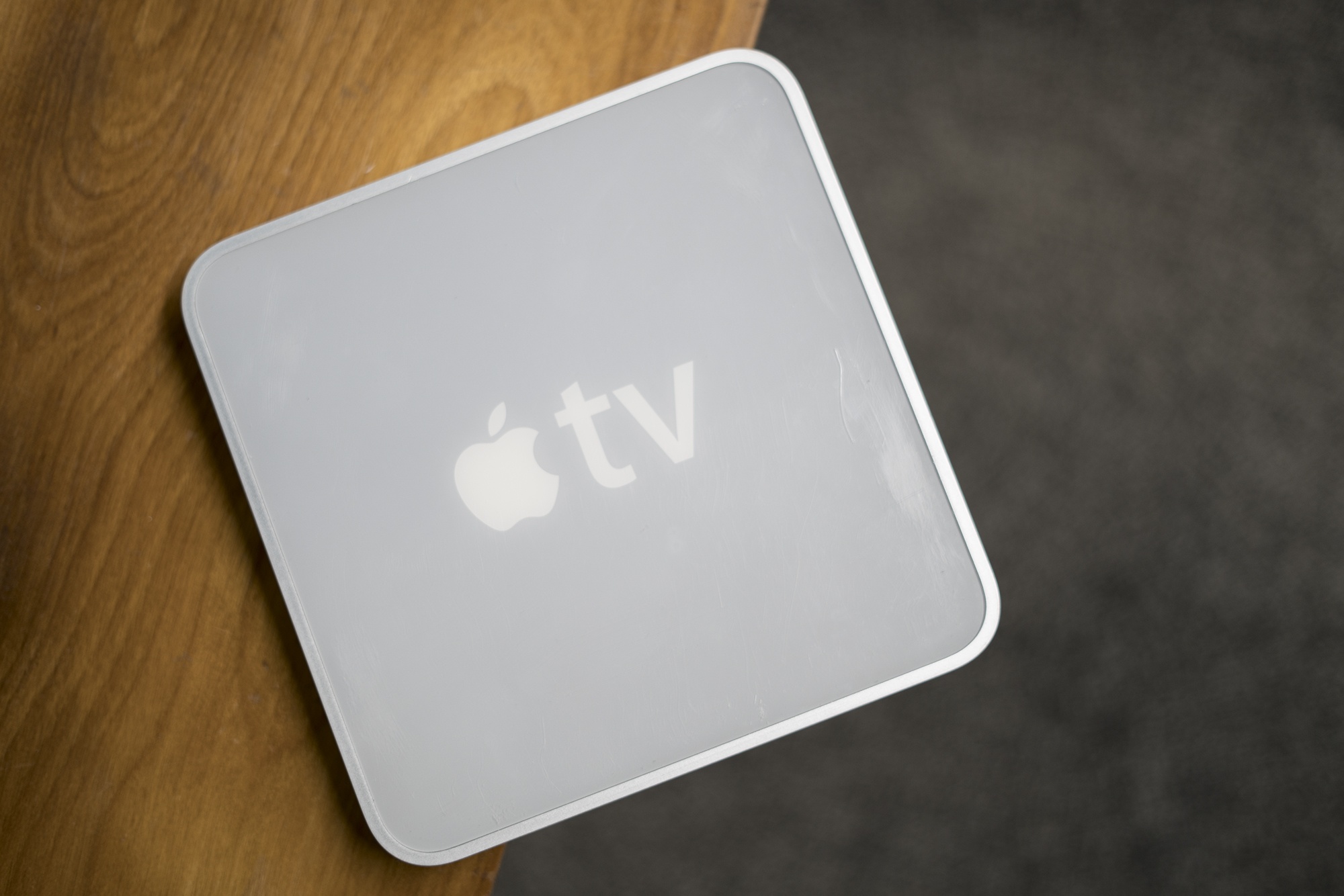
In the world of Apple products, the iPod mini is an example of the latter. It’s perhaps the best example of Apple killing one of its darlings.
Last Friday, I left my job as a lawyer. Many readers may not even know that’s something I did because it’s not pertinent to what I do at MacStories. Over the course of many years, that job became less interesting and challenging. Eventually, I recognized that I needed a change, but nothing felt quite right. That is, until the day I decided to make an app. I’m not much of an app developer, but I wouldn’t be where I am now, writing this, if I hadn’t built one. This is my app story.
Enthusiasts of all types always have that one special obsession. For muscle car people, maybe it’s one particular year of Ford Mustang. Photographers always have a favorite lens, while baseball players may have a favored bat or glove.
Ask almost any macOS fan, and they’ll tell you that Snow Leopard is their favorite version of all time.
There are a bunch of good reasons for that, beyond pure nostalgia.
It is difficult to reconcile a critical appraisal of the Apple Watch with the product’s commercial success. To examine the most popular watch in the world1 and find it wanting seems dubious; yet as Apple’s smartwatch kicks off its third year, its history implores ignominy.
The integration of hardware and software is a keystone in Apple’s foundation. Every game-changing product they’ve released over the years has used this as a core advantage over the competition. Yet despite the Cupertino company’s proven track record, the last three years of Apple Watch have demonstrated a consistent struggle to get this right.
Apple has certainly iterated on unsuccessful hardware and software ideas in the past, but never quite so publicly. The Apple Watch feels like a device that was rushed a little too early to market. Apple knew that it had something good, but it didn’t yet know which areas the device would really excel in.
One of the most interesting pieces of this product’s story is that all signs point to Apple having gotten the hardware of the Apple Watch exactly right, at least in terms of its direction. The original Apple Watch was underpowered and lacking some technology that Apple simply couldn’t fit into it at the time, but the idea was there. In subsequent hardware iterations Apple has significantly increased the processing power, added vital new sensors, improved battery life, and shipped LTE. In this time the case design has remained unchanged (other than growing slightly thicker), and the input methods have persisted exactly. It may have taken until the latest Series 3 release for Apple to fulfill its initial vision for the Apple Watch hardware, but that vision has remained unshaken since the beginning.
The same cannot be said for the Apple Watch software.
Apple’s smartwatch operating system has had a rocky first few years. watchOS 1 was fundamentally broken in several ways, and probably should never have shipped. watchOS 2 was an attempt to shore up and replace the poor foundations under the hood, but it left the substandard user interface to fester in production for over a year. With last year’s release of watchOS 3, Apple took its best shot at rethinking cardinal pieces of that interface.
watchOS 3 was a huge improvement over the blunders that came before it. As I wrote in my watchOS 3 review last year, Apple did great work with the update to cut away the excess and hone the OS to something simpler and more straightforward. It was a significant course correction which set a far better trajectory, but it didn’t get us all the way there.
In a lot of ways it feels like watchOS 3 was the true watchOS 1. Where Apple left off with the smartwatch operating system last year was really the point where it should have started. Nothing was complete, but almost every piece felt primed for improvement rather than necessitating reinvention. In the wake of that update, Apple has been at a crossroads. With the foundations of watchOS finally feeling solid, Apple could either continue to drive the platform forward, or leave it on a slow-moving autopilot.
Yesterday marked the release of watchOS 4 — our first opportunity to see the hope kindled by watchOS 3 borne out — and I’m pleased to report that Apple has succeeded in maintaining the platform’s momentum. Every area that this year’s update focuses on has seen fantastic improvements, and I’ve found myself interacting with my Apple Watch more than ever before. My only disappointment is that the scope of watchOS 4 isn’t quite as far-reaching as last year’s update.
The big themes of watchOS 4 are fitness and music, and Apple has done some excellent work in these departments. New activity goals, completely overhauled Workout and Music apps, auto-launch of audio apps, a Now Playing Complication, and more are all excellent upgrades. As always there is still room for improvement, but many of these features are making the leap for the first time from options on my Apple Watch which I mostly ignore to real features which I find consistently useful in my daily life.
There’s a lot to dig into here with the choices made and the new features added. Let’s dive in and find out what Apple has in store for the next year of Apple Watch.
For the second time in three years, the iPad isn’t following in the iPhone’s footsteps. With iOS 11, the iPad is going in its own direction – this time, with no cliffhanger.
iOS 9 marked a significant milestone for the iPad platform. In contrast with previous iPhone interface adaptations, iOS 9 did away with longstanding preconceptions and allowed the iPad to reach beyond the comfort of familiarity with the iPhone’s experience.
Shedding the vestiges of intrinsic iPhone OS notions – namely, single-tasking through one app at a time – the combination of more capable hardware with features such as Split View and Picture in Picture inaugurated a new beginning for the iPad’s post-PC endeavors. iOS 9 reset the iPad’s expectations and potential, providing millions of disenchanted users with the modern, powerful PC replacement they’d been envisioning since 2010.
But in many ways, iOS 9 wasn’t enough. The productivity enhancements that set the iPad on a new course felt, in hindsight, like first attempts at reviving its software and app ecosystem. Key aspects of iOS 9 were evidently unfinished, possibly hinting at future optimizations and fixes.
That future didn’t arrive with last year’s iOS 10, which only added to the sense of wondering when the iPad’s next shoe would drop. Amidst consistently declining unit sales and following another bland (at least iPad-wise) mid-cycle update to iOS, the legacy of iOS 9 gradually shifted from a first step packed with promise to a bittersweet one-off effort to infuse new life into the iPad.
With iOS 11, Apple’s iPad vision feels resolute again. Multitasking is blending with multitouch, giving drag and drop a new purpose; the Mac’s best features – from file management to the dock – have been rethought, simplified, and extended specifically for iOS. The iPad’s mission is to reimagine the very concept of a portable computer by empowering a new generation of users to do their best work wherever they are, whenever they want.
If anything, iOS 9 was merely the iPad’s overture.
The iPad, however, is only one part of the broader iOS story, which has been – and most likely always will be – characterized by the iPhone’s evolution and impact on our society.
From that standpoint, not only did iOS 10 deliver with upgrades to core iPhone apps such as Photos, Messages, Music, and Maps – it showed how Apple was judiciously planting the seeds for technologies and human interface guidelines that are blossoming in iOS 11. The two-pronged approach of iOS 10 – updates to consumer apps along with the first signs of native iOS machine learning – resulted in an iPhone update that felt impactful without the need for a ground-up redesign.
For the most part, iOS 11 follows the playbook of last year. The transition to a new design language is still in flux, with a progressive remodeling of iOS 7’s divisive aesthetic and the adoption of friendly UI elements that can guide users across the system. iOS 11’s most notable redesigns, including the App Store and Control Center, lay new foundations and fix what didn’t work before. Refinements – in some cases, reversals of ideas that didn’t pan out – are one of iOS 11’s overarching themes.
iOS 11 also reaps the rewards of investments Apple made in iOS 10 and 2016’s iPhone line. From the upcoming wave of augmented reality apps to deeper computational photography and new responsibilities for iCloud, iOS 11 epitomizes – with remarkable accomplishments and a few missteps along the way – the focus and priorities of the modern Apple.
But perhaps more importantly, unlike iOS 10, iOS 11 presents a cohesive narrative for both the iPad and iPhone. A story where, for the first time in years, the iPad is informing some of the design principles and features of the iPhone’s software. Even from different angles, and each with its own past struggles, both acts in iOS 11 end up asking the same question:
In a series of tweets yesterday, one of the developers behind Codea announced that a new version of the iPad coding app had been approved for release, and this update would enable code sharing for the first time.
Previously we covered the revised App Store guidelines that now permit downloading and executing code inside of apps, but we haven’t seen those changes put into practice before now. With version 2.3.7 of Codea you can now import projects from both .zip files and .codea bundles, making it easy to share code with others.
We’ve been trying for six years (six!) to allow code sharing on iPad. So glad Apple has updated their policy now.
Although Codea is the first prominent adopter of features made possible by Apple’s newly-granted permissions, it certainly won’t be the last. Other notable programming apps and IDEs like Pythonista and Continuous can follow suit as they so choose. These policy changes, combined with Apple’s own entrance into iOS coding via Swift Playgrounds, all of the sudden make iPad a much more attractive programming environment than ever before.
One excellent example of the power of coding on iOS is a game called Starsceptre. Starsceptre is a retro-style arcade shooter that was coded entirely on an iPad using Codea. Creator Richard Morgan wrote the game primarily during his daily commute on a train. “My work commute is basically the only spare time I have, so I needed a way to make games in that time – on the move, on my iPad.” The game’s trailer is embedded below.
With the less restrictive new App Store policies on coding, and the upcoming power user iPad features in iOS 11, hopefully we will see a lot more examples of apps coded entirely on iPad going forward.
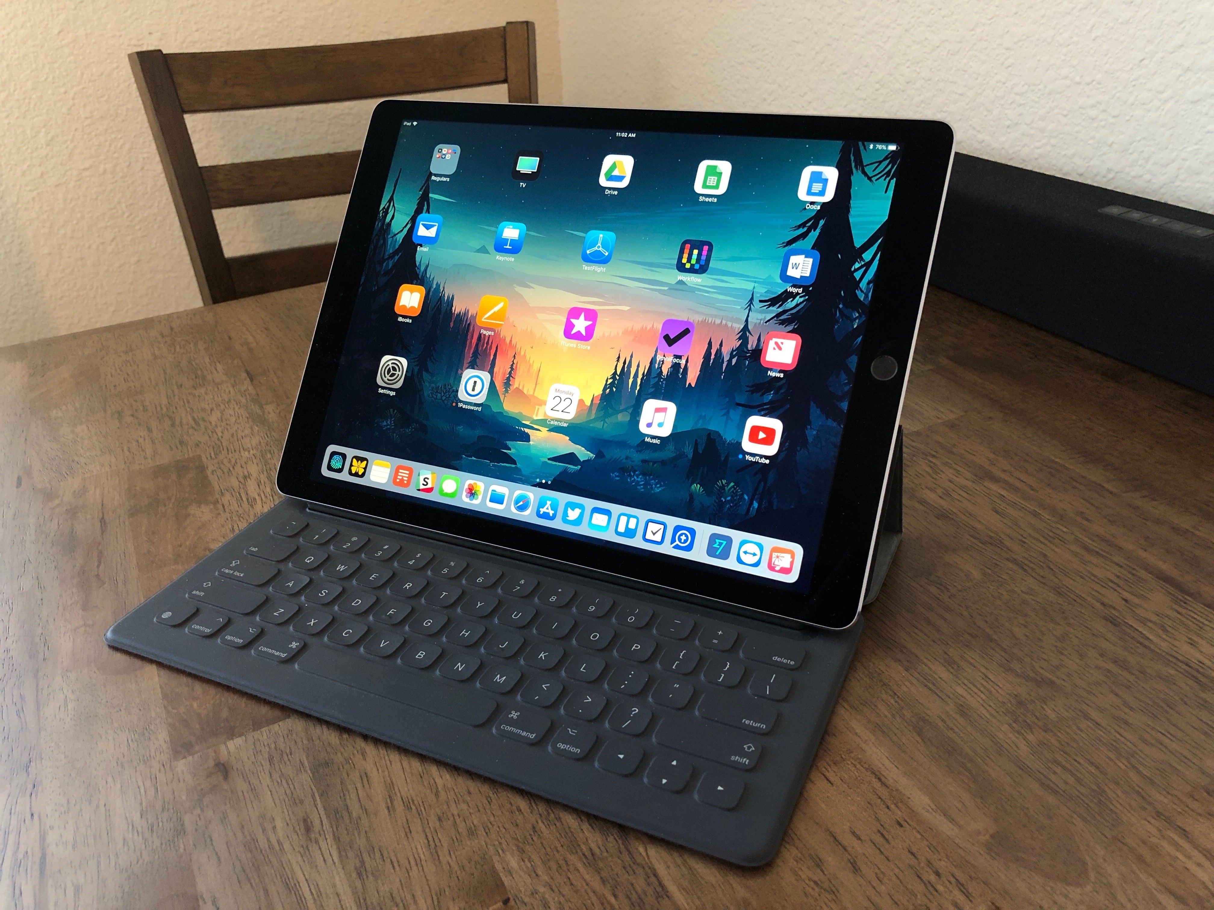
There’s something about the screen of the new 10.5” iPad Pro that feels immediately novel but quickly becomes normal, and something that seems obvious at first but reveals itself as a deeper change after a few days. As a heavy user of the 12.9” iPad Pro, I’ve been pleasantly deceived by this new iPad, and the more I think about it, the more I keep coming back to the display and the story behind its new form factor.
It has been nearly a full year since Craig Federighi introduced the iMessage App Store to developers at WWDC. Coming out of that keynote, it was easy to guess that sticker packs might become a hit with users, but the big unknown surrounded the idea of more powerful iMessage apps. Would anyone actually want to use iMessage for anything more than basic messaging?
The challenge with creating a great iMessage app is similar in ways to that of creating a great Apple Watch app. In most cases it requires taking an existing app and stripping functionality down to its simplest form, while still retaining the overall usefulness and power of the full app. And as is true with Watch apps, some iMessage apps tackle the challenge well, while others fail to be useful due to slow or overcomplicated interfaces.
The first year of the iMessage App Store has been dominated by stickers, but amidst the crazy sharks and flaming pizza, there are a number of interesting and creative apps serving as helpful utilities as well. I have tried out iMessage apps for ordering food, managing files, sharing calendars, sending payments, planning meetings, and more. What follows is a list of some of my favorites.