I’m just going to state this up front: visual news readers are the next (and current) big thing on the iPad. Pulse was featured in the The New York Times, then made its way to the iPhone, too. My Newspapers. The Early Edition. Blogshelf, featured in many other blogs.
But the thing that surprises me most, is that people actually keep on buying these apps. They’re willing to try something new. They’re spending their bucks every single week for the new kid on the block of visuals news readers just to, perhaps, change their habits again the next week. I have the feeling this kind of applications are what Twitter clients were for the iPhone in the early days: a goldmine. Just like people discovered that tweeting from a phone (from the iPhone, especially) could be a highly enjoyable experience (sometimes even better than on the desktop), now they’re looking for a better, new way to consume news. It’s the natural circle of things: a developer comes around and reinvents a genre.
It is a few ones’ job to fine-tune it, just look at how Loren Brichter waited to develop his Twitter client, eventually acquired by Twitter itself.
Developers are coming out with these visual news readers. Should we give them a new name? Let’s say visual feeds, because that’s what they are now. Plus some adjustments to browsing and navigation, that is.
Can Apollo News claim the throne of the best new app in this new category?
See, even though it has its downsides and ares of improvements, I don’t think it’s easy to beat Alphonso Labs’ Pulse. Sure the icon could be better and so could the UI. But it’s got a tight grip on people’s minds, being the app that came out first and showed everyone its good potentialities. So what Apollo News has to do, is come up with some new features that will convince users to start using it as their default news app.
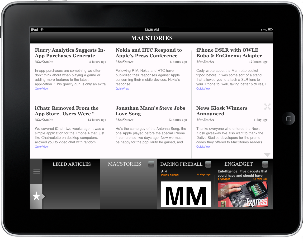
The idea is simple: you have Top News and Favorite Sources. You can’t change Top News’ sources, but you can enter as many Favorite as you wish. Also, if you tell the app which content you like and which you think it’s unnecessary, it will learn over time by your tastes. It’s a pretty great idea, but the execution is not-so-great. Like I said, you can’t change sources in the Top section, but you can bury articles. Ok, but what if I don’t want Huffington Post in the sources? I don’t want it, but there’s no way to remove it. Ok, let’s move on.
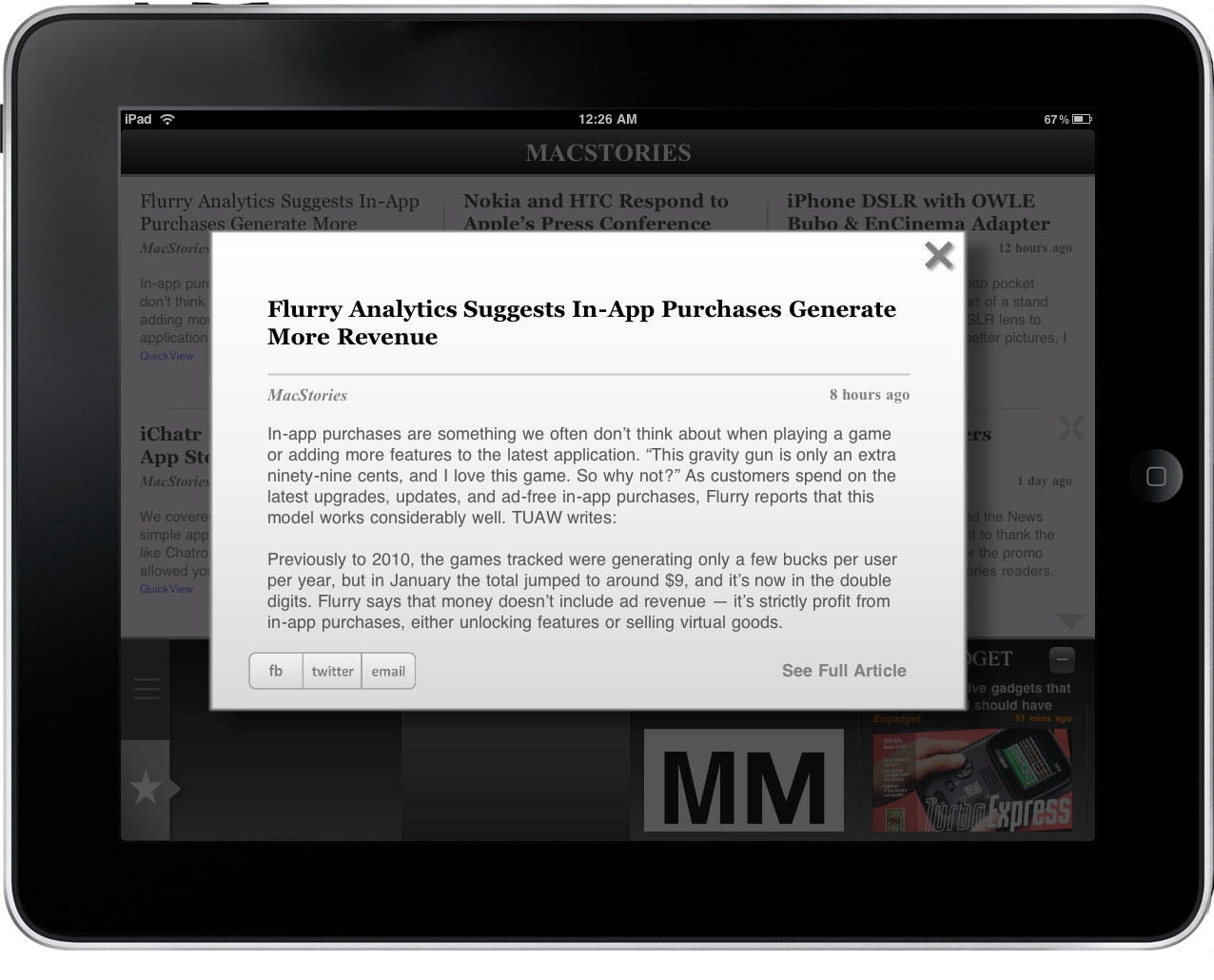
The app presents you news at the top and sources, or categories, in a scrollable drawer at the bottom. It’s nice because you can see thumbnail previews and such, but it needs refinements (especially the UI) and performance tweaks. To read the actual articles you can either open the standard web version or enter the Quickview, The Quickview is an interesting idea: it pulls text from the website’s RSS feeds and wraps it inside a modal window, both in landscape and portrait mode. Like I said it’s cool, but it could be so much better. The window itself is small, and more important you have no typographic control over the way the app displays content. I’d like to see improvements in the future updates. As for the web view, is slow and buggy as hell. Did they test it before submitting the app?
There’s no Quickview in the Top News section, sometimes you’ll see truncated titles and scrolling doesn’t exactly feel like it’s been made on an Apple device. It feels like Android’s scrolling, with no bounce effect. Somebody please explain me why. There’s also no state saving, meaning that every time you quit the app you’ll be forced to get to that article again. Overall, the UI needs to be refined and re-thought in many parts.
So why am I reviewing this app, you might wonder. Well, it’s got some nice touches here and there. The drawer at the bottom is nice, the whole “change the behavior of the app” concept is cool and shows great room for improvements. The video section is highly recommended. The app is fast at retrieving RSS feeds with a simple search, and it’s quite fast at displaying headlines, too. The fade effect on pictures looks good.
The first version of Apollo News could have been so much more. Instead, we’re forced to live with a buggy and sometimes slow app which buries all the good ideas under a terrific layer of beta testing gone wrong. It’s like that girl from high-school that doesn’t care about looking good, but you know she could if she just cared. And you’re pissed off about it.
If you want to give it a try, Apollo News comes at $4.99 in the App Store. For anyone else, maybe it’s better if you wait. For a new app, or for a huge update to this one.


