Can you imagine if two college students reinvented the way you consume news on your iPad? Think about a small project, with no big budget and a couple of good ideas: that’s how great products usually come to life, right?
Now let’s face it, if you read news on the iPad you either do it using a Google Reader client or a website-specific application such as the New York Times one. Me too, I have downloaded some apps from the App Store to enjoy the single website experience they provide and installed the latest beta of Reeder (check out our exclusive preview here) to catch up with Google Reader.
Now let’s try something different, shall we? Meet Pulse for iPad.
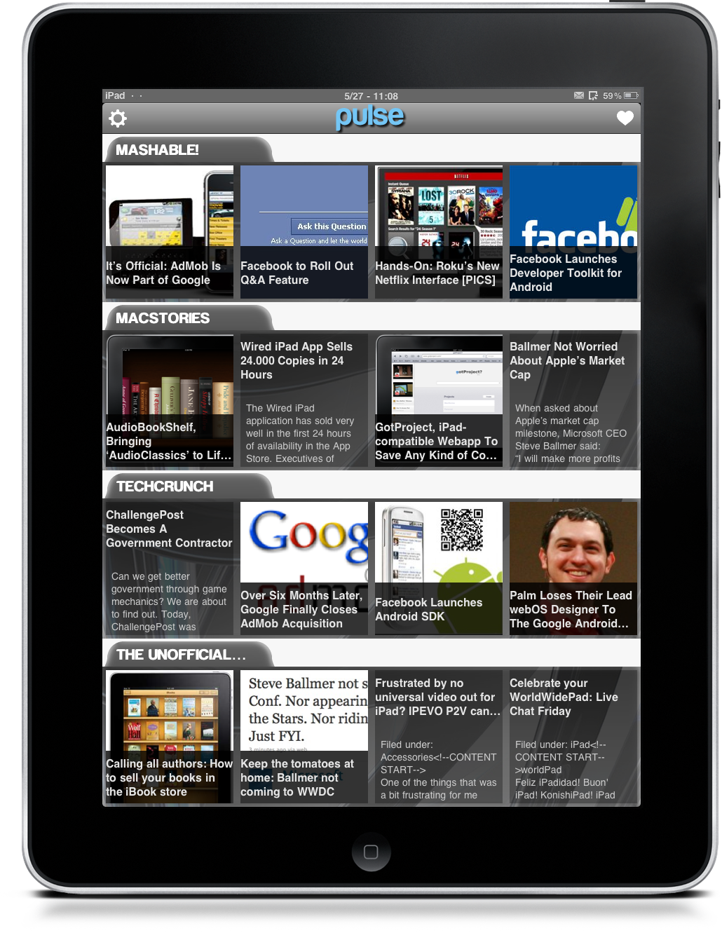
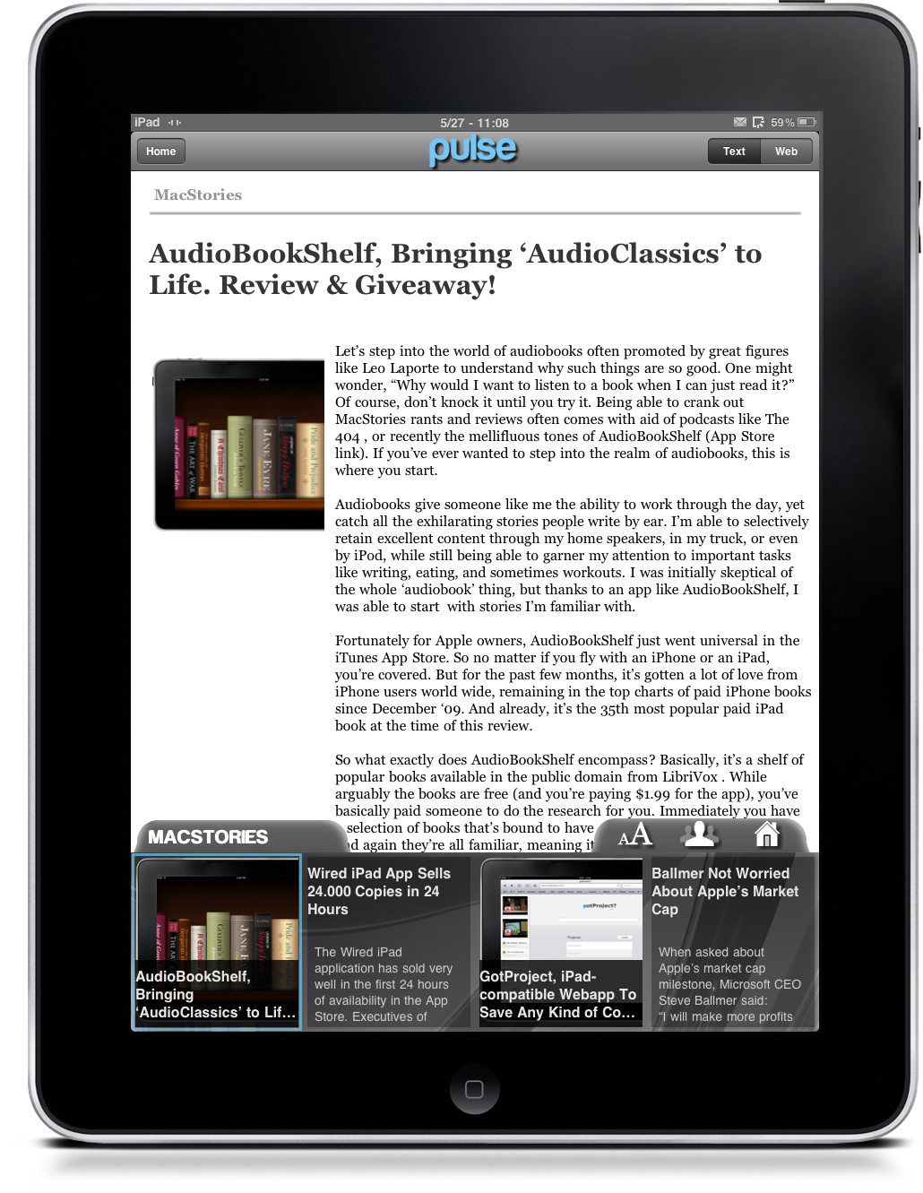
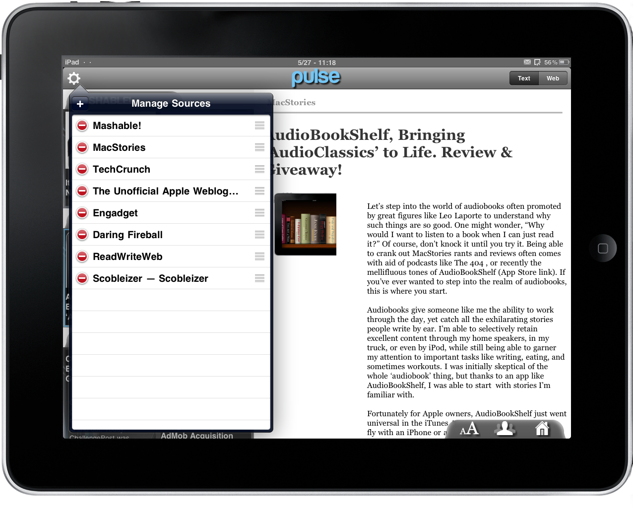
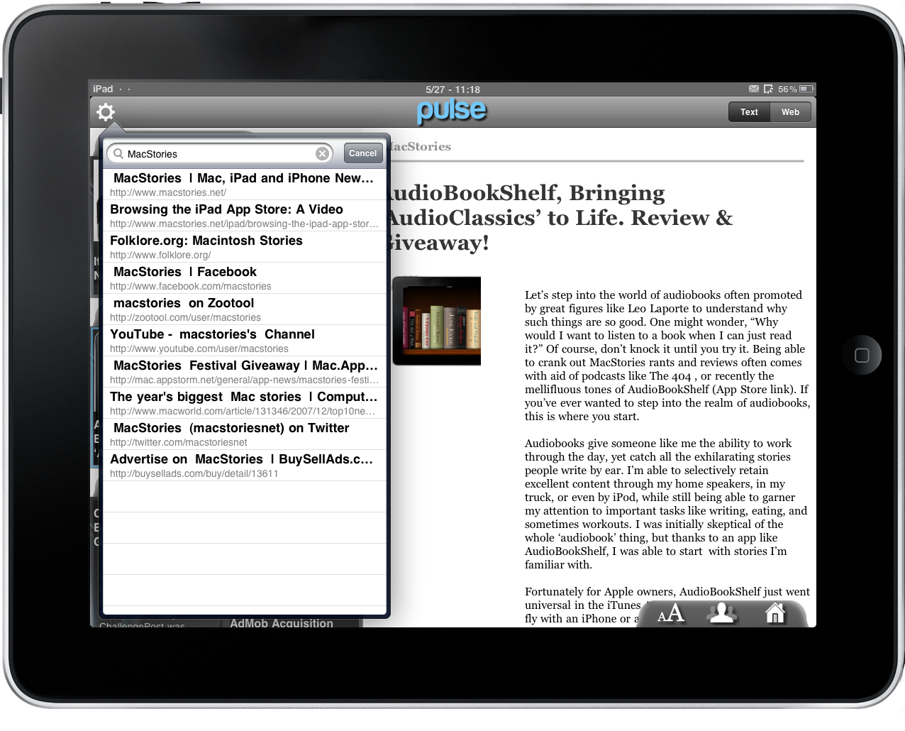
Pulse is a news reader app for iPad that allows you to visually browse news and add sources with just a few taps, instead of messing around with complicated feed URLs and such. You have a main dashboard listing all your sources, and thumbnails for all the posts from those sources. You can change orientation, browse though these thumbnails and, of course, read the actual articles.
You can switch from text-only view to web view, and there are some sharing options to send articles via email or share them on Twitter and Facebook. Overall the application is very intuitive and easy to use, but it could use some adjustments to scrolling smoothness.
While I believe that Pulse is a great idea and is even well implemented overall, I can’t help but saying that the UI design is ugly. I mean, not entirely ugly, but it’s no Reeder for sure. So my hope is that the devs will take some time to rethink the design, and come up with something really great.
Is Pulse a game changer yet? No, but it could get there. The concept is very good and could change the way we consume news on our iPads, but the app still needs to be refined. Available on the App Store, feel free to give it a try if you’re intrigued.


