If you read my Good Reader review last week, you should have noticed that I’m pretty satisfied with the app, even though it has some UI quirks and it surely can get a lot better. I know that the developers are working hard on improving the app, and I guess that an update addressed to fix the aforementioned problems is already on its way to the App Store.
Are there any alternatives to Good Reader though? Not so many, and most of them are very poorly executed applications that let you import documents and, in the best case, upload them somewhere on the internet. Can ReaddleDocs for iPad be any better than the others?
Readdle Docs does almost all the things Good Reader does. Also, it’s got a higher price tag.
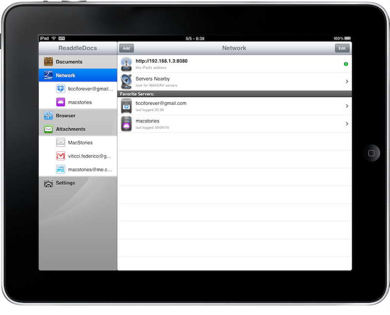
ReaddleDocs allows you download and browse documents on your iPad. You can set up the app to interact with various online services like Dropbox and MobileMe, access email servers (Gmail or your own IMAP server, for example) and browse the web through the built in web browser. If there’s something which isn’t missing from this application is the possibility to customize sources the way you want and access almost any kind of online repository you can think of.
There are tons of features in ReaddleDocs, but I guess that my main concern with the app is how it looks - the interface really seems something coming from Windows sometimes. Let’s take a look at how it works anyway, and how it compares to Good Reader.
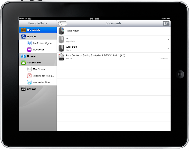
The app has a sidebar on the left side, which weirdly enough doesn’t become a popover when you rotate the iPad, and this is a major problem the developers should look into as soon as possible. It feels weird to rotate the device and have the same sidebar with a stretched right panel to fit the screen. I mean, this happens in Settings as well and I’m not a fan either, but while one could argue that Settings is not an app - same cannot be said for ReaddleDocs and all those applications that take this similar approach. The sidebar lists the main features of ReaddleDocs: Documents, Network, Browser, Attachments and the Settings.
Documents is your personal inbox, where all the docs you download from the Internet or other applications will go and where you’ll also be able to move files around, zip them and even create new folders and text files. Again, I’d like to point out the non-native UI and UX choices here: you can’t swipe to delete files and every action must be performed through a top bar which is quite ugly and unusable. I seriously hope that the developers are going to change all of this in a future update, because RD feels completely different from every other iPad app. And this isn’t exactly good.
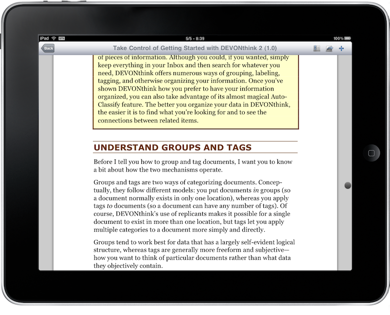
Straight to the point, PDF reading in ReaddleDocs is good: it feels more like flicking rather than scrolling, and you can add bookmarks, zoom and stuff like that. I guess the PDF experience is the thing I liked most about the app, as it’s straightforward and the UI doesn’t really get on the way. The app has been able to play with large documents just fine, and it’s undoubtedly better than iPhone OS’ default PDF reader. Thumbs up here.
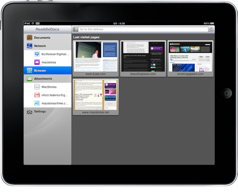
As for the connections with online services and email servers, they work just as expected: you save your login credentials, the app remembers them and lets you navigate through folders and such just like you can with the Documents inbox. I’ve configured Dropbox and MobileMe and the app is pretty fast to retrieve files, but I really would like to have the possibility to queue downloads like I can don in Good Reader. You can also browse the web and download stuff with the built in browser, which looks and works better than Good Reader’s one - but again it feels weird most of the times and I can’t really do some daily and serious browsing on it.
If only ReaddleDocs had a different UI, it would be an amazing app. As of now, it’s a good app which comes with a terrible interface that destroys everything good the developers did. Seriously, hire a new designer and follow Apple’s guidelines, then maybe you’ll manage to reach Good Reader up there in the charts.


