The iPad has been available for 2 months today, and many users are still looking for a great application to catch up with Google Reader feeds. Sure we’ve reviewed a bunch of good apps here on MacStories such as Newsrack, NetNewsWire and Headline, but none of them can be described as the great piece of software that manages to show all the capabilities of the device it runs on.
Don’t get me wrong, those are good applications. I’ve used Newsrack for about a month and, even though it looks like a bigger iPhone version, it definitely did its job fine. What I’m saying is that we’re still missing that application that shines in the App Store, the one you could describe as “the best”.
Now, you’ve already read the title of this post so you know what I am about to review. Before we delve deep into it, let’s provide some background. Reeder for iPhone came out of nothing last year, and we were amongst the first blogs to spot the potentialities of that app and review it. Needless to say, I immediately fell in love with the app and decided to keep it on my home screen for good. Reeder 1.0 was a great app, and a stunning first version. It was fast, probably the fastest Google Reader engine I had ever seen in an iPhone application. The UI design was custom, with faux leather elements and paper to give the feeling of an old journal or something. Animations were smooth and pleasant, and so was navigation.
Overall, using Reeder was like using an Apple application - a perfect and polished experience. Silvio Rizzi, the developer behind Reeder, gained a lot of popularity thanks to his breakthrough app, and surely made some good bucks out of it. But he wanted more, and so he started working on a 2.0 version, which we reviewed here. Reeder 2.0 was (is) a well-thought refinement and betterment of the original application, with an even faster engine, faster loading times, more features and a better overall experience. I am not afraid to say that Reeder 2.0 for iPhone is the best Google Reader client ever made for a mobile phone.
Back to 2 months of iPad, you guys want to know whether Silvio Rizzi made it once again or not. Let me state this straight up: Reeder for iPad is the best Google Reader experience you can have on the tablet right now. It’s the app that perfectly manages to showcase all the great things about this device, and deserves to be installed by every user who daily checks his Reader account.
Reeder for iPad is beautiful, fast and easy to use. On the other hand, it’s loaded with features, powered by a highly custom interface and is different from every other app you’ve seen on the iPad so far. As far as Google Reader clients are concerned, Silvio Rizzi has just started his personal revolution.
The concept behind Reeder is that a Google Reader app for iPad should make extensive use of the device’s unique features, and not just focus on porting the old iPhone schemes to a bigger screen. Silvio knows that if you want to be successful on this new tablet market, you have to leave the old ideas behind and come up with something new and fresh. A very few developers have done that on the iPad until now.
You have a Google Reader account, and you have folders. You have subscriptions inside these folders, and these subscriptions come with daily unread items. Also, you star items, attach notes to feeds and share something on Google Buzz every once in a while. You’re the average Google Reader user. As an iPad user, you know that you can hold the device in different orientations, and it’s very likely that you’ve got used to hold it in a certain way that’s comfortable with you. It’s also very likely that you hold the iPad with one hand and type a few words with the other, say tweets and emails. You’re the average iPad user.
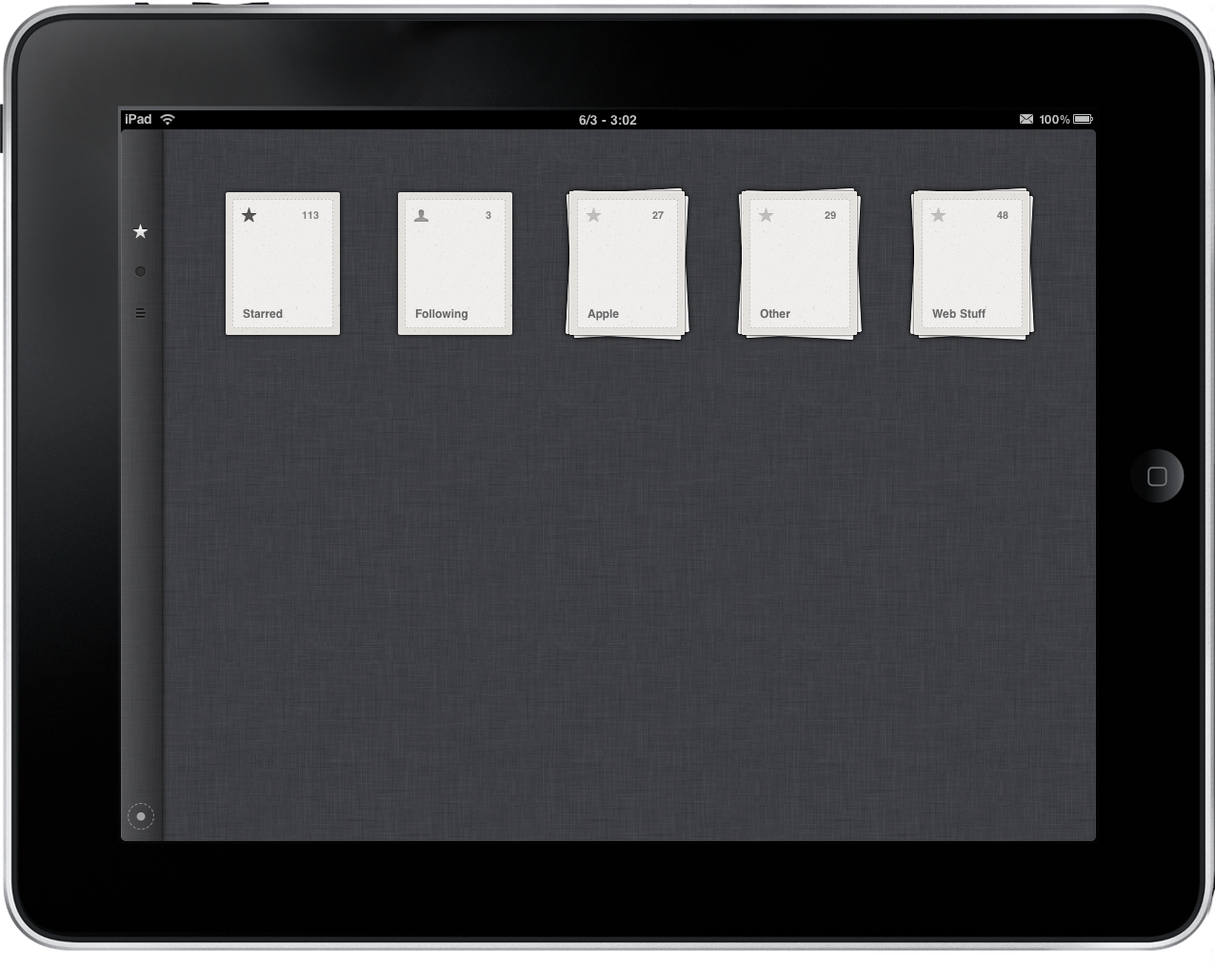
When you fire up Reeder, you’re presented with a dashboard screen that contains your Reader folders as stacks and a control bar on the left. The interaction patterns here are very interesting and are the most important factor of this new version. You can use the bar on the left (both in landscape and portrait mode) to switch between unread items, favorites and unread + Notes and Shared items. The sync button is placed lower in the same bar, and it’s got a sweet animation that you can see when the app is talking to Google Reader. It’s all about the details. The navigation bar provides an easy and comfortable way to “hold the app” in your hands, so that you can use your thumb to switch between items and quickly press the sync button again.
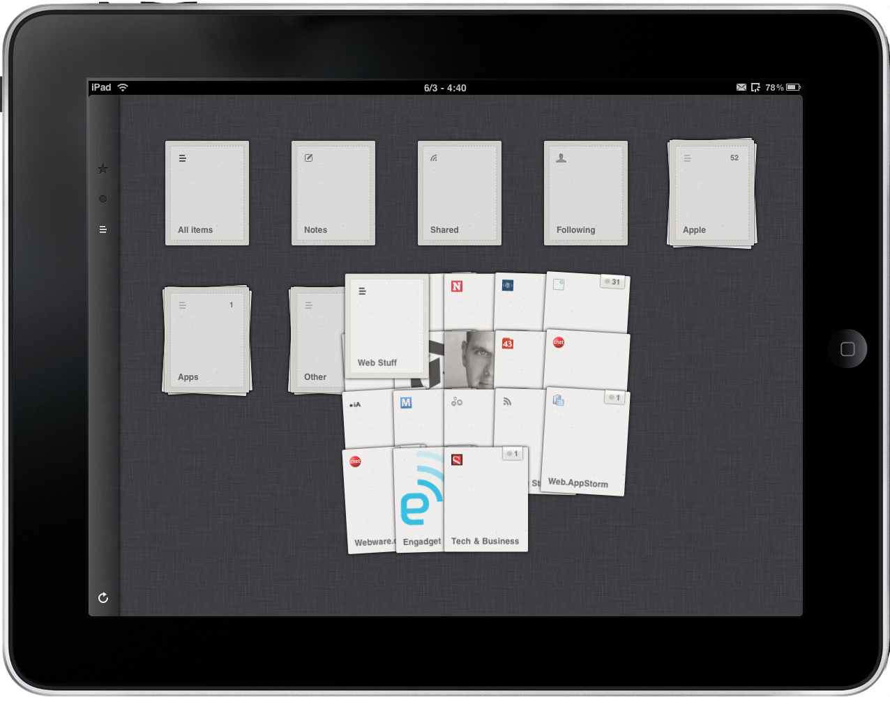
Like I said, you can pinch to get a visual peek at the items inside a folder, and feeds inside a source. It works just like Albums in the Photos application, meaning that when you start holding a stack with you fingers you get a “mosaic” that you can drag on screen, expand and then release to enter another screen with all the items associated to that stack. In Reeder’s case, when you pinch a Google Reader folder you get another screen with sources (MacStories, Engadget and so on). Pinching a subscription gives you a preview of the articles inside it. It sounds more complex than it actually is, and using it with your fingers is a different story. It feels good and natural. Also, pinch and zoom is implemented at an application-wide level, so that you can perform the gesture no matter where you are: you can pinch in the articles view just like you can in the aforementioned folders view.
If you don’t want to pinch and zoom, you can tap. Tap on a folder to activate the “all items” view, tap on a single source to see all the unread feeds. To go back to a previous screen you can also tap on the back arrow in the left bar.Reeder comes with two different navigation methods, and that’s where Silvio Rizzi nailed it.
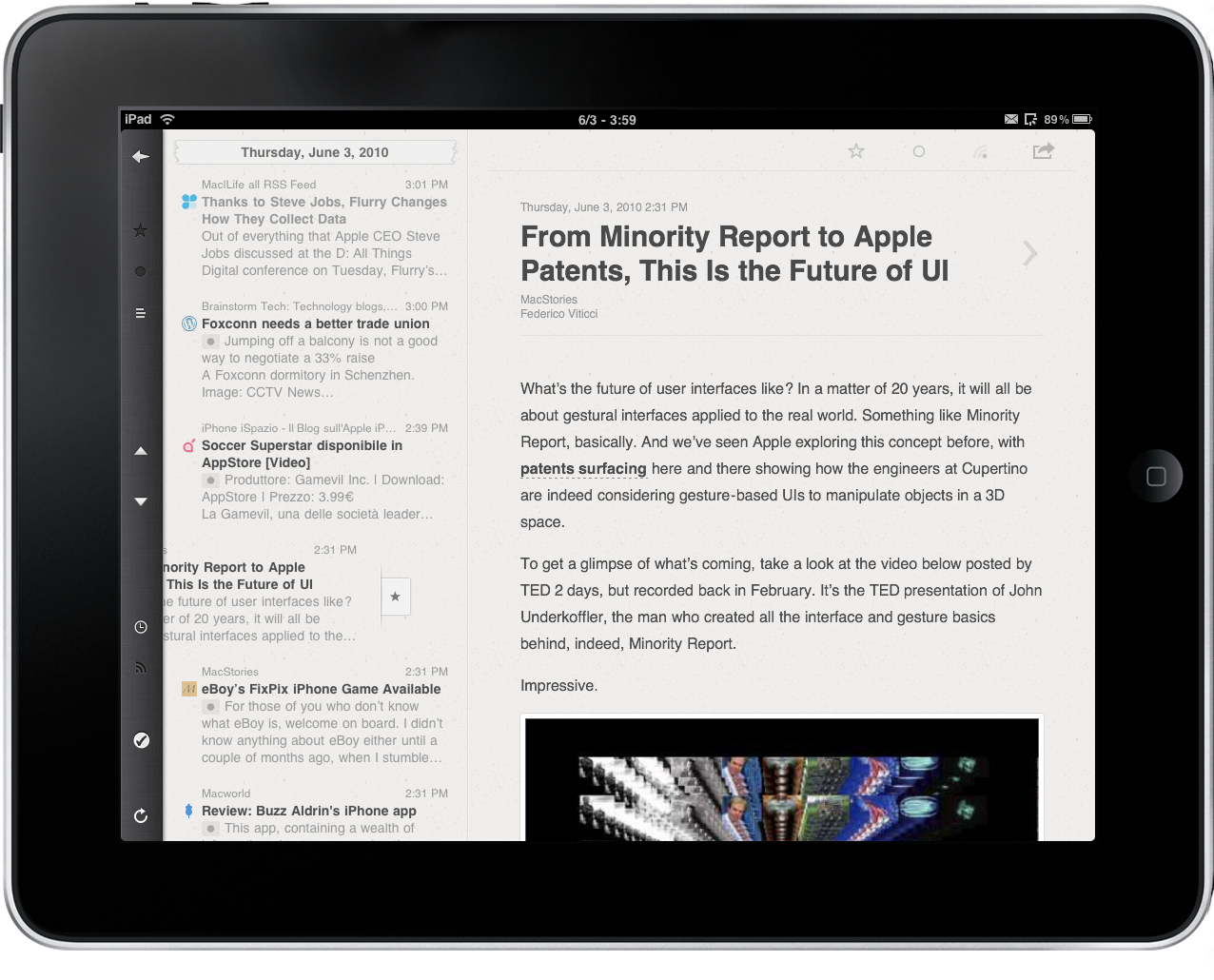
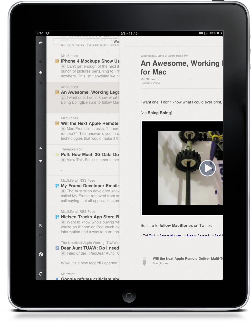
When it comes to news reading, the experience is very different depending on the device orientation. When in landscape mode, you get a sidebar on the left listing all your unread items. Tapping on an item opens the feed in the right panel, just like messages in the Mail app. Where Reeder really stands out is in portrait mode: instead of displaying feeds inside a popover like many other apps do, the application relies once again on gestures and new interaction methods. Why use a popover when you can slide to open and dismiss articles? That’s right: tap on an item and the articles slides in from the right. When you’re done, you can go back to the items view by swiping right and dismiss the panel. Maybe this gesture can’t be understood at first, but once you get the hang of it is pure genius.
As you can guess, tapping on the headline of a feed opens the web view. The interface is minimal here, with buttons to go back, reload and share.
You can do a lot of other stuff with feeds. Swiping on an item in the list view allows you to fave it or mark it as unread, for instance. If you want to share or mail an article, tap on the arrow icon and a popup appears on screen allowing to share the post across all the services supported by Reeder, and this brings me to the Settings of the application. You can enable and disable services in the Services Panel, turn caching for images on,change the way the app sorts feeds. There are a lot of options, just as you can see in these screenshots. [here and here]
Reeder provides a great Google Reader experience, and you’ll find yourself constantly coming back to the application to catch up with the news, share, fave stuff and save articles for later. Even when you have a queue of 200 items to be processed, it will be a real pleasure to check those items using Reeder. The fast engine and smooth animations surely help to this matter. Is there something Reeder can do better? Maybe the developer could make it even faster in a future version. Or perhaps new interaction methods will be introduced and the existing ones will be refined to perfection. No matter how you look at it, Reeder for iPad is a gem.
It may sound cheesy, but Reeder for iPad really is the best Google Reader client you can have on this device right now. Well, not exactly right now, as the app is still currently awaiting for approval in the App Store and should be available soon. Once it is, go ahead and purchase it. This is the start of the second wave of great iPad apps.
Check out our Reeder for iPad set on Flickr.
Update: Silvio has confirmed that the app will be priced at $4.99 in the App Store.


