Like I said in my first coverage of Flipboard, I didn’t have enough time to test the application and come up with an opinion about the innovations of this new way to consume and, to a degree, produce news content on the iPad. When Flipboard launched two days ago, the servers were immediately hammered down by Robert Scoble’s highly hyped preview, people tried to add their own Twitter / Facebook feeds and the application servers crashed. I guess McCue wasn’t expecting such a huge and positive response, probably because he didn’t know that iPad users were looking for something like this.
A new, fresh, revolutionary app that could prove that the iPad is indeed magical. We’ve seen some great apps on the iPad, but as Scoble puts it: “you’ve never seen one like this”. Is Flipboard revolutionary? It’s the first seed for a revolution in how people find interesting content on the crowded web, and this revolution is happening now. The problem with this revolution is that many people don’t think it’s a revolution at all. Strange, isn’t it? A company comes out with a greatly innovative product and many people don’t see that product as great or innovative.
They’re not looking at the big picture. They don’t get the concept, they don’t see the potential because they’re too busy criticizing some developers that made the wrong choice of not choosing the right amount of servers for day-one.
I’ve been testing the app with full Twitter and Facebook support since yesterday. Indeed, I was able to add my Twitter and Facebook accounts, other people’s profiles and Twitter lists, both the ones curated by me and others. So, I’m enjoying the complete Filpboard experience right now. Here are my thoughts about it.
Flipboard is a social magazine. It aggregates sources Twitter and Facebook and displays content that you’ll likely be interested in. Furthermore, you can add other Twitter users as “sections”, Twitter lists and choose from a good set of pre-loaded “curated sections”.
The problem with Social Media, is that good and unique content is buried under millions of status updates about the latest Apple conference or Justin Bieber’s language problem. The most popular Twitter clients are Tweetie, Seesmic and Tweetedeck, and all these clients display content (tweets) in a vertical list that makes impossible to the human eye to distinguish important content from the noise. Twitter clients are stupid, in a way that they don’t know what you care about and what you don’t even want to look at. A tweet from @gruber looks just the same as a tweet from my friend who says that he had bacon for breakfast. How so? Because there’s no curation.
Curation of content is a hard subject to discuss, especially when there’s no backend to actually bring in the discussion. If there’s no backend, then you either have to do it manually or build your own algorithm. Obviously you can’t curate social media manually, so let’s build an algorithm. And that’s what Flipboard did. They created a system that a) knows what you usually tweet and post about b) knows your contacts c) knows what content it’s popular right now and d) knows how to relate that popular content to your network. Meaning: if everyone else is talking about Obama’s latest speech, that doesn’t necessarily mean I’m interested in reading about it.
Here’s the difference with traditional printed magazines: when I buy Wired, it is possible that it has content I don’t want to read. With this system, Flipboard knows what content I want to consume and creates a magazine around it. Simple.
So now that you get the hang of Flipboard, let’s see how the app performs. When you fire it up, you’re presented a cover - an image the Flipboard crawler found in your network and chose to use as cover image. Usually, these images are picked from a link that the crawler followed. The idea is nice, but I wish the developers implemented a system to tell the app to only pick images with a certain resolution, or otherwise rely on Flickr’s public tags and such. Also in the cover, you can find the users who shared images (but then again, they didn’t actually shared an image, the crawler extracted it) and scroll through them. It’s pretty nice. Let’s go to the main screen.
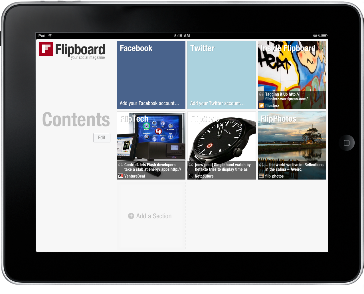
The main screen is the table of contents of Flipboard. You can create up to 9 sections (represented as huge and good-looking squares) and arrange them by dragging them around. I hope the developers will introduce the option to create more than 9 sections, or at least break the table of contents in more pages. I’m subscribed to some Twitter lists, I follow almost 1000 people on Twitter, I have my Facebook contacts, I’d like to discover new users: 9 sections are not enough.
Anyway, let’s try with 9 and see what happens.
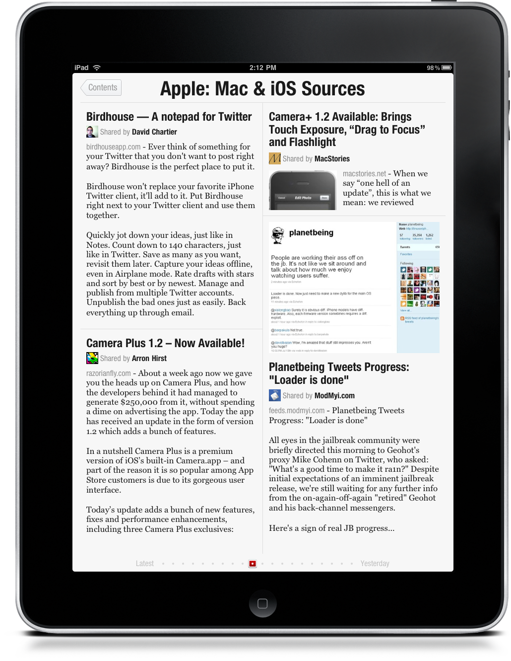
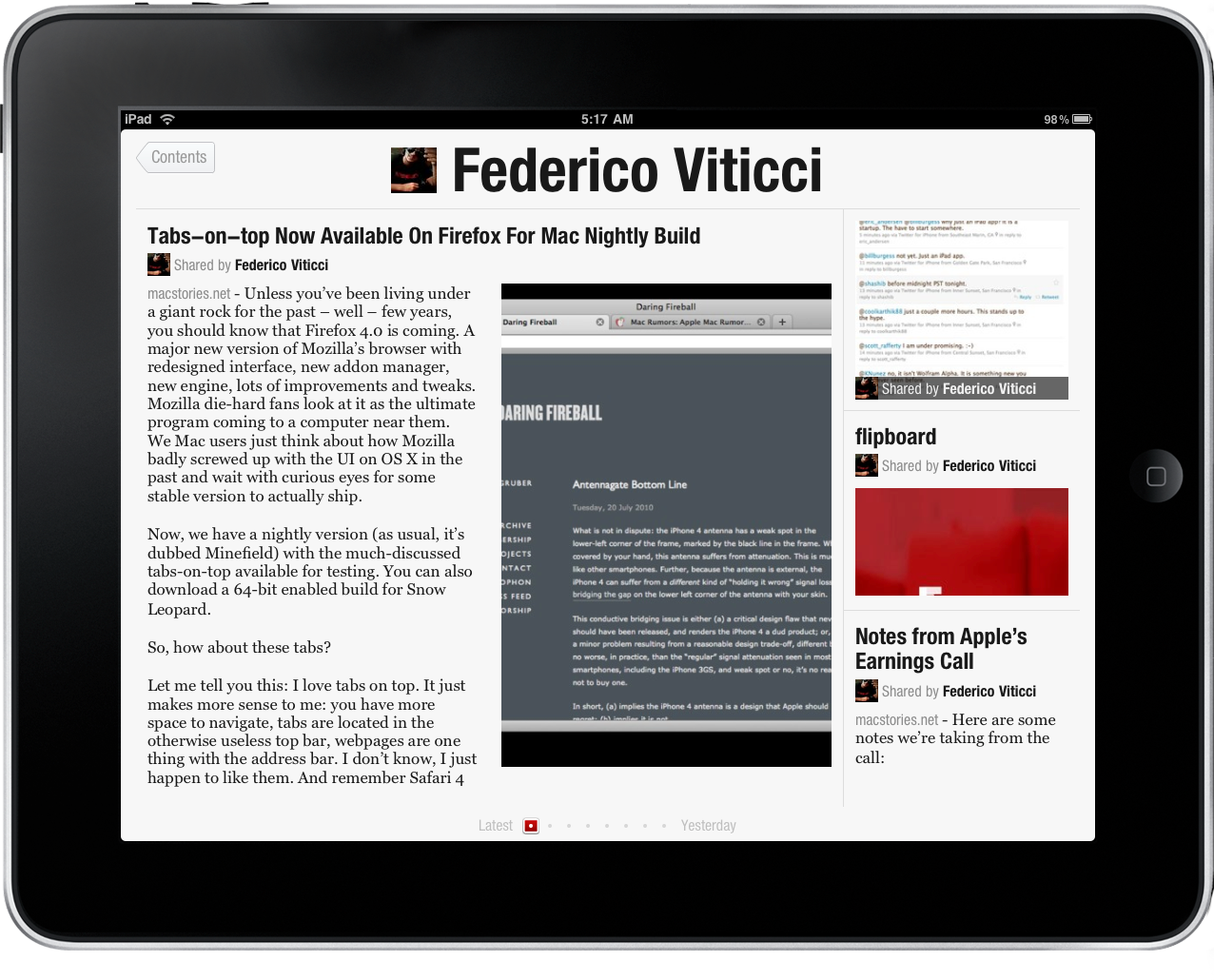
Like I said, it’s very likely that you won’t be able to add Twitter streams (including your own) because of server-side issues with the app. If so, you can still add the pre-loaded “bundles”, which are pretty nice and well built, especially those curated by @scobleizer such as Tech Influencers. These sections feature content from popular sources, and I’ve found a couple of very interesting ones, together with some I don’t really care about. What will literally explode now that Flipboard is available are Twitter lists: nothing more than a few ones’ hobby in the past months, Twitter Lists are perfect for Flipboard. If you can come up with a curated selection of users and sources that don’t post the same link over and over but share original and unique content instead, you’ll find yourself surprised to know that Flipboard parses this content perfectly, accordingly to complex parameters which will make it relevant or not. Say you’re following both your friend who had bacon for breakfast (and tweeted about it) and VentureBeat. VentureBeat tweeted an article, many people retweeted it, some of your followers retweeted, some even replied to @VentureBeat commenting on the article. That article indeed is about something you care about. Also, it’s been reposted by other sources, say MacStories and TUAW. You’re following both of them, and both of them tweeted their posts as well. On Twitter, this means that you’ll find a huge list of status updates about the same stuff: the VentureBeat original post, and the re-posts by MacStories and TUAW. Plus all the retweets and comments. Now, here’s where Flipboard comes in handy: if you open the section with VentureBeat (or perhaps just the one dedicated to your Twitter account), you’ll find that post in a relevant position. In the same place, you’ll find retweets and the possibility to: share by email, retweet, Instapaper, hide, open the web view and reply to the author. All within an interface that it’s beautiful, shows great attention to typography and readability and dynamically rearranges content based on the device orientation. The integrated web view is one of the fastest I’ve ever seen on the iPad. You can pinch and zoom to open / close articles previews.
Does Flipboard only care about relevant content? What if I want to use the app to find latest news and fresh articles? Good question. Yes, you can. Actually, despite all the talks about finding and displaying relevant content, the app it’s still pretty dependent on the “freshness” of posts, especially for Twitter. Which is a good thing, because nobody wants old news to stick in the front page. After hours of tests, I think I got the hang of it: the app follows a timeline (which you can access through the beautiful scrubber at the bottom of each page) and relevancy of content is conveyed through a clever newspaper-like design. Scoble writes:
“For that I have to go back to my newspaper design class. I remember that early eye tracking research showed that pages that had a single headline that was twice as big as any other headline were more likely to be read. Same for pages with photos. If you put two photos of equal size on the page, it would be looked at less often, or less completely, than a page that had a photo that was at least twice as big as any other.
I won a newspaper design contest in college because of this — my designs made sure that they included headlines that were twice as big as any other and photos that were twice as big as any other.
This might not seem intuitive, but it is how our brains work and eye track research has proven that over and over again.
[…]
Notice that having large headlines and photos gives eyes an entry point onto the page.
Now, what’s missing in, say, Seesmic or Tweetdeck? That’s right. Any kind of editorial weighting to the headlines and photos are totally missing. Entry points are gone.
Not all tweets are the same. One about Apple’s financial results SHOULD be bigger and more important than one about what I had for lunch today. In Flipboard, which isn’t always perfect because it’s done by algorithms, there is weight and photos and an attractive design.”
I’ve heard of many people complaining about attribution of content shared and aggregated by Flipboard. As you notice, Flipboard follows links, extracts text and images and re-formats them to visualize them in a newspaper-like UI. The problem is, it pulls text from the original webpage without giving credit to the author - it just displays who shared it on Twitter. Whether it’s the official website account or my friend, it doesn’t matter. This could be a major downside for web publishers, especially the large ones like NYT, but I don’t think the engineers over at Flipboard are ignoring the problem. Actually, I think that their priority for Flipboard as a social-content platform (and not just an algorithm-based aggregator) is to help publishers by giving them the tools and technologies to easily spread content to more users yet retaining all the attribution rights and advertising models they have on their websites. How can this be done in the short term? By truncating the RSS feed and displaying only a portion of text. After that, you’re forced to open the web view and play the publishers’ game. In the mid and long term though, I think that Flipboard will team up with major publications and figure out a way to bring the original website’s experience to Flipboard on the iPad. Like a Flipboard-specific New York Times or official sections curated by journalists, perhaps with inline rich advertising. I can see that happening.
I don’t want to list all the features missing from this first release, as I’ve already mentioned them on Twitter. I want to close this article by reflecting on where the platform is headed and how, ultimately, it will inevitably change the way we read online content. Not just on our iPads. It’s very likely that Flipboard will introduce iPhone, Android and Web versions in the future; the iPhone app might be the first one to come by this holiday season, I guess. So what Flipboard as a company wants, let alone monetizing their efforts and find more investors willing to put money in the project, is to become the de-facto new standard of reading articles online. Their idea is, people can’t stand reading news like this anymore. Let’s give them a better platform, let’s make it pretty and let’s hope that they’ll embrace it as the ultimate social magazine. Sure it’s a good plan. But on top of this, what McCue needs to focus on is making the algorithm faster, smarter and even more personal, build the app so that casual users (the majority of iPad customers) won’t be scared by “Tech Influencers” and “FlipTech” sections, team up with publications to offer exclusive content on the app, all rendered server-side. They have the money to do that. In this way, Flipboard will become the first platform featuring curated content that knows what you like, what your friends like, what you can’t stand and changes its shape based on what’s happening (latest news) and what’s hot (trends). Boom.
In a few hours Flipboard has changed the way I read articles on my iPad, and I can imagine this becoming more and more important in the upcoming weeks, with fixes and improvements on their way. Does Flipboard change everything? For sure. It’s a big start, and from now on it can only get bigger.
Flip. Flip. Flip.


