Ever since I bought the iPad, I knew it was going to change the way I read news online. Be it the New York Times or MacStories, TechCrunch or The Huffington Post, the iPad and the developers who create new apps for this new device have changed the way we approach news. At least this is what we thought before Flipboard came out. Flipboard pushed the game to the next level, enabling users to create their own digital magazine starting from their Twitter and Facebook streams - something many had tried in the past but never quite nailed as much as McCue and his guys did.
Now we have choices: RSS readers, apps that start from RSS subscriptions to build something visually new, and Flipboard. In fact, we reviewed a lot of these “visual newsreaders” in the past.
Where does Times for iPad fit?
Times has a long history that goes back in the days when Mac users didn’t have anything like a “visual newsreader” and they just relied on apps such as NetNewsWire or Newsfire to stay updated with the Internet. Oh, and there was no Twitter. We used to discuss stuff in forums and blog comments - there was no social internet. Flipboard wouldn’t have been possible back then, but most of all - developers didn’t care about making news visually appealing. I’m talking about attention to good design, typography, user experience. It was all about making that unread badge go away.
There’s no unread badge in real magazines, and Dustin MacDonald knew it. When Times for Mac was released, some people didn’t really get it. Times allowed you to read your favorite online sources in a paper magazine-like fashion, page curl effects being part of the offer. It was a digital magazine for Mac. It didn’t have Google Reader sync though, as - again - Reader was about badges and Times’ purpose was to eliminate them and let you access your favorite websites in a fresh new way. Big innovations sometimes come with compromises.
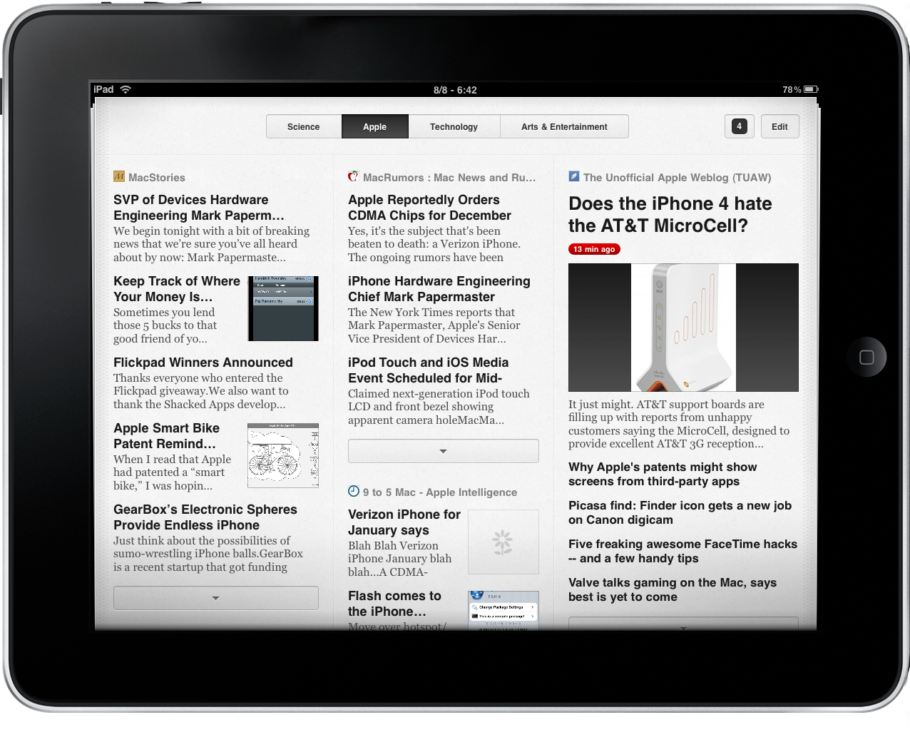
Now there’s an iPad version of Times out in the App Store. Times for iPad starts from where the Mac version left off: a beautiful experience affected by some performance issues and an interface clearly geared towards a touch interaction rather than point and click. Put simply: with Times for iPad you can manually add your favorite sources, organize them in sections and customize the look of each section (or page) by choosing different column layouts. This is a first for Times, and I bet it will come soon in Times for Mac 2.0.
It’s a RSS visual newsreader.
It’s not only about turning blogs in a good-looking magazine experience, though. The engine was completely rewritten for this iPad iteration: the app is fast, both at fetching content and laying it out according to the UI scheme you chose. It’s a huge leap forward from Times for Mac, and a great advantage on apps like the aforementioned Flipboard, which is still struggling over connectivity and server issues. Times grabs the RSS URL of each source, and does all the UI stuff user-side - that’s it.
The app itself is very straightforward: pages are displayed at the top, you create new ones, edit them, delete them. A page is made of columns, and columns contain sources. You can modify the appearance of columns by tapping the Edit button and tap on a slider to make columns wider or narrower. Regrettably, you can’t completely rearrange the layout of columns - here’s to hoping the developers will introduce the feature in the next weeks. You can, however, change the look of sources inside columns: thumbnail previews or simple headlines? How many articles? Want to read articles inline or with a web view? How about priority? That’s the kind of stuff you can do. All you have to do is tap on Edit and access the sources’ Settings.
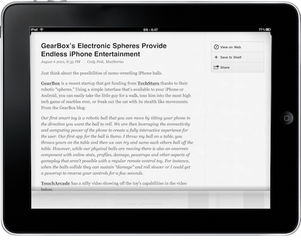
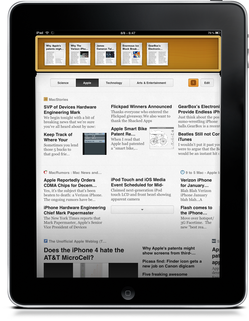
Another cool feature of Times is the Shelf: say you’re skimming through your virtual newspaper and you don’t have time to read an entire MacStories article - just tap on the headline and drag it to save it in the shelf, a wooden bar that appears on top and lets you save articles as beautiful thumbnails you can read later. It’s Times’ local Instapaper, and it works both via drag & drop or a shortcut in the single article view. Speaking of which, the single view is elegant: you can’t customize the colors or typography, but it’s really beautiful. You can also share an article via Twitter / Facebook / Email or open the web view. Simple, but works.
As for features I’d like to see in the app, I can’t help but mention the fact that, even if Google Reader is a different thing from Times, I would at least liked the possibility to import sources - instead of doing it manually. I don’t want Reader’s folders laid out as Times’ sections, but at least let us import them. It shouldn’t be that difficult. Also, I’d like to be able to drag & drop feeds between columns, but I guess this is coming with a future update. For anything else, I’ve enjoyed the app and I have to say it’s stable, blazing fast and yes, beautiful to look at.
So where does Times for iPad fit? If you don’t need Flipboard (or believe in what it offers) and can’t stand all those others visual newsreaders in the App Store, trust Acrylic Apps (makers of visually stunning Mac and iPhone software) and go buy their latest creation at $7.99 in the App Store.
Don’t get me wrong though: Times is different from Flipboard. They’re different experiences with different goals. Times really is the ultimate visual newsreader for iPad and with Mac sync coming in Times for Mac 2.0 it’s going to be hard for all those other competitors to catch up. Once you see Times for iPad, you’ll understand that you don’t mess with an experienced OS X / iOS developer. Times is cleverly and beautifully crafted, it has its quirks and could use some additional online integrations - but it puts every similar app to shame.
Well done, Dustin MacDonald.
—
We’ve got 5 copies to give away. Leave a comment below, tell us why you’ve been waiting for Times on your iPad. Winners will be announced on Thursday.
Good luck!


