I’ve been using MobileMe for some weeks now and I’m really satisfied with it. I can receive and sync mails, keep a backup of my important files, use a dedicated disk space, store my photos in the beautiful MobileMe galleries. Indeed, let me focus on these ones: in case you don’t know, I’ve created some open galleries where you can submit screenshots of your desktops, of beautiful Mac apps and cool iPhone apps interfaces. The galleries are currently online here, feel free to submit anything you think it’s noteworthy.
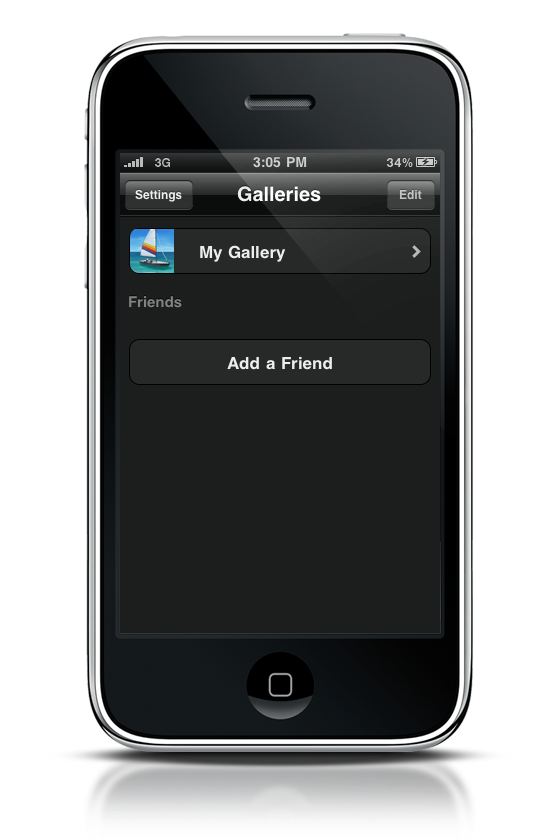
Anyway, you should probably know that Apple released a MobileMe Gallery iPhone application, which enables you to browse your gallery on the go. I haven’t found any good post about it, so I decided to write down my impressions so far.
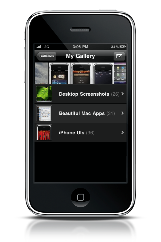
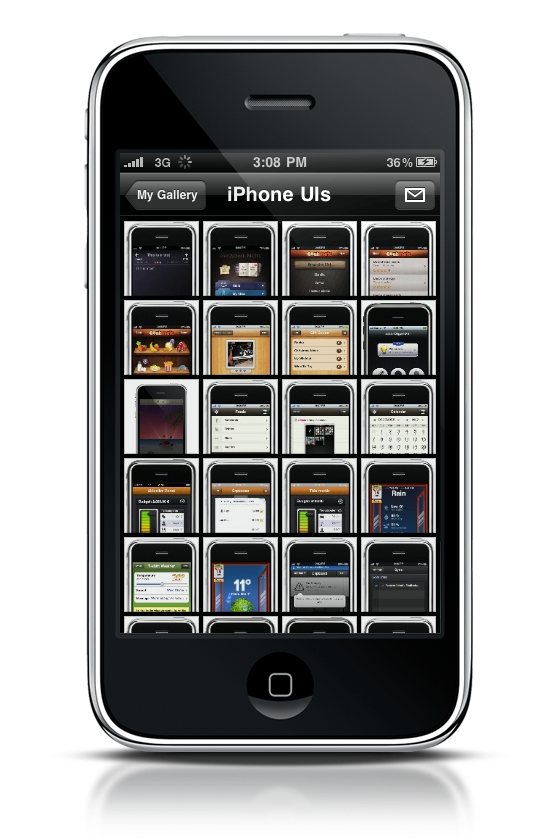
The app is sexy. I mean it, it’s powered by a gorgeous custom black design, which - pretty much like FlickIt Pro, makes every picture stand out. As far as design is concerned Apple did a great job here, except for the application icon which is tremendously ugly. I hate this kind of glossy icons on my iPhone.
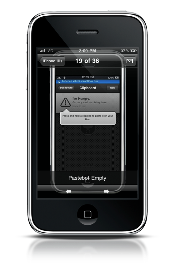
Moving onto the features side, the app doesn’t offer that much. You can only browse galleries and share pictures via email. Galleries are listed as cells in the main page, with a nice thumbnail next to them showing what you’re about to visit. Also, there’s a nice slideshow rolling on the top. Problem is, that’s it. You can’t do anything more than this. You can view single pictures, zoom and..stop. I really don’t know what else to write here.
You can’t upload photos, you can’t share on social networks, you can’t do anything. If this is what I get for a free app, I’d rather pay $0.99 for a more complete one next time, Apple.


