Twitter clients on the iPhone? We had enough, thank you. That’s what I used to say to any developer pitching me and asking whether I thought yet another iteration of Twitter on the iPhone would be a good idea. I was wrong, and here’s why: despite the fact that a genre could be (is) over-crowded and saturated, there’s always the possibility to do better. And as Twitter as a platform is constantly evolving, giving up on ideas just because of competitors is silly.
It’s a fact that we have hundreds of clients to choose from. What’s not so obvious is that you never know who may come up next.
So here we are, talking about Weet. Developed by Raptor Apps and designed by ex-Iconlicious pixel rockstar Marcelo Marfil, Weet was released last week with much buzz over Twitter and other Apple-related blogs. I beta tested the app all along, but I decided to take my time and use it for some more days before writing up something about it.
I’ve been using Weet for a month as the default Twitter client on my iPhone. In fact, I deleted all the other Twitter apps I had. Here’s why.
Weet is elegant, fast, beautiful and it’s got the features I need. I deleted Twitter, Twitterrific and Osfoora for it. Maybe I shouldn’t have kept three different apps on my iPhone in the first place. Still, not the point. Weet is the first app to come with the exact feature set I need, and nothing more. I found it perfectly suited to my needs, so I went ahead and made it default.
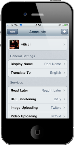
Starting from the main screen, the developers had the great idea to put settings below your Twitter account shortcuts: I can switch between @viticci and @macstoriesnet, but I don’t need an additional tap (like in the majority of Twitter clients) to access settings. Or for that matter, I don’t need to navigate through multiple views to set my favorite Read Later service. As for settings, here’s what I like about Weet: it doesn’t overwhelm you (just like Twitterrific) but it retains all the features I need in a Twitter client, plus a neat integration with CloudApp. You can also enter your Bit.ly credentials.
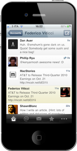
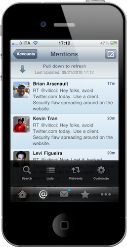
The timeline is clean, but the shortcuts to do stuff faster are there. You just need to know them, or discover them. Or take a moment to read everything on Weet’s great looking website. Design-wise, just take a look at the screenshots: Marfil is a master of light-blue shades and delightful black tones. The whole thing is polished and readable. Thank God. The tab bar is translucent black and transparent: pay attention, it’s not just a design trick to make it look special. You can read tweets below that tab bar and, call me crazy, I actually found myself looking beneath that black panel a couple of times. Say I missed a tweet while scrolling, I get a few extra pixels to spot it. It’s nice. I don’t like that links aren’t directly clickable as in Twitterrific, and I don’t care about the lack of a “unified” timeline with tweets and replies appearing in the same stream. Yes, there’s a dedicated tab for mentions. I’m used to it.
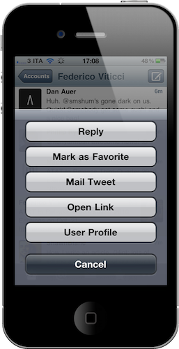
Two things I love about Weet’s timeline: shortcuts (tap & hold to access the menu) and the conversation bubble. Every time a conversation is ongoing between two users or more, a tweet belonging to that conversation gets a sweet bubble icon in the top right corner. The loading animation for conversation is another neat little touch you should notice. If you don’t like tapping on the bubble icon, you can always open the conversation view by hitting “In reply to…” in the single tweet view. Speaking of which, action buttons are integrated within the single tweet window: no need to open other menus or another view. I wish I could customize this menu a little bit, but really - no big deal.
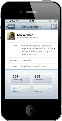
Other features I like about Weet are details, and I think that I switched to Weet for these details. You can customize the tab bar elements, access search, lists and retweets. You can of course toggle your retweets, your tweets retweeted and just “retweets”. When you hit the compose button in the DM view the app asks you if you want to write a new tweet or a new DM. Clever. The user profile screen is clean and minimal, but everything you need is in there. Pull to refresh is supported. You can tweet and read more with Twtmore.
Maybe you won’t like Weet as much as I do. Maybe you’ll stick with Osfoora. Maybe you don’t even know what’s the point in switching between clients when you’ve found a good one that works for you. I switched to Weet because it works for me, because it’s beautiful and does all the things I need. Sure it’s not perfect, but guess what - the official Twitter app isn’t, either. Weet evens works fine on iOS 4.2 beta.
Weet is available at $0.99 in the App Store. if you buy it now, you’ll get early access to the Weet for Mac beta dropping in October. Check out more Weet screenshots below.


