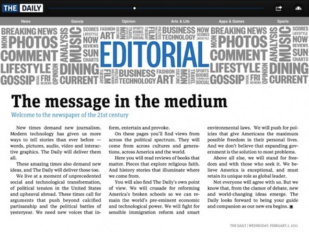
A Typographic Review Of The Daily
Fonts In Use shares our same views on the problems with text in The Daily:
Text typography is still the weakness of nearly every iPad publication. Presented with a device that echoes the dimensions of a printed page, designers — especially those in the news world — feel obligated to stick with print conventions: static text set in justified columns. The Daily suffers the same shortcomings. When the columns are wide enough (see above) full justification works. When columns are any narrower (see below), letter- and word-spacing stretches to distraction, even with hyphenation. I admire the way text layouts change when switching between vertical and horizontal orientation — pull quotes often pop in when appropriate — but the typesetting requires more attention. Articles rarely scroll, but when they do, it works just fine. It makes one wonder whether the very short story lengths are a preference of the design staff or an editorial staff unwilling to put more meat on the table.
It also makes me wonder: will we ever see an iPad newspaper / magazine with proper text manipulation? Does’t that fall under the “interactivity” promised by many publications? [via]


