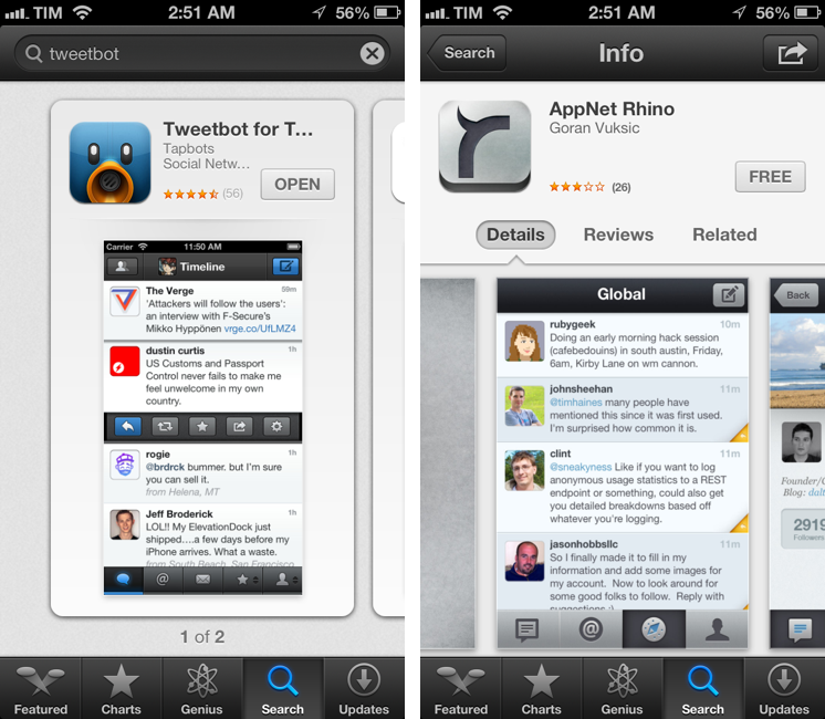
Dissecting The iOS 6 App Store
Justine Pratt has published (via TUAW) a very thorough overview of the new App Store in iOS 6.
The new AppStore, especially the cards, was really designed for the iPad and the faster processor of the iPhone5. Finally the stores on both devices are common, which should help increase the familiarity when browsing both stores. On older devices, the icons and graphics are slow to load and the cards are slow to scroll on the iPhone. This situation is only temporary, as new devices are released and adopted.
In my iOS 6 review, I took an extensive look at the App Store, its new features, and its most apparent shortcomings; Justine does a much better job at carefully analyzing every single section and change in App Store layout and category organization. I also learned a few tidbits from her overview, such as the new positioning of the “App Support” button next to reviews.
Interestingly, we both came to the conclusion that the new App Store seems to really be optimized for the iPad in terms of layout. In the past few weeks, following the release of iOS 6, I’ve heard quite a few people saying that the opposite was true – that the cards layout was meant for the iPhone first, and eventually brought to the iPad with a larger UI design.
Overall, the App Store still has several visible and deeply annoying bugs that hinder the performance of search, Genius, and Purchased History. Apple still hasn’t fixed many of these, and the improved speed of the iPhone 5 only partially contributes to making the browsing experience slightly better.
As I wrote in my review, there are still some noteworthy additions and changes for developers in the new App Store, so make sure to check out Justine’s article for a detailed analysis.


