When it comes to email clients, most Mac users still stick to Apple Mail as their client of choice, although there are plenty good alternatives available. The reasons for that are clear: over years of constant development, improvement and changes, Apple managed to create a powerful, but still clearly laid out program, which fits the needs of both private and professional business users. Diversified labelling options, multiple mail signatures, folders, and diversified reply and creation features are just some examples. Nevertheless, there are still some people out there demanding one specific feature Apple mail lacks: statistics. But, as you know, there’s always an app for that. In this case, it’s Mailsum by Appmasters.
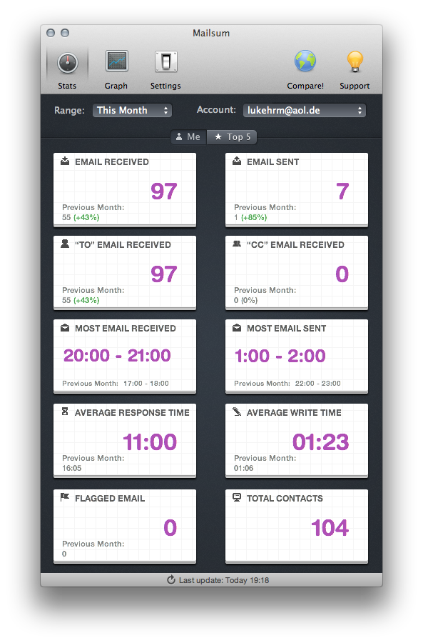
Designed exclusively for Apple Mail, Mailsum frequently scans your mail accounts for interesting information and displays the collected data in various ways. In the simple stats view in the starting window, you can set the exact range of displayed numbers (today, yesterday, last week etc.) using a menu panel at the top. Mailsum provides you the respective information in several categories; Mailsum searches exact data for total mails received and sent, how much “To” and “CC” mails you received, and the time span of the day, during which you receive the most mails. Furthermore, it also displays the average writing time you need for composing a new or a respond mail, the amount of flagged mails, and the number of contacts attached to the respective account.
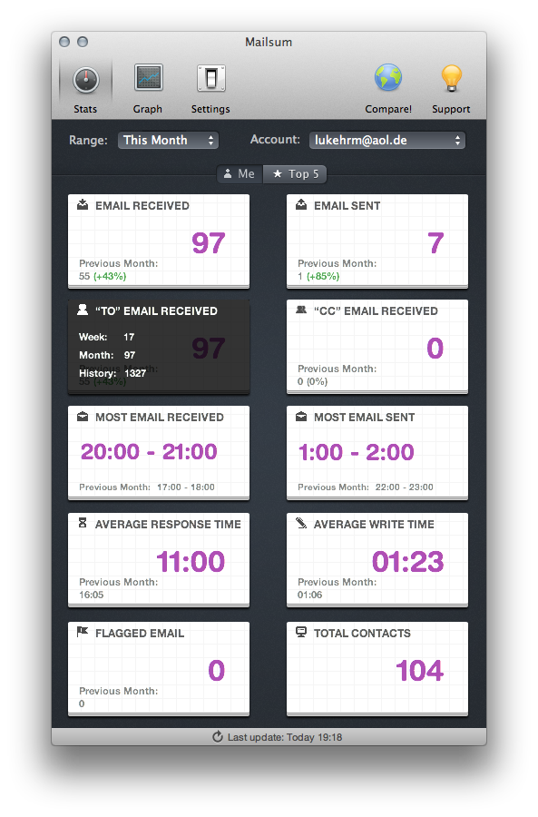
Information for the current day is displayed in notepad-like panels (one for each category). Those panels are arranged in a list view, which optionally update automatically. Each panel also contains the last day’s data to directly compare the averaged data to your current activity — hover over a panel to investigate last week’s and last month’s data as well. The second method the stats view uses to display the stats are the “top 5″ lists: the recipients you send the most mails to and the people who mail you most frequently. Just to be clear: the app only scans your mail’s header information (it won’t store or upload any private data).
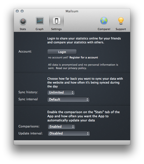
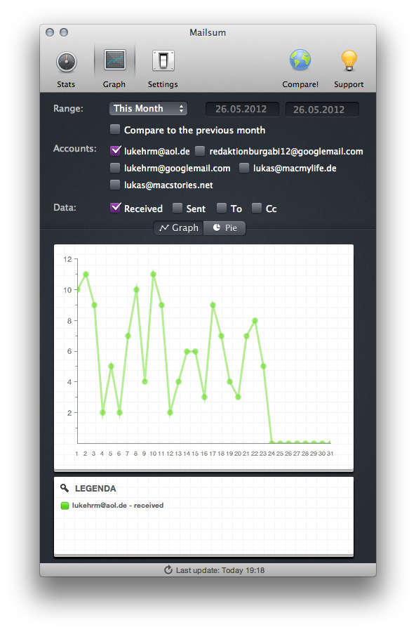
Mailsum doesn’t just collect and list this information, it also visualizes it as well. Click the “Graph” panel in the nav bar, and Mailsum lets you take a look at the changes of the different data over time. Just set an exact range for accounts which should be included into the visualization (so you can compare traffic between your accounts). Then up comes a graph, or, optionally, a pie chart. Mailsum has nice comparison possibilities, but enhances them by offering another, to me, pretty narcissistic and exaggerated feature: online comparison with your friends. It works as follow: you can set up an account at Mailsum.com, add other Mailsum users around you, and upload your stats (sharing them via Twitter is possible to, which I consider even more dumb). Within seconds the web app generates a list of how many mail conversations you and your friends have, with the intention of showing how productive you are, but comes off as feeling like a competition for who has the most mail friends. Honestly, it’s one thing to compare your own accounts, but it’s definitely too much to compare that data online and make users compete on how much traffic their mail inboxes can generate.
Fortunately, Mailsum has another feature, which justifies online sharing a bit: business plans. By subscribing to a plan, starting at $2 a month for 1 to 10 users for small businesses, you can have an overview of how many mails your employees sent, and to whom. That might be pretty useful to check on the frequency of emails sent against overall performance, and it’s definitely the only justifiable use of the “Top list” online comparison feature.
Before I forget: Mailsum also looks nice. It’s a pretty difficult task — formatting numbers and data graphs and embedding them into a nice UI is not easy. But Appmasters got it right and earned the right to use that name. As I already mentioned earlier, data (displayed as big violet sans-serifed characters) is framed by notepad-like panels. Those are surrounded by a custom designed, black UI, of which some elements like the checkboxes are also colored in violet, which conveys an overall coherent user experience. The top navigation bar features nice icons to indicate the various panels. Just the two on the right side (“Compare!” and “Support”) are a bit misleading: users intentionally consider them as panels but, but in reality, they are not well-indicated links to the app’s website behind them, which is pretty annoying when trying the app out for the first time.
If you’re emailing often and want to keep tabs on your use, Mailsum can provide some interesting insight. But it’s still for a very specific user base; even when you’re a “pro user”, you still do not really need the kind of statistics the app collects and displays for you. But if have that that need, it should perfectly suit your desires. Mailsum is available on the Mac App Store for $4.99.


