We all love Twitterrific for iPad, right? It’s a beautiful app, with all the features that you need, yet it’s simple and user friendly. It turns out that after the launch of the iPad and the App Store grand opening, the Iconfactory (developers of the Twitterrific apps for iPhone, iPad and Mac) realized that Twitterrific for iPad was the iteration people liked most: the Mac version was stuck at somewhere between 2008 and 2009, and the iPhone version had become something they weren’t proud of. They wanted to rewrite the apps starting from the fresh and powerful new codebase of Twitterrific for iPad. And so they started working on Twitterrific 3.0 for iPhone and 4.0 for Mac.
Gedeon Maheux, over at his personal blog:
“Somewhere during Twitterrific’s evolution from the desktop to the iPhone, we forgot how to say no. We said yes to too many of the latest features, 3rd party services and user requests. Eventually this “leap before you look” approach increased the complexity of the user interface and made the app’s settings too confusing for even us to figure out. A growing chorus of users told us the app was too hard to understand. We had lost our way.”
This is absolutely true. The current version of Twitterrific for iPhone is pretty, but it’s difficult to use. It doesn’t feel natural and it doesn’t manage to provide a fast and pleasant Twitter experience as much as the iPad one does.
David Lanham, designer, goes even further:
“As a first step, we decided to take a step back and re-evaluate our approach. We want to make Twitterrific quick and light with a focus on content and usability rather than feature count. We will continue to add necessary features and updates to Twitterrific, but we’ve decided to only add features that will enhance the experience and avoid adding them because it’s easy or just because we can.
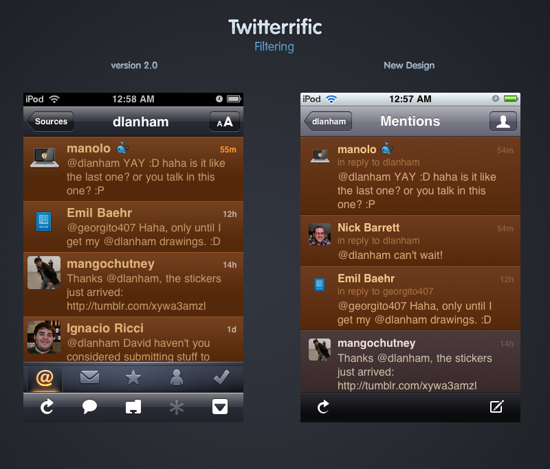
One of the biggest challenges was balancing a simple layout with the need for about 10 possible actions on each tweet. It’s very easy to send the interface spiraling off towards the black hole of over-complication. In the previous versions of Twitterrific we’ve relied on a selected state for tweets before you can perform an action. This design led to needing an action button in the toolbar, which after we thought about it, seemed unnecessary since the main reason you’d select a tweet was to perform an action on it. So now actions have been separated into two main categories: actions that affect the timeline and actions that affect only you. This gave us a logical way to divide the actions among two buttons with the addition of a star for easy access to adding a tweet to favorites. Tapping any avatar will also bring up a user’s profile so we no longer needed an explicit button for profiles.”
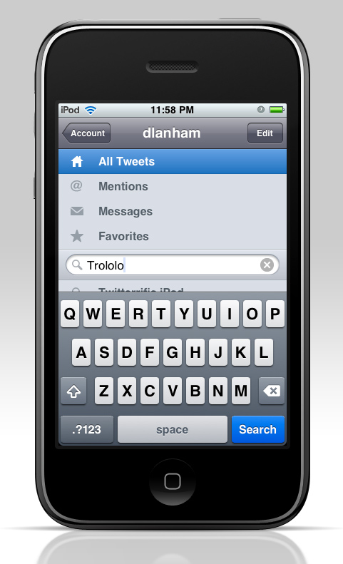
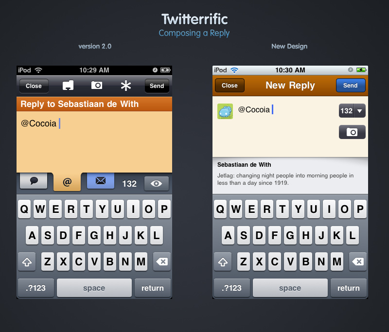
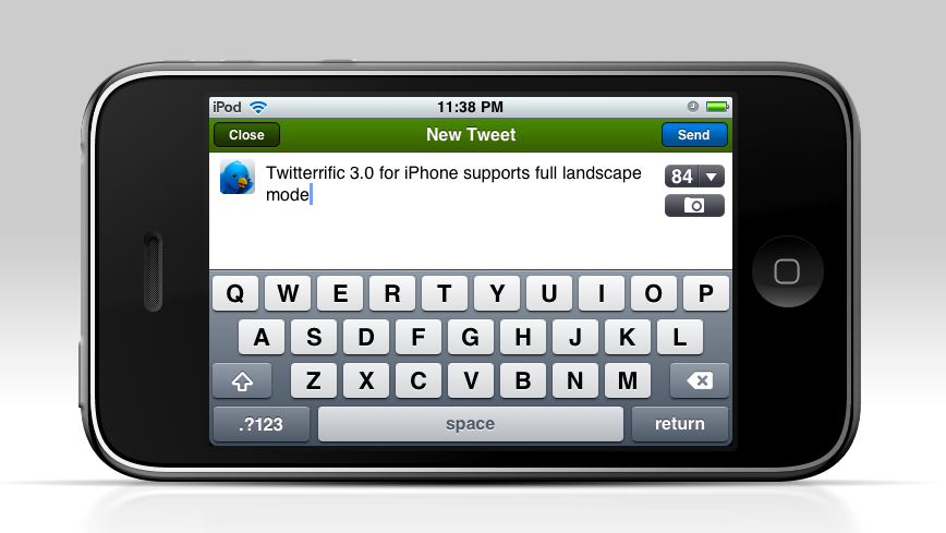
So there you have it folks. The new version of Twitterrific for iPhone will come out soon, and the new Mac version is in the works too. They will both share the same “Flamingo” codebase and keep a consistent look across iPhones, Macs and iPads. Check out the first screenshots of the new Twitterrific for iPhone below.


