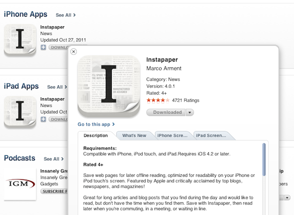
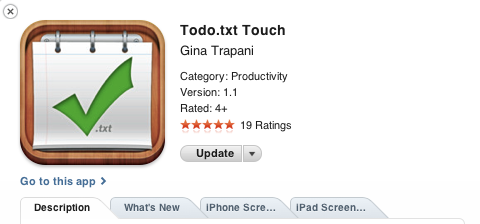
As first noticed by iSpazio [Google Translation], it appears Apple has introduced sometime earlier today a new “quick look” preview feature for App Store search results on iTunes. When searching for apps in the desktop application, in fact, users are now able to click on a small “i” button next to an app’s icon to get a modal preview with additional information about the app. The new preview window organizes Description, What’s New and Screenshots in multiple tabs, and separates iPhone screenshots from iPad screenshots when the app is universal, as with the example above.
You can try the new app preview system by starting a new search in iTunes (here’s a search for Instapaper).
Personally, I believe this minor addition greatly improves usability and app discovery in iTunes. Not only it makes app descriptions more readable (it’s easier to scan information and changelog with tabs), it also allows users to browse top charts and categories without having to go back and forth between the main results and a single app page (often losing view options like “sort by release date” in the refresh process). Recently, Apple also introduced a minor update to the iPad App Store that made swiping through apps more intuitive.


