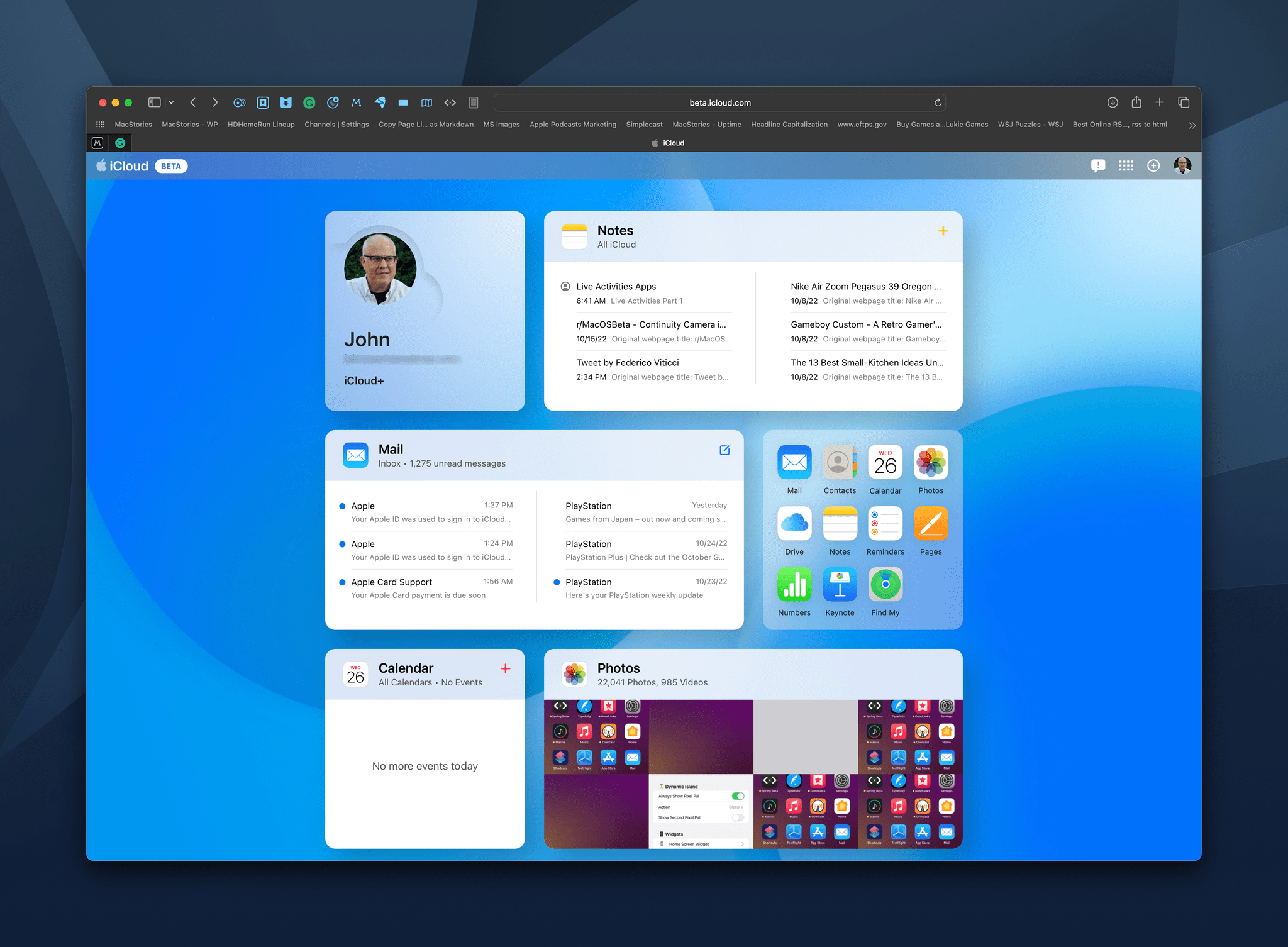
Today, Apple launched a preview of changes coming to iCloud.com, the website that allows users to access their iCloud data and apps, including Mail messages, notes, photos, tasks, and more. The new card-like UI is available to anyone who wants to try it by visiting beta.icloud.com and logging in with your Apple ID.
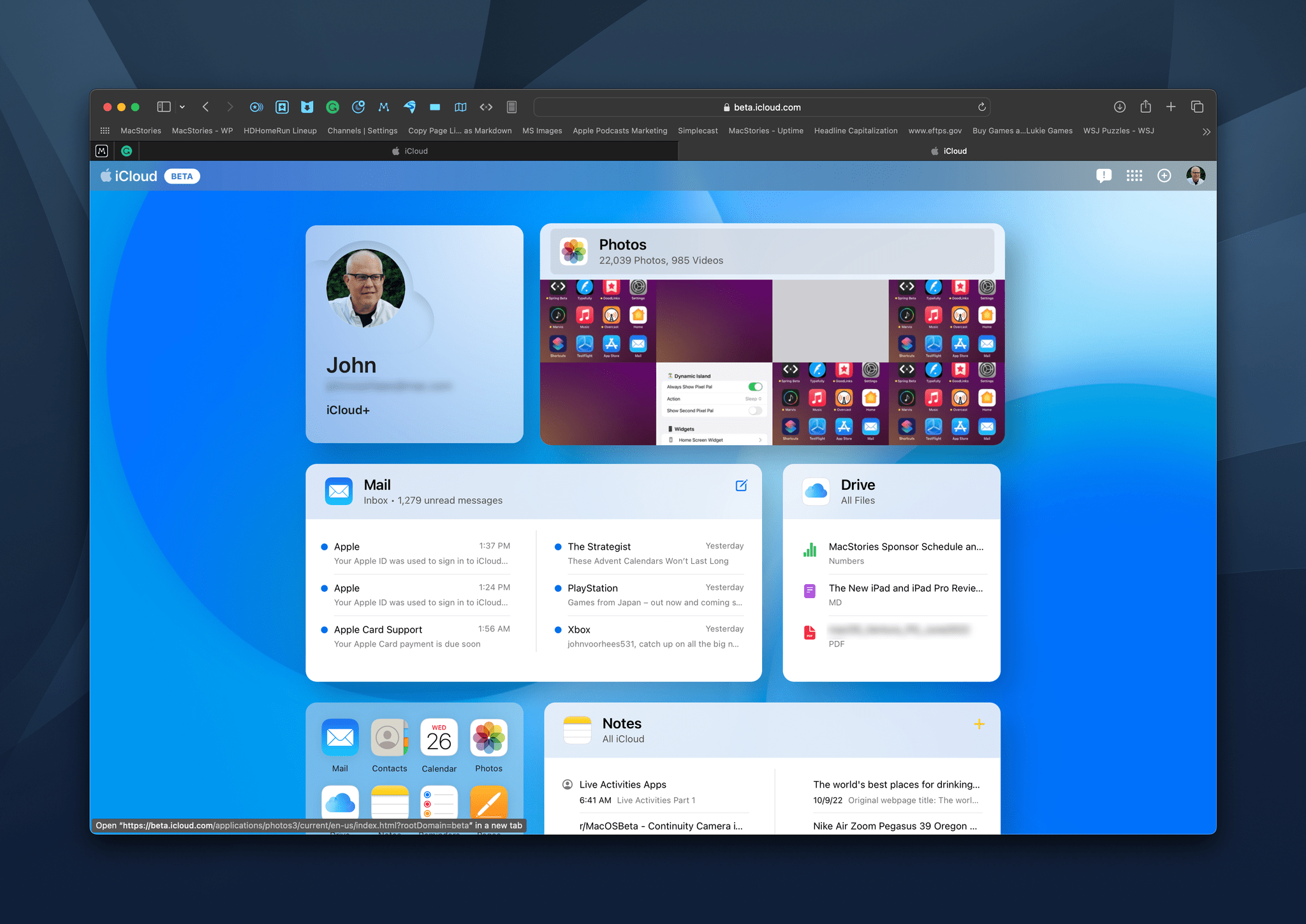
The cards are laid out in a grid with a rectangular and square tile per row on larger screens and a single column of cards on narrow screens like the iPhone. When you first launch the preview page, you’ll see your Apple ID profile picture, email address, and type of iCloud account, plus several app tiles.
However, other than your profile tile, everything on the preview page is fully customizable. Currently, there are tiles available for Mail, Photos, Notes, Reminders, iCloud Drive, Calendar, Numbers, Pages, and Keynote. Contacts and Find My are also accessible from the preview page but don’t have their own tiles.
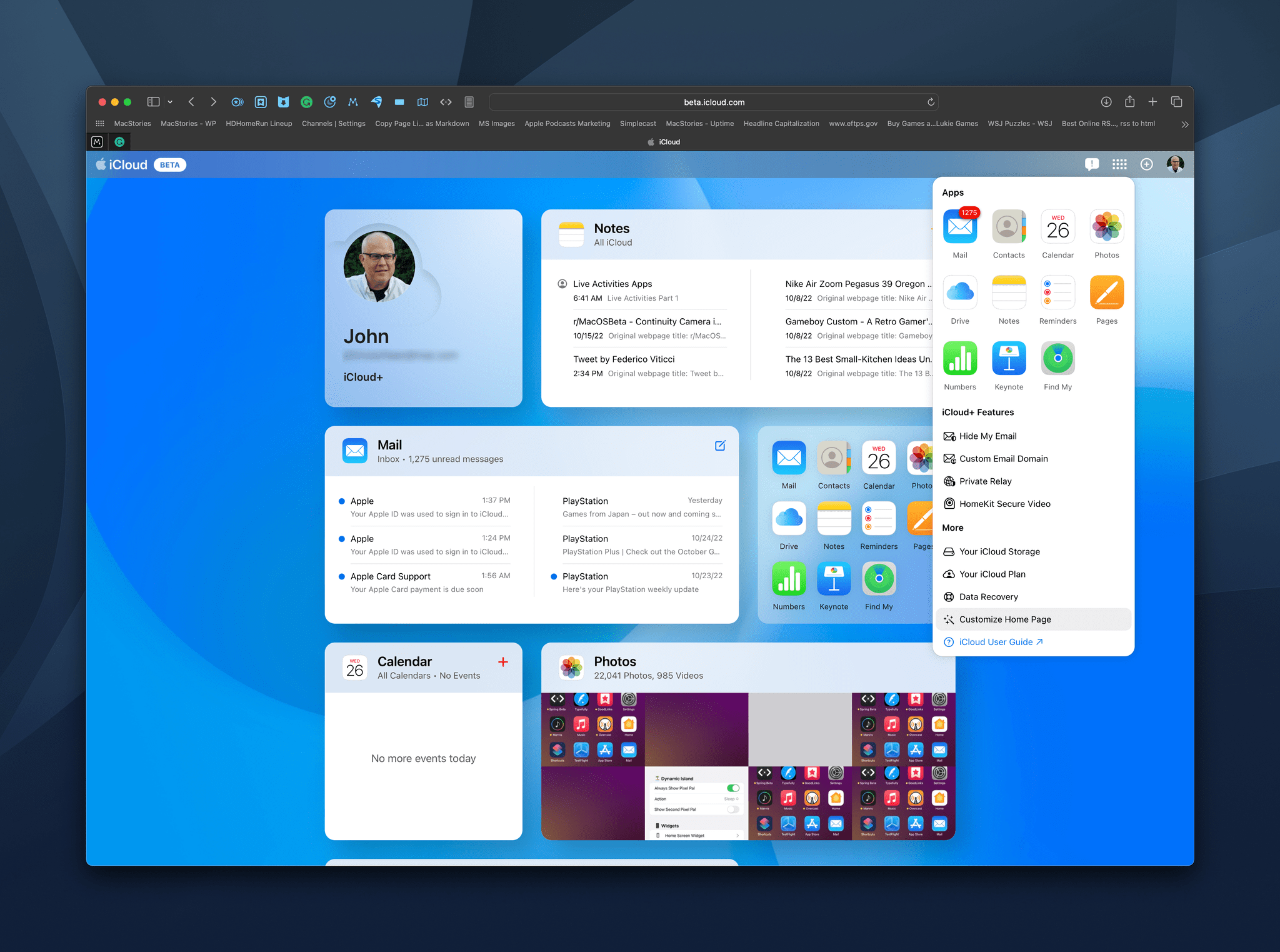
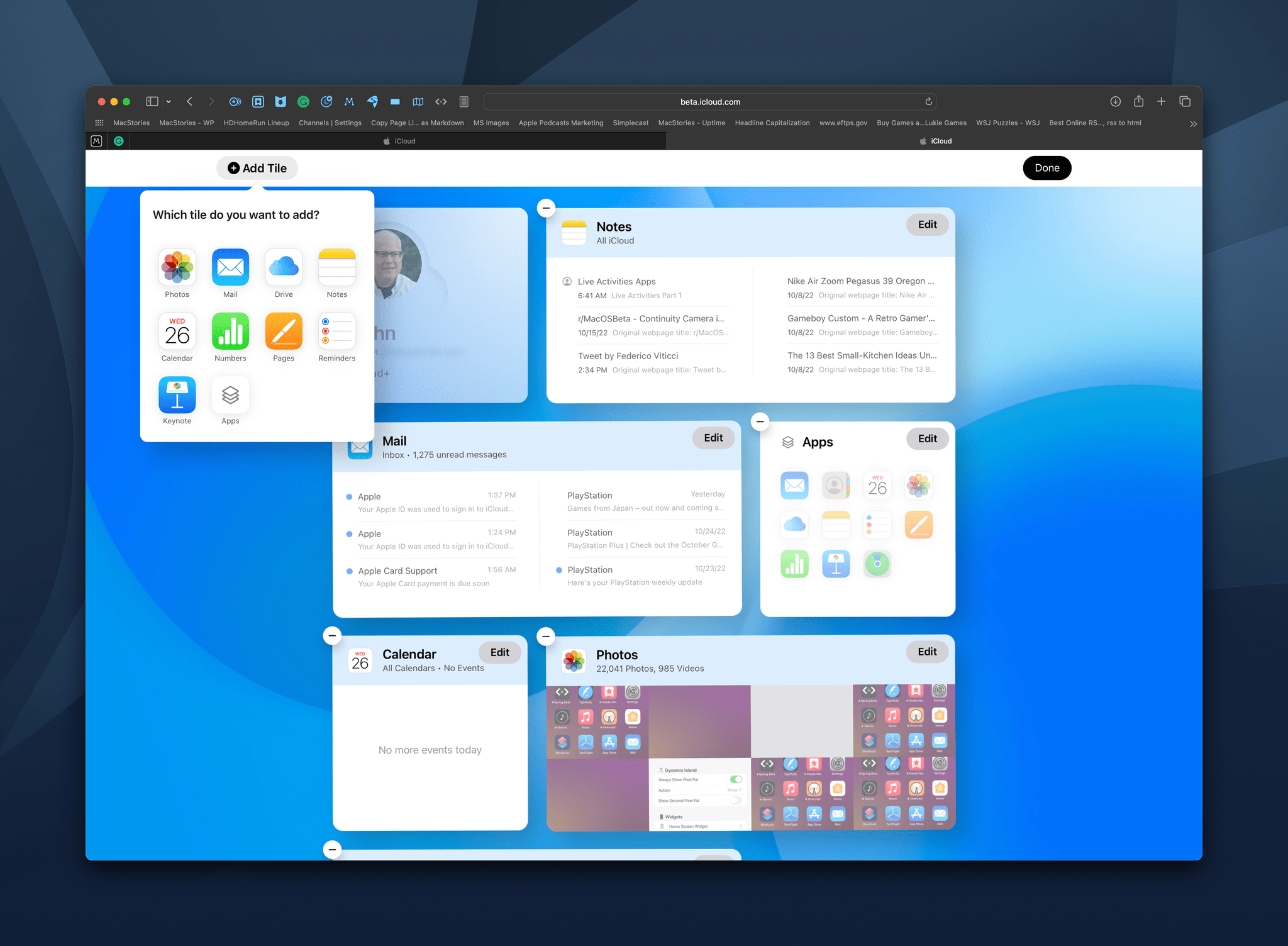
To customize the page, select the button in the top right corner that looks like a grid of icons, and the webpage’s UI will go into a jiggle mode similar to when you long-press on an iPhone or iPad’s Home Screen. From here, you can rearrange existing tiles, remove ones you don’t want, and add new tiles.
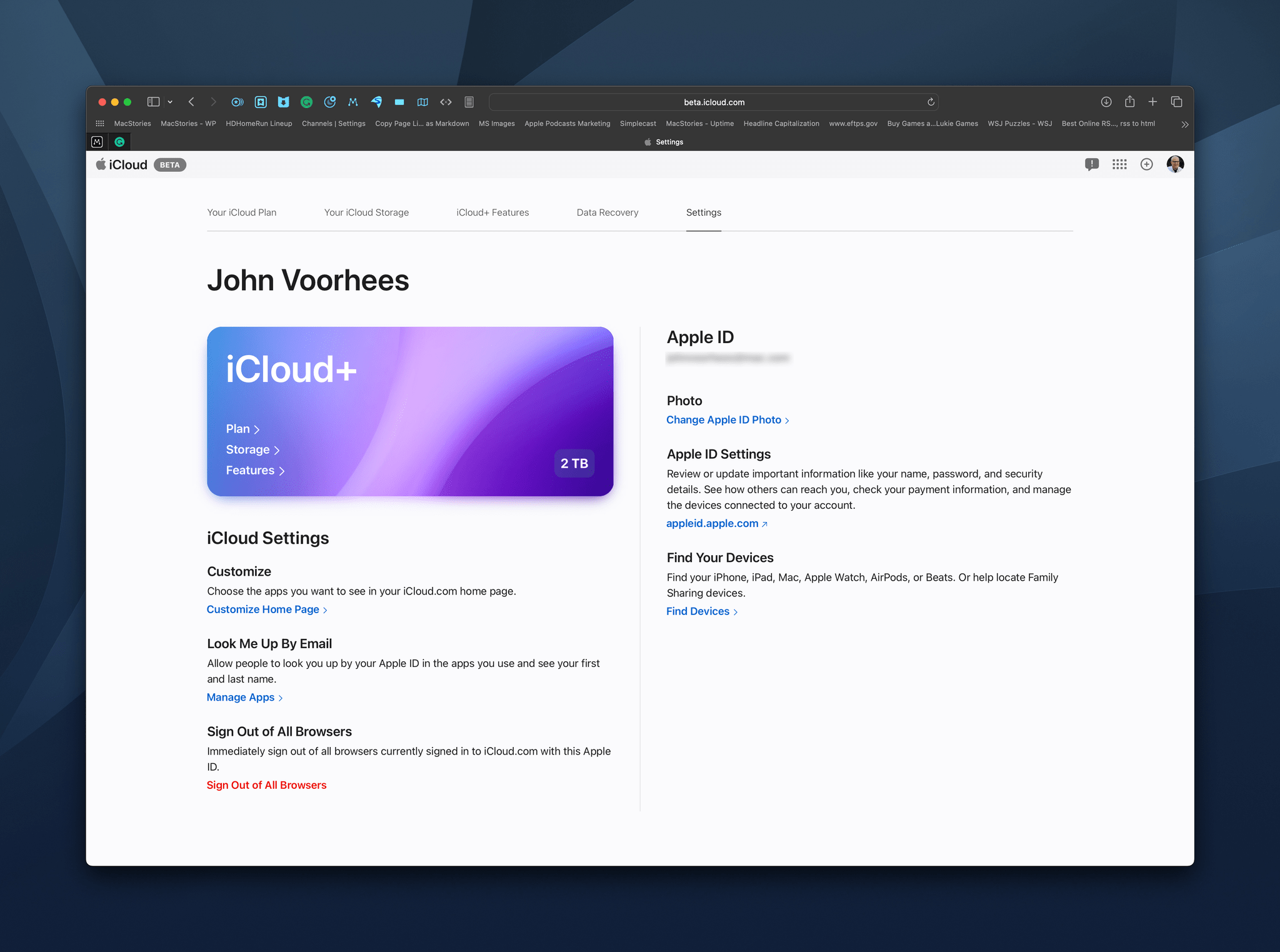
Each tile works a lot like a Home Screen widget, displaying recent data stored in that app. Click on the tile, and the full web app opens. Clicking on your profile tile offers details about your iCloud subscription and links to related actions. The same button you use to access the preview’s customization features also provides access to all of the iCloud web apps, iCloud+ features, like Hide My Email, and more. Finally, there’s also a dedicated ‘Plus’ button for creating new items or documents in many of the iCloud web apps without the need to launch the associated app first.
I like the preview’s design a lot. It beats the static grid of web app icons of the existing site, which is still available if you don’t use the preview, by providing an overview of recent data in each apps. I’m also a fan of the page’s customization tool, which makes it simple to organize the page with an emphasis on the apps you use most.
Based on my very limited testing, the preview page is quite stable too. I did run into an error accessing my iCloud Drive documents, but that’s been it so far. Once finalized, the new iCloud.com page is going to be a very nice upgrade for anyone who needs to access their account and data from a device that’s not their own, such as a work PC.
To give it a try yourself, go to iCloud.com, log in with your Apple ID, and use the link above your profile picture on the existing page design, or go straight to beta.icloud.com and log in there.


