I’ve watched a lot of sessions this week. I’ve been impressed with the production quality of them all and the shorter, more condensed format of many of them. I’m still working my way through everything that has been released, but my favorite sessions by far have been the ones presented by Apple’s design team. Through a combination of under-the-hood peeks at how various design elements work and practical tips for implementing new UI controls, the sessions are terrific resources and provide fascinating insight into where design is heading across all of Apple’s products.
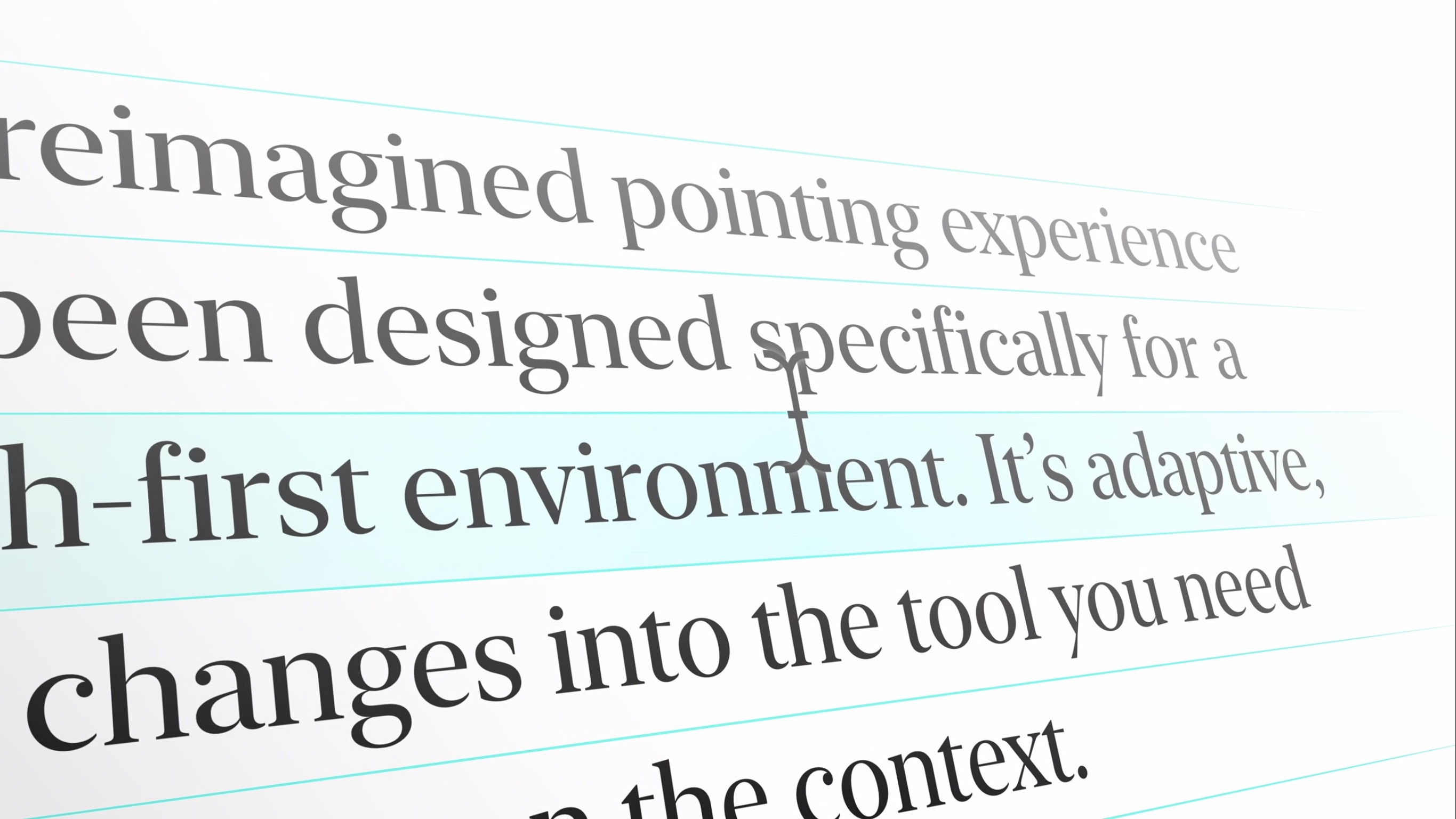
Probably my favorite session of the bunch has been Design for the iPadOS pointer. The session explains not only how the pointer works on iPadOS, but why it works that way through a technique called adaptive precision that accounts for the context in which the pointer is being used to define its level of precision. The talk also covers pointer inertia, magnetism, and interaction with controls and other screen elements. It’s an excellent place to start for anyone adapting an iPad for pointer support.
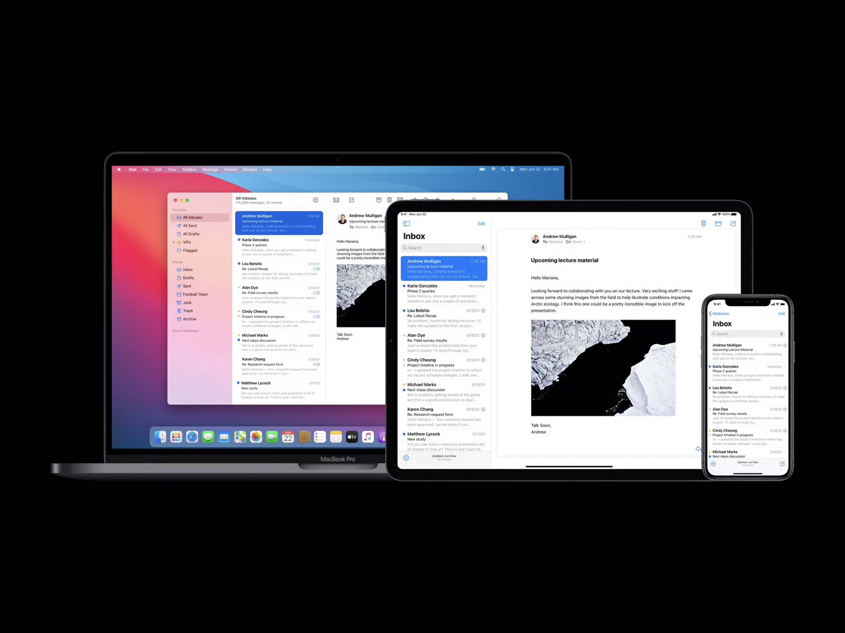
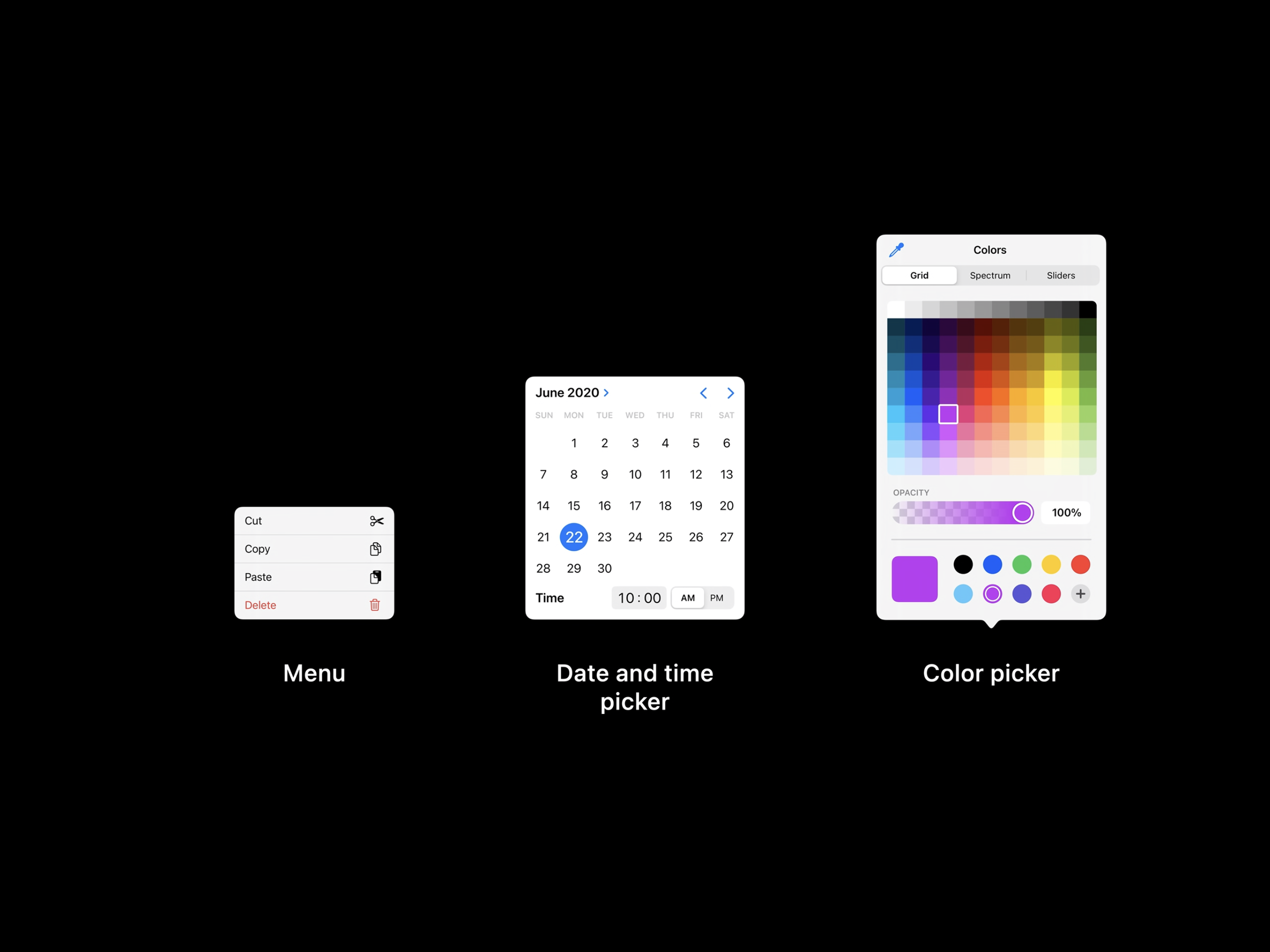
One of the big picture themes that I came away with from the design sessions I’ve watched so far is the emphasis on designing for the unique qualities of each platform’s hardware. As Design for iPad explains, this doesn’t just mean designing something in between a Mac and an iPhone for the iPad, it also requires developers to consider what makes using an iPad different from either of those platforms. Having used far too many iPad apps that feel like blown up iPhone apps in the past, I hope this session is watched by a lot of developers and designers. I also enjoyed the Design with iOS pickers, menus and actions session, which explains the migration away from (but not complete elimination of) action sheets and popovers in favor of pickers and menus.
Finally, I want to mention the SF Symbols 2 and the details of UI typography sessions. I’m a big fan of SF Symbols. I love the consistent look and feel they provide across UIs. This year there are over 750 new glyphs including Apple device, transportation, game controller, and human-related images, plus multicolored symbols for the first time.
As someone who looks at text all day, I also enjoyed nerding out on typography with the details of UI typography session. It’s a fun deep-dive into a subject that I don’t know well, but appreciate for what it adds to an app’s experience.
Even if you’re not a developer or designer, the design sessions at WWDC are some of the most accessible talks released this week. I highly recommend them to anyone who has any interest in how the apps they use are made and the care that goes into the process.
You can also follow all of our WWDC coverage through our WWDC 2020 hub, or subscribe to the dedicated WWDC 2020 RSS feed.


