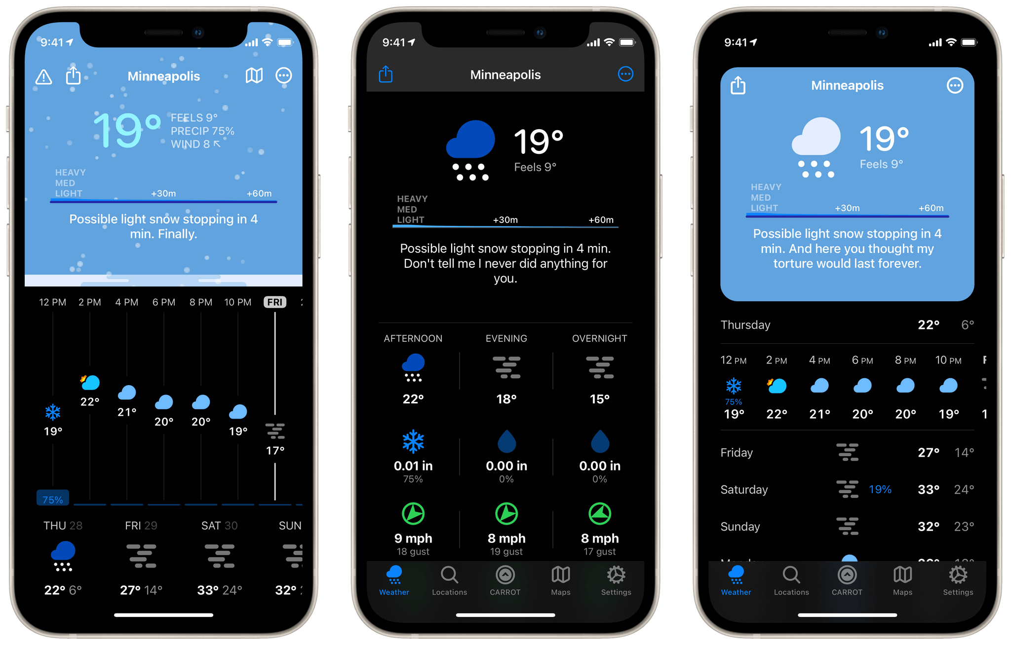
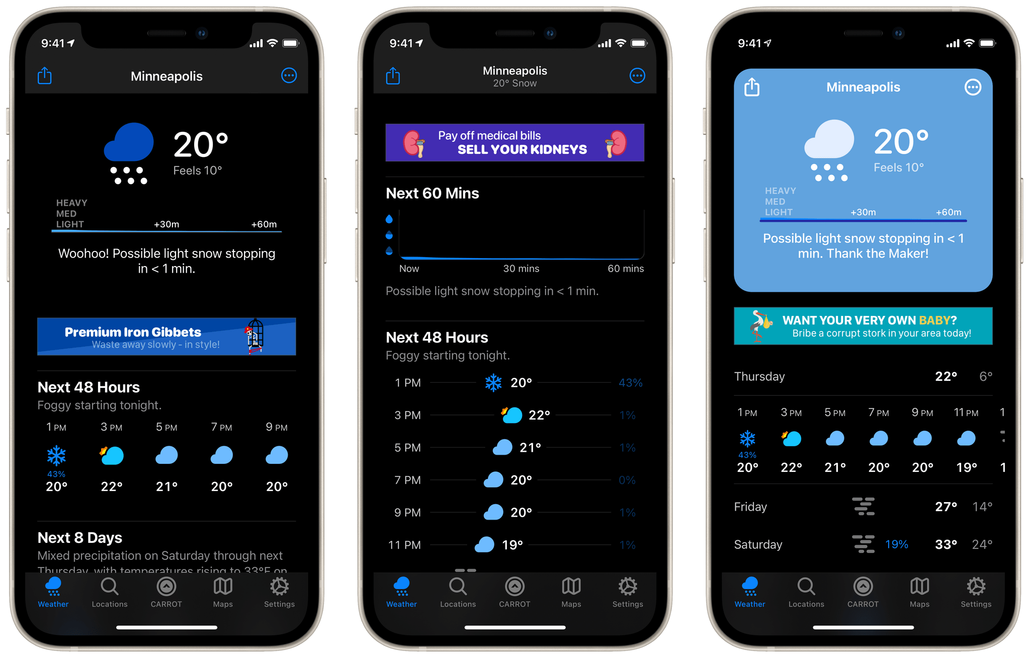
CARROT Weather has been a MacStories favorite for years now. Just last month we named it the Best Watch App of 2020 in our annual MacStories Selects awards. One of the impressive features in CARROT’s Apple Watch app is the ability to customize the interface to display exactly the weather data that you’re interested in. With today’s release of CARROT Weather 5, developer Brian Mueller has brought that same concept to the iOS and iPadOS versions of the app. The major update also includes a host of new icon designs, snarky weather responses, achievements, and fun Easter eggs.
CARROT’s new interface builder is an ambitious approach to designing a weather app that can appeal to anyone. Mueller has recognized that one of the reasons there are so many weather apps out there is that everybody has different opinions on exactly what data they want surfaced and how they prefer to view it. With the interface builder, CARROT Weather makes it possible for you to tweak the app to fit your exact preferences.
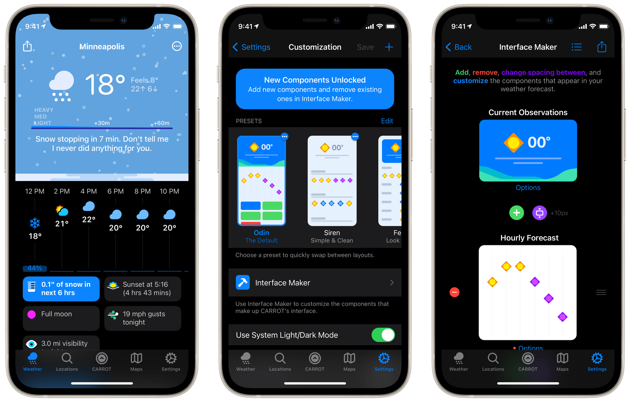
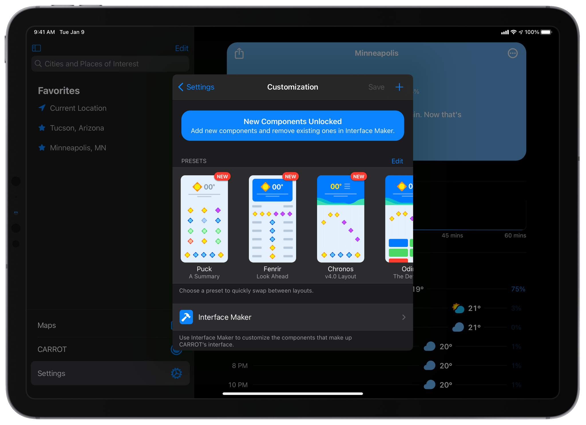
CARROT’s Customization screen is made up of three sections: presets, the ‘Interface Maker’, and a handful of toggles for tweaking the app’s tab bar. Presets are saved interfaces which you’ve built that you can then switch back and forth between. The app comes with six default presets, all of which look very different. There’s nothing special about the default presets though — you can delete them or duplicate them from scratch in the Interface Maker — they just exist to get your brain working on the different possibilities.
If you don’t want to construct an entire interface from nothing, the default presets are a great starting point1. Pick one that you like the best, then use the Interface Maker just to tweak it to fit your exact preferences of weather data. For instance, I’ve never really cared about the long vertical lists of daily highs and lows for the next week. In most weather apps I just ignore this element, but with CARROT Weather 5 I can pop open the Interface Maker and just delete that item entirely.
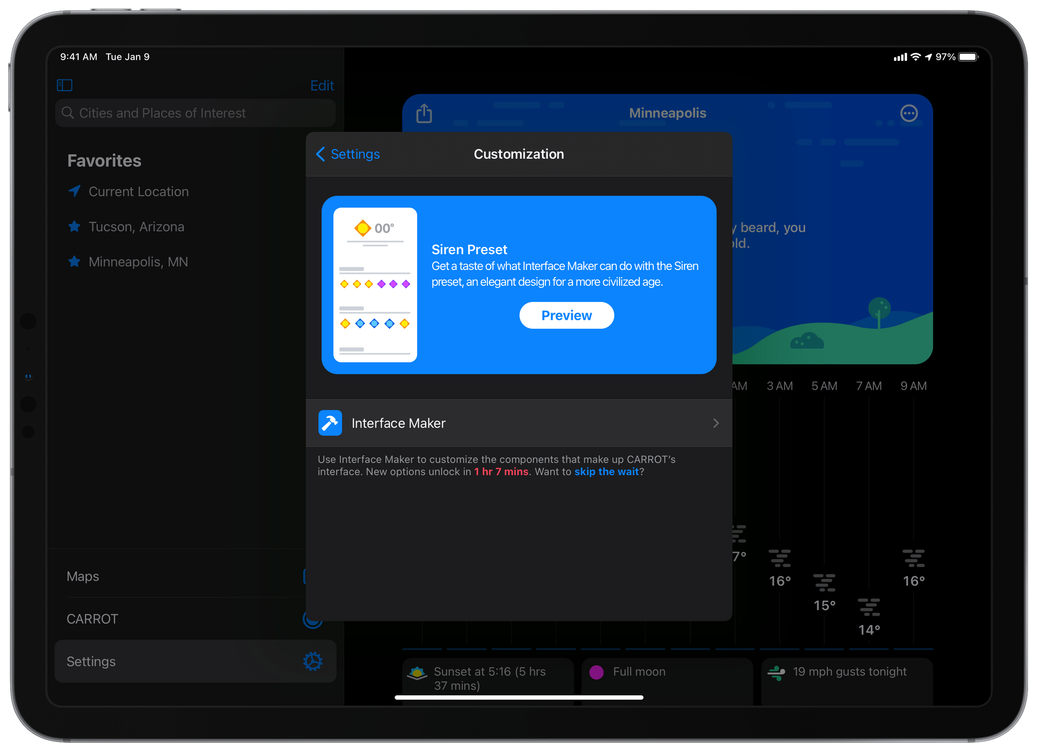
The UI for working with the interface is a bit intimidating at first. Mueller seems aware of this though, because he’s set up a system which tries to introduce you to the vast array of options slowly, day by day rather than all at once. When you first navigate to the Customization view (Settings tab > Customization, or follow one of the in-app prompts that pop up), you’ll only see one preset and the ‘Interface Maker’ button. Tapping into the Interface Maker lets you edit the preset, but you can only tweak the data that its surfacing (such as switching from actual temperature to “feels like” temperature, or reordering the wind speed card to come before the precipitation card). CARROT wants you to get adjusted to these options before jumping into the more advanced work of adding and removing entire elements from the interface or adjusting the spacing between elements one pixel at a time.
To unlock the next set of options, you can wait and come back to the app 24 hours later, or you can just press the ‘skip the wait’ button to unlock everything immediately. Once you’ve unlocked everything, you’ll see new buttons in the Interface Maker for adjusting spacing, adding elements, and deleting elements.
To actually edit an interface, first select a preset from the default options or create a new one using the ‘+’ button in the top right corner of the Customization screen (you have to fully unlock the screen to see this button). Once you tap a preset the app will bump you to the main ‘Weather’ tab to preview it — you’ll see ‘Set’ and ‘Cancel’ buttons at the bottom which allow you to lock the interface in or go back to your previous selection. With a preset selected, go back to Settings > Customization and tap the ‘Interface Builder’ button to make changes to the preset. From here you can add or remove elements, edit particular elements to display different data or use a different design, and add custom amounts of spacing between elements. Each time you make a change, you can tap back to the Weather tab to see your edits reflected in the live preview. Return to the Settings tab to keep making more changes.
When I first looked at Interface Builder I thought the spacing options were a little pointless — why add blank space into my interface? I came around on it though when I created an interface that happened to leave a small gray divider line about 4 pixels above my tab bar. I was able to just add 4 pixels of spacing to the element above it and this line perfectly disappeared. With everyone using different sizes of phones these days, small spacing options like this can help you get back that pixel-perfect feel of iOS apps from the original 3.5”-screen era.
There are too many individual elements to cover all of them here, so you should hop into the interface builder and start playing with them yourself to see the options. That said, the ‘Cards’ element is one of the most interesting, so we’ll take a deeper look into that.
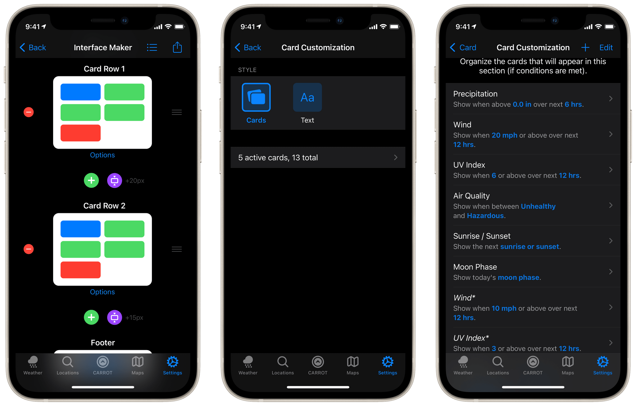
If you tap into a Cards element in the Interface Maker, you’ll be presented with a list of data points (such as precipitation, wind, UV index, etc.) and rules for when to show them. Some of the data points might even be duplicated in the list. This is confusing at first, but you’re actually looking at an ordered list of rules for when to show a card for each data point. For example, you can set your Cards element to only show precipitation when it’s going to rain in the next 6 hours. If rain isn’t forecasted, you won’t even see the precipitation card show up.
Adding multiple of the same data point to the list allows you to create complicated ordering rules. Maybe you want the precipitation card to be at the very top when it’s going to rain in the next 6 hours, but you want it to be lower down if it’s only going to rain sometime in the next 7 days. You can add a second precipitation card lower in the list which looks for any rain over the next 7 day period. This card only shows up if the higher priority 6-hour rain card is not active.
The card ordering is definitely tough to wrap your mind around, but it’s a very powerful option for custom data displays. If you’re worried about high wind or UV indexes, or poor air quality, you can make sure those items bubble to the very top of your weather data when they are active. This ensures that you don’t miss that information while allowing you to not waste space on it when it isn’t relevant.
When you’ve finished composing your perfect interface, head back to the Weather tab and tap the ‘Set’ button to save your changes and lock in the preset as your selected option. Thankfully, CARROT is not picky about you remembering to do this. If you forget to save then it will keep the edited preset as your selected interface, and the Set/Cancel buttons will even go away next time you open the app. However, the next time you try to swap interfaces the app will ask if you’d like to save the changes you had made to the last one.
What I love about CARROT Weather’s interface builder is that all of the available elements have been beautifully designed and are cohesive together. While the options for customizing your personal layout are infinite, there’s essentially no way to end up with an interface that looks bad. I find this freeing rather than constraining, because I don’t have to worry about my tweaks ruining the nice look of my weather app.
CARROT Weather 5 also introduces a new business model for the app, but the developer has taken steps to make sure that previous users are as unaffected as possible by the changes. CARROT Weather 5 is now a free app with a premium subscription tier rather than a paid-up-front app with an optional subscription on top of that. For existing users who paid up front, Mueller has promised that all features which you already paid for will continue to be available forever. New free users will get a subset of these features, and will also see banner ads in the app.
Amusingly, Mueller still seems to be working out what he wants to do for the ads, so right now some of them will be free ads for other indie apps, and others will actually be for entirely fake products. Mueller has promised that, while he may actually sell these banner ads in the future, he will never sell his users’ data or embed sketchy third-party SDKs into the app.
If you’re already a premium subscriber, your pricing has been locked in at its current level. In other words, for premium subscribers absolutely nothing changes. For people who bought the app but didn’t subscribe, you might not get future new features but you’ll always have what you already paid for. Furthermore, if you choose to subscribe in the future, you get access to the same now-legacy subscription pricing that existing subscribers are locked in with.
Many weather apps tend to become feature complete and then stagnate over time, but CARROT’s amazing personality and creative depth have always helped it avoid this fate. The new interface builder and customization settings are the excellent headline features of CARROT Weather 5, but don’t miss out on digging into the new hidden gems that Mueller has scattered throughout the app. You can long-press on tab buttons for quick actions, and there are fun new achievements to explore in the CARROT tab. Some achievements can be found by navigating to various city locations to view different types of animated weather scenery, and sometimes by interacting with it. I won’t spoil the fun, but do make sure to be careful around nuclear reactors.
CARROT Weather 5 is available in the App Store as a free download, with in-app purchases to unlock its full feature set.
- In fact, when you create a new preset, it always picks a random default preset as a starting point. If you really want to start from scratch though then you can delete all of the elements before adding them back as you want them. ↩︎


