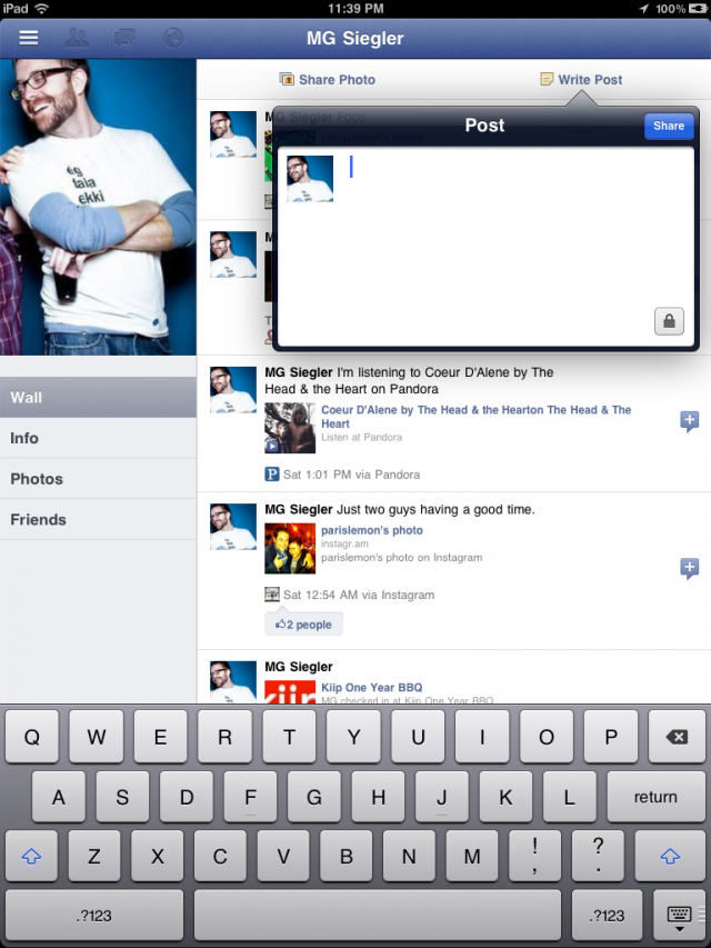
As revealed by TechCrunch, it appears the official Facebook app for iPad may become available in the App Store relatively soon, as the iPad app is actually hidden away, inside the iPhone app and actually executable! It is unclear when and how Facebook will announce the availability of Facebook for iPad, however as MG Siegler explains, it is a completely re-imagined Facebook experience for the tablet that takes advantage of the iPad’s screen to lay out a different view for your photo albums, friends, profile, and more. The app does seem to use an iPad optimized web view in the main Facebook interface (just like on the iPhone), but several other UI elements are native to iOS and built specifically for the iPad.
Facebook for iPad uses a concept not too dissimilar from Twitter’s iPad app – rather than displaying all content vertically, the app heavily relies on horizontal navigation to access various Facebook sections, the news feed, chats, liked posts, and so forth. For instance, a sidebar on the left contains tabs below your main profile to open your News Feed, Messages, Events, Places, Friends, and Photos. In the same sidebar, there are links to jump to the groups you’re subscribed to – it almost appears as Facebook wants to put the focus on Groups as much as Google gave Circles, its friend-organization tool, a huge role in Google+. There are two top bars in the middle panel: one has buttons to upload photos from your iPad’s camera and library, the other two are associated with a regular status update and check-ins. In the blue toolbar, the app has a series of additional icons to open the friend requests panel, messages, and notifications – this looks very similar to Facebook on the desktop, and the design is very distant from Facebook’s implementation on the iPhone. There is also a search function in the app, though it’s been placed at the top of the sidebar, rather than the toolbar. As for the stream, judging from the screenshots it seems to be a web view optimized for the iPad’s new app UI.
Facebook for iPad includes a Chat sidebar on the right and a full interface for Messages, which look very similar to Apple’s own iMessage model – at least as far as the design goes – with recipients listed on the left and the actual message inside a larger panel on the right.
UPDATE: TechCrunch has posted an album-full of screenshots of the app here. We’ve embedded a sample of these below the break, but here’s one:
[Via TechCrunch]


