News Corp.’s much hyped foray into an iPad exclusive digital Newspaper has just launched and it has some high expectations to live up to, not only for consumers but for Murdoch’s News Corporation which has endured a shrinking reader base and advertising revenue. Jump the break for our first impressions and a tonne of screenshots of the app.
OK well that’s it for our first impressions, undoubtedly some of us here at Macstories will in the next day or so write up an in-depth summation of our feelings towards The Daily so keep an eye on the site and our Twitter account for that!
Content
Whilst we’ll have to see over time how much and how good the quality of journalism is, first looks seem to be positive. With up to 100 pages each day (obviously depending on how busy the news is), The Daily definitely sets a high standard quantity-wise and quite a bit higher than most other Newspapers on the iPad at the moment.
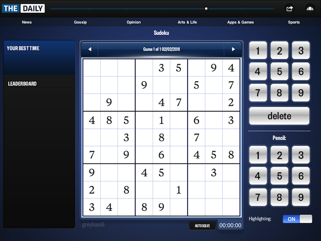
There is also an interactive game of Sudoku and Crosswords! In fact there is even Game Center support, check out the screenshots.
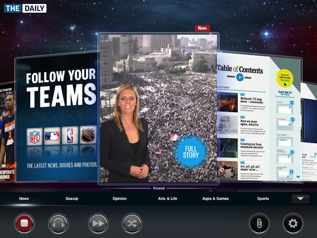
It’s pretty hidden away but when you are on the carousel view if you click the arrow on the far bottom right a new pop up will appear down the bottom. In that are some buttons amongst those is a TV icon and headphone icon, by clicking the TV you get a TV news style break down of the top news via video, the headphones allow you to listen to audio versions of selected articles.
Social
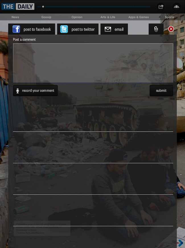
The Daily allows for sharing articles via email, Twitter and Facebook. Because The Daily is essentially a paywalled newspaper only that article that is shared can be viewed outside the app.
Tweets are actively featured in the corner of some articles, for example as shown below there is Twitter box that shows tweets about the Egypt protests.
Sadly text can not be selected in articles which diminishes the ability of quick tweets of a specific fact or such.
Poll’s are also dynamically placed in certain articles and users can vote and view the results easily and simply.
Design
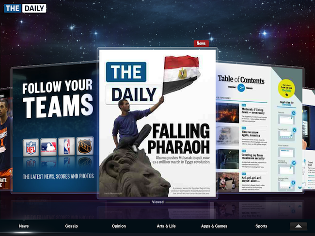
When you launch the app you launch into a carousel view, this is like a contents page, just prettier. The Carousel only has the contents page for each section, so to change just click one of the tab’s right down the bottom of the page to go from News to Gossip. Unfortunately this carousel view is laggy, not terribly unusable kind of lag, but just plain annoying. Its actually quite jarring.
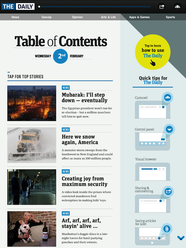
If you don’t like the carousel just jump into the first page of any of the carousels and slide across horizontally to navigate through, theres also a more typical contents page there too.
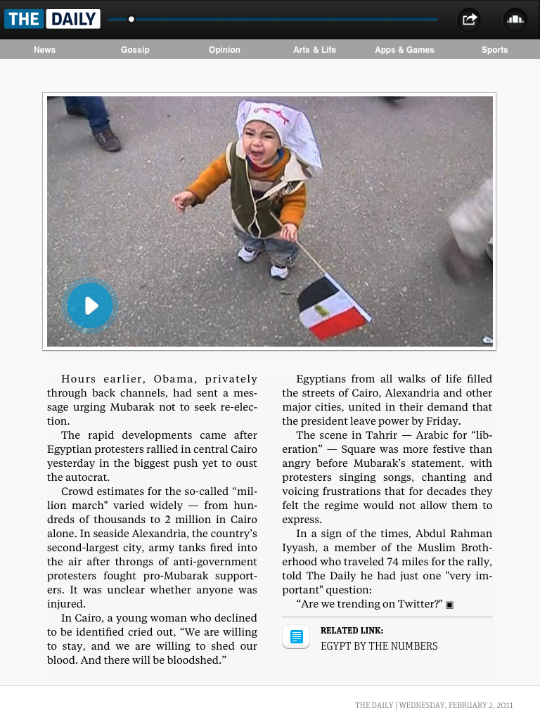
A more annoying thing however is the lack of ability to read some articles in landscape. Seriously some articles and most of the UI works in both landscape and portrait, yet a handful of articles require turning the iPad to portrait to read.
The UI is actually quite jarring on the whole for a lot of things, the App fails to really have a consistent UI throughout the whole experience. Whilst the front page is nice and clean the Sharing Menu pop-up is just plain ugly and looks horribly rushed. Scrolling is as discussed quite laggy and the black bar that stays on the top is overly imposing and too visible.
Furthermore because of the inconsistent UI and everything being in fullscreen there is also a feeling of being lost, you have no bearings and it confuses you, completely the opposite of what most Apple UI’s are like.
Screenshots
