Rumors of a smaller iPad were back again this week with a report from Bloomberg and since then the rumor mill has been in full swing. Not much detail was in the rumor, other than it’s a smaller iPad and that it’ll launch later this year. Earlier in the year, the display was rumored to be around 7.85” and A.T. Faust of AppAdvice gave compelling reasons as to why it makes sense. That number seems to have stuck around with this latest round of iPad mini rumors.
“The reason we [won’t] make a 7-inch tablet isn’t because we don’t want to hit [a lower] price point,” Jobs said. “It’s because we think the screen is too small to express the software. As a software driven company, we think about the software strategies first.” - AllThingsD
When I read the rumors this week I sighed, not again. I wasn’t the only one either, an iPad mini seems like a compromise, with little advantage. Plus the old Steve Jobs quote about 7 inch iPads just kept circling around. But others weren’t so closed minded and were considering whether it might actually have a place in Apple’s product line.
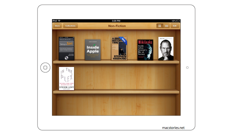
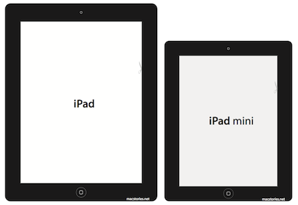
The biggest issue I have is with the screen, and whether the screen can still be sufficiently useful at the smaller size. To find out, I decided to do the old hack of making a little paper template of the iPad mini and see how it looked. I decided to stick with the 7.85” diagonal display size suggested and use a bezel only slightly smaller than those on the current iPad. For comparison I also made a paper template for the current iPad and versions of both with the bevel colored in. You can download, print and cut them out for yourself.
That was all good and well, but it didn’t really give me a sense of what the UI might look like on an iPad mini. So I decided to take some screenshots and shrink them down to the appropriate size. But I also made a duplicate copy of the screenshot and using Photoshop, reconfigured the UI to fit on a 7.85” display without adjusting the size of the buttons. To my mind that’s the only way that Apple would do this - Apple does frequently remind iOS designers to keep buttons at a tappable size (mentioned prominently in iOS Human Interface Guide), just shrinking the current iPad display would make buttons more difficult to tap.
Finally I put it all together into a Keynote presentation so that I could view it on my iPad and visibly see and compare how it would look. I’ve uploaded it, so you can do the same yourself. You just need Keynote for iOS and go into presentation mode to look at it yourself. If you want to go the extra step, cut your iPad mini template out and place it on top of your iPad whilst viewing the screenshots.
- Download the Keynote presentation (requires Keynote for iOS)
- Alternatively: download printable versions of the comparisons
I’ve only made three screenshots but I would love to see some of our readers send in their own comparison screenshots. If it’s good (i.e. you’ve done everything right), I’ll include it in an updated Keynote presentation, crediting you. Send them in to graham [at] macstories [dot] net.
How to make your own:
- Send in two images; the original screenshot and the reconfigured UI version
- Do not adjust the resolution at all for either image.
- For the reconfigured UI image, make two guides in Photoshop at 80% horizontally and vertically and then refit all of the UI into that. Once done, crop the image.


