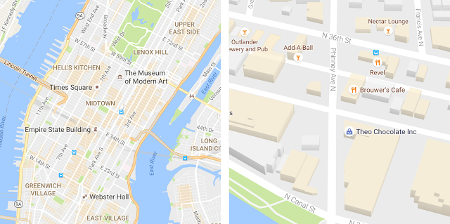
Google Maps is on the move. Just last week, Google added enhanced crowdsourcing features to Google Maps making it easier for users to edit map locations and add richer information about them. Now, Google has updated the design of its iOS, Android, and web apps to make them easier to explore visually too.
The goal of the Google Maps update was to create a less cluttered look:
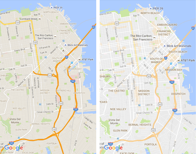
… as part of this update, we’ve removed elements that aren’t absolutely required (like road outlines). The result is a cleaner look that makes it easier to see helpful and actionable information like traffic and transit.
Google also modified the typography and color scheme of Maps to make it easier to identify different map elements.
The update to Google Maps includes an all-new feature as well – areas of interest, which are shaded orange. The shading, which is determined algorithmically and by humans makes it easy to spot areas where you may want to zoom in to browse points of interest.
I like the design changes that Google has made. In the before and after screenshots of downtown San Francisco above, the neighborhood names and other points of interest are much more legible than they were previously, which should make it easier to use Google Maps to explore and navigate new places.


